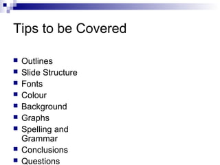
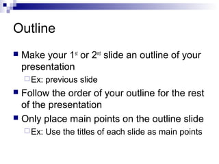
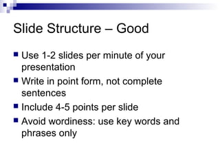
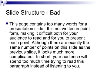
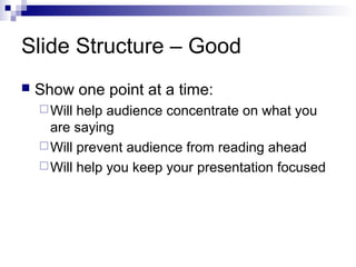
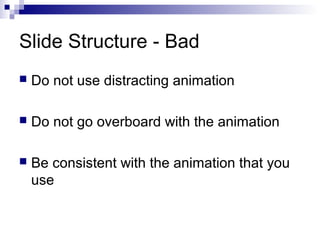
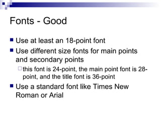
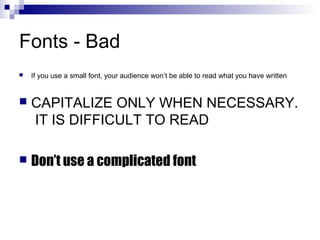
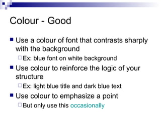
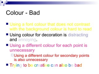
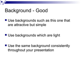
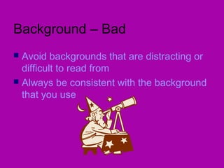
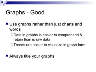
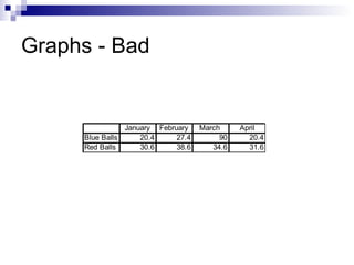
Making PowerPoint
Slides
Avoiding the Pitfalls of Bad
Slides
Tips to be Covered










Outlines
Slide Structure
Fonts
Colour
Background
Graphs
Spelling and
Grammar
Conclusions
Questions
Outline


Make your 1st or 2nd slide an outline of your
presentation
 Ex:

previous slide

Follow the order of your outline for the rest
of the presentation
 Only place main points on the outline slide


 Ex:

Use the titles of each slide as main points
Slide Structure – Good
Use 1-2 slides per minute of your
presentation
 Write in point form, not complete
sentences
 Include 4-5 points per slide
 Avoid wordiness: use key words and
phrases only

Slide Structure - Bad


This page contains too many words for a
presentation slide. It is not written in point
form, making it difficult both for your
audience to read and for you to present
each point. Although there are exactly the
same number of points on this slide as the
previous slide, it looks much more
complicated. In short, your audience will
spend too much time trying to read this
paragraph instead of listening to you.
Slide Structure – Good


Show one point at a time:
 Will

help audience concentrate on what you
are saying
 Will prevent audience from reading ahead
 Will help you keep your presentation focused
Slide Structure - Bad


Do not use distracting animation



Do not go overboard with the animation



Be consistent with the animation that you
use
Fonts - Good
Use at least an 18-point font
 Use different size fonts for main points
and secondary points


 this

font is 24-point, the main point font is 28point, and the title font is 36-point



Use a standard font like Times New
Roman or Arial
Fonts - Bad


If you use a small font, your audience won’t be able to read what you have written



CAPITALIZE ONLY WHEN NECESSARY.
IT IS DIFFICULT TO READ



Don’t use a complicated font
Colour - Good


Use a colour of font that contrasts sharply
with the background
 Ex:



Use colour to reinforce the logic of your
structure
 Ex:



blue font on white background

light blue title and dark blue text

Use colour to emphasize a point
 But

only use this occasionally
Colour - Bad
Using a font colour that does not contrast
with the background colour is hard to read
 Using colour for decoration is distracting
and annoying.
 Using a different colour for each point is
unnecessary


 Using

a different colour for secondary points
is also unnecessary



Trying to be creative can also be bad
Background - Good


Use backgrounds such as this one that
are attractive but simple



Use backgrounds which are light



Use the same background consistently
throughout your presentation
Background – Bad
Avoid backgrounds that are distracting or
difficult to read from
 Always be consistent with the background
that you use

Graphs - Good


Use graphs rather than just charts and
words
 Data

in graphs is easier to comprehend &
retain than is raw data
 Trends are easier to visualize in graph form


Always title your graphs
Graphs - Bad

January February
Blue Balls
20.4
27.4
Red Balls
30.6
38.6

March
90
34.6

April
20.4
31.6
Graphs - Good
Items Sold in First Quarter of 2002
100
90
80
70
60
50
40
30

Blue Balls
Red Balls

20
10
0
January

February

March

April
Graphs - Bad
100
90

90

80

70

60
Blue Balls

50

Red Balls
38.6

40

34.6
31.6

30.6
27.4

30
20.4

20.4

20

10

0
January

February

March

April
Graphs - Bad
Minor gridlines are unnecessary
 Font is too small
 Colours are illogical
 Title is missing
 Shading is distracting

Spelling and Grammar


Proof your slides for:
 speling

mistakes
 the use of of repeated words
 grammatical errors you might have make


If English is not your first language, please
have someone else check your
presentation!
Conclusion


Use an effective and strong closing
 Your

audience is likely to remember your last
words



Use a conclusion slide to:
 Summarize

the main points of your
presentation
 Suggest future avenues of research
Questions??


End your presentation with a simple
question slide to:
 Invite

your audience to ask questions
 Provide a visual aid during question period
 Avoid ending a presentation abruptly
THANK YOU

Presentations tips.ppt for class

  • 1.
  • 2.
    Tips to beCovered          Outlines Slide Structure Fonts Colour Background Graphs Spelling and Grammar Conclusions Questions
  • 3.
    Outline  Make your 1stor 2nd slide an outline of your presentation  Ex: previous slide Follow the order of your outline for the rest of the presentation  Only place main points on the outline slide   Ex: Use the titles of each slide as main points
  • 4.
    Slide Structure –Good Use 1-2 slides per minute of your presentation  Write in point form, not complete sentences  Include 4-5 points per slide  Avoid wordiness: use key words and phrases only 
  • 5.
    Slide Structure -Bad  This page contains too many words for a presentation slide. It is not written in point form, making it difficult both for your audience to read and for you to present each point. Although there are exactly the same number of points on this slide as the previous slide, it looks much more complicated. In short, your audience will spend too much time trying to read this paragraph instead of listening to you.
  • 6.
    Slide Structure –Good  Show one point at a time:  Will help audience concentrate on what you are saying  Will prevent audience from reading ahead  Will help you keep your presentation focused
  • 7.
    Slide Structure -Bad  Do not use distracting animation  Do not go overboard with the animation  Be consistent with the animation that you use
  • 8.
    Fonts - Good Useat least an 18-point font  Use different size fonts for main points and secondary points   this font is 24-point, the main point font is 28point, and the title font is 36-point  Use a standard font like Times New Roman or Arial
  • 9.
    Fonts - Bad  Ifyou use a small font, your audience won’t be able to read what you have written  CAPITALIZE ONLY WHEN NECESSARY. IT IS DIFFICULT TO READ  Don’t use a complicated font
  • 10.
    Colour - Good  Usea colour of font that contrasts sharply with the background  Ex:  Use colour to reinforce the logic of your structure  Ex:  blue font on white background light blue title and dark blue text Use colour to emphasize a point  But only use this occasionally
  • 11.
    Colour - Bad Usinga font colour that does not contrast with the background colour is hard to read  Using colour for decoration is distracting and annoying.  Using a different colour for each point is unnecessary   Using a different colour for secondary points is also unnecessary  Trying to be creative can also be bad
  • 12.
    Background - Good  Usebackgrounds such as this one that are attractive but simple  Use backgrounds which are light  Use the same background consistently throughout your presentation
  • 13.
    Background – Bad Avoidbackgrounds that are distracting or difficult to read from  Always be consistent with the background that you use 
  • 14.
    Graphs - Good  Usegraphs rather than just charts and words  Data in graphs is easier to comprehend & retain than is raw data  Trends are easier to visualize in graph form  Always title your graphs
  • 15.
    Graphs - Bad JanuaryFebruary Blue Balls 20.4 27.4 Red Balls 30.6 38.6 March 90 34.6 April 20.4 31.6
  • 16.
    Graphs - Good ItemsSold in First Quarter of 2002 100 90 80 70 60 50 40 30 Blue Balls Red Balls 20 10 0 January February March April
  • 17.
    Graphs - Bad 100 90 90 80 70 60 BlueBalls 50 Red Balls 38.6 40 34.6 31.6 30.6 27.4 30 20.4 20.4 20 10 0 January February March April
  • 18.
    Graphs - Bad Minorgridlines are unnecessary  Font is too small  Colours are illogical  Title is missing  Shading is distracting 
  • 19.
    Spelling and Grammar  Proofyour slides for:  speling mistakes  the use of of repeated words  grammatical errors you might have make  If English is not your first language, please have someone else check your presentation!
  • 20.
    Conclusion  Use an effectiveand strong closing  Your audience is likely to remember your last words  Use a conclusion slide to:  Summarize the main points of your presentation  Suggest future avenues of research
  • 21.
    Questions??  End your presentationwith a simple question slide to:  Invite your audience to ask questions  Provide a visual aid during question period  Avoid ending a presentation abruptly
  • 22.