Presentations tips

A cellular network or mobile network is a radio network distributed over land areas called cells, each served by at least one fixed-location transceiver, known as a cell site or base station. In a cellular network, each cell uses a different set of frequencies from neighboring cells, to avoid interference and provide guaranteed bandwidth within each cell. When joined together these cells provide radio coverage over a wide geographic area. This enables a large number of portable transceivers (e.g., mobile phones, pagers, etc.) to communicate with each other and with fixed transceivers and telephones anywhere in the network, via base stations, even if some of the transceivers are moving through more than one cell during transmission. Cellular networks offer a number of desirable features: More capacity than a single large transmitter, since the same frequency can be used for multiple links as long as they are in different cells Mobile devices use less power than with a single transmitter or satellite since the cell towers are closer Larger coverage area than a single terrestrial transmitter, since additional cell towers can be added indefinitely and are not limited by the horizon Major telecommunications providers have deployed voice and data cellular networks over most of the inhabited land area of the Earth. This allows mobile phones and mobile computing devices to be connected to the public switched telephone network and public Internet. Private cellular networks can be used for research[1] or for large organizations and fleets, such as dispatch for local public safety agencies or a taxicab company.[2]

Recommended
More Related Content
Recently uploaded
Recently uploaded (20)
Featured
Featured (20)
Presentations tips
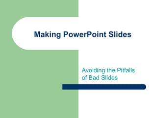
- 1. Making PowerPoint Slides Avoiding the Pitfalls of Bad Slides
- 2. Tips to be Covered Outlines Slide Structure Fonts Colour Background Graphs Spelling and Grammar Conclusions Questions
- 3. Outline Make your 1st or 2nd slide an outline of your presentation – Ex: previous slide Follow the order of your outline for the rest of the presentation Only place main points on the outline slide – Ex: Use the titles of each slide as main points
- 4. Slide Structure – Good Use 1-2 slides per minute of your presentation Write in point form, not complete sentences Include 4-5 points per slide Avoid wordiness: use key words and phrases only
- 5. Slide Structure - Bad This page contains too many words for a presentation slide. It is not written in point form, making it difficult both for your audience to read and for you to present each point. Although there are exactly the same number of points on this slide as the previous slide, it looks much more complicated. In short, your audience will spend too much time trying to read this paragraph instead of listening to you.
- 6. Slide Structure – Good Show – – – one point at a time: Will help audience concentrate on what you are saying Will prevent audience from reading ahead Will help you keep your presentation focused
- 7. Slide Structure - Bad Do not use distracting animation Do not go overboard with the animation Be consistent with the animation that you use
- 8. Fonts - Good Use at least an 18-point font Use different size fonts for main points and secondary points – this font is 24-point, the main point font is 28-point, and the title font is 36-point Use Arial a standard font like Times New Roman or
- 9. Fonts - Bad If you use a small font, your audience won’t be able to read what you have written CAPITALIZE ONLY WHEN NECESSARY. IT IS DIFFICULT TO READ Don’t use a complicated font
- 10. Colour - Good Use a colour of font that contrasts sharply with the background – Ex: blue font on white background Use colour to reinforce the logic of your structure – Ex: light blue title and dark blue text Use – colour to emphasize a point But only use this occasionally
- 11. Colour - Bad Using a font colour that does not contrast with the background colour is hard to read Using colour for decoration is distracting and annoying. Using a different colour for each point is unnecessary – Using a different colour for secondary points is also unnecessary Trying to be creative can also be bad
- 12. Background - Good Use backgrounds such as this one that are attractive but simple Use Use backgrounds which are light the same background consistently throughout your presentation
- 13. Background – Bad Avoid backgrounds that are distracting or difficult to read from Always be consistent with the background that you use
- 14. Graphs - Good Use – – graphs rather than just charts and words Data in graphs is easier to comprehend & retain than is raw data Trends are easier to visualize in graph form Always title your graphs
- 15. Graphs - Bad January February Blue Balls 20.4 27.4 Red Balls 30.6 38.6 March 90 34.6 April 20.4 31.6
- 16. Graphs - Good Items Sold in First Quarter of 2002 100 90 80 70 60 50 40 30 Blue Balls Red Balls 20 10 0 January February March April
- 17. Graphs - Bad 100 90 90 80 70 60 Blue Balls 50 Red Balls 38.6 40 34.6 31.6 30.6 27.4 30 20.4 20.4 20 10 0 January February March April
- 18. Graphs - Bad Minor gridlines are unnecessary Font is too small Colours are illogical Title is missing Shading is distracting
- 19. Spelling and Grammar Proof – – – If your slides for: speling mistakes the use of of repeated words grammatical errors you might have make English is not your first language, please have someone else check your presentation!
- 20. Conclusion Use – Your audience is likely to remember your last words Use – – an effective and strong closing a conclusion slide to: Summarize the main points of your presentation Suggest future avenues of research
- 21. Questions?? End your presentation with a simple question slide to: – – – Invite your audience to ask questions Provide a visual aid during question period Avoid ending a presentation abruptly