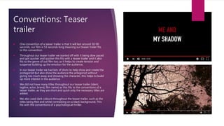
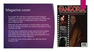
In what ways does your media product
use, develop or challenge forms and
conventions of real media products?
AMY PACKER
Conventions: Teaser
trailer
 One convention of a teaser trailer is that it will last around 30-90
seconds, our film is 53 seconds long meaning our teaser trailer fits
to this convention.
 Throughout our teaser trailer we started off with it being slow paced
and got quicker and quicker this fits with a teaser trailer and it also
fits to the genre of out film too, as it helps to create tension and
suspense building up the emotion for the audience.
 In our teaser trailer we had lots of shots to help show and create the
protagonist but also show the audience the antagonist without
giving too much away and showing the character, this helps to build
up more interest in the audience.
 We did not have many titles throughout our teaser trailer (ident,
tagline, actor, brand, film name) as this fits to the conventions of a
teaser trailer, as they are short and quick only the necessary titles are
added.
 We also used dark colours throughout the teaser trailer, such as the
titles being Red and white contrasting on a black background. This
fits with the conventions of a psychological thriller.
Poster:
 Our poster has a large title that stands out drawing the audience into
it more, the red and white titles colours also fit to the conventions of a
thriller, we also used these colours as they stand out best from the
dark background.
 We also have a tagline, it is positioned under the title meaning it
stands out but does not take away from the title or anything else in
the poster, your eye is not drawn to it till after you have read the title.
 We also have a social media link at the bottom of our poster this helps
to bring the product through other platforms and creates more
advertisement, this is used in almost all posters.
 We also have a billing block at the bottom of our poster this is used in
all posters to show who worked in the creation of the film, we used a
white for the billing block to get it to stand out but also put an opacity
on it so that it didn’t take away attention from the main parts of the
poster.
 We also had the release date at the bottom of the poster in the same
colour as the title making it one of the seconds things to stand out
after the title.
Magazine cover:
 Our poster fits with the conventions of the Fangoria
magazine, we used dark colours and also put a filter over
the image to create a vintage feel as this is what the
poster does as well.
 Although we used Fangoria in most of their covers they
focus on having more gore, we could not do that as it did
not fit to our film.
 We also took screenshots of past work we have created
and made the strip down the side of the cover this is
something that Fangoria does with upcoming films, and
films being shown in the magazine.
 To make the cover more realistic we used the actual
Fangoria title.

Me and my shadow evaluation q1

  • 1.
    In what waysdoes your media product use, develop or challenge forms and conventions of real media products? AMY PACKER
  • 2.
    Conventions: Teaser trailer  Oneconvention of a teaser trailer is that it will last around 30-90 seconds, our film is 53 seconds long meaning our teaser trailer fits to this convention.  Throughout our teaser trailer we started off with it being slow paced and got quicker and quicker this fits with a teaser trailer and it also fits to the genre of out film too, as it helps to create tension and suspense building up the emotion for the audience.  In our teaser trailer we had lots of shots to help show and create the protagonist but also show the audience the antagonist without giving too much away and showing the character, this helps to build up more interest in the audience.  We did not have many titles throughout our teaser trailer (ident, tagline, actor, brand, film name) as this fits to the conventions of a teaser trailer, as they are short and quick only the necessary titles are added.  We also used dark colours throughout the teaser trailer, such as the titles being Red and white contrasting on a black background. This fits with the conventions of a psychological thriller.
  • 3.
    Poster:  Our posterhas a large title that stands out drawing the audience into it more, the red and white titles colours also fit to the conventions of a thriller, we also used these colours as they stand out best from the dark background.  We also have a tagline, it is positioned under the title meaning it stands out but does not take away from the title or anything else in the poster, your eye is not drawn to it till after you have read the title.  We also have a social media link at the bottom of our poster this helps to bring the product through other platforms and creates more advertisement, this is used in almost all posters.  We also have a billing block at the bottom of our poster this is used in all posters to show who worked in the creation of the film, we used a white for the billing block to get it to stand out but also put an opacity on it so that it didn’t take away attention from the main parts of the poster.  We also had the release date at the bottom of the poster in the same colour as the title making it one of the seconds things to stand out after the title.
  • 4.
    Magazine cover:  Ourposter fits with the conventions of the Fangoria magazine, we used dark colours and also put a filter over the image to create a vintage feel as this is what the poster does as well.  Although we used Fangoria in most of their covers they focus on having more gore, we could not do that as it did not fit to our film.  We also took screenshots of past work we have created and made the strip down the side of the cover this is something that Fangoria does with upcoming films, and films being shown in the magazine.  To make the cover more realistic we used the actual Fangoria title.