Download to read offline
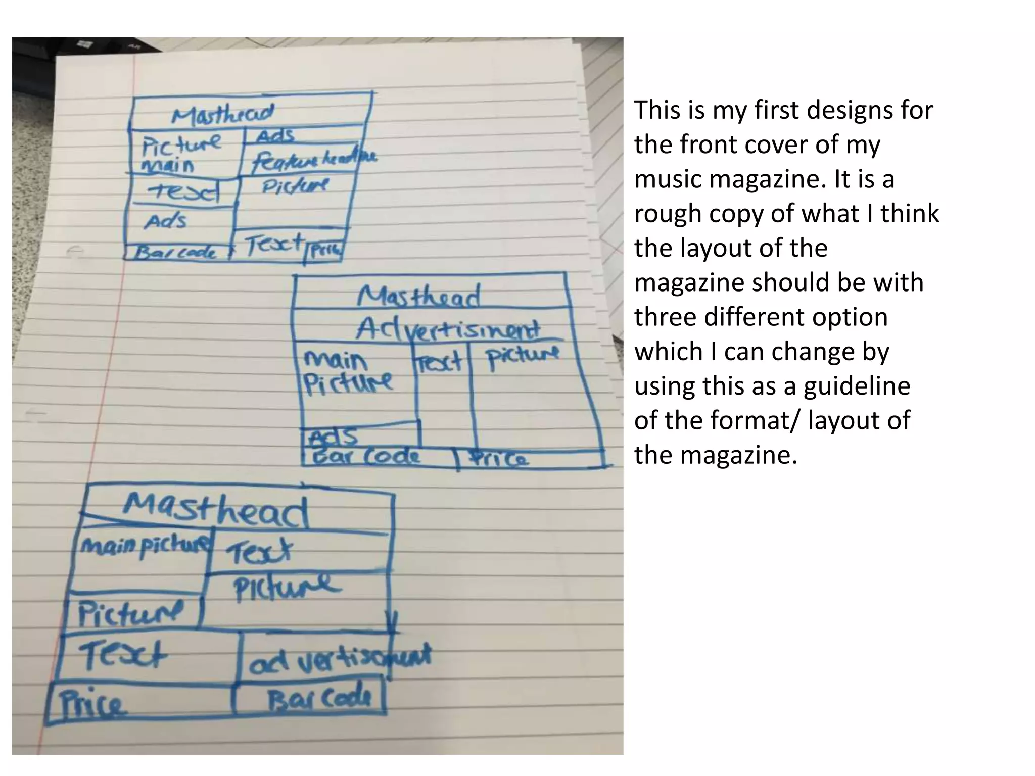
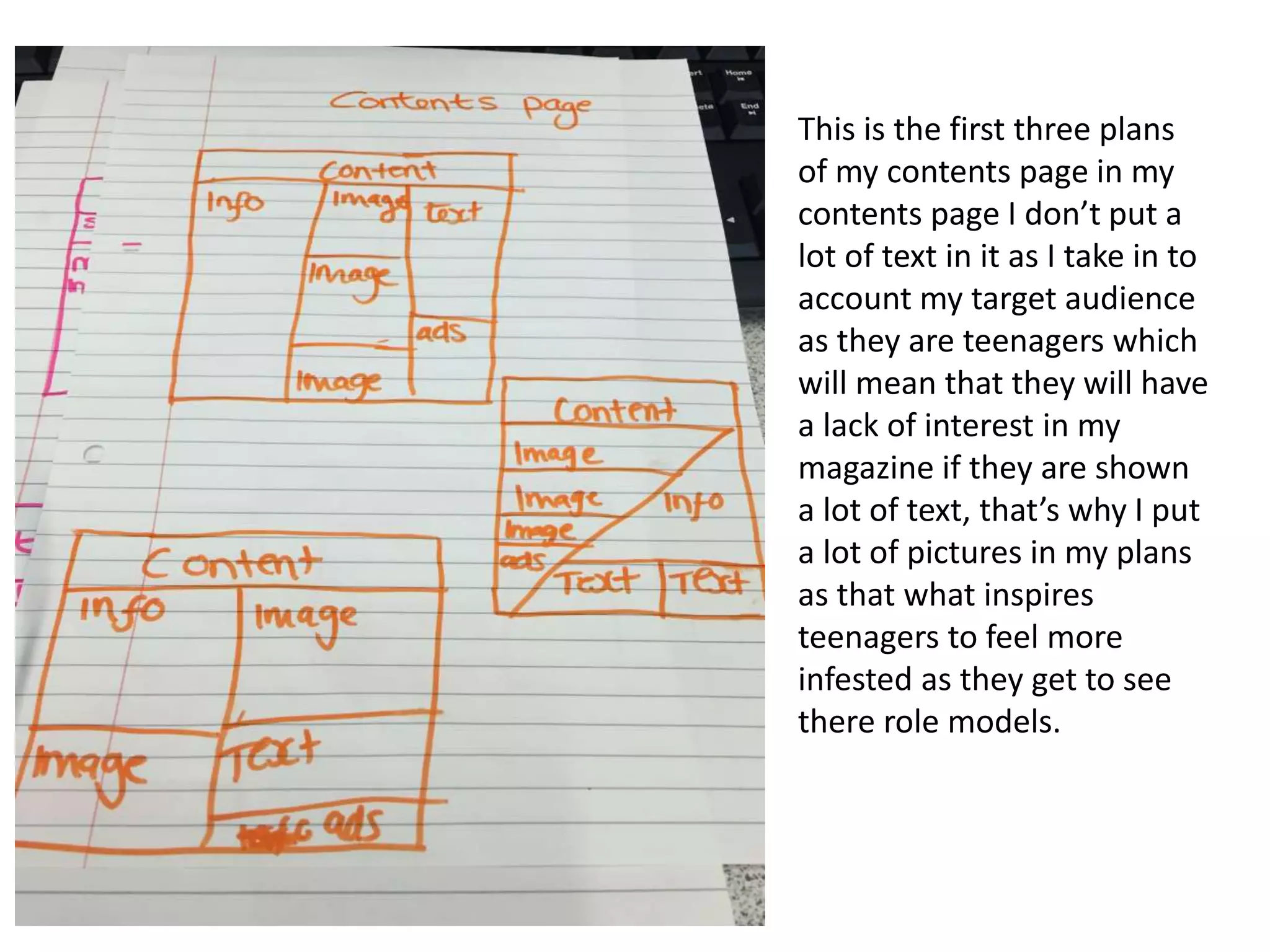
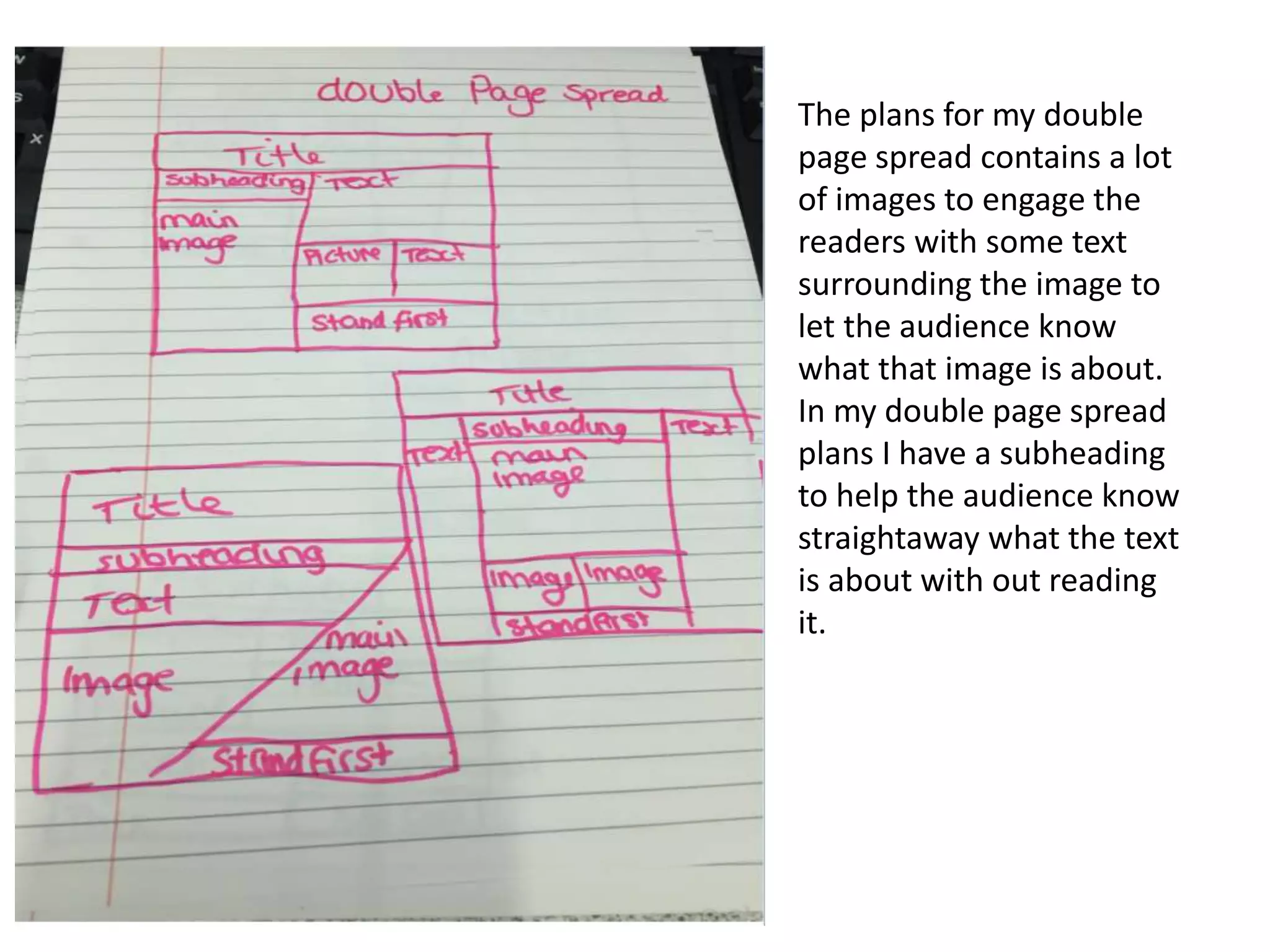
This document contains three rough draft plans for a music magazine's front cover, contents page, and double page spread. The front cover layout explores three design options to guide the overall format. The contents page uses mostly images and little text to engage the teenage target audience. The double page spread features many photos with brief surrounding text and subheadings to inform readers quickly.


![Preliminary task, school magazine compared to music[1]](https://cdn.slidesharecdn.com/ss_thumbnails/preliminarytaskschoolmagazinecomparedtomusic1-130201041120-phpapp02-thumbnail.jpg?width=640&height=640&fit=bounds)


