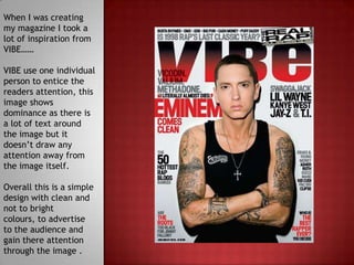
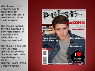
When I was creating
my magazine I took a
lot of inspiration from
VIBE……

VIBE use one individual
person to entice the
readers attention, this
image shows
dominance as there is
a lot of text around
the image but it
doesn’t draw any
attention away from
the image itself.

Overall this is a simple
design with clean and
not to bright
colours, to advertise
to the audience and
gain there attention
through the image .
Spin is similar to VIBE
as they both use
bland colours but
with one colour being
bright allowing it to
stand out.

The cover lines are
simple and not to
extravagant which
means it keeps the
focus on the main
image in the centre
of the page.

This is simple but
gives a good clean
and professional look
like VIBE.
What I aimed to do
with mine was to
follow their set
up, which was show a
dominant picture on
the front cover.

The photo is layered
over the masthead to
show more interest in
the artist himself
rather than the
magazine masthead.

This Photo is a Mid-Shot
from the waste
upwards and showing
him as the main photo
helps to target my
initial
audience, young, trend
y modern people.

Question 2 Evaluation

  • 2.
    When I wascreating my magazine I took a lot of inspiration from VIBE…… VIBE use one individual person to entice the readers attention, this image shows dominance as there is a lot of text around the image but it doesn’t draw any attention away from the image itself. Overall this is a simple design with clean and not to bright colours, to advertise to the audience and gain there attention through the image .
  • 3.
    Spin is similarto VIBE as they both use bland colours but with one colour being bright allowing it to stand out. The cover lines are simple and not to extravagant which means it keeps the focus on the main image in the centre of the page. This is simple but gives a good clean and professional look like VIBE.
  • 4.
    What I aimedto do with mine was to follow their set up, which was show a dominant picture on the front cover. The photo is layered over the masthead to show more interest in the artist himself rather than the magazine masthead. This Photo is a Mid-Shot from the waste upwards and showing him as the main photo helps to target my initial audience, young, trend y modern people.