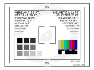
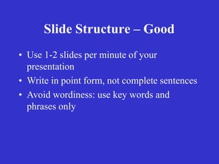
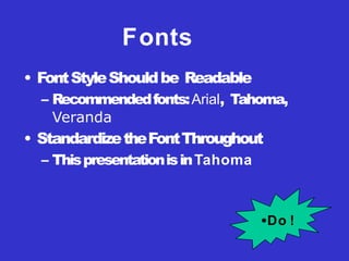
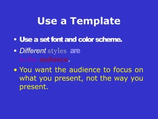
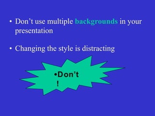
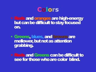
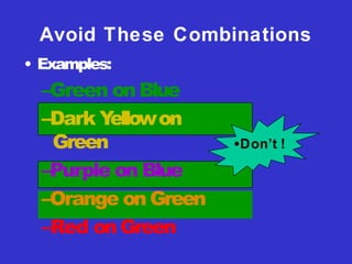
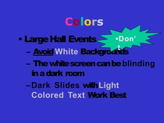
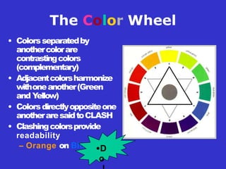
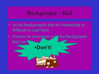
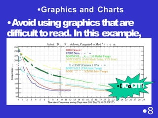
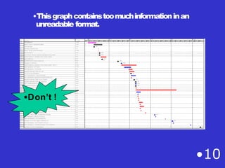
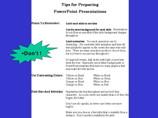
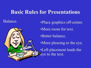
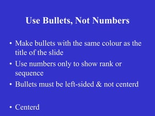
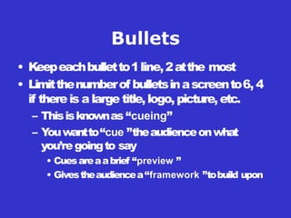
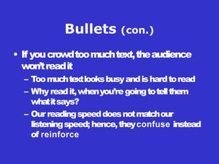
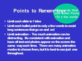
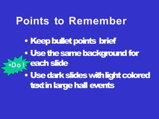
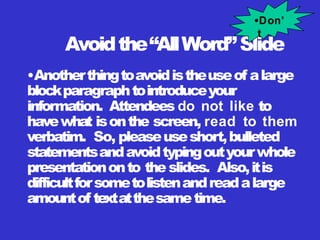
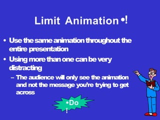
Guidelines for Preparing
Power-point Presentations
Prof. S.M.Sagar
M.Phil applied linguistics
03426476557
sagarmehmood85@gmail.com
Objectives
• Why do you need a presentation?
• How to make a good presentation ?
• What is a bad presentation?
Tips to be Covered
•
•
•
•
•
•
•
•
•
Outlines
Slide Structure
Fonts
Colour
Background
Graphs
Spelling and Grammar
Conclusions
Questions
Basic Rules for Presentations
• Contrast is important.
• For paper…
– Dark text on a light background.
Basic Rules for Presentations
• For projection…
– Light text on a semi-dark
background.
– The eye is attracted to the light
on the screen.
• Inorderforyourpresentationtofitonmostscreens,
textandimagesshouldbeplacedwithin95%of the
PowerPointslide.This“actionsafe”areaisseenin
thenextslide.
PowerPoint Slide
• Layoutcontinuityfromframetoframeconveysa
senseof completeness
• Headings,subheadings,andlogosshouldshowup
in the same spot on each frame
• Margins,fonts,fontsize,andcolorsshouldbe
consistentwithgraphicslocatedinthesamegeneral
positiononeach frame
• Lines,boxes,borders,andopenspacealsoshould
beconsistent throughout
PowerPoint Layout
Slide Structure – Good
• Use 1-2 slides per minute of your
presentation
• Write in point form, not complete sentences
• Avoid wordiness: use key words and
phrases only
• No More than One Topic per Slide
•Do !
6 lines of text
6 words per line
•6 X 6 rule
•Do !
Fonts
• FontStyleShouldbe Readable
– Recommendedfonts:Arial, Tahoma,
Veranda
• StandardizetheFontThroughout
– ThispresentationisinTahoma
•Do !
Text size
• Select Readable Type Size
• Minimum 36 point for titles
– 24 point for body text
• This is 32 point •Do !
•TIPS Presentation: 3/8/2004 •Dawn Thomas, CRM
•Don’t !
What does this say? Garamond Font, Italic, Bold 12pt.
• This is very difficult to read. Times Font, Bold, 12pt.
• This point could be lost. Century Gothic Font, Bold, Italic, 14pt.
• No one will be able to read this. Gill Sans Font, Condensed Bold, 12pt
•Font Size
Combiningsmallfontsizeswithboldori
t
a
l
i
c
s
is
not recommended:
Small fontsareokayforafooter,such
a
s
:
Fonts
• Don’t Sacrifice Readability for Style
• D o n ’ t S a c r i f i c e
r e a D a b i l i t y f o r S t y l e
• Don’t Sacrifice Readability for
Style
• D o n ’ t S a c r i f i c e
R e a d a b i l i t y
f o r S t y l e
•Don’t !
Caps and Italics
• DO NOT USE ALL CAPITAL
LETTERS
– Makestexthardto read
– Conceals acronyms
– DeniestheiruseforEMPHASIS
• Italics
– Usedfor “quotes”
– Usedtohighlight thoughtsor ideas
– Usedforbook,journal,ormagazine titles
Use a Template
• Use a setfontand color scheme.
• Different styles are
to the audience.
• You want the audience to focus on
what you present, not the way you
present.
UsetheSameBackground
onEach Slide
•Do !!
•Don’t
!
• Don’t use multiple backgrounds in your
presentation
• Changing the style is distracting
Colors
• Redsandorangesarehigh-energy
butcanbedifficulttostayfocused
on.
• Greens,blues,andbrownsare
mellower,butnotasattention
grabbing.
• RedsandGreenscanbedifficultto
seeforthosewhoarecolor blind.
Avoid These Combinations
• Examples:
–Green on Blue
–Dark Y
ellowon
Green
–Purple on Blue
–Orange on Green
–Red on Green
•Don’t !
Colors
• Whiteondarkbackgroundshouldnotbe
usedif audienceismorethan20 ftaway
.
– This setof slidesis a good example.
– Youcanreadtheslidesupclose.
– Thefurtherawayyouget,theharderitisto
read.
– Thisisagoodcolorcombinationif viewedona
computer
.
– Adarkbackgroundonacomputerscreen
reduces glare.
Colors
• LargeHall Events
– AvoidWhite Backgrounds
– Thewhitescreencanbeblinding
inadark room
–Dark Slides withLight
Colored Text Work Best
•Don’
t
The Color Wheel
• Colorsseparatedby
anothercolorare
contrastingcolors
(complementary)
• Adjacentcolorsharmonize
withoneanother(Green
and Y
ellow)
• Colorsdirectlyoppositeone
anotheraresaidtoCLASH
• Clashingcolorsprovide
readability
– Orange on Blue •D
o
•Thisisagoodmixof
colors. Readable!
•Background Colors
•Remember: Readability! Readability! Readability!
•Thisisabadmixof
colors.Low contrast.
•Unreadable!
•Thisisagoodmix of
•colors. Readable!
•Thisisabadmix of
•colors. Avoid bright
•colors on white.
•Unreadable!
Background – Bad
• Avoid backgrounds that are distracting or
difficult to read from
• Always be consistent with the background
that you use
•Don’t!
Chloroquine
•
•
•
Prototypeantimalarialdrug,m
o
s
twidelyu
s
e
dtotreatalltypesofmalarialinfections.It is
alsothecheapest,timetesteda
n
dsafeantimalarialagent.
T
h
em
e
c
h
a
n
i
s
mofactionofchloroquineisunclear
.
Beingalkaline,thedrugr
e
a
c
h
e
shighconcentrationwithinthefoodv
a
c
u
o
l
e
softheparasitea
n
d
raisesitspH.It isfoundtoinducerapidclumpingofthepigment.Chloroquine s
that convertsthe
toxich
e
m
e
intonon-toxichemazoin,therebyresultingintheaccumulationoftoxich
e
m
e
withinthep
a
r
a
s
i
t
e
•
.
D
I
tm
o
a
y
n
a
l
s
’
o
t
i
n
!
t
e
r
f
e
r
ewith thebiosynthesisofnucleic acids.
Graphs and Charts
Make sure the audience
can read them!
olor
ck the
makethegraph
ul be v diffi
t ck
•8
wh
tor I
•D
r
o
o
n
o
’
t
m
!
.
•Graphics and Charts
•Avoidusinggraphicsthatare
difficulttoread.Inthis example,
•Thisgraphcontainstoomuchinformationinan
unreadable format.
•10
•Don’t !
•Good Graph
•Theseareexamples
of
•goodgraphs,withnice
•linewidthsandgood
•colors.
•Do !
Charts and Graphs
20
10
0
30
40
50
80
70
60
Nor t h America Europe Aust railia
Mode A
Mode B
Mode C
•Don
’ t
Charts and Graphs
•8
0
•7
0
•6
0
•5
0
•4
0
•3
0
•Americ
•Nort
•h
Eur•oApuestrali
•Mode A
•Mode B
•Mode C
•D
o
•Thisisagood,readabletable.Tables,especiallylargeones,
should be placed on a separate slide.
4/19 Fri 109
4/22 Mon 112
4/23 Tue 134
4/24 Wed 155
4/25 Thur 165
4/26 Fri 174 DQE test visit 1; Control temp +0.5 K
NICMOS restarted, Ne-loop control
continues
Change to mounting•cDupocontrol
Return to Ne control, Filter wheel test
begins
Increase control temperature to allow
for +2 K variations
Begin darks every 3rd orbit
!
Illustrations
• Useonlywhenneeded,otherwisethey
becomedistractersinsteadof communicators
• Theyshouldrelatetothemessageandhelp
makeapoint
• Askyourself if itmakesthemessage clearer
• Simplediagramsaregreatcommunicators
•Do
!
•Don’t !
Basic Rules for Presentations
Balance. •Place graphics off-center.
•More room for text.
•Better balance.
•More pleasing to the eye.
•Left placement leads the
eye to the text.
Use Bullets, Not Numbers
• Make bullets with the same colour as the
title of the slide
• Use numbers only to show rank or
sequence
• Bullets must be left-sided & not centerd
• Centerd
Bullets
• Keepeachbulletto1line,2atthe most
• Limitthenumberof bulletsinascreento6, 4
if thereis a large title,logo, picture, etc.
– Thisisknownas “cueing”
– Y
ouwantto“cue ”theaudienceonwhat
you’regoingto say
• Cuesareaabrief “preview ”
• Givestheaudiencea“framework ”tobuild upon
Bullets (con.)
• If youcrowdtoomuchtext,theaudience
won’treadit
– Toomuchtextlooksbusyandishardtoread
– Whyreadit,whenyou’regoingtotellthem
whatitsays?
– Ourreadingspeeddoesnotmatchour
listeningspeed;hence,theyconfuse instead
of reinforce
• Limiteachslideto1idea
• Limiteachbulletpointtoonlyafewwordstoavoid
longsentencesthatgoonand on!
• Limitanimation– Toomuchanimationcanbe
distracting. Beconsistentwithanimationand
havealltextandphotosappearonthescreenthe
same wayeach time. Therearemanyanimation
modestochoosefrom,butitisbesttousejust one
throughout.
Points to Remem•
D
o
bn
eo
rt do this!
Limit Bullet Points
•To a few words
Points to Remember
• Keepbulletpoints brief
• Usethesamebackgroundfor
eachslide
• Usedarkslideswithlightcolored
textinlargehall events
•Do !
Avoidthe“AllWord”Slide
•Anotherthingtoavoidistheuseof alarge
blockparagraphtointroduceyour
information. Attendees do not like to
havewhat isonthe screen, read to them
verbatim. So, pleaseuseshort,bulleted
statementsandavoidtypingoutyourwhole
presentationonto the slides. Also,itis
difficultforsometolistenandreadalarge
amountof textatthesametime.
•Don’
t
• To make a s l i d e s t a n d o u t ,
c h a n g e t h e f o n t ,
b a c k g r o u n d , o r a d d
animation.
Limit Animation •!
• Usethesameanimationthroughoutthe
entire presentation
• Usingmorethanonecanbevery
distracting
– The audience will only see the animation
and not the message you’re trying to get
across
•Bam!
•Don’t
Limit Animation•!
• Usethesameanimationthroughoutthe
entire presentation
• Usingmorethanonecanbevery
distracting
– The audience will only see the animation
and not the message you’re trying to get
across
•Do
!
YOU
• Do notusethemediatohideyou
• TheaudiencecametoSEE you
• ThemediashouldENHANCE thepresentation,
notBE thepresentation
• If you’reonlygoingtoreadfromtheslides,then
justsendthemtheslides!
• Remember,onlyyoucanprevent
“Death by PowerPoint”
Spelling and Grammar
• Proof your slides for:
– speling mistakes
– the use of of repeated words
– grammatical errors you might have make
• If English is not your first language, please
have someone else check your presentation!
Conclusion
• Use an effective and strong closing
– Your audience is likely to remember your last
words
• Use a conclusion slide to:
– Summarize the main points of your
presentation
– Suggest future avenues of research
Questions??
• End your presentation with a simple
question slide to:
– Invite your audience to ask questions
– Provide a visual aid during question period
– Avoid ending a presentation abruptly
Your Slides are Not your Presentation
• Your slides are a focus for your
presentation
• Your topic is proof
• You present your proof with slides to
focus interest on what you think is
important
Simplicity
is
the best
Also Remember
• Home
• Insert
• Design
• Animations
• Slide Show
• Review
• View
• Format
Also Remember
• Always save the document to a proper
location & proper file name.
• Try to save the PPT every 2-3 minutes.
• Always convert first to 97-2003 format &
then save.
Key Board Commands
• Ctrl + X = Cut
• Ctrl + C = Copy
• Ctrl + V = Paste
• Ctrl +A= SelectAll
• Ctrl + M = New Slide
• Ctrl + Z = Undo
• Ctrl + J = Justify
• Ctrl + S = Save
Key Board Commands
• Ctrl + Shift + > = increase size
• Ctrl + Shift + < = decrease size
Thank you….

A Formal oral presentation.pptx