Power BI KPIs
•Download as PPTX, PDF•
0 likes•47 views

This document provides a guide to creating and using KPI visuals in Power BI. It defines what a KPI is and gives examples of common KPIs like sales, marketing ROI, and customer satisfaction. It then provides a step-by-step guide to creating a KPI visual in Power BI, including adding a date dimension table, measures for current and previous year sales, and setting a target value. Finally, it discusses formatting options for KPI visuals and some limitations to keep in mind.

Recommended
Recommended
More Related Content
Similar to Power BI KPIs
Similar to Power BI KPIs (20)
More from Select Distinct Limited
More from Select Distinct Limited (20)
Recently uploaded
Recently uploaded (20)
Power BI KPIs
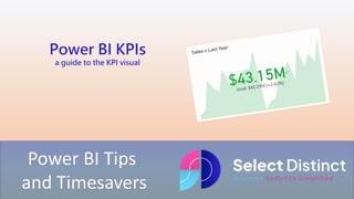
- 1. Power BI Tips and Timesavers Power BI KPIs a guide to the KPI visual
- 2. Power BI KPIs can be a very powerful way to draw attention to specific key performance indicators Here is a step by step guide to get you started
- 3. What is a KPI? a KPI (Key Performance Indicator) is a way to measure performance against a target Examples of KPIs KPIs could include some of the following Sales Gross Sales could be measured against a Budget Marketing A Marketing return on investment could be tracked Customer Satisfaction Collecting customer feedback and using an ordinal measures such as a 1 to 5 scale to ensure happy customers
- 4. What is a KPI? Using KPIs in Power BI Power BI can be very helpful with its built in KPI visuals, you can easily add the KPI visual to a dashboard to highlight very quickly areas that need to made prominent Example The KPI visual shows a comparison to a target Sales last year are the target with a value of $42.29M Sales this year are over 2% higher at $43.15M It also shows the trend in the background to give more visual context, good performance shown in green
- 5. How to create a KPI visual in Power BI Step 1 Starting with a Power BI workbook in Power BI desktop, select the KPI visual and drag it onto your canvas You can see that there are three standard pieces of information that we need in a KPI visual Value is the data to be measured, in our example we use the Sales in Dollars Trend Axis is the time period to be measured across, we will use the date Target is optional, but we will come back to this
- 6. How to create a KPI visual in Power BI Step 2 Add a date dimension table This is important to give us the option to roll up the data aggregation into useful buckets We want to show the Year and Month as measured periods Set the relationship to the date table
- 7. How to create a KPI visual in Power BI Step 2 continued Add the Year and Month number to the trend axis We can now see the visual begin to take shape But you can see that is still lacks the context of a target
- 8. How to create a KPI visual in Power BI Step 3 We will use the last year as a comparative In the sales table, create a new measure using SAMEPERIODLASTYEAR Sales $ LY = CALCULATE(SUM(sales[sale_dollars]), SAMEPERIODLASTYEAR('Calendar table'[Date])) Add this to the Target field in the KPI Visual The value is higher than the target, so it changes to a green colour
- 9. Formatting options for Power BI KPIs Callout value is used to set the font, size and positioning. You can also change the display units as Thousands, Millions, Billions or even Trillions Icons allows you turn them on or off, and resize Trend Axis options for the trend chart in the background Target Label settings for the sizing and type of target to show Date allows you to show the date, again with the usual font, size and colour options
- 10. Limitations Some Limitations of Power BI KPIs Although the KPI cards can be very useful, it's worth trying to keep the focus on the relative performance of the key indicators, too many visual elements can detract from the impact so choose items carefully The axis of the trend line can be misleading at times as it defaults to a maximum and minimum value, this can cause confusion as the low points in the trend tend to look like zero Unlike other visuals there is no interactivity on the objects so no way to drill through, you would need to add other visuals to the page to allow this
- 11. The main purposes of KPIs and the KPI visuals in Power BI are to draw your attention to the relevant performance Think of using them to highlight the most important points on a page but keep things to a minimum
- 12. For more Tips, Tricks and Timesavers, visit our website Business Analytics Blog – Select Distinct Credit: simon.harrison@selectdistinct.co.uk