Need to show the direction of travel on a map in Power BI
We had a client which needed us to do this very thing
This short guide shows how to do it using the Icon Map
https://www.selectdistinct.co.uk/2023/10/11/direction-of-travel-on-a-map-in-power-bi/
#PowerBI #IconMap #businessintelligence
This document contains a step by step guide to create a BI Solution with SQL Server 2008 R2, it was downloaded from
http://channel9.msdn.com/Learn/Courses/Office2010/BIApplicationsUnit/BIApplicationsLab
This document is part of the Developing BI Applications Course that is available at Channel9 from Microsoft
Regards,
Eduardo Castro
Microsoft SQL Server MVP
http://ecastrom.blogspot.com
MBA 620 Module Five Power BI Executive Summary AssignmentAbramMartino96
MBA 620 Module Five
Power BI Executive Summary Assignment User Manual
MBA 620 Module Five .............................................................................................................................1
Power BI Executive Summary Assignment User Manual ........................................................................1
Introduction .........................................................................................................................................1
Accessing Power BI via the Virtual Desktop Infrastructure (VDI) .......................................................1
Cleaning the CSV File ...........................................................................................................................2
Importing Files to Power BI .................................................................................................................4
Working on the Module Five Visualization of Financial Performance Assignment ............................8
Creating Clustered Column Charts 8
Creating a Line Chart ........................................................................................................................ 14
Exporting Files From Power BI ......................................................................................................... 18
Uploading Image Files to OneDrive .................................................................................................. 20
Introduction
Power BI is a tool that enables its users to visualize and present data in a manner that is easy to
understand and analyze.
Accessing Power BI via the Virtual Desktop Infrastructure (VDI)
1. Open the virtual desktop interface (VDI) on your machine.
2
2. On the VDI home screen, select Power BI Desktop. The Power BI homepage is displayed.
Cleaning the CSV File
We should clean the CSV file before we import it into Power BI. For example, to plot charts as per
the prompt in the assignment guidelines, we will use data from the Balance Sheets section of the
CSV file. The other data sections, such as Income Statement, Cash Flow Statement, and Supporting
Schedules, are not required. Therefore, we can remove them and conduct the analysis.
To clean the data set file, locate MBA620_Module five_Assignment two_Company A Financial.
1. On the VDI home screen, open the Business Analytics Course Content folder.
3
2. Open the MBA620_Module five_Assignment two_Company A Financial CSV file.
3. In the file, we can remove following data to clean the CSV file for creating the specific chart
in the assignment:
• Remove columns A, C, and D, as they are empty and not required in analysis.
• Remove rows 1, 2, 3, and 4, as that data is not required to plot the charts in Power
BI.
• In section 1 of the prompt, in guiding question 1, you are asked to analyze the data
in the balance sheet section of the CSV file, which is starting ...
FME is typically used to exchange data, but it can also be used as a powerful tool to automate the transformation of spatial data into technical CAD diagrams. In this presentation I will show how I embedded FME into an application process to create on-the-fly AutoCAD diagrams for communication manholes. This involves determining the local spatial reference, calculating the extents required, clipping the data, creating labels for the data, filtering the data to set line colors and styles, and then exporting the file using linked workspaces.
In general, the app bar is a highly used component in many applications. An app bar can be effectively helpful to house the search field, simply the page title or buttons to navigate around pages. It is a commonly used component, and Flutter app development services offer the dedicated widget for the functionality known as AppBar.
Business users like you often have to create summary reports out of the data you have. Writing formulae, providing information and organizing the totals into a new table take up valuable time!
E.g., Imagine you have created the perfect summary report that compares, say, sales in different rE.g. ions. You may also have to compare sales across different product lines or customers.
To ease your efforts, Excel supports a feature called ‘pivot table’ which helps in summarizing your data. Moreover, you can easily generate multiple summary reports from the same pivot table.
The best part is, Collabion Charts for SharePoint supports basic pivoting features. It lets you create insightful charts based on pivot tables.
How?
Take a peek at the slides below to get to know!
Create Location Sharing apps using the Ionic framework Shelly Megan
Location-sharing apps have made traveling much easier and hassle-free. This blog provides step-by-step guidance on creating Location Sharing apps using ionic app development services. We hope this will be useful to the Ionic app developers.
How the clothing product life take advantage from MIDIH Open Source architecture implementation. Real-time modelling simulations in order to detect the population coverage for a clothing design.
Year on Year comparison by weekday in power BI
A Step by Step guide to avoid potential errors when using SAMEPERIODLASTYEAR and a simple solution to ensure you compare matching weekdays
https://www.selectdistinct.co.uk/2024/04/16/year-on-year-power-bi/
#PowerBI #SAMEPERIODLASTYEAR #DataViz
Sync Your Slicers in Power BI
A Step by Step guide, to keeping separate slicers in sync across different data sets using slicer groups
https://www.selectdistinct.co.uk/2024/03/12/sync_slicers_in_power_bi/
#PowerBI #Slicers #DataViz
More Related Content
Similar to Direction of travel on a map in Power BI.pptx
FME is typically used to exchange data, but it can also be used as a powerful tool to automate the transformation of spatial data into technical CAD diagrams. In this presentation I will show how I embedded FME into an application process to create on-the-fly AutoCAD diagrams for communication manholes. This involves determining the local spatial reference, calculating the extents required, clipping the data, creating labels for the data, filtering the data to set line colors and styles, and then exporting the file using linked workspaces.
In general, the app bar is a highly used component in many applications. An app bar can be effectively helpful to house the search field, simply the page title or buttons to navigate around pages. It is a commonly used component, and Flutter app development services offer the dedicated widget for the functionality known as AppBar.
Business users like you often have to create summary reports out of the data you have. Writing formulae, providing information and organizing the totals into a new table take up valuable time!
E.g., Imagine you have created the perfect summary report that compares, say, sales in different rE.g. ions. You may also have to compare sales across different product lines or customers.
To ease your efforts, Excel supports a feature called ‘pivot table’ which helps in summarizing your data. Moreover, you can easily generate multiple summary reports from the same pivot table.
The best part is, Collabion Charts for SharePoint supports basic pivoting features. It lets you create insightful charts based on pivot tables.
How?
Take a peek at the slides below to get to know!
Create Location Sharing apps using the Ionic framework Shelly Megan
Location-sharing apps have made traveling much easier and hassle-free. This blog provides step-by-step guidance on creating Location Sharing apps using ionic app development services. We hope this will be useful to the Ionic app developers.
How the clothing product life take advantage from MIDIH Open Source architecture implementation. Real-time modelling simulations in order to detect the population coverage for a clothing design.
Year on Year comparison by weekday in power BI
A Step by Step guide to avoid potential errors when using SAMEPERIODLASTYEAR and a simple solution to ensure you compare matching weekdays
https://www.selectdistinct.co.uk/2024/04/16/year-on-year-power-bi/
#PowerBI #SAMEPERIODLASTYEAR #DataViz
Sync Your Slicers in Power BI
A Step by Step guide, to keeping separate slicers in sync across different data sets using slicer groups
https://www.selectdistinct.co.uk/2024/03/12/sync_slicers_in_power_bi/
#PowerBI #Slicers #DataViz
Make your Google Search Console Data more useful with Power BI
Here is a simple step by step guide to taking the daily GSC data, smoothing it into weekly summary data and presenting a nice clean report to show progress without all of the noise that the daily data shows
https://www.selectdistinct.co.uk/2024/03/01/using-google-search-console-data-in-power-bi/
#SEO #DataAnalytics #PowerBI #GSC
Data Lake v Data Warehouse
Do you know the difference?
Data lakes and data warehouses are both storage systems for big data, but they have several key differences.
A data lake is designed to store raw data of all types, including structured, semi-structured, and unstructured data. It’s a great option for companies that benefit from raw data for machine learning.
A data warehouse is designed to be a repository for already structured data to be queried and analysed for very specific purposes. It’s a better fit for companies whose business analysts need to decipher analytics in a structured system.
Understanding these key differences is important for any aspiring data professional
https://www.selectdistinct.co.uk/2024/01/02/difference-between-a-data-lake-and-a-data-warehouse/
#datawarehouse #datalake #dataanalytics
How to create a drop down list in Excel
Use this feature to help get your data input right at source, with built in data validation and in cell drop down
Limit the amount of spelling variations, inconsistencies and errors in Excel
https://www.selectdistinct.co.uk/2024/01/02/dropdown-lists-in-excel/
#Excel #dropdown #datavalidation
Top 5 SQL tips 2023
Presenting our most popular SQL tips for 2023
1. How to calculate running totals in SQL server
2. How to use the LEAD and LAG functions in SQL
3. Group by ROLLUP in SQL
4. Divide by Zero Errors
5. How to split a column in SQL Server
https://www.selectdistinct.co.uk/2023/12/19/top-sql-tips-for-2023/
#SQL #businessanalytics #data #analytics #sqltips
Top 5 Power Bi tips 2023
Presenting our most popular Power BI tips for 2023
1. Show values in Rows
2. Use SAMEPERIODLASTYEAR
3. How to sort dates properly
4. Toggle Measures with SWITCH
5. Advanced TOPN filter
https://www.selectdistinct.co.uk/2023/12/18/top-power-bi-tips-for-2023/
#PowerBI #dataviz #businessanalytics #data #analytics
Music by www.bensound.com
What are CTE's in SQL
WITH Statements?
What the benefits, limitations and Syntax are
https://www.selectdistinct.co.uk/2023/12/05/how-to-use-a-cte/
#SQL #CTE #SQLWITH #DATA
Do you know the difference between calculated columns and measures in Power BI?
In this article, you’ll learn what calculated columns and measures are, how they work, and when to use them.
You’ll also get some tips and best practices for choosing between them.
https://www.selectdistinct.co.uk/2023/11/21/calculated-columns-and-measures-in-power-bi/
#powerBI #measures #calculatedcolumns
Divide by zero errors and how to avoid them
Examples and code samples for SQL, Big Query, Excel, Power BI including DAX and Power Query
https://www.selectdistinct.co.uk/2023/11/01/divide-by-zero-errors/
#dividebyzero #SQL #PowerBI
music by www.bensound.com
How to choose between DAX, Power Query or SQL
to transform data for your Power BI reporting
https://www.selectdistinct.co.uk/2023/10/25/when-to-transform-data/
#powerbi #DAX #PowerQuery
KPIs in Power BI are a great way to focus attention on what matters
This step by step guide shows you how to set them up with tips on their best use
https://www.selectdistinct.co.uk/2023/10/18/power-bi-kpis/
#powerbi #KPIs #dataviz
How to combine data tables in DAX in Power BI using the UNION command
This guide shows you how to create a seamless data set from 2 or more tables to make further analysis and reporting much easier
https://www.selectdistinct.co.uk/2023/10/04/union-in-dax/
#PowerBI #DAX #UNION
Combine data sets with APPEND in Power Query
You can use this simple technique to consolidate data from different sources into a single data set to make analysis easier
This is useful if you can't combine the data at source or if you dont have the facility
https://www.selectdistinct.co.uk/2023/09/27/append-data-in-power-query/
#PowerQuery #Append #PowerBI
Connect Power BI to Google BigQuery
Use the public datasets to develop your skills and demonstrate the power of both platforms for FREE
In this example we use the actual wholesale sales data for the US state of Iowa that is one of the public datasets
https://www.selectdistinct.co.uk/2023/09/07/connect-power-bi-to-google-big-query/
This is a great starting point for anyone wanting to build their skills with data that can be refreshed
#PowerBI #BigQuery #PublicData
Easily add subtotals into your queries with the Group by ROLLUP clause in SQL server
We explain the syntax, the logic, and the benefits of using ROLLUP to create subtotals and grand totals in your queries. With examples you can follow
https://www.selectdistinct.co.uk/2023/08/23/group-by-rollup-in-sql-server
#ROLLUP #SQL #DATAANALYTICS
Advanced Top N in Power BI
Here we set up a slicer to define how many Top items we want to see, but importantly classify the rest as 'Others'
This allows us to see the whole picture and focus on the leading items
https://www.selectdistinct.co.uk/2023/07/27/advanced-top-n-filter-power-bi/
#PowerBI #TOPN #DataVisualisation
Power BI comes ready loaded with a wide range of format options
But did you know that you are not limited to the pre-defined options
Some organisations have specific standards for things such as date formats, these can be catered for using custom formats
https://www.selectdistinct.co.uk/2023/07/20/custom-formats-in-power-bi/
#powerbi #dataviz #customformats
You have heard of the 80:20 rule (Pareto)
Power BI has a TOPN function in DAX
This guide shows you how to start using it
https://www.selectdistinct.co.uk/2023/06/28/topn-in-power-bi/
#powerbi #topn #businessintelligence
In the world of data analysis, having the ability to efficiently rank and prioritize information is crucial. This is where the TOPN function in Power BI comes into play. By utilizing this powerful ranking function, analysts and data professionals can gain valuable insights from their datasets.
The TOPN function, short for "top n," allows users to identify and retrieve the top or bottom records based on a specified criteria. This function is particularly useful when dealing with large datasets that require quick and accurate analysis.
With Power BI's extensive capabilities, the TOPN function can be utilized through its native DAX (Data Analysis Expressions) formula language. By incorporating this formula into your Power BI reports and dashboards, you can effectively sort and filter data to highlight key trends, outliers, or patterns.
The importance of the TOPN function lies in its ability to streamline decision-making processes by presenting relevant information in a concise manner. Whether you are analysing sales figures, customer satisfaction ratings, or any other dataset, being able to quickly identify the top performers or underperformers can greatly impact strategic decision-making.
In this section, we will delve deeper into understanding how the TOPN function works within Power BI and explore real-world use cases where it can be applied effectively. So let's dive in and unlock the full potential of this essential feature in Power BI!
Do you want to learn how to unpivot a table in SQL Server?
Unpivot is a handy operator that converts columns into rows, making your data more normalized and readable.
Check out my latest blog post to see how it works and why you should use it.
https://www.selectdistinct.co.uk/2023/06/12/unpivot-function-in-sql/
#sql #unpivot #datatransformation #sqlserver #blogpost
Chatty Kathy - UNC Bootcamp Final Project Presentation - Final Version - 5.23...John Andrews
SlideShare Description for "Chatty Kathy - UNC Bootcamp Final Project Presentation"
Title: Chatty Kathy: Enhancing Physical Activity Among Older Adults
Description:
Discover how Chatty Kathy, an innovative project developed at the UNC Bootcamp, aims to tackle the challenge of low physical activity among older adults. Our AI-driven solution uses peer interaction to boost and sustain exercise levels, significantly improving health outcomes. This presentation covers our problem statement, the rationale behind Chatty Kathy, synthetic data and persona creation, model performance metrics, a visual demonstration of the project, and potential future developments. Join us for an insightful Q&A session to explore the potential of this groundbreaking project.
Project Team: Jay Requarth, Jana Avery, John Andrews, Dr. Dick Davis II, Nee Buntoum, Nam Yeongjin & Mat Nicholas
Levelwise PageRank with Loop-Based Dead End Handling Strategy : SHORT REPORT ...Subhajit Sahu
Abstract — Levelwise PageRank is an alternative method of PageRank computation which decomposes the input graph into a directed acyclic block-graph of strongly connected components, and processes them in topological order, one level at a time. This enables calculation for ranks in a distributed fashion without per-iteration communication, unlike the standard method where all vertices are processed in each iteration. It however comes with a precondition of the absence of dead ends in the input graph. Here, the native non-distributed performance of Levelwise PageRank was compared against Monolithic PageRank on a CPU as well as a GPU. To ensure a fair comparison, Monolithic PageRank was also performed on a graph where vertices were split by components. Results indicate that Levelwise PageRank is about as fast as Monolithic PageRank on the CPU, but quite a bit slower on the GPU. Slowdown on the GPU is likely caused by a large submission of small workloads, and expected to be non-issue when the computation is performed on massive graphs.
Adjusting primitives for graph : SHORT REPORT / NOTESSubhajit Sahu
Graph algorithms, like PageRank Compressed Sparse Row (CSR) is an adjacency-list based graph representation that is
Multiply with different modes (map)
1. Performance of sequential execution based vs OpenMP based vector multiply.
2. Comparing various launch configs for CUDA based vector multiply.
Sum with different storage types (reduce)
1. Performance of vector element sum using float vs bfloat16 as the storage type.
Sum with different modes (reduce)
1. Performance of sequential execution based vs OpenMP based vector element sum.
2. Performance of memcpy vs in-place based CUDA based vector element sum.
3. Comparing various launch configs for CUDA based vector element sum (memcpy).
4. Comparing various launch configs for CUDA based vector element sum (in-place).
Sum with in-place strategies of CUDA mode (reduce)
1. Comparing various launch configs for CUDA based vector element sum (in-place).
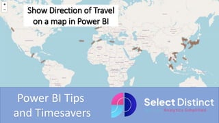
1. Show Direction of Travel
on a map in Power BI
Power BI Tips
and Timesavers
2. A global commodity trading client of ours had a requirement to create a dashboard
that presented the latest locations and headings for a range of container ships
The internal BI team had been using a dashboard in Tableau which catered for this
requirement quite easily, but could not find a way to replicate this in Power BI, so the
task was handed over to us
What follows is a simplified guide using some sample data that we have generated to
make it straight forward to follow along
3. Getting Started
The first thing you will need is some
sample shipping data
We created a simple spreadsheet
with 49 rows to illustrate
4. Getting Started
You will also need an appropriate icon to represent the ships
In our case we used an AI image creator to represent a ship
and removed the background
It is important that this image faces North in its neutral
position, we will be applying the heading as a rotation to
illustrate the direction of travel
5. Load the sample data into Power BI
The first step is to load the sample data
into Power BI
On the Home ribbon in Power BI Desktop,
select get data, then Excel workbook and
select your excel file
If you download our sample data you will
save yourself some time and not have to
do anything to the field types
6. Load the ICON MAP V3 add in
Once it is loaded you can then
download the IconMapV3
from the marketplace, which
is a free download
select the three dots and
select get more visuals
7. Add the map to the canvas
Now select this and drag it
onto your canvas
8. Field Settings for the icon map
Field settings for the Icon Map
Category - use ship name
longitude = longitude
latitude = latitude
Size = Icon Size
Add the icon
Select format your visual
Then go down to objects and expand the section
9. Choosing the ICON
We will use the conditional formatting options under Image /
WKT
The icon field is a url which Power BI uses to download the icon
10. Rotate the image
Then set the heading, we use the image rotation to turn the
object by the correct number of degrees
Select Heading from the field options
12. Showing the direction of travel on a map in Power BI is made much
easier with this add in
This just the basics to get you started, and by following along with the
example you can get similar results
Icon Map v3 is the latest release and has a great deal more features,
some of which look very impressive
13. For more Tips, Tricks and
Timesavers, visit our website
Business Analytics Blog – Select Distinct
Credit: simon.harrison@selectdistinct.co.uk