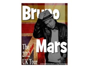
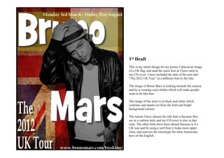
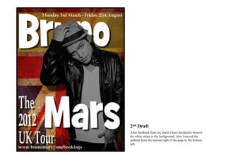
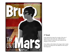
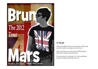
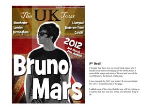
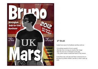
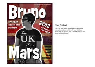
1st Draft
This is my initial design for my poster, I placed an image
of a UK flag, and used the same font as I have used in
my CD cover. I have included the date of the tour and
“The 2012 UK Tour” in a different font to the title.

The image of Bruno Mars is looking towards the camera
and he is wearing cool clothes which will make people
want to be like him.

The image of the artist is in black and white which
contrasts and stands out from the bold and bright
background colours.

The reason I have chosen the title font is because they
are in a cartoon style and my CD cover is also in that
style. The other fonts have been chosen because is it a
UK tour and by using a serif font it looks more upper
class, and conveys the stereotype for what Americans
have of the English.
2nd Draft
After feedback from my peers I have decided to remove
the white stripe in the background. Also I moved the
website from the bottom right of the page to the bottom
left.
3rd Draft
I then replaced the image for an image of the actor. I
made the actor look to the side. I think that this is
effective because it makes him seem important and
arrogant as if he is too cool.

I have added a white border to the image to that it stands
out more on the page and I also added the white strip in
the background.
4th Draft
I then got feedback from some more peers, and they told
me that I needed to rearrange some of the text.

I then moved the text around so that it filled the page
better and it looked more professional.

The actors head is covering the ‘O’ in the word Bruno
because the head looks like the letter ‘O’.
5th Draft
I thought that there was too much blank space, and I
needed to do some rearranging of the whole poster. I
centred the image and some of the text and moved the
word Bruno to the bottom of the page.

I also changed the 2012 tour to the UK tour and added
the ‘2012’ to another part of the page.

I added some of the cities that the tour will be visiting as
I realised that this was also a very conventional thing to
do.
6th Draft
I asked more peers for feedback and they told me:

-Everything seemed to be too centred
-The title was covering too much of the image
-The UK tour was to dominant in the page
- The yellow banner would look better at the bottom.

I took these tips well and used them constructively to
develop my product further, and this is what I came up
with.
Final Product
This is my final poster, I have got all of the required
information on there, and the only thing that I have
altered from the previous draft is ‘the UK tour’ has been
moved and re-positioned.

Posters Development and Final Product

  • 2.
    1st Draft This ismy initial design for my poster, I placed an image of a UK flag, and used the same font as I have used in my CD cover. I have included the date of the tour and “The 2012 UK Tour” in a different font to the title. The image of Bruno Mars is looking towards the camera and he is wearing cool clothes which will make people want to be like him. The image of the artist is in black and white which contrasts and stands out from the bold and bright background colours. The reason I have chosen the title font is because they are in a cartoon style and my CD cover is also in that style. The other fonts have been chosen because is it a UK tour and by using a serif font it looks more upper class, and conveys the stereotype for what Americans have of the English.
  • 3.
    2nd Draft After feedbackfrom my peers I have decided to remove the white stripe in the background. Also I moved the website from the bottom right of the page to the bottom left.
  • 4.
    3rd Draft I thenreplaced the image for an image of the actor. I made the actor look to the side. I think that this is effective because it makes him seem important and arrogant as if he is too cool. I have added a white border to the image to that it stands out more on the page and I also added the white strip in the background.
  • 5.
    4th Draft I thengot feedback from some more peers, and they told me that I needed to rearrange some of the text. I then moved the text around so that it filled the page better and it looked more professional. The actors head is covering the ‘O’ in the word Bruno because the head looks like the letter ‘O’.
  • 6.
    5th Draft I thoughtthat there was too much blank space, and I needed to do some rearranging of the whole poster. I centred the image and some of the text and moved the word Bruno to the bottom of the page. I also changed the 2012 tour to the UK tour and added the ‘2012’ to another part of the page. I added some of the cities that the tour will be visiting as I realised that this was also a very conventional thing to do.
  • 7.
    6th Draft I askedmore peers for feedback and they told me: -Everything seemed to be too centred -The title was covering too much of the image -The UK tour was to dominant in the page - The yellow banner would look better at the bottom. I took these tips well and used them constructively to develop my product further, and this is what I came up with.
  • 8.
    Final Product This ismy final poster, I have got all of the required information on there, and the only thing that I have altered from the previous draft is ‘the UK tour’ has been moved and re-positioned.