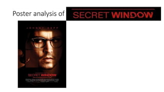
2. Film title
The text chosen for the film is
different for the two words. Both of
the fonts are quite plain and straight.
This links to the title of the film as it
indicate the structure of a window.
The second word of the title, Window,
is in a bolder font and looks as if it has
been shattered, similar to how a
window could be shattered.
3. Actors
Jonny Depp is a well known actor who is
admired by many people. By placing his
name right at the top and filling out most
of the width of the poster will attract a
large target audience. Depp’s name is
very privileged in the poster. This is a
convention of posters to have the best
known actor separately from the billing
block as it reflects his status.
4. Main image
The main image is very striking. It is a
close up of the protagonist with a
worried look on his face as he has his
eyes glaring off to the side. This
leaves questions with the audience as
it tells us he is looking at something
he is afraid of. This fits in with the
thriller convention and I think this
design will work well when I come
down to designing and making my
own poster.
5. Tagline or slogan
This is an effective tagline as it relates to
the title of the film and leaves the
audience on an elliptic which will make
them want to watch the film. The tagline
will make the audience think of the film
when they read it as there is a clear link.
6. Cast and crew
The billing block is a legal
requirement for any film and
includes the actors, directors,
producers and other key
members involved in making
the film. The names that appear
at the front of the billing block
will have more of a key role in
the production of the film or if
its an actor, they will have more
screen time on the film. This
insures that the audience are
aware of who are in the film,
then they can judge if they
want to see it or not.