Poster 2
•
0 likes•80 views

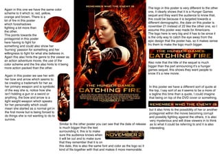
This poster for The Hunger Games sequel features the same color scheme of red, yellow, orange, and brown. It depicts the protagonist fighting with her bow and arrow, suggesting she will have to fight for something she believes in. The large logo and title signal this is a new installment in the franchise, with the release date also prominently displayed to remind viewers when it will be in theaters. Overall, the poster uses visual cues and stylistic elements to advertise the action-packed plot of the protagonist again being forced to compete while hinting at potential corruption or infighting among characters.

Recommended
More Related Content
What's hot
What's hot (20)
Viewers also liked
Viewers also liked (11)
Similar to Poster 2
Similar to Poster 2 (20)
More from Aaron Newbigging
More from Aaron Newbigging (20)
Poster 2
- 1. Again in this one we have the same color scheme to it which is; red, yellow, orange and brown. There is a lot of fire in this poster which foreshadows fighting a lot more than the other. This points towards the protagonist in this poster here having to fight for something and could also show her ʻburningʼ passion for something and her willingness to fight for what she believes in. Again this also hints the genre to the viewer as an action adventure movie, the use of the color scheme and the fire also hints to it being more action packed than the other. Again in this poster we see her with her bow and arrow which seems to be creating a trademark for her as her primary weapon and is symbolic of the way she is, notice how she isnʼt holding a gun or a sword or anything, the bow and arrow is a light weight weapon which speaks for her personality which could mean she started as a normal girl in the first movie but is being forced to do things she is not wanting to do to survive. The logo in this poster is very different to the other one, it clearly shows that it is a Hunger Games sequel and they want the audience to know that, this could be because it is targeted towards a different demographic, the date on this poster is november 21 instead of 22 like the other one, so I assume this poster was made for Americans. The logo here is very big and it has to be since it is the only way to catch the eye away from the epic design that the poster has, so it makes sense fro them to make the logo much bigger. Also note that the title of the sequel is much bigger than the part announcing itʼs a hunger games sequel, this shows they want people to know itʼs a new movie. In this poster we have a different sort of quote at the top, I say sort of as it seems to be a more of a tagline this time than a quote, I could imagine that being on top of the DVD cover or something, Similar to the other poster you can see that the date of release is much bigger than the text surrounding it, this is to make sure the audience knows when it will be out and to make sure that they remember that it is on this date, this is also the same font and color as the logo so it kind of fits together with that and makes it more memorable. but it also hints to the possibility of her or another protagonist within the movie becoming corrupt and possibly fighting against the others, it is also very mysterious and will draw viewers in to think as to what it could be referring to and it is also interesting.