Planning
By Matthew McMinn
Style Sheet
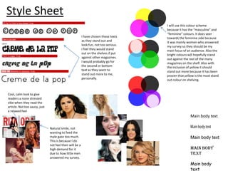
I have chosen these texts
as they stand out and
look fun, not too serious.
I feel they would stand
out on the shelves if put
against other magazines.
I would probably go for
the second or bottom
text as they seem to
stand out more to me,
personally.

I will use this colour scheme
because it has the “masculine” and
“feminine” colours. It does veer
towards the feminine side because
it was mainly women who answered
my survey so they should be my
main focus of an audience. Also the
bright colours will hopefully stand
out against the rest of the many
magazines on the shelf. Also with
the inclusion of yellow it should
stand out more because it has been
proven that yellow is the most stand
out colour on shelving.

Cool, calm look to give
readers a none stressed
vibe when they read the
article. Not too saucy, just
a relaxed feel

Main body text
Natural smile, not
wanting to feed the
male gaze too much.
This is because I do
not feel their will be a
high demand for it
due to how little men
answered my survey.

Main body text
Main body
text
Main body
text
Drafts-Cover

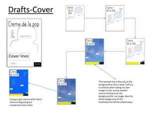
Trying to get colours which don’t
look too disgusting but
compliment each other.

This example has a blue sky as the
background as this is what I will try
to achieve when taking my own
images as the survey showed
natural setting to be the
background for my image. Also the
white background of the
masthead text will be edited away.
Drafts-Contents

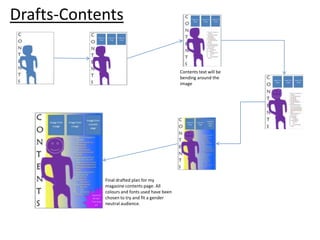
Contents text will be
bending around the
image

Final drafted plan for my
magazine contents page. All
colours and fonts used have been
chosen to try and fit a gender
neutral audience.
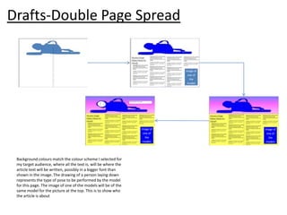
Drafts-Double Page Spread

Background colours match the colour scheme I selected for
my target audience, where all the text is, will be where the
article text will be written, possibly in a bigger font than
shown in the image. The drawing of a person laying down
represents the type of pose to be performed by the model
for this page. The image of one of the models will be of the
same model for the picture at the top. This is to show who
the article is about
Picture Planning
•
•
•
•

•

•
•
•

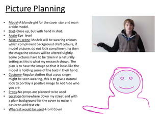
Model-A blonde girl for the cover star and main
article model.
Shot-Close up, but with hand in shot.
Angle-Eye level
Mise-en-scene-Models will be wearing colours
which compliment background draft colours, if
model pictures do not look complimenting then
the magazine colours will be altered slightly.
Some pictures have to be taken in a naturally
setting as this is what my research shows. The
plan is to have the image so that it looks like the
model is holding some of the text in their hand.
Costume-Regular clothes that a pop singer
might be seen wearing, this is to give a natural
look to portray a positive image to not hide who
you are.
Props-No props are planned to be used
Location-Somewhere down my street and with
a plain background for the cover to make it
easier to add text etc.
Where it would be used-Front Cover
•
•
•
•

•
•
•
•

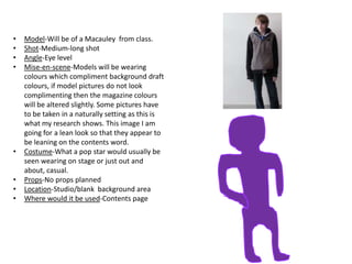
Model-Will be of a Macauley from class.
Shot-Medium-long shot
Angle-Eye level
Mise-en-scene-Models will be wearing
colours which compliment background draft
colours, if model pictures do not look
complimenting then the magazine colours
will be altered slightly. Some pictures have
to be taken in a naturally setting as this is
what my research shows. This image I am
going for a lean look so that they appear to
be leaning on the contents word.
Costume-What a pop star would usually be
seen wearing on stage or just out and
about, casual.
Props-No props planned
Location-Studio/blank background area
Where would it be used-Contents page
•
•
•
•

•
•
•
•

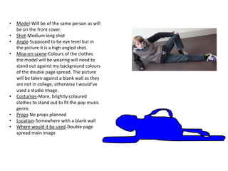
Model-Will be of the same person as will
be on the front cover.
Shot-Medium long shot
Angle-Supposed to be eye level but in
the picture it is a high angled shot.
Mise-en-scene-Colours of the clothes
the model will be wearing will need to
stand out against my background colours
of the double page spread. The picture
will be taken against a blank wall as they
are not in college, otherwise I would’ve
used a studio image.
Costumes-More, brightly coloured
clothes to stand out to fit the pop music
genre.
Props-No props planned
Location-Somewhere with a blank wall
Where would it be used-Double page
spread main image
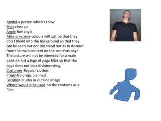
Model-a person which I know
Shot-close up
Angle-low angle
Mise-en-scene-colours will just be that they
don’t blend into the background so that they
can be seen but not too stand out as to distract
from the main content on the contents page.
The picture will not be intended for a main
position but a type of page filler so that the
page does not look disinteresting.
Costumes-Regular clothes
Props-No props planned
Location-Studio or outside image
Where would it be used-on the contents as a
filler

Planning (actual)

  • 1.
  • 2.
    Style Sheet I havechosen these texts as they stand out and look fun, not too serious. I feel they would stand out on the shelves if put against other magazines. I would probably go for the second or bottom text as they seem to stand out more to me, personally. I will use this colour scheme because it has the “masculine” and “feminine” colours. It does veer towards the feminine side because it was mainly women who answered my survey so they should be my main focus of an audience. Also the bright colours will hopefully stand out against the rest of the many magazines on the shelf. Also with the inclusion of yellow it should stand out more because it has been proven that yellow is the most stand out colour on shelving. Cool, calm look to give readers a none stressed vibe when they read the article. Not too saucy, just a relaxed feel Main body text Natural smile, not wanting to feed the male gaze too much. This is because I do not feel their will be a high demand for it due to how little men answered my survey. Main body text Main body text Main body text
  • 3.
    Drafts-Cover Trying to getcolours which don’t look too disgusting but compliment each other. This example has a blue sky as the background as this is what I will try to achieve when taking my own images as the survey showed natural setting to be the background for my image. Also the white background of the masthead text will be edited away.
  • 4.
    Drafts-Contents Contents text willbe bending around the image Final drafted plan for my magazine contents page. All colours and fonts used have been chosen to try and fit a gender neutral audience.
  • 5.
    Drafts-Double Page Spread Backgroundcolours match the colour scheme I selected for my target audience, where all the text is, will be where the article text will be written, possibly in a bigger font than shown in the image. The drawing of a person laying down represents the type of pose to be performed by the model for this page. The image of one of the models will be of the same model for the picture at the top. This is to show who the article is about
  • 6.
    Picture Planning • • • • • • • • Model-A blondegirl for the cover star and main article model. Shot-Close up, but with hand in shot. Angle-Eye level Mise-en-scene-Models will be wearing colours which compliment background draft colours, if model pictures do not look complimenting then the magazine colours will be altered slightly. Some pictures have to be taken in a naturally setting as this is what my research shows. The plan is to have the image so that it looks like the model is holding some of the text in their hand. Costume-Regular clothes that a pop singer might be seen wearing, this is to give a natural look to portray a positive image to not hide who you are. Props-No props are planned to be used Location-Somewhere down my street and with a plain background for the cover to make it easier to add text etc. Where it would be used-Front Cover
  • 7.
    • • • • • • • • Model-Will be ofa Macauley from class. Shot-Medium-long shot Angle-Eye level Mise-en-scene-Models will be wearing colours which compliment background draft colours, if model pictures do not look complimenting then the magazine colours will be altered slightly. Some pictures have to be taken in a naturally setting as this is what my research shows. This image I am going for a lean look so that they appear to be leaning on the contents word. Costume-What a pop star would usually be seen wearing on stage or just out and about, casual. Props-No props planned Location-Studio/blank background area Where would it be used-Contents page
  • 8.
    • • • • • • • • Model-Will be ofthe same person as will be on the front cover. Shot-Medium long shot Angle-Supposed to be eye level but in the picture it is a high angled shot. Mise-en-scene-Colours of the clothes the model will be wearing will need to stand out against my background colours of the double page spread. The picture will be taken against a blank wall as they are not in college, otherwise I would’ve used a studio image. Costumes-More, brightly coloured clothes to stand out to fit the pop music genre. Props-No props planned Location-Somewhere with a blank wall Where would it be used-Double page spread main image
  • 9.
    Model-a person whichI know Shot-close up Angle-low angle Mise-en-scene-colours will just be that they don’t blend into the background so that they can be seen but not too stand out as to distract from the main content on the contents page. The picture will not be intended for a main position but a type of page filler so that the page does not look disinteresting. Costumes-Regular clothes Props-No props planned Location-Studio or outside image Where would it be used-on the contents as a filler