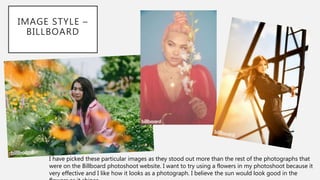
PLANNING
Simran Jabbal
INSPIRATION – CINDY KIMBERLY
When I came across this Instagram page, I quite liked
her style and look. There was these two images that
popped out to me the most. I like the natural look
about her make up. I will be using these as inspiration
for my final product. As my model has darker skin, I feel
like the red lipstick maybe too much depending on her
costume, however, the nude lipstick would look better.
Underneath is how Cindy Kimberly became famous.
INSPIRATION – HAYLEY KASSEL
The eyeliner on this model,
I think is the best as it
really stands out and looks
really good.
INSPIRATION – HAYLEY KASSEL
I found this page from a
Youtube video where they used
the model above with the red
flowers. Hayley Kassel is a
make-up artist from Los
Angeles. I liked the colours she
has used. Most of the models
have a natural look rather than
a bold one which is what I am
looking as the look for my
model.
INSPIRATION – SYDNEY J HARPER
Sydney J Harper is the same model that Hayley Kassel has used as her make up model. I thought I’d have a look at her
Instagram to see her style and I liked it. When I went further down, there was a few images of her modelling for
clothes. Harper is a brilliant inspiration for my work as I can show my model the kind of poses or positions she can
stand in. I have printed out some of these images so I can properly show my model what I want and I have always
written on the back of the paper what I think would look good on her.
IMAGE STYLE –
BILLBOARD
This last image in the flowers is something I
want to do with my model. It would look
good with a bright coloured outfit standing in
flowers.
IMAGE STYLE –
BILLBOARD
I have picked these particular images as they stood out more than the rest of the photographs that
were on the Billboard photoshoot website. I want to try using a flowers in my photoshoot because it
very effective and I like how it looks as a photograph. I believe the sun would look good in the
COLOUR SCHEMES
This time I have used Adobe Colour CC because it means I can use the images I want to get certain colours. Adobe
Colour has picked up on the colours that stand out the most or I have moved the markers if there was the same
colour twice. I think using Adobe Colours has been a lot easier than using Coolors as you don’t get the colours you
want and I don’t really like it because it is time consuming. This is going to help my photoshoot as the images I
have used are from my inspiration as they are modelled photoshoots with similar scenery to what I will be using for
my photoshoot.
FRONT COVER LAYOUT
Masthead
Main Cover Story
Cover Story
Main Image
Masthead
Cover Story
Cover Story
Additional cover line Barcode
Main Image
Issue
Date
Price
Cover Story
Cover Story
Promotional offer
Tagline
Cover Line
Information about music
Simple StructureBusy Structure
FRONT COVER LAYOUT
From my research I have used these structures and
now I am going to be using the simple structure. This
will be my final decision. I want to use the simple
layout as it means the model will be the main focus
and the busy structure will take over the model.
This NME magazine cover was voted most liked from
my survey. I have picked out some of the aspects I
liked from this magazine. I like how the layout is set
on this cover.
For the other covers, I tried to pick similar companies.
The other NME cover has Dua Lipa and is similar to
the Camila Cabello one. In both of them, the artist is
the main focus and both have a plain background
which is effective.
DOUBLE PAGE SPREAD LAYOUT
Main image
Masthead
Cover line
Main article
Imag
e Image
Imag
e
Quotation
I have used the layout
before for a double
page spread and has
proved to be very
effective as I can use
an image of model
and have it as my
main focus. The
quotation will be
from the article.
DOUBLE PAGE SPREAD LAYOUT
Main image
Masthead
Cover line
Main article
Image Quotation
This will be
another idea I
could possibly use
as my double
page spread.
Again, I have used
this layout for
another project
and has looked
good.
Main article
TOUR DATE POSTER LAYOUT
Masthead
Main image
Dates for
the tour
Website &
Social media
I have not created a tour date
poster before but have created
many posters. I will be sticking
with this layout which has proved
to be most popular from my
research. Everything on the poster
will be bold and stand out. I have
come up with two different tour
date posters so then I have an
alternative.
One of the questions on my
survey was ‘Which tour date
poster do you prefer?’ The choices
were between Dua Lipa, Madonna
and Camila Cabello. The most
picked was Dua Lipa. So from this
I have used a similar layout and
then it will appeal to my audience.
Masthead
Main
image
Dates for
the tour
Website &
Social media
LOCATIONS
The first location is Valley Gardens and the Royal Pump
Room Museum. There is a street by the side of the Royal
Pump Room which looks very pretty when it’s lit up on a
night. At the top of Valley Gardens there is the sun
pavilion. I like these locations as they are very pretty and
with the models clothes, it will look stunning. However, I
am a little unsure about using Valley Gardens because of
the weather and the photos won’t look as good as they
would if it was sunny.
LOCATIONS
All Bar One
John Street
Major
Toms
These locations are perfect for if the weather isn’t going our way on the day. I have chosen both All Bar One
and Major Toms because they have a lovely atmosphere and the décor in both are very different. Both also
have a very chilled vibe. A good thing about Major Toms is underneath the social club there is an old vintage
shop with beautiful aspects. If the weather does change and turns sunny then I might be using John Street as a
location. This street has many bars with outside seating and little shops and cafes on the other side. A few shots
in one of the little cafes will look elegant. I have picked these locations as I think they will look good on the
photography portfolio. For the magazine cover, I will be using a studio or somewhere with a blank clean
background.
LOCATIONS
Starling
Hales
Bar
A suggestion I got given was a contrast between the models clothing and the location. This is
why I have picked Hales Bar as it is the oldest bar in town. Otherwise there is Starlings which
has a relaxed feel and a different feel to it then the rest of the cafes and bars. Hales Bar is
probably the bar I’d use more than Starling though because I feel there is more features in
Hales Bar.
FONTS
These are some fonts I have picked from DaFont. For
my font, I wanted something elegant and something
rolled off your tongue. I haven’t chosen the final font
yet because I want to see what they all look like on
the final product. I will be using one of these fonts on
the t-shirt and on the tour date poster.
PRODUCTION SCHEDULE
Week One In this week, I will start looking through the images from the photoshoot to see if any of
them need re-taking. If not, I will start editing them and divide them into sections of where
they are going to go.
Week Two I will start creating the design for the t-shirt and album cover. For this I will be needing to
find the right image that looks good for both.
Week Three I’m going to start the magazine cover, for this I will pick an appropriate image that will suit
the front cover. I will be following the structure I have already made which will make it easier
because I know exactly how I want my work.
Week Four I will be looking at doing my double page spread, the article will be already written so I will
just need to add this in and make sure it looks good. I will be following the structure I have
already made.
Week Five In this week, I will start the tour date poster, again I will be following a structure. This may
take a little longer to make, just in case it doesn’t turn out right.
Week Six Finally, I will do my photography portfolio, I will be using Portfolio Box as I have used this
before and is a good way to present my work.
Week Seven In the final week, I will be checking that everything is done to the best or if there is anything I
COPY - ARTICLE

Planning

  • 1.
  • 2.
    INSPIRATION – CINDYKIMBERLY When I came across this Instagram page, I quite liked her style and look. There was these two images that popped out to me the most. I like the natural look about her make up. I will be using these as inspiration for my final product. As my model has darker skin, I feel like the red lipstick maybe too much depending on her costume, however, the nude lipstick would look better. Underneath is how Cindy Kimberly became famous.
  • 3.
    INSPIRATION – HAYLEYKASSEL The eyeliner on this model, I think is the best as it really stands out and looks really good.
  • 4.
    INSPIRATION – HAYLEYKASSEL I found this page from a Youtube video where they used the model above with the red flowers. Hayley Kassel is a make-up artist from Los Angeles. I liked the colours she has used. Most of the models have a natural look rather than a bold one which is what I am looking as the look for my model.
  • 5.
  • 6.
    INSPIRATION – SYDNEYJ HARPER Sydney J Harper is the same model that Hayley Kassel has used as her make up model. I thought I’d have a look at her Instagram to see her style and I liked it. When I went further down, there was a few images of her modelling for clothes. Harper is a brilliant inspiration for my work as I can show my model the kind of poses or positions she can stand in. I have printed out some of these images so I can properly show my model what I want and I have always written on the back of the paper what I think would look good on her.
  • 7.
    IMAGE STYLE – BILLBOARD Thislast image in the flowers is something I want to do with my model. It would look good with a bright coloured outfit standing in flowers.
  • 8.
    IMAGE STYLE – BILLBOARD Ihave picked these particular images as they stood out more than the rest of the photographs that were on the Billboard photoshoot website. I want to try using a flowers in my photoshoot because it very effective and I like how it looks as a photograph. I believe the sun would look good in the
  • 9.
    COLOUR SCHEMES This timeI have used Adobe Colour CC because it means I can use the images I want to get certain colours. Adobe Colour has picked up on the colours that stand out the most or I have moved the markers if there was the same colour twice. I think using Adobe Colours has been a lot easier than using Coolors as you don’t get the colours you want and I don’t really like it because it is time consuming. This is going to help my photoshoot as the images I have used are from my inspiration as they are modelled photoshoots with similar scenery to what I will be using for my photoshoot.
  • 10.
    FRONT COVER LAYOUT Masthead MainCover Story Cover Story Main Image Masthead Cover Story Cover Story Additional cover line Barcode Main Image Issue Date Price Cover Story Cover Story Promotional offer Tagline Cover Line Information about music Simple StructureBusy Structure
  • 11.
    FRONT COVER LAYOUT Frommy research I have used these structures and now I am going to be using the simple structure. This will be my final decision. I want to use the simple layout as it means the model will be the main focus and the busy structure will take over the model. This NME magazine cover was voted most liked from my survey. I have picked out some of the aspects I liked from this magazine. I like how the layout is set on this cover. For the other covers, I tried to pick similar companies. The other NME cover has Dua Lipa and is similar to the Camila Cabello one. In both of them, the artist is the main focus and both have a plain background which is effective.
  • 12.
    DOUBLE PAGE SPREADLAYOUT Main image Masthead Cover line Main article Imag e Image Imag e Quotation I have used the layout before for a double page spread and has proved to be very effective as I can use an image of model and have it as my main focus. The quotation will be from the article.
  • 13.
    DOUBLE PAGE SPREADLAYOUT Main image Masthead Cover line Main article Image Quotation This will be another idea I could possibly use as my double page spread. Again, I have used this layout for another project and has looked good. Main article
  • 14.
    TOUR DATE POSTERLAYOUT Masthead Main image Dates for the tour Website & Social media I have not created a tour date poster before but have created many posters. I will be sticking with this layout which has proved to be most popular from my research. Everything on the poster will be bold and stand out. I have come up with two different tour date posters so then I have an alternative. One of the questions on my survey was ‘Which tour date poster do you prefer?’ The choices were between Dua Lipa, Madonna and Camila Cabello. The most picked was Dua Lipa. So from this I have used a similar layout and then it will appeal to my audience. Masthead Main image Dates for the tour Website & Social media
  • 15.
    LOCATIONS The first locationis Valley Gardens and the Royal Pump Room Museum. There is a street by the side of the Royal Pump Room which looks very pretty when it’s lit up on a night. At the top of Valley Gardens there is the sun pavilion. I like these locations as they are very pretty and with the models clothes, it will look stunning. However, I am a little unsure about using Valley Gardens because of the weather and the photos won’t look as good as they would if it was sunny.
  • 16.
    LOCATIONS All Bar One JohnStreet Major Toms These locations are perfect for if the weather isn’t going our way on the day. I have chosen both All Bar One and Major Toms because they have a lovely atmosphere and the décor in both are very different. Both also have a very chilled vibe. A good thing about Major Toms is underneath the social club there is an old vintage shop with beautiful aspects. If the weather does change and turns sunny then I might be using John Street as a location. This street has many bars with outside seating and little shops and cafes on the other side. A few shots in one of the little cafes will look elegant. I have picked these locations as I think they will look good on the photography portfolio. For the magazine cover, I will be using a studio or somewhere with a blank clean background.
  • 17.
    LOCATIONS Starling Hales Bar A suggestion Igot given was a contrast between the models clothing and the location. This is why I have picked Hales Bar as it is the oldest bar in town. Otherwise there is Starlings which has a relaxed feel and a different feel to it then the rest of the cafes and bars. Hales Bar is probably the bar I’d use more than Starling though because I feel there is more features in Hales Bar.
  • 18.
    FONTS These are somefonts I have picked from DaFont. For my font, I wanted something elegant and something rolled off your tongue. I haven’t chosen the final font yet because I want to see what they all look like on the final product. I will be using one of these fonts on the t-shirt and on the tour date poster.
  • 19.
    PRODUCTION SCHEDULE Week OneIn this week, I will start looking through the images from the photoshoot to see if any of them need re-taking. If not, I will start editing them and divide them into sections of where they are going to go. Week Two I will start creating the design for the t-shirt and album cover. For this I will be needing to find the right image that looks good for both. Week Three I’m going to start the magazine cover, for this I will pick an appropriate image that will suit the front cover. I will be following the structure I have already made which will make it easier because I know exactly how I want my work. Week Four I will be looking at doing my double page spread, the article will be already written so I will just need to add this in and make sure it looks good. I will be following the structure I have already made. Week Five In this week, I will start the tour date poster, again I will be following a structure. This may take a little longer to make, just in case it doesn’t turn out right. Week Six Finally, I will do my photography portfolio, I will be using Portfolio Box as I have used this before and is a good way to present my work. Week Seven In the final week, I will be checking that everything is done to the best or if there is anything I
  • 20.