The document discusses various principles of graphic design including layers, hierarchy, color, scale, repetition, balance, grids, and typography. It provides examples of how these principles can be applied in information graphics to effectively communicate ideas and guide the eye through a design. Key principles discussed include using hierarchy to assign importance and order, using color and scale to emphasize elements, and employing repetition, balance and grids to unite a composition and allow for comparisons.
4 Key Elements of Great Infographic DesignAndrea Fryrear
The strict definition of an infographic is deceptively simple: “a visual image such as a chart or diagram used to represent information or data,” but when we hear the word we’re not thinking of a neat little pie chart or line graph.
Instead the term has come to represent really long, visually intriguing graphics.
The trouble is that not all infographics are long, and certainly not all of them are visually intriguing. So what takes an image from graphic to infographic, and what elements separate the boring from the brilliant?
This infographic guide will cover the answers to these burning questions.
How to Create an Infographic with these 5 Delicious ElementsKatai Robert
I want to introduce you to the 5 main elements that any creator, even just a content marketer or a designer, should take into account when planning an infographic.
What is Infographics?
There are lot of phrase around the term Information graphics like
"Infographics." "Data visualization." "Information design. & “Communication Design"
We're talking about any graphic that displays and explains information, whether that be data or words. When we use the term "data visualization," we're using it as a general term used to describe data presented in a visual way.
Why Infographics?
Infographics are important because they change the way people find and
experience stories especially now, when more and more infographics are being used to augment editorial content on the web. Infographics create a new way of seeing the world of data, and they help communicate complex ideas in a clear and beautiful way.
This is a very basic introduction to graphic design based on Robin Williams' book, "The Non-Designer's Design Book." It was created for grade 9 art students.
A video version is available here: http://www.youtube.com/watch?v=-eUhJ_jTrMQ
How to design an infographic in 9 simple stepsKatai Robert
I will not tell you exactly how to design an infographic, but I will rather share with you the 9 important points you should be taking into account when it comes to this visual content.
People consume information on the web differently than traditional media. In an era of information overload we’ve become “grazers” of content, skimming digital channels for nuggets of information. More than ever, it’s important for individuals and organizations to be able to present ideas in a manner that can be quickly consumed, understood and remembered.
The Power of Infographics is a presentation that digs into visual thinking, how organizations can learn to present their ideas visually and how infographics can be used to help achieve some common business
objectives.
The presentation will give you a good understanding about the significance, meaning and the types of designing elements and principles. For more visit our website https://www.admecindia.co.in/.
Infographics are a hot topic at the moment. They help to translate data into insights and understanding. This slide deck describes what an infographic is and provides many great examples of info graphics.
24 Awesome Infographic Ideas to Inspire Your Next Beautiful CreationPiktochart
Infographics are awesome, simply because they can capture and hold our attention so well - if done right. The best part is, there are so many great examples out there that we can draw inspiration from. Here are 24 infographic ideas that you can use to create your next beautiful creation.
This slideshow provides an introduction to graphic design. It illustrates the growth of it, especially during the Web 2.0 age. This was presented by Viraj and Veena, our designers at MindTree Limited.
The slideshow uses images and examples from external sources. The respective owners hold the copyright.
Strategic Map Marking Rubric
High Distinction
(80-100)
Distinction
(70-79)
Credit
(60-69)
Pass
(50-59)
Fail
(30-49)
Serious Fail
(0-29)
Correspondence
The ability to recognize
that one set of
connected information
(e.g. a map) has a
relationship to a second
set of connected
information (e.g. an
environment)
There is a strong, clear and direct
relationship between information
contained in the map and information
contained in the group document
including the presentation of the
internal structure (and linkages) of
the information.
There has been a
clear attempt to
organise the map in
such a way that the
relationship between
the information in
the map and the
information
contained in the
group document is
logical.
Information contained in the map
is also found in the group
document. Some attempt has
been made to develop a
relationship between the two
pieces.
Information contained in
the map is also found in
the group document.
There is information
in the map that is not
in the group
document.
There is no discernible
relationship between
information contained in
the map and information
contained in the group
document.
Visual Hierarchy
A clear indication of what
is important on the map.
This might be achieved
through the use of
colour, size, shapes etc.
A well developed and integrated
visual hierarchy exists that has been
used creatively to enhance the ability
of the map to communicate its
message. Work at this level is highly
sophisticated.
A well-developed
hierarchy exists and
has been applied
appropriately to help
communicate
relative levels of
importance of pieces
of information on the
map.
A developed visual hierarchy
exists. Here the method adopted
to articulate the visual hierarchy
(e.g. such things as size, colour
or shapes) have been used in a
manner that demonstrates the
map-makers understand and can
differentiate between relative
levels of importance if the pieces
of information.
A basic visual hierarchy
exists. Simple use of
size or colour or shapes
provide for a
straightforward or
unsophisticated map.
An attempt has been
made to design a
visual hierarchy,
however it is
incoherent and/or
inconsistent.
There is no discernible
visual hierarchy of the
pieces of information in
the map.
Narrative
A presented account of
connected events. A
story.
A sophisticated narrative exists that
includes all of the relevant points, is
original and utilises creativity to
highlight important insights.
A well-developed
hierarchy exists and
has been applied
appropriately to help
communicate
relative levels of
importance of pieces
of information on the
map.
A developed narrative exists. All
the main parts of the narrative
are present and some logic for
their inclusion is included.
A basic narrative can be
determined by the map
reader. Some aspects of
the narrative may be
missing or un.
These are the slides form my talk on the Value Deign Provides to Business Across the Innovation Cultural Divide. I gave this at the business school at the University of Gothenburg.
Data Visualizations That Expand Your Visual LiteracyUXPA Boston
Many data displays are compromised representations that may limit our ability to understand the full story or lead us to shortsighted conclusions. Between multiple screen displays, tables of data, and basic charts that only show a limited perspective of the data, we are often left with subpar tools to combine and analyze data. Collectively, we know we need to improve our data experiences, as well as our ability to see the main issues, discover the hidden details, make connections, and compare the top ideas. Increasing amounts of data only heighten the need to do more with the data we have and ensure our decisions are well considered. As a result, we also need better methods to navigate data and extract multiple questions from datasets so that our follow up queries are only a click away.
Julie Rodriguez draws upon examples from her book Visualizing Financial Data to show you how to turn your raw data into meaningful information. Along the way, Julie shares new visual design methods that provide a greater perspective of the data through embedded context, adjustments to commonly used charts, and new chart types that are easier to read and comprehend.
Talk given Oct 2018 for Albuquerque, NM's "Girl Develop It" group.
What is UX?: Explanation of the different aspects
of UX
Risks: What happens if we skip any of
these aspects of UX?
Fail Boat: What doing it wrong
looks like and how we can do it right
No Screen First: An Evolving Approach For An Exclusive AudienceThomas O'Keefe
What is a “visualization” for someone who can’t see? How do you take something inherently visual—a rich, highly interactive data visualization—and make it usable for people across the spectrum of visual impairment, from color deficiency to blindness? How can we evolve our design and development approach to create solutions that work for everyone?
Senior Designer, Nguyet Vuong and Web Developer, Tommy O’Keefe from Atlantic Media Strategies team up to discuss what it means to design and develop for an inclusive audience in an agency setting and how no-screen-first is their evolving approach to integrating accessibility into their workflow. They’ll explore strategies and discuss learnings for creating accessible experiences that are inclusive and future-friendly.
Wireframing Workshop - TiE Women Create-a-ThonKristine Howard
A talk given at the TiE Sydney Create-a-Thon on July 18, 2015 on what wireframing is, the benefits, what fidelity means, and tools and techniques to get started.
DevOps and Testing slides at DASA ConnectKari Kakkonen
My and Rik Marselis slides at 30.5.2024 DASA Connect conference. We discuss about what is testing, then what is agile testing and finally what is Testing in DevOps. Finally we had lovely workshop with the participants trying to find out different ways to think about quality and testing in different parts of the DevOps infinity loop.
Generative AI Deep Dive: Advancing from Proof of Concept to ProductionAggregage
Join Maher Hanafi, VP of Engineering at Betterworks, in this new session where he'll share a practical framework to transform Gen AI prototypes into impactful products! He'll delve into the complexities of data collection and management, model selection and optimization, and ensuring security, scalability, and responsible use.
The Art of the Pitch: WordPress Relationships and SalesLaura Byrne
Clients don’t know what they don’t know. What web solutions are right for them? How does WordPress come into the picture? How do you make sure you understand scope and timeline? What do you do if sometime changes?
All these questions and more will be explored as we talk about matching clients’ needs with what your agency offers without pulling teeth or pulling your hair out. Practical tips, and strategies for successful relationship building that leads to closing the deal.
Accelerate your Kubernetes clusters with Varnish CachingThijs Feryn
A presentation about the usage and availability of Varnish on Kubernetes. This talk explores the capabilities of Varnish caching and shows how to use the Varnish Helm chart to deploy it to Kubernetes.
This presentation was delivered at K8SUG Singapore. See https://feryn.eu/presentations/accelerate-your-kubernetes-clusters-with-varnish-caching-k8sug-singapore-28-2024 for more details.
zkStudyClub - Reef: Fast Succinct Non-Interactive Zero-Knowledge Regex ProofsAlex Pruden
This paper presents Reef, a system for generating publicly verifiable succinct non-interactive zero-knowledge proofs that a committed document matches or does not match a regular expression. We describe applications such as proving the strength of passwords, the provenance of email despite redactions, the validity of oblivious DNS queries, and the existence of mutations in DNA. Reef supports the Perl Compatible Regular Expression syntax, including wildcards, alternation, ranges, capture groups, Kleene star, negations, and lookarounds. Reef introduces a new type of automata, Skipping Alternating Finite Automata (SAFA), that skips irrelevant parts of a document when producing proofs without undermining soundness, and instantiates SAFA with a lookup argument. Our experimental evaluation confirms that Reef can generate proofs for documents with 32M characters; the proofs are small and cheap to verify (under a second).
Paper: https://eprint.iacr.org/2023/1886
Alt. GDG Cloud Southlake #33: Boule & Rebala: Effective AppSec in SDLC using ...James Anderson
Effective Application Security in Software Delivery lifecycle using Deployment Firewall and DBOM
The modern software delivery process (or the CI/CD process) includes many tools, distributed teams, open-source code, and cloud platforms. Constant focus on speed to release software to market, along with the traditional slow and manual security checks has caused gaps in continuous security as an important piece in the software supply chain. Today organizations feel more susceptible to external and internal cyber threats due to the vast attack surface in their applications supply chain and the lack of end-to-end governance and risk management.
The software team must secure its software delivery process to avoid vulnerability and security breaches. This needs to be achieved with existing tool chains and without extensive rework of the delivery processes. This talk will present strategies and techniques for providing visibility into the true risk of the existing vulnerabilities, preventing the introduction of security issues in the software, resolving vulnerabilities in production environments quickly, and capturing the deployment bill of materials (DBOM).
Speakers:
Bob Boule
Robert Boule is a technology enthusiast with PASSION for technology and making things work along with a knack for helping others understand how things work. He comes with around 20 years of solution engineering experience in application security, software continuous delivery, and SaaS platforms. He is known for his dynamic presentations in CI/CD and application security integrated in software delivery lifecycle.
Gopinath Rebala
Gopinath Rebala is the CTO of OpsMx, where he has overall responsibility for the machine learning and data processing architectures for Secure Software Delivery. Gopi also has a strong connection with our customers, leading design and architecture for strategic implementations. Gopi is a frequent speaker and well-known leader in continuous delivery and integrating security into software delivery.
Dev Dives: Train smarter, not harder – active learning and UiPath LLMs for do...UiPathCommunity
💥 Speed, accuracy, and scaling – discover the superpowers of GenAI in action with UiPath Document Understanding and Communications Mining™:
See how to accelerate model training and optimize model performance with active learning
Learn about the latest enhancements to out-of-the-box document processing – with little to no training required
Get an exclusive demo of the new family of UiPath LLMs – GenAI models specialized for processing different types of documents and messages
This is a hands-on session specifically designed for automation developers and AI enthusiasts seeking to enhance their knowledge in leveraging the latest intelligent document processing capabilities offered by UiPath.
Speakers:
👨🏫 Andras Palfi, Senior Product Manager, UiPath
👩🏫 Lenka Dulovicova, Product Program Manager, UiPath
The Metaverse and AI: how can decision-makers harness the Metaverse for their...Jen Stirrup
The Metaverse is popularized in science fiction, and now it is becoming closer to being a part of our daily lives through the use of social media and shopping companies. How can businesses survive in a world where Artificial Intelligence is becoming the present as well as the future of technology, and how does the Metaverse fit into business strategy when futurist ideas are developing into reality at accelerated rates? How do we do this when our data isn't up to scratch? How can we move towards success with our data so we are set up for the Metaverse when it arrives?
How can you help your company evolve, adapt, and succeed using Artificial Intelligence and the Metaverse to stay ahead of the competition? What are the potential issues, complications, and benefits that these technologies could bring to us and our organizations? In this session, Jen Stirrup will explain how to start thinking about these technologies as an organisation.
A tale of scale & speed: How the US Navy is enabling software delivery from l...sonjaschweigert1
Rapid and secure feature delivery is a goal across every application team and every branch of the DoD. The Navy’s DevSecOps platform, Party Barge, has achieved:
- Reduction in onboarding time from 5 weeks to 1 day
- Improved developer experience and productivity through actionable findings and reduction of false positives
- Maintenance of superior security standards and inherent policy enforcement with Authorization to Operate (ATO)
Development teams can ship efficiently and ensure applications are cyber ready for Navy Authorizing Officials (AOs). In this webinar, Sigma Defense and Anchore will give attendees a look behind the scenes and demo secure pipeline automation and security artifacts that speed up application ATO and time to production.
We will cover:
- How to remove silos in DevSecOps
- How to build efficient development pipeline roles and component templates
- How to deliver security artifacts that matter for ATO’s (SBOMs, vulnerability reports, and policy evidence)
- How to streamline operations with automated policy checks on container images
Transcript: Selling digital books in 2024: Insights from industry leaders - T...BookNet Canada
The publishing industry has been selling digital audiobooks and ebooks for over a decade and has found its groove. What’s changed? What has stayed the same? Where do we go from here? Join a group of leading sales peers from across the industry for a conversation about the lessons learned since the popularization of digital books, best practices, digital book supply chain management, and more.
Link to video recording: https://bnctechforum.ca/sessions/selling-digital-books-in-2024-insights-from-industry-leaders/
Presented by BookNet Canada on May 28, 2024, with support from the Department of Canadian Heritage.
Encryption in Microsoft 365 - ExpertsLive Netherlands 2024Albert Hoitingh
In this session I delve into the encryption technology used in Microsoft 365 and Microsoft Purview. Including the concepts of Customer Key and Double Key Encryption.
Observability Concepts EVERY Developer Should Know -- DeveloperWeek Europe.pdfPaige Cruz
Monitoring and observability aren’t traditionally found in software curriculums and many of us cobble this knowledge together from whatever vendor or ecosystem we were first introduced to and whatever is a part of your current company’s observability stack.
While the dev and ops silo continues to crumble….many organizations still relegate monitoring & observability as the purview of ops, infra and SRE teams. This is a mistake - achieving a highly observable system requires collaboration up and down the stack.
I, a former op, would like to extend an invitation to all application developers to join the observability party will share these foundational concepts to build on:
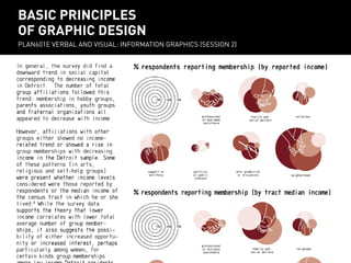
1. differences between responses both quantatitively and qualitatively.
BASIC PRINCIPLES OF
basic principles
GRAPHIC DESIGN
of graphic design
PLAN601E VERBAL AND VISUAL: INFORMATION GRAPHICS (SESSION 2)
PLAN601E Verbal and visual: Information Graphics (session 2)
2. LAYERS help you think about what information want
LAYERS help you think about what information youyou want
to communicate and what graphic elements you need.
ACTIVITY ICONS, WATER CONNECTIONS, GREEN CONNECTIONS, TRANSIT STATIONS, TREES, BUILDINGS, PAVEMENT EDGES, WATER WATER
ACTIVITY ICONS, WATER CONNECTIONS, GREEN CONNECTIONS, TRANSIT STATIONS, TREES, BUILDINGS, PAVEMENT EDGES,
EAST RIVER ESPLANADE PLAN
East River Esplanade Plan
NYC ECONOMIC DEVELOPMENT CORPORATION / SHOP ARCHITECTS
3. HIERARCHY provides route for the eye to follow and
HIERARCHY provides aa route for the eye to follow and
assigns order of importance to each graphic element.
assigns an an order of importance to each graphic element.
JOURNALISTS USE THE MODEL OF AN “INVERTED PYRAMID” TO ORGANIZE INFORMATION IN NEWS STORIES.
THE INVERTED PYRAMID
the inverted pyramid
4. HIERARCHY provides a route for the eye to follow and
assigns an order of importance to each graphic element.
COLOR HUE
LINE WEIGHT
FONT SIZE
Very Important
Important
Less Important
Least Important
THERE ARE MANY GRAPHIC ELEMENTS THAT CREATE VISUAL HIERARCHY.
VISUAL HIERARCHY
5. HIERARCHY provides a route for the eye to follow and
HIERARCHY provides a route foreach eye to follow and
assigns an order of importance to the graphic element.
assigns an order of importance to each graphic element.
Where does your eye go first? GO FIRST?
WHERE DOES YOUR EYE
Where does it go from there? THERE?
WHERE DOES IT GO FROM
What do you noticeNOTICE LAST?
WHAT DO YOU last?
What graphic elements create visual
WHAT GRAPHIC ELEMENTS CREATE
hierarchy?
VISUAL HIERARCHY?
Does the hierarchy communicate a clear
DOES THE HIERARCHY COMMUNITY
idea?
A CLEAR IDEA?
FUTURE OF GREENWICH STREET SOUTH, DOWNTOWN ALLIANCE / ARO
Future of Greenwich Street South, Downtown Alliance / ARO
6. COLOR helps to create hierarchy by emphasizing graphic
elements and associating elements emphasizing graphic
COLOR helps to create hierarchy by with information.
elements and associating elements with information.
EQUIDISTANT COLORS
EQUIDISTANT COLORS
ADJACENT COLORS
ADJACENT COLORS
COMPLEMENTARY COLORS
MONOCHROMATIC COLORS
THERE ARE DIFFERENT APPROACHES TO SELECTING A COLOR PALETTE.
THE COLOR WHEEL
THE COLOR WHEEL
7. COLOR helps create hierarchy by emphasizing graphic
COLOR helps toto createhierarchyby emphasizing graphic
elements and associating elements with information.
elements and associating elementswith information.
MONOCHROMATIC BACKGROUND WITH HIGHLIGHT COLOR COLOR EMPHASIZING A SINGLE
MONOCHROMATIC BACKGROUND WITH HIGHLIGHT EMPHASIZING A SINGLE ELEMENT. ELEMENT.
“MILLION DOLLAR BLOCKS”, SPATIAL INFORMATION DESIGN LAB
“Million Dollar Blocks”, Spatial Information Design Lab
8. COLOR helps toto createhierarchyby emphasizing graphic
COLOR helps create hierarchy by emphasizing graphic
elements and associating elementswith information.
elements and associating elements with information.
EQUIDISTANT COLORS LEAD YOUR EYE LEFT TO RIGHT. RIGHT.
EQUIDISTANT COLORS LEAD YOUR EYE FROM FROM LEFT TO
PLANYC 2030, MAYOR’S OFFICE OF LONG-TERM SUSTAINABILITY / TWO TWELVE
PlaNYC 2030, Mayor’s Office of Long-term Sustainability / Two Twelve
9. COLOR helps toto createhierarchy by emphasizing graphic
COLOR helps create hierarchy by emphasizing graphic
elements and associating elementswith information.
elements and associating elements with information.
COMPLEMENTARY COLORS EMPHASIZE A DIFFERENCE BETWEEN TWO ELEMENTS.
NYUPlans 2031, NYU Office of Strategic Assessment,
NYU PLANS 2031, NYU OFFICE OF STRATEGIC ASSESSMENT,
PLANNING, AND DEVELOPMENT / 2 X 4
10. COLOR helps create hierarchy by emphasizing graphic
COLOR helps to to create hierarchy by emphasizing graphic
elements and associating elements with information.
elements and associating elementswith information.
COMPLEMENTARY COLORS MAKE SOME ELEMENTS “POP” MORE MORE THAN
COMPLEMENTARY COLORS MAKE SOME ELEMENTS “POP”THAN OTHERS. OTHERS.
PLANYC2030, Mayor’s Office of Long-term Sustainability / Two Twelve TWELVE
PlaNYC 2030, MAYOR’S OFFICE OF LONG-TERM SUSTAINABILITY / TWO
11. PANTONE helps choose a palette of colors that work together
PANTONE helps toto choose a palette of colors that work together
and makes printing more predictable.
CHOOSE COLORS FROM PANTONE SOLID SOLID UNCOATED – AVOID RANDOMLY SELECTING THE COLOR PICKER. COLOR PICKER.
CHOOSE COLORS FROM PANTONE UNCOATED – AVOID RANDOMLY SELECTING COLORS WITH COLORS WITH THE
COLOR PICKING
COLOR PICKING
12. SCALE helps to create hierarchy using size
SCALE helps to create hierarchy using size
to distinguish one element from its surroundings.
SCALE
SCALE
13. SCALE helps to create hierarchy using size
SCALE helps to create hierarchy using size
to distinguish one element from its surroundings.
SCALE CAN LEAD YOUR ACROSS THE IMAGE AND HELP TO MAKE COMPARISONS.
SCALE CAN LEAD YOUR EYEEYE ACROSS THE IMAGE AND HELP TO MAKE COMPARISONS.
“MAPPINGIstanbul,” Project Projects
“Mapping ISTANBUL,” PROJECT PROJECTS
14. SCALE helps create hierarchy using size
SCALE helps toto create hierarchy using size
to distinguish one element from its surroundings.
SCALING FONTS DRAWS ATTENTION TO THE MOST IMPORTANT NUMBER.
NYU PLANS NYU Office of Strategic Assessment,
NYU Plans 2031,2031, NYU OFFICE OF STRATEGIC ASSESSMENT,
PLANNING, AND DEVELOPMENT
Planning, and Development / 2 x 4 / 2 X 4
15. REPETITION holds together the composition of of
REPETITION holds together the composition
a graphic and can help to communicate a narrative.
HOLDING BACKGROUND ELEMENTS CONSTANT IS A GOOD WAY TO SHOW CHANGE OVER TIME.
EAST RIVER ESPLANADE PLAN
East River Esplanade Plan
NYC ECONOMIC DEVELOPMENT CORPORATION / SHOP ARCHITECTS
NYC Economic Development Corporation / SHoP Architects
16. REPETITION holds together the composition
REPETITION holds togetherthe composition of of
a graphic and can help to communicate a narrative.
REPETITION CAN BE USED TO MAKE COMPARISONS – EDWARDEDWARD TUFTE CALLS THESE “SMALL MULTIPLES”.
REPETITION CAN BE USED TO MAKE COMPARISONS – TUFTE CALLS THESE “SMALL MULTIPLES”.
“PUBLIC HOUSING: A NEW CONVERSATION”,
“Public Housing: A New Conversation”,
BUELL CENTER FOR THE STUDY OF THE AMERICAN LANDSCAPE,
Buell Center for the Study of the American Landscape, MTWTF MTWTF
17. REPETITION holds together the composition
REPETITION holds together the composition of of
a graphic and can help to communicate a narrative.
IT DOESN’T HAVE TO TAKE MUCH REPETITION TO COMMUNICATE A COMPELLING IDEA...
IT DOESN’THAVE TO TAKE MUCH REPETITION TO COMMUNICATE A COMPELLING IDEA.
SPONGE Park, Dland Studio
Sponge PARK, DLAND STUDIO
18. BALANCE happens when there is hierarchy, but one
BALANCE happens when thereis aahierarchy, but no no one
graphic element has more “visual weight” than another.
IN A CAT’S CRADLE, EACH LINE SEGMENT IS HELD HELD IN TENSION WITH THE REST...
A CAT’S CRADLE, EACH LINE SEGMENT IS IN TENSION WITH THE REST...
19. GRIDS are important for laying-out boards or
arranging elements in a supergraphic.
The rule of thirds says that the eye
likes to see images and layouts
broken into a grid 3 x 3 grid and its
natural focal point is off-center.
layout and grids
20. GRIDS are important for laying out boards or
arranging elements in a supergraphic.
2
1
1) PAGE MARGINS
2) VERTICAL COLUMNS
3) HORIZONTAL ROWS
4) SPACE BETWEEN TYPE
OR IMAGES (GUTTER)
3
4
layout and grids
21. GRIDS are important for laying-out boards
GRIDS are important for laying-out boards or or
arranging elements in a supergraphic.
2
1) PAGE MARGINS
PAGE MARGINS
1
2) VERTICAL COLUMNS
2) VERTICAL COLUMNS
3) HORIZONTAL ROWS
3) HORIZONTAL ROWS
4) SPACE BETWEEN TYPE
OR IMAGES (GUTTER)
OR IMAGES (GUTTER)
3
4
“VENDOR POWER”, CENTER FOR URBAN PEDAGOGY
“Vendor Power”, Center for Urban Pedagogy
22. GRIDS are important for laying-out boards
GRIDS are important for laying-out boards or or
arranging elements a supergraphic.
arranging elements in a supergraphic.
2
1) PAGE MARGINS
PAGE MARGINS
1
2) VERTICAL COLUMNS
2) VERTICAL COLUMNS
3) HORIZONTAL ROWS
3) HORIZONTAL ROWS
4) SPACE BETWEEN TYPE
4)SPACE BETWEEN TYPE
OR IMAGES (GUTTER)
OR IMAGES (GUTTER)
3
4
4
“VENDOR POWER”, CENTER FOR URBAN PEDAGOGY
“Vendor Power”, Center for Urban Pedagogy
23. TYPOGRAPHY is important for establishing hierarchy
and making presentations legible.
SERIF FONTS
SANS-SERIF FONTS
Clarendon
Helvetica
Century Schoolbook
News Gothic
Rockwell
Futura
typography
24. TYPOGRAPHY is important for establishing hierarchy
and making presentations legible.
HEADER AND TEXT
HELVETICA NEUE
Century Schoolbook luptat ra
qui numquo eari dolore etur
sandae nonsequo mint. Genit
ipsam fugitectem doluptam
es si id ut velicim aciur,
simusandis enet audae dessinc
tatiuntotat moluptur, solupis
LABELS
HELVETICA NEUE
Helvetica Neue
Helvetica Neue
HELVETICA NEW
CHOOSE ONE SERIF FONT FOR RUNNING TEXT AND ONE SANS-SERIF FONT FOR HEADERS AND LABELS;
A VARIETY OF SIZES, DISPLAY TYPES, AND TINTS ADDS VISUAL INTEREST TO THE PRESENTATION.
typography