Download to read offline
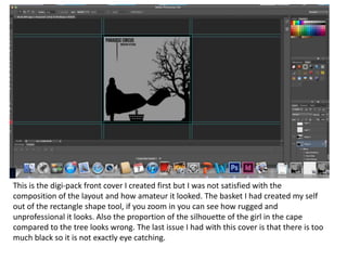
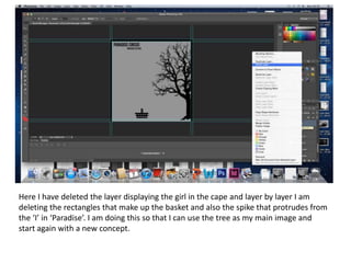
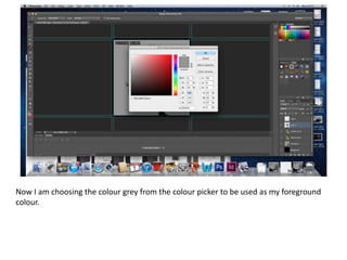
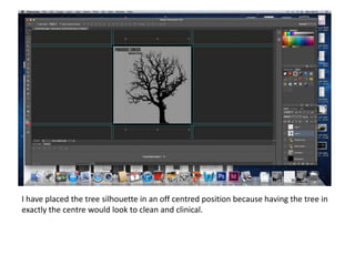
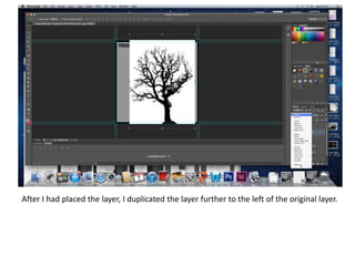
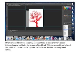
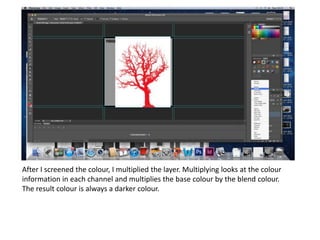
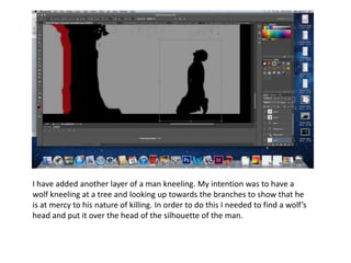
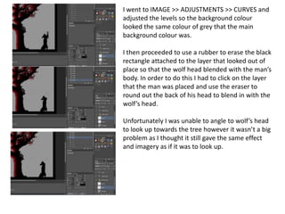
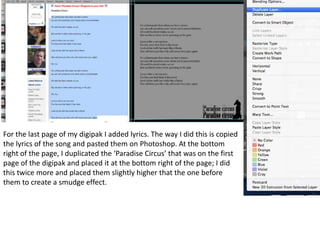

The artist created an initial cover design for a digipak that they were not satisfied with because the layout looked amateurish. They then proceeded to delete elements layer by layer to start over with a new concept focusing on the tree silhouette as the main image. The tree was placed off-center and duplicated to the left, with one layer screened red to create depth. Additional layers were added, including a man kneeling that was edited to look like a wolf at the tree. Lyrics from the song were also added to complete the last page.


