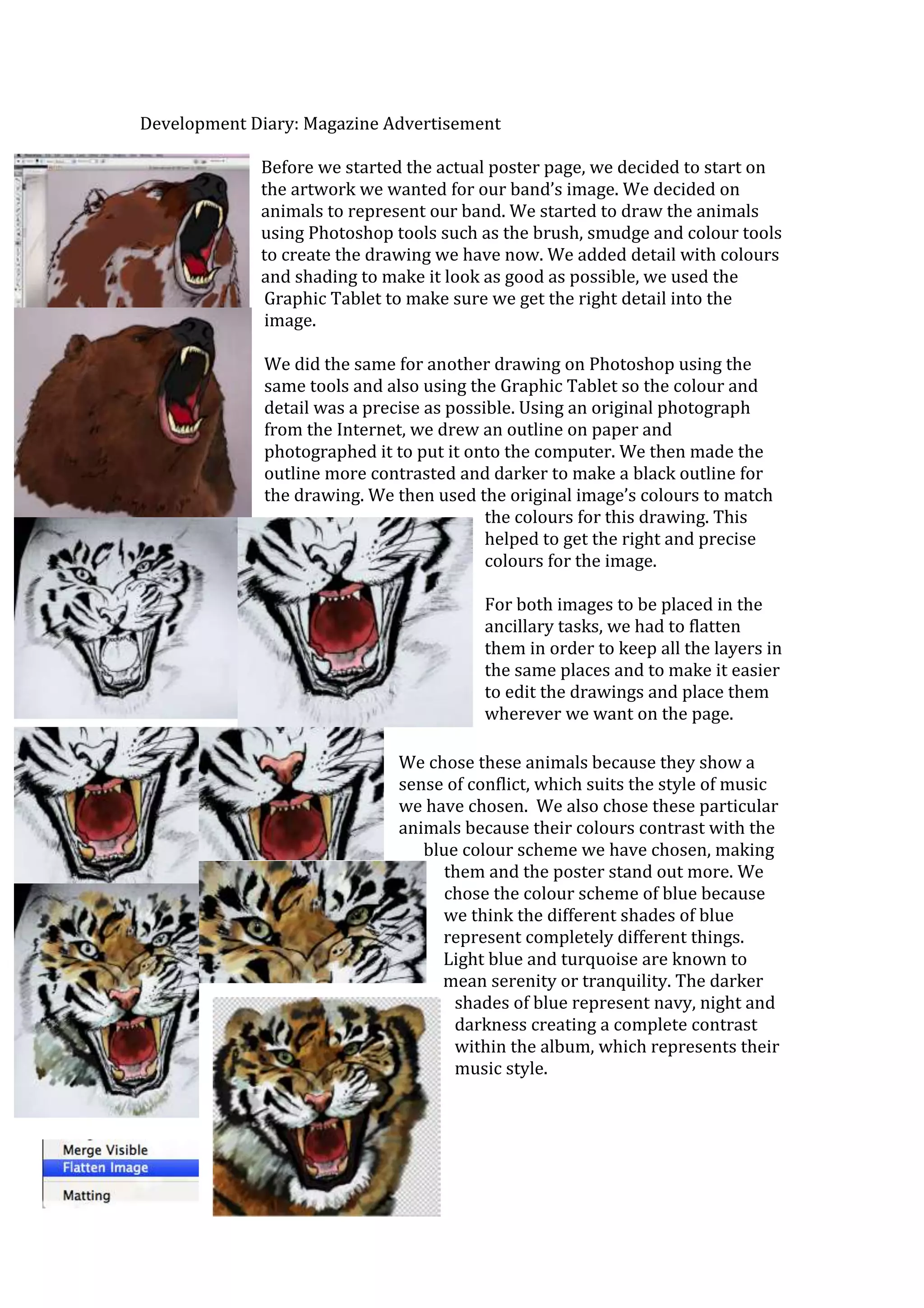
The document describes the process of creating artwork and a poster for a band's magazine advertisement. Key details include:
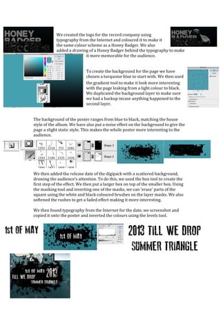
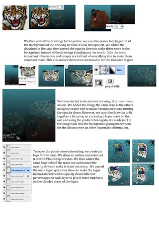
1) The band chose animals like honey badgers and owls to represent their style of conflicting music, drawing them in Photoshop with tools like brushes and adjusting colors and layers.
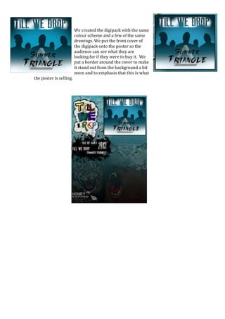
2) Typography, logos, release dates and other elements were added to the poster design using techniques like layering, opacity adjustments, and effects to draw attention while maintaining a blue-to-black color scheme matching the album's style.
3) Additional drawings and the album cover were incorporated into the poster's layout to clearly promote the product and appeal to audiences through memorable visuals and organization