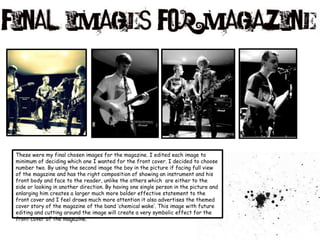
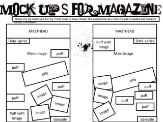
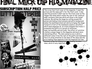
The document discusses the design process for the front cover of a magazine. It describes choosing a black, white and grey color scheme to create contrast. Bold fonts and a "paint splatter" masthead were selected to draw attention. Various puffs and images were tested before choosing a photo of a musician facing the camera to portray the cover story. The final design includes this large central image, puffs arranged horizontally and vertically, and date/price information set apart in white.


![Audience research[1]](https://cdn.slidesharecdn.com/ss_thumbnails/audienceresearch1-110303081456-phpapp01-thumbnail.jpg?width=640&height=640&fit=bounds)
![Audience research[1]](https://cdn.slidesharecdn.com/ss_thumbnails/audienceresearch1-110303081700-phpapp02-thumbnail.jpg?width=640&height=640&fit=bounds)
![Planning[1]2](https://cdn.slidesharecdn.com/ss_thumbnails/planning12-110303080955-phpapp02-thumbnail.jpg?width=640&height=640&fit=bounds)


