OBSERVING THE SHOPS AROUND US
by Sue Sheikh
VS.


Battle of the Hypermarkets.
REAL’s entrance: bright, colourful, organised
TESCO’s entrance: messy, haphazard, looks like they couldn’t care
less.
Everything in REAL gave the impression that it was very orderly -
overhead lamps were in long straight lines, aisles were straight unlike in
TESCO’s where islands of products were literally everywhere, as if they
had suddenly received the shipment of products and didn’t really know
where to put it, so they just dumped it where they could find floor
space.
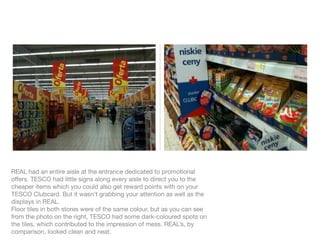
REAL had an entire aisle at the entrance dedicated to promotional
offers. TESCO had little signs along every aisle to direct you to the
cheaper items which you could also get reward points with on your
TESCO Clubcard. But it wasn’t grabbing your attention as well as the
displays in REAL.
Floor tiles in both stores were of the same colour, but as you can see
from the photo on the right, TESCO had some dark-coloured spots on
the tiles, which contributed to the impression of mess. REAL’s, by
comparison, looked clean and neat.
VS.


Fashion Retail.
ZARA: lounge/chillout music was playing quite loudly; the scent of one
of their fragrances greeted you as you entered the store. The first thing
that strikes you is how everything is very classy - beige interiors from
floor to ceiling, and every detail, including the ceiling, is well arranged
and taken care of.
The display arrangements reminded me of the Fengshui principle to
allow traffic/air to circulate around objects - customers were literally
moving around in circles as they flitted from display to display.
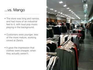
...vs. Mango

• The store was long and narrow,
  and had more of an industrial
  feel to it, with loud pop music
  playing in the background.


• Customers were younger, less
  of the more mature, working
  crowd at Zara’s.


• It gave the impression that
  clothes were cheaper, when
  they actually weren’t.
VS.
DUKA: a store selling kitchen appliances at upmarket prices
Interiors: bright, colourful
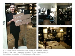
ALMI Decor: Elegant home furnishings, mainly sourced from the East.
Interiors: dark, cosy, a showcase of elegant rooms. I liked the sign at
the entrance announcing a 20% discount on all products.
INSIGHTS & OBSERVATIONS

• Places that were more elegant or        • Fragrances played a clear role in
  classy paid attention to all details      encouraging me to stay longer in
  from top to bottom. I was surprised       the store - gave me a light and
  to note the differences in ceilings -     happy feeling as I walked into the
  I’m sure I had noticed it before, but     store
  I hadn’t paid that much attention to
  it as much.
                                          • More upmarket furnishing stores
                                            had fewer paying customers (about
• Some principles, such as the ones         10% or even less) compared to
  commonly associated with                  clothing stores which had at least
  Fengshui arrangements do have             50% of walk-in customers buying
  value when it comes to retail -           at least 1 item. I think the fact that
  circular movements encourage you          you are encouraged to touch the
  to walk more, see more and even           merchandise more in the clothing
  touch more of what’s on display.          store had something to do with it.
INSIGHTS & OBSERVATIONS ...continued

• The salespeople in the store were      • Well-organized display
  only needed when customers were          arrangements encouraged me to
  looking for assistance in finding the     stay longer in the store - they made
  right size or a particular item. In      me feel good in the store so I felt
  general, there were very few             less like leaving.
  salespeople in each store
  compared to the crowd coming in.
                                         • Entrances that were not cluttered
  Most of them weren’t around to
                                           with displays, that actually had
  greet customers as they entered.
                                           some room, also made me feel
                                           good about walking in - I could take
• Security guards, if any, seemed to       in the space of the store as I walked
  serve this function of greeting and      in and that, in turn, made me feel
  bidding farewell to customers            like I was welcomed.
  because they are placed right at the
  entrance of the stores.
POSSIBLE OPPORTUNITIES

• Fengshui as an fundamental               • In retail sales, the customers should
  element of interior design for retail      always be encouraged to touch the
  outlets - facilitates traffic flow which     merchandise. The higher the rate of
  in turn increases browsing time,           touch, the higher is the likelihood of
  increases the tendency to touch the        a purchase. In elegant furnishing
  display and ultimately, leading to a       stores, this could translate to
  purchase.                                  having several items in each rooms
                                             designated to be touched by
                                             customers, with visible signs to
                                             encourage it.
The end.
Thank you for your time :)

Observing

  • 1.
    OBSERVING THE SHOPSAROUND US by Sue Sheikh
  • 2.
    VS. Battle of theHypermarkets.
  • 3.
    REAL’s entrance: bright,colourful, organised TESCO’s entrance: messy, haphazard, looks like they couldn’t care less. Everything in REAL gave the impression that it was very orderly - overhead lamps were in long straight lines, aisles were straight unlike in TESCO’s where islands of products were literally everywhere, as if they had suddenly received the shipment of products and didn’t really know where to put it, so they just dumped it where they could find floor space.
  • 4.
    REAL had anentire aisle at the entrance dedicated to promotional offers. TESCO had little signs along every aisle to direct you to the cheaper items which you could also get reward points with on your TESCO Clubcard. But it wasn’t grabbing your attention as well as the displays in REAL. Floor tiles in both stores were of the same colour, but as you can see from the photo on the right, TESCO had some dark-coloured spots on the tiles, which contributed to the impression of mess. REAL’s, by comparison, looked clean and neat.
  • 5.
  • 6.
    ZARA: lounge/chillout musicwas playing quite loudly; the scent of one of their fragrances greeted you as you entered the store. The first thing that strikes you is how everything is very classy - beige interiors from floor to ceiling, and every detail, including the ceiling, is well arranged and taken care of. The display arrangements reminded me of the Fengshui principle to allow traffic/air to circulate around objects - customers were literally moving around in circles as they flitted from display to display.
  • 7.
    ...vs. Mango • Thestore was long and narrow, and had more of an industrial feel to it, with loud pop music playing in the background. • Customers were younger, less of the more mature, working crowd at Zara’s. • It gave the impression that clothes were cheaper, when they actually weren’t.
  • 8.
  • 9.
    DUKA: a storeselling kitchen appliances at upmarket prices Interiors: bright, colourful
  • 10.
    ALMI Decor: Eleganthome furnishings, mainly sourced from the East. Interiors: dark, cosy, a showcase of elegant rooms. I liked the sign at the entrance announcing a 20% discount on all products.
  • 11.
    INSIGHTS & OBSERVATIONS •Places that were more elegant or • Fragrances played a clear role in classy paid attention to all details encouraging me to stay longer in from top to bottom. I was surprised the store - gave me a light and to note the differences in ceilings - happy feeling as I walked into the I’m sure I had noticed it before, but store I hadn’t paid that much attention to it as much. • More upmarket furnishing stores had fewer paying customers (about • Some principles, such as the ones 10% or even less) compared to commonly associated with clothing stores which had at least Fengshui arrangements do have 50% of walk-in customers buying value when it comes to retail - at least 1 item. I think the fact that circular movements encourage you you are encouraged to touch the to walk more, see more and even merchandise more in the clothing touch more of what’s on display. store had something to do with it.
  • 12.
    INSIGHTS & OBSERVATIONS...continued • The salespeople in the store were • Well-organized display only needed when customers were arrangements encouraged me to looking for assistance in finding the stay longer in the store - they made right size or a particular item. In me feel good in the store so I felt general, there were very few less like leaving. salespeople in each store compared to the crowd coming in. • Entrances that were not cluttered Most of them weren’t around to with displays, that actually had greet customers as they entered. some room, also made me feel good about walking in - I could take • Security guards, if any, seemed to in the space of the store as I walked serve this function of greeting and in and that, in turn, made me feel bidding farewell to customers like I was welcomed. because they are placed right at the entrance of the stores.
  • 13.
    POSSIBLE OPPORTUNITIES • Fengshuias an fundamental • In retail sales, the customers should element of interior design for retail always be encouraged to touch the outlets - facilitates traffic flow which merchandise. The higher the rate of in turn increases browsing time, touch, the higher is the likelihood of increases the tendency to touch the a purchase. In elegant furnishing display and ultimately, leading to a stores, this could translate to purchase. having several items in each rooms designated to be touched by customers, with visible signs to encourage it.
  • 14.
    The end. Thank youfor your time :)

Editor's Notes