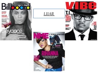
3. Conventions of a magazine:
Masthead:
The Masthead is typically at the top of the magazine at the front page, which identifies the newspaper
or magazine. On this example of the magazine, this is shown through using bigger font and adding
colours into the text. This is shown on the title “Billboard”. This is on all billboard magazine so this
will catch the readers attention as it is typically known through the use of the colours, red, yellow and
blue. This is centred in the usual place of the centre.
Cover Lines:
The Cover lines show the most enticing features that are going to be inside the magazine. This is used
to grab readers attention so they can see what is potentially going to be inside the magazine. In this
example of the magazine, The cover lines are used to show that inside the magazine is going to be
Beyoncé which states “I want to be an icon”. This may appeal to readers as they may want to know
more about Beyoncé which may incise someone to potentially buy the magazine.
Headline:
Headline is typically the biggest font and will relates to the main story inside the magazine. On this
particular website it is the word “Beyoncé” which shows that the icon Beyoncé is going to be the main
story inside the magazine.
Kicker:
This is typically designed to stand out from the rest of the front cover, through the use of different
typeface and the different types of layout. On this particular billboard magazine, the Kicker is shown
as “MTV OFFERS BEATLES FOR SALE” this is shown as the kicker as this is written in capitals
and the writing is black, where as the rest are pink.
Main image:
The main image is to show and to grab the readers attention. On this billboard magazine, the image is
in black and white and takes up the whole magazine cover. This is a close up shot and extremely
focuses on her eyes which could try and draw people into it.
Splash:
Splash is typically used to show the main story and is therefore usually put with a headline and
picture. For this particular example of Billboard. The main story is Beyoncé and is will the headline “I
want to be an icon” This suggests that this then is put with the main image of Beyoncé. This is done to
fit many different ages wants for example, images may appeal to younger audience and the writing
may appeal to older audiences.
4. Language
This magazine cover associated with billboard, consists of a close up shot of Beyoncé who is
known worldwide as a solo artist. This close up shot of Beyoncé focus strongly on her eyes. This
is done to draw people in to this magazine. The image is bigger than anything else on the front
cover of this magazine which suggests that Beyoncé is the only main focus of this magazine and
has to most importance to the rest. The masthead is placed over Beyoncé's face, this could be
because it is a fact that readers read from the top left of the magazine to the bottom right of the
magazine which is what Billboard have done with the image of Beyoncé.
The left third consists of the text written to state “Beyoncé”, “I want to be an icon”. This is shown
using white text over a grey background which automatically makes this text stand out. This
text reveals what may be inside and what Beyoncé's topic which is the main feature in this
article (exclusive interview).
Billboard have also used a rhetorical question on the front cover of there magazine which
consists of “Can emi get out of its debt jam?” this is a rhetorical question used to make readers
feel that they need to read the rest of the magazine to find out the answer to this question.
Another statement billboard has made “Irving Azoff talks about his new empire”. This is a small
insight of the story in which is going to be inside the magazine.
A lure is used within this front cover which is “MTV offers Beatles for sale” this is a lure as this
statement stands out from all the other statements written on the front cover. This stands out as
the writing is black and in capital letters and this is written over a white background.
The actual text on the front cover consists of , very short sentences sometimes consisting of only 5
words. This suggests that the magazine wanted to get straight to the point to try and get viewers
enticed to the magazine and show what is going to be inside. This also leads to there current
target audience which could potentially be a younger generation consisting of 15-30 this is
because the sentences which usually means that there is a younger generation who are going to
read the magazine. Through the use of using short statements such as “I want to be an icon”
which is a quote from Beyoncé her self. This may make more people want to read to magazine as
this is spoken by the main person in which this magazine is about. Also Billboard use the
statement “MTV offers beetles for sale” this could suggest that this is trying to use persuasive
language to try and gain peoples attention.
5. Billboard Institution/Ideology
Billboard institution is an American based magazine which is situated in the central city of new
York city. This suggests that Billboard focus on the most popular parts of America.
Billboard is a very well known to those within the music industry. Billboard began publishing
music charts. When Billboard originally began there main three genres were, pop Rhythm and
blues. This then led them to start showing the most current charts.
This now leads to Billboard being distinguished as being one of the oldest trade music magazines
in the world, as this magazine is still popular today this suggests that Billboard are extremely
respected today to those interested in chart music.
Billboards main focus of there magazine is keeping up to date within the international record
charts this ensures that there main audience/readers gain the knowledge of the most popular
music in the world at that specific point. This is then written within the magazine consisting of
various different artists who have been interviewed and contain some facts about different
artists lives etc..
Billboard is also seen as “The most influential music brands” this could suggest that this
magazine is influential to those who read this magazine and listen to current music. This then
could lead to those who are new to the music industry would want to be in this magazine and to
be recognised because this is so internationally known.
Billboards main focus for there magazines are that they keep a weekly track on international
record charts, which then ensures they have to keep up to date with new albums, singles and new
artists. This is then taken place weekly to ensure every information given is at that specific time.
Billboard also are extremely focused on pop songs that are listened to nationally. This shows
that this again is always weekly and shown to be at that current time.
This also suggest that billboard main focus is those whom are very modern and bring out new
songs. This is why this particular front cover of “Beyoncé” is focused on her this is because she is
very modern and continually brings out ne songs or albums and is known nationally.
Billboard also focus on the charts not just in America but “Nationally” within the current time
period. This could suggest that is why there front cover on almost nearly every magazine is
always someone new or have brought something new to the music industry are always used.
6. Audience/Representation
The target audience for Billboard magazine, is primarily within the US. This magazine is
continually growing rapidly not only in the US but internationally. For example it is also
growing throughout here in the UK.
From researching and analysing not only this front cover, nut many others of Billboard front
covers. Its is clear that the main target audience, is those who are extremely interested in
current music at the specific time of when the magazine was purchased.
As identified Billboards main focus is current music this suggests that there target audience are
those of a younger generation whom range from 15-30 years old. This is as explained because
most people of this age listen to charts and will know wall about the current music, for example
Beyoncé who is the main model within this magazine.
The main representation of this Billboard magazine is shown to be a a hop hop current magazine.
This is shown through the use of current artist, bright colours of the Billboards logo.
This also follows the typical layout, codes and conventions of a magazine such as the headline is
situated at the top of the magazine front cover.
Billboard has represented hip hop through this magazine front cover because they have used
“Beyoncé” as there model and she takes over the whole magazine which represents that Beyoncé
is very big in the music industry in which Billboard are trying the portray.
Beyoncé takes over the whole of the image, this is done to capture potential audience to view the
magazine. The expression on Beyoncé's face mainly focuses on her eyes.
7. Conventions of a magazine:
Main image
Masthead
Splash
Cover lines
Kicker
Left third
Lure
Another cover
line
8. Conventions of a magazine:
Masthead:
The Masthead is typically at the top of the magazine at the front page, which identifies the newspaper
or magazine. On this example of the magazine, this is shown through using bigger font and adding a
bright red colour as the text. This is shown on the title “VIBE ”. This is on all VIBE magazine so this
will catch the readers attention as it is typically known through the use of the bright red colour
Cover Lines:
The Cover lines show the most enticing features that are going to be inside the magazine. This is used
to grab readers attention so they can see what is potentially going to be inside the magazine. In this
example of the magazine, The cover lines are used to show that inside the magazine is going to be
VIBE which states “I want to be an icon”. This may appeal to readers as they may want to know more
about Beyoncé which may incise someone to potentially buy the magazine.
Headline:
Headline is typically the biggest font and will relates to the main story inside the magazine. On this
particular magazine it is the word “T.I. ” which shows that the icon T.I. is going to be the main story
inside the magazine.
Kicker:
This is typically designed to stand out from the rest of the front cover, through the use of different
typeface and the different types of layout. On this particular VIBE magazine, the Kicker is shown as
“Aint no thing as secret snitch” this is shown as the kicker as this is written in capitals and the writing
is black, where as the rest are pink.
Main image:
The main image is to show and to grab the readers attention. On this VIBE magazine, the image is in
ta red colour and takes up the whole magazine cover. This is a close up shot and extremely focuses on
her eyes which could try and draw people into it.
Splash
Splash is typically used to show the main story and is therefore usually put with a headline and
picture. For this particular example of Vibe. The main story is T.I and is will the headline “I want to
be an icon” This suggests that this then is put with the main image of T.I . This is done to fit many
different ages wants for example, images may appeal to younger audience and the writing may appeal
to older audiences.
9. Language
This magazine cover “Vibe” the first part of the magazine that stood out was the close up shot of
T.I., this is a close up shot with him posing with his head slightly tilted. This close up shot strongly
focus on the facial expression in which is shown by him. This image is much larger than any of the
other content on the magazine front cover, this shows that the image is the dominant of this
cover. The Masthead is placed over his head in Capital text, which is red over his hat which is
black so this is evident to me the colours have been used as total opposites to so that the
mastheads stand out from everything else. Vibe have used many conventions of the layout of this
magazine, such as, the cover lines which are shown as “Aint no such thing as a secret snitch” this
is then followed by “The untold story behind the deal”, this shows a little extract from the main
story which is going to be inside. This again uses different colour text and different size text. This
is so that this story stands out from the magazine. This is because this story will give an incite as
to what is going to be in the rest of the magazine.
Vibe have also used the left third convention on this magazine as the story of the “51 lost
albums” is also another story that is inside of the magazine. This follows the typical way as to
which how people read a magazine witch is from top right to bottom left and this is clear that
vibe have tried to incorporate this into the magazine to try and gain the viewers attention.
Vibe have also used an “exclusive” with “Mavado, Gangster for life” this is an exclusive
interview that is inside the magazine and this interview is evident to just be for this particular
magazine.
On the front cover of Vibe magazine, the writers have used names of various artists which are
current artists within the music industry. This goes with Vibes aims of keeping the information
they are giving, up to date and current news about the artist.
Vibe also use short sentences such as “Gangster for life”, this is done so potential readers will
know and understand what is potentially going to be inside the magazine.
10. Institution/Ideology
•
•
•
Vibe is a music and entertainment magazine, which was founded by produces “Quincy Jones”.
Which mainly features R&B and hip hop music. As vibe focus on current music Vibe is usually
issued every month which they now incorporate double spread covers every month.
Vibe magazine are also extremely big online which also shows that people internationally this
means that vibe ensure that the magazine can be viewed by everyone as can the magazine be read
anywhere and everywhere.
Vibe is published by intermedia partners which is a private investment fund, which they pride
themselves on focusing on the media industry across the World and within all different aspects
such as publishing and music.
•
VIBE’s main focus for there magazine is up to date music whom mainly focus on Hip hop, R&B,
Dance and Pop.
VIBES main focus for there magazine is to ensure that the music is up to date, which there main
focus is hip-hop, R&B, Dance and Pop.
Vibe also ensure that they put up to date news about all different artists and different news
about the charts at that specific time.
Vibe magazine claims that there magazine success because Vibe ensure that they feature a
broader range of interests than its other competitors. This ensures that they can appeal to more.
11. Audience/Representation
VIBE magazine target is predominantly young and urban followers of hip-hop culture.
Vibe have also features a broader range of interests than its closest competitors such as XXL.
This gives VIBE the opportunity to ensure they include all music genres in there music magazine
to open to a larger target market.
Originally the target audience for vibe magazine was primarily the US, this magazine is
growing constantly.
From researching all the different Vibe magazines, I have concluded that the main target
audience is those who are extremely interested in new music and not bothered about the old. Also
all the different facts about the charts at that particular time, because I have concluded this I
believe that the target audience for VIBE is a younger generation which could potentially range
from the age of 15-30.
The target audience for VIBE magazine, is primarily the US, this magazine is growing rapidly
internationally for example throughout here in the UK.
•
The main representation of vibe is shown to be a current R&B music magazine. The main image
of T.I dressed in a black suit. This image represents that he is quite smart and is into fashion. He
is a new artist who is continuously bringing new singles out to the charts. The target audience is
represented as the main image on this particular magazine is TI who is a modern artist whom
brings out new songs often and is very often in the charts. With some new raps. Many of TI
followers and his target audience are of the same age (15-30) which suggests why the image used
is to appeal to those of that particular target audience.
This is also represented through the use of different colour text is that the target audience again
of this age to ensure that the main parts stand out and the colours could potentially make the
magazine more exciting to read rather than the typical “Black text”.
Also T.I glasses are in fashion at this point of time which suggests that he is trying to keep within
the modern styles and up to date. This suggest why he represented in the magazine as such.
12. Codes and Conventions. LIARR
Main image
Masthead
Splash
Lure
Kicker
Cover line
Splash
Cover lines
Barcode
13. Codes and Conventions. LIARR
Masthead:
The Masthead is typically at the top of the magazine at the front page, which identifies the newspaper
or magazine. On this example of the magazine, this is shown through using bigger font and adding the
colour pink as the text.. This is shown on the title “NME”. Through the use of such an explicit colour it
is easy to identify by potential readers.
Cover Lines:
The Cover lines show the most enticing features that are going to be inside the magazine. This is used
to grab readers attention so they can see what is potentially going to be inside the magazine. In this
example of the magazine, The cover lines are used to show that inside the magazine is going to be
Rihanna which states “You need people who aren't afraid to tell you when you’re f**cking”. This may
appeal to readers as they may want to know more about what Rihanna means by this statement and
why she has said it.
Headline:
Headline is typically the biggest font and will relates to the main story inside the magazine. On this
particular magazine it is the word “Rihanna” which shows that the icon Rihanna is going to be the
main story inside the magazine.
Kicker:
This is typically designed to stand out from the rest of the front cover, through the use of different
typeface and the different types of layout. On this particular NME magazine, the Kicker is shown as
“The state of music today” this is shown as the kicker as this is written in capitals and the writing is
pink, where as the rest is black.
Main image:
The main image is to show and to grab the readers attention. On this billboard magazine, the image is
in black and white and takes up the whole magazine cover. This is a close up shot and extremely
focuses on her eyes and mouth which could try and draw people into it.
Splash:
Splash is typically used to show the main story and is therefore usually put with a headline and
picture. For this particular example of NME. The main story is Rihanna You need people who aren't
afraid to tell you when you’re f**cking This suggests that this then is put with the main image of
Rihanna. This is done to fit many different ages wants for example, images may appeal to younger
audience and the writing may appeal to older audiences.
14. Language
This magazine cover associated with NME consists of a median close up of Rihanna in a black
top and a bird sitting on her shoulder. This bird could represent her freedom within the music
industry because she is a very respectable artist within the music industry, this could also
represent her dominance and place within the music industry.
Rihanna herself is bigger than anything else on the screen which also represents the importance
of her as an artist and her representing NME.
The cover lines show the most enticing parts of what is going to be inside of the magazine, from
NME using the quote “You need people who aren't afraid to tell you when you’re f**cking up”,
this is used to entice people into reading the magazine and this will lead to people wanting to
know why and what Rihanna meant by this statement. This is written in white over Rihanna's
black top to ensure that this would stand out to the rest of the writing n the magazine because
this would be what draws attention to the magazine.
NME have also used a “kicker” convention to try and show other stories that are going to be
inside of the magazine, this is done through the use of “pink writing”, the pink writing is used on
the main titles through out the front cover, this will naturally draw the readers eye to this
particular point. The statement for the kicker is “The state of music today” this is a statement
which has been made and readers may ask the question “What is wring with music today” which
may then lead them to want to read on.
The actual text on the magazine is written in very short sentences with just the main facts listed.
This suggests that the magazine wanted to get straight to the point and did not want readers to
have to read a lot to find out what is going to be inside. This has been done with the kicker by just
adding a list of various artists. As a list it is easier for viewers to read.
15. Institution/Ideology
NME stands for “New musical express” a magazine which is based in the UK with weekly
fixtures of the magazine. There main focus is pop/rock music journalism. NME started as a
music newspaper by through time the format was changed to a music magazine as it is today.
NME are known to be the first British magazine to include single charts. With this being there
main focus they where then ensured of being the best-selling singles chart throughout. An online
version of this magazine was launched in 1996. This is now nationally one of the biggest music
sites.
NME are based in London Southwark, which where they also produce well known media brands
such as LOOK.
Ipc media (International publishing corporation) are the publishing company of NME
magazine. Who are also digital publishers within the UK.
The magazine NME is a weekly magazine, the aims of this magazine is to try and get bands who
are not yet established into the music charts.
They also pride themselves on providing the industry most current up to date music every week.
It also focuses on those who were big in the past who they then talk about there music successes.
16. Audience/Representation
From analysing different NME music magazine, it is clear that this magazine is those of the age
range of 20-30 this is because NME also talk about older music and are very big online. This
suggests that in this century online is much rather preferred which may be why the audience are
of this age as they would know about older music and would be online. I originally was going to
choose a younger age range but I believe that 15 years olds are to young to be able to know about
some of the bands and singles that the magazine is talking about which suggest that it may not
appeal to them.
The main representation of this NME magazine is shown to be a pop magazine but also speaks
about music artists from the past . The use of Rihanna wearing mainly black ensures that she is
shown to have dominance within the magazine. She is also looking directly at the audience with
the bird on her shoulder which suggests “Freedom”. She is being portrayed as very serious
through the use of her eyes and mouth. But her body posture suggests that she is a bit more
relaxed because she is tilted to the side with her hand on her shoulder.
NME have also represented pop by using the bright colours which suggest “Glamour” this is a
stereotypical way of people thinking that all people in the music industry and usually associated
with glamour.
Also because Rihanna has taken over the whole of the magazine front cover it is shown that she
has more importance to the other statements on the magazine.