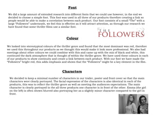
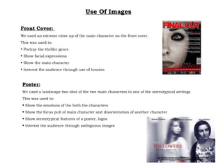
Initially we decided to follow the thriller/horror genre however we found this was too broad and decided to take on the challenge of a thriller genre. We tried to implement this genre into both our front cover and poster. To do this we considered several aspects which include: Colour Font Character Genre
We looked into stereotypical colours of the thriller genre and found that the most dominant was red, therefore we used this throughout our products as we thought this would make it look more professional. We also had meetings about other colours we could combine with this and came up with the mix of black and white, this continued the dark atmosphere that is thought of within the thriller genre. We have used these colours in each of our products to show continuity and create a link between each product. With our font we have made the “Followers” bright red, this adds emphasis and shows that the “Followers” might be a key element in the film. Colour Font We did a large amount of extended research into different fonts that we could use however, in the end we decided to choose a simple font. This font was used in all three of our products therefore creating a link so people would be able to make a correlation between each product. Our font consists of a small “The” with a large “Followers” underneath, we feel this is effective as it will attract attention, as through our research we have found that some thriller films use a similar font. Characters We decided to keep a minimal number of characters in our trailer, poster and front cover so that the main characters were clearly portrayed. The facial expression of the characters is also identical in each of the products, this was to reflect the thriller genre as well as meeting the audiences expectations. The main character is clearly portrayed in the all three products one character is in front of the other. Emma (the girl on the left) is often shown blurred also portraying her as a slightly minor character compared to the girl in front.
Use Of Images Front Cover:  We used an extreme close up of the main character on the front cover. This was used to: Portray the thriller genre Show facial expressions Show the main character Interest the audience through use of tension Poster: We used a landscape two shot of the two main characters in one of the stereotypical settings This was used to: Show the emotions of the both the characters  Show the focus pull of main character and disorientation of another character Show stereotypical features of a poster, logos Interest the audience through ambiguous images

Evaluation 5

  • 1.
  • 2.
    Initially we decidedto follow the thriller/horror genre however we found this was too broad and decided to take on the challenge of a thriller genre. We tried to implement this genre into both our front cover and poster. To do this we considered several aspects which include: Colour Font Character Genre
  • 3.
    We looked intostereotypical colours of the thriller genre and found that the most dominant was red, therefore we used this throughout our products as we thought this would make it look more professional. We also had meetings about other colours we could combine with this and came up with the mix of black and white, this continued the dark atmosphere that is thought of within the thriller genre. We have used these colours in each of our products to show continuity and create a link between each product. With our font we have made the “Followers” bright red, this adds emphasis and shows that the “Followers” might be a key element in the film. Colour Font We did a large amount of extended research into different fonts that we could use however, in the end we decided to choose a simple font. This font was used in all three of our products therefore creating a link so people would be able to make a correlation between each product. Our font consists of a small “The” with a large “Followers” underneath, we feel this is effective as it will attract attention, as through our research we have found that some thriller films use a similar font. Characters We decided to keep a minimal number of characters in our trailer, poster and front cover so that the main characters were clearly portrayed. The facial expression of the characters is also identical in each of the products, this was to reflect the thriller genre as well as meeting the audiences expectations. The main character is clearly portrayed in the all three products one character is in front of the other. Emma (the girl on the left) is often shown blurred also portraying her as a slightly minor character compared to the girl in front.
  • 4.
    Use Of ImagesFront Cover: We used an extreme close up of the main character on the front cover. This was used to: Portray the thriller genre Show facial expressions Show the main character Interest the audience through use of tension Poster: We used a landscape two shot of the two main characters in one of the stereotypical settings This was used to: Show the emotions of the both the characters Show the focus pull of main character and disorientation of another character Show stereotypical features of a poster, logos Interest the audience through ambiguous images