Download to read offline


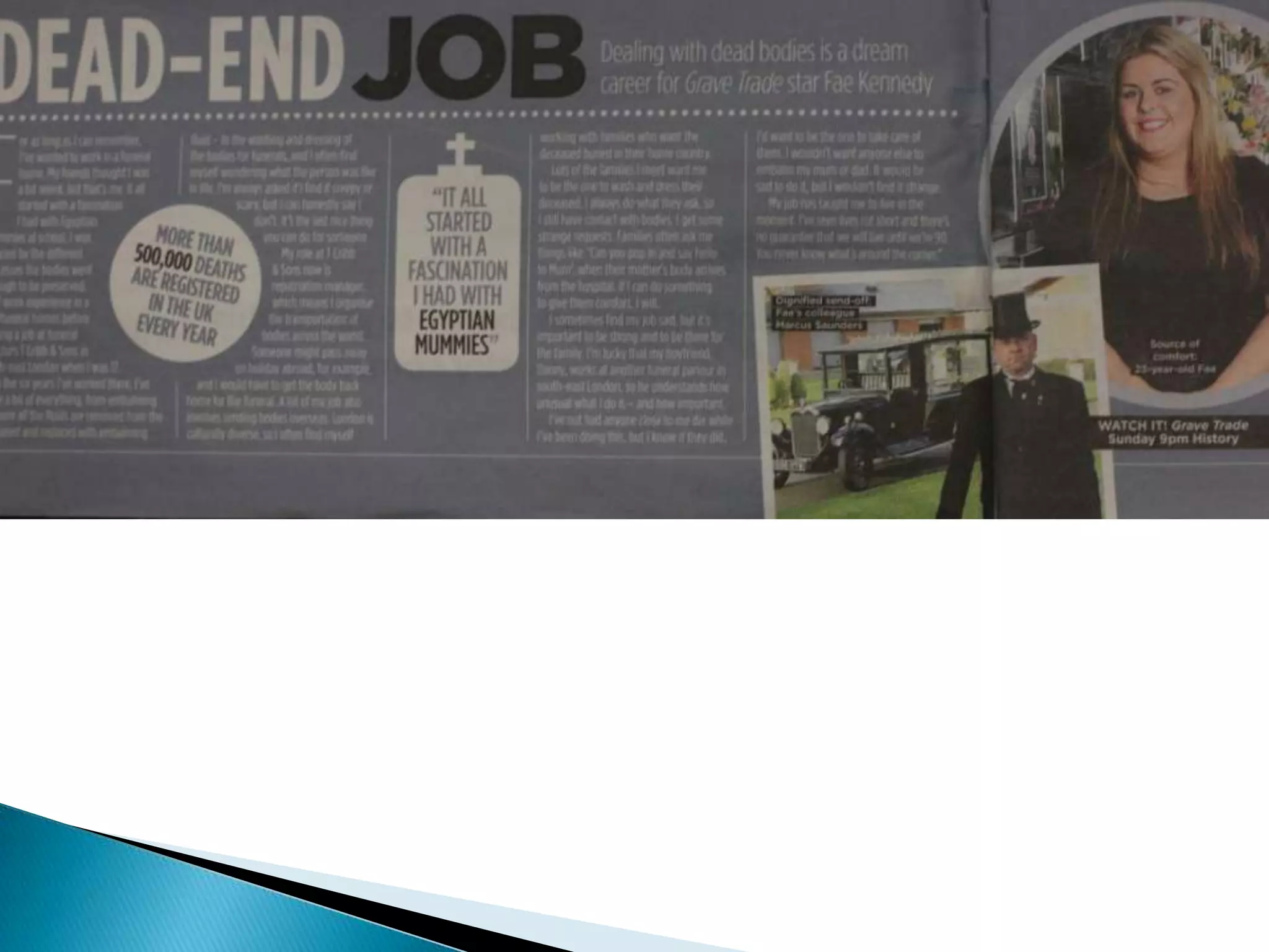
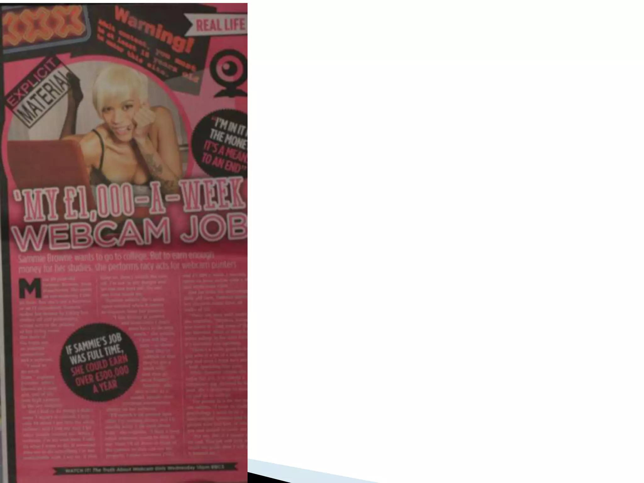

The document discusses the layout and design of double page spreads advertising documentaries in TV listing magazines. It analyzes three documentary ads that use a similar layout with contrasting background colors, brighter colors for smaller ads, and plain white with green headings for the main ad. The ads catch readers' attention with punny headings rather than program names. Images show documentary subjects and settings. Straplines simply describe topics. Write-ups include general facts, interviews, and brief descriptions without spoilers. Additional design elements like circles with facts are used.


