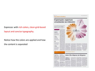
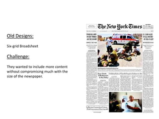
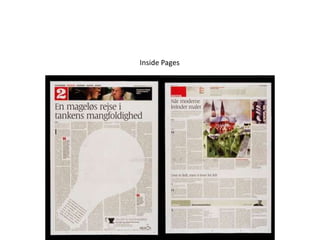
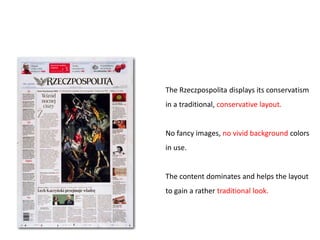
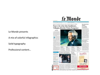
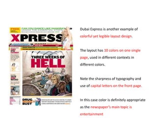
Case Study


    Strategies adopted by the
newspapers around the world to
 strengthen their position in the
              market


 Presented by jasmeet.warraich@gmail.com
Market Scenario

From time to time newspaper publishers are faced with the challenge of
sustaining their brand as credible sources of information and a
premier advertising medium.
How they achieve it?

The newspaper may adopt any of the following means:

- Revamping newspaper design in terms of layout, typography, colours etc

- Re-branding exercise to make newspaper look contemporary

- Pick up any social cause to promote the newspaper, which has relevance
with current issues in the society
CASE STUDY 1

The Morning Call is a daily newspaper based
in Allentown, Pennsylvania, in the United States.
1. USE A VOUCHER


The idea is low cost. A proven, efficient format. Easy to print, produce, and mail.
This voucher is a two-part, folded form.
Each part measures 3-1/2″ x 8-1/2″. There’s a perf on the fold.
It prints both sides using spot colors.
2. LEVERAGING THE VALUE OF CONTENT

Research shows readers buy newspapers as much for the price-off coupons as for
they do for the local coverage. So The Morning Call promoted the value of both.


Readers mostly ignore state and national and world coverage.
Hence The morning call focused instead on close-to-home interests such as
- Gardening
- Parenting
- Weddings
- Clubs
- Real estate sales
- Community news and such.
3. CREATED LOW COST , ENTRY LEVEL PRICE:

Almost everyone can afford $1.00. Try to create an offer priced that low, even if only
for your Sunday paper. Even better: 99¢
4. OFFERED FREE GIFTS ALONG SUBSCRIPTION:

New subscribers expect a reward. Gifts make a dramatic difference in response, and
more often than not pay for themselves in additional orders.


If you do not have the budget to offer everyone a desirable something, then offer
everyone who responds a chance to win a prize drawing with a high intrinsic value.
CASE STUDY 2
The only newspaper is India to adopt
Berliner format


The Berliner format is slightly taller and marginally wider than

the tabloid/compact format; and is both narrower and shorter

than the broadsheet format.
The effort at Mint, a business paper from Hindustan Times in association with
The Wall Street Journal, has been to bring clarity through every aspect of the
newspaper –

- The experienced Editorial team

- The unbiased and credible analysis

- The exclusive WSJ partnership

- The path breaking design

- The rich reproduction

- It relies on significant typography and elegant graphic highlights to visually
divide the content.
A very neat and clean layout as compared to all other financial newspapers in India
Result:
Launched in 2007

Within four years Mint has over two lac readers make Mint a strong No. 2 player

25 percent readership share in the key markets of Delhi, Mumbai and
Bangalore.

With editions in Kolkata, Chennai, Chandigarh, Pune and Ahmadabad it reaches
the who’s who of corporate India nationally
CASE STUDY 3


   (Marathi)
Lokmat Media unveils a refreshing look for Marathi newspaper ‘Lokmat’ May 2011

Objective:

To strengthen its position further in the Market
Old   New
The changes in the pages include
- Shorter stories

- A Maharashtra centre-spread with zonal news

- Statistics where-ever possible

- A discussion forum -- Khuli Charcha -- to integrate and converge with the online
website.

- The sports page will also focus on local sports and inter-school tournaments.
Layout changes:
- Redesign is contemporary and elegant

- The newspaper is easily navigable

- A defined colour palette makes the pages more attractive and disciplined
CASE STUDY 4
Lokmat Samachar
Lokmat Samachar, the Hindi daily from
the stable of Lokmat Media, has
undergone a revamp.

The new look for Lokmat Samachar was
unveiled on August 15 2011 across
Nagpur
Kolhapur
Aurangabad
Akola
Jalgaon.

This is the first time that the daily has
changed its look since its launch in 1989.
Old   New
The new identity of LokmatSamachar boasts of

-A new design

-Easily navigable content

- A colourful layout.

According to the company, the new version aims to :

'educate, inform and entertain' its consumers.
CASE STUDY 5
Rajasthan Patrika
Rajasthan Patrika, the Rajasthan-based Hindi daily, has undergone cosmetic changes
to attract young readers.

The design change had been done to re-position the daily as per the tastes and
preferences of Sec A and B.

The change had been carried out across all editions of the newspaper.
Teaser Ad
New Look:


The new layout has an urban, youthful feel,
and is contemporary in design.


The news pages have been re-designed,
keeping in mind :
- Eye movement
- Essential elements have been highlighted
using a news hierarchy
- Non-priority items have been eliminated
CASE STUDY 6
The Guardian, a London (UK) daily,
Overview:
The Guardian, a London (UK) daily, provides an excellent example of how a
new layout can positively impact readership and revenues.

Rather than copy its two chief rivals, which converted from Broadsheets to
Tabloids, The Guardian went to the even smaller Berliner.

That inspired a bold redesign that features updated typography and takes
advantage of new capabilities to provide colour throughout.

The result was more vivid colours and blocks without sacrificing legibility and
sharpness of presentation.
Before   After
Result:
Following these changes,
The Guardian saw an incredible increase in its circulation of
40 percent on the first day of introduction
30 percent during the first week
14 percent readership in the year following the new layout.
CASE STUDY 7
 Expresso, the leading national
weekend newspaper in Portugal,
Expresso did a complete
redesign that was
- Fresh
-Provocative
- Smart and easy to read.

It incorporated
- Rich colours
- Clean grid-based layout
- Concise typography.
Expresso: with rich colors, clean grid-based
layout and concise typography.


Notice how the colors are applied and how
the content is separated
Result:

One year later Expresso sold 9.1 percent more paid copies than the

prior year

Advertising was up 3.9 percent and the newspaper now has more

young readers than any other Portuguese newspaper.
CASE STUDY 8
Hindustan Times – new look
     Unveiled in 2009
Objective:
It tries to cement its place as the
market leader in New Delhi
To become the fastest growing
English-language daily across India.


New look:
- More use of colour
- New layouts and typefaces
- A new line-up of features and
columnists,
Old Look                New Look


           Kindly note now they write name in small caps
hindustan times
started with giving
Crux of each articles.

It was aimed for the
people who prefer to
scan through the
morning newspaper.

This feature makes
Hindustan times stands
Apart from TOI
Result:

It has maintained No. I position in Delhi, and is one of the fastest growing No. 2
newspapers in other metro cities.
CASE STUDY 9
The New York Times
Old Designs:
Six-grid Broadsheet

Challenge:
They wanted to include more content
without compromising much with the
size of the newspaper.
New Designs:
By using a 5-column grid, the space was more effectively utilized.

Result:

The overall size of the newspaper was shrunk by about 10% and was able to fit
about 10% more text than that of the original layout. newspaper
CASE STUDY 10
        Dainik Bhaskar
Promoting newspaper through social cause
Editorial – 23 days campaign
ON GROUND PARTICIPATIVE INITIATIVE
Award Winning
Newspaper Designs
CASE STUDY 11
      The Hindu
launches monthly luxury tabloid –
   'Watches, Luxury & Beyond'
Watches, Luxury & Beyond, the monthly
offering will be published on the last
Saturday of every month.


It will be distributed across seven markets
along with The Hindu and Business Line.


Brands such as
Breguet, Omega, Versace, Victorinox,
Mercedes and Classic Collection from GRT
have already come on board as advertisers.
The pullout is targeted at
- High net worth individuals
-Corporate managers
-Discerning buyers

It aims to be a one-stop shop for information on the finer things in life.
El Economista (Madrid, Spain)
El Economista uses a very traditional, subtle
and unique newspaper layout.


Notice how well the typography reflects the
weight of single articles.


Infographics support the content and
headlines are surrounded by huge amount of
whitespace.
Inside pages
Äripäev (Tallinn, Estonia)
Äripäev‘s signature is the heavy use of
typography.


The packaging is always clean, simple to digest
and easy to read.


Grey and red are applied carefully and
sparingly.
Inside pages
De Morgen (Belgium)
De Morgen focuses on attractive packaging
and a visually appealing layout.


Vivid colors offer readers more eye-candy.


Clearly separate quotations from the overall
article.


Headlines are centered, background-colors
differ from page to page.
Inside pages
Politiken (Copenhagen, Denmark)
Politiken has a very eye-pleasing, legible layout
with soft, neutral colors.


Notice the clean horizontal packaging on the
right-hand side image below.


The sharpness of typography is breathtaking.
Inside Pages
The Rzeczpospolita (Warsaw, Poland)
The Rzeczpospolita displays its conservatism
in a traditional, conservative layout.


No fancy images, no vivid background colors
in use.


The content dominates and helps the layout
to gain a rather traditional look.
Inside Pages
Le Monde (Paris, France)
Le Monde presents

A mix of colorful infographics

Solid typography

Professional content…
Inside Pages
Dubai Express (Dubai, United Arab Emirates)
Dubai Express is another example of
colorful yet legible layout design.


The layout has 10 colors on one single
page, used in different contexts in
different colors.


Note the sharpness of typography and
use of capital letters on the front page.


In this case color is definitely appropriate
as the newspaper’s main topic is
entertainment
Inside Pages
Thank You

Newspaper case studies

  • 1.
    Case Study Strategies adopted by the newspapers around the world to strengthen their position in the market Presented by jasmeet.warraich@gmail.com
  • 2.
    Market Scenario From timeto time newspaper publishers are faced with the challenge of sustaining their brand as credible sources of information and a premier advertising medium.
  • 3.
    How they achieveit? The newspaper may adopt any of the following means: - Revamping newspaper design in terms of layout, typography, colours etc - Re-branding exercise to make newspaper look contemporary - Pick up any social cause to promote the newspaper, which has relevance with current issues in the society
  • 4.
    CASE STUDY 1 TheMorning Call is a daily newspaper based in Allentown, Pennsylvania, in the United States.
  • 5.
    1. USE AVOUCHER The idea is low cost. A proven, efficient format. Easy to print, produce, and mail. This voucher is a two-part, folded form. Each part measures 3-1/2″ x 8-1/2″. There’s a perf on the fold. It prints both sides using spot colors.
  • 7.
    2. LEVERAGING THEVALUE OF CONTENT Research shows readers buy newspapers as much for the price-off coupons as for they do for the local coverage. So The Morning Call promoted the value of both. Readers mostly ignore state and national and world coverage. Hence The morning call focused instead on close-to-home interests such as - Gardening - Parenting - Weddings - Clubs - Real estate sales - Community news and such.
  • 9.
    3. CREATED LOWCOST , ENTRY LEVEL PRICE: Almost everyone can afford $1.00. Try to create an offer priced that low, even if only for your Sunday paper. Even better: 99¢
  • 11.
    4. OFFERED FREEGIFTS ALONG SUBSCRIPTION: New subscribers expect a reward. Gifts make a dramatic difference in response, and more often than not pay for themselves in additional orders. If you do not have the budget to offer everyone a desirable something, then offer everyone who responds a chance to win a prize drawing with a high intrinsic value.
  • 13.
  • 14.
    The only newspaperis India to adopt Berliner format The Berliner format is slightly taller and marginally wider than the tabloid/compact format; and is both narrower and shorter than the broadsheet format.
  • 15.
    The effort atMint, a business paper from Hindustan Times in association with The Wall Street Journal, has been to bring clarity through every aspect of the newspaper – - The experienced Editorial team - The unbiased and credible analysis - The exclusive WSJ partnership - The path breaking design - The rich reproduction - It relies on significant typography and elegant graphic highlights to visually divide the content.
  • 16.
    A very neatand clean layout as compared to all other financial newspapers in India
  • 17.
    Result: Launched in 2007 Withinfour years Mint has over two lac readers make Mint a strong No. 2 player 25 percent readership share in the key markets of Delhi, Mumbai and Bangalore. With editions in Kolkata, Chennai, Chandigarh, Pune and Ahmadabad it reaches the who’s who of corporate India nationally
  • 18.
    CASE STUDY 3 (Marathi)
  • 19.
    Lokmat Media unveilsa refreshing look for Marathi newspaper ‘Lokmat’ May 2011 Objective: To strengthen its position further in the Market
  • 20.
    Old New
  • 21.
    The changes inthe pages include - Shorter stories - A Maharashtra centre-spread with zonal news - Statistics where-ever possible - A discussion forum -- Khuli Charcha -- to integrate and converge with the online website. - The sports page will also focus on local sports and inter-school tournaments.
  • 22.
    Layout changes: - Redesignis contemporary and elegant - The newspaper is easily navigable - A defined colour palette makes the pages more attractive and disciplined
  • 23.
  • 24.
    Lokmat Samachar, theHindi daily from the stable of Lokmat Media, has undergone a revamp. The new look for Lokmat Samachar was unveiled on August 15 2011 across Nagpur Kolhapur Aurangabad Akola Jalgaon. This is the first time that the daily has changed its look since its launch in 1989.
  • 25.
    Old New
  • 26.
    The new identityof LokmatSamachar boasts of -A new design -Easily navigable content - A colourful layout. According to the company, the new version aims to : 'educate, inform and entertain' its consumers.
  • 27.
  • 28.
    Rajasthan Patrika, theRajasthan-based Hindi daily, has undergone cosmetic changes to attract young readers. The design change had been done to re-position the daily as per the tastes and preferences of Sec A and B. The change had been carried out across all editions of the newspaper.
  • 29.
  • 30.
    New Look: The newlayout has an urban, youthful feel, and is contemporary in design. The news pages have been re-designed, keeping in mind : - Eye movement - Essential elements have been highlighted using a news hierarchy - Non-priority items have been eliminated
  • 31.
    CASE STUDY 6 TheGuardian, a London (UK) daily,
  • 32.
    Overview: The Guardian, aLondon (UK) daily, provides an excellent example of how a new layout can positively impact readership and revenues. Rather than copy its two chief rivals, which converted from Broadsheets to Tabloids, The Guardian went to the even smaller Berliner. That inspired a bold redesign that features updated typography and takes advantage of new capabilities to provide colour throughout. The result was more vivid colours and blocks without sacrificing legibility and sharpness of presentation.
  • 33.
    Before After
  • 34.
    Result: Following these changes, TheGuardian saw an incredible increase in its circulation of 40 percent on the first day of introduction 30 percent during the first week 14 percent readership in the year following the new layout.
  • 35.
    CASE STUDY 7 Expresso, the leading national weekend newspaper in Portugal,
  • 36.
    Expresso did acomplete redesign that was - Fresh -Provocative - Smart and easy to read. It incorporated - Rich colours - Clean grid-based layout - Concise typography.
  • 37.
    Expresso: with richcolors, clean grid-based layout and concise typography. Notice how the colors are applied and how the content is separated
  • 38.
    Result: One year laterExpresso sold 9.1 percent more paid copies than the prior year Advertising was up 3.9 percent and the newspaper now has more young readers than any other Portuguese newspaper.
  • 39.
    CASE STUDY 8 HindustanTimes – new look Unveiled in 2009
  • 40.
    Objective: It tries tocement its place as the market leader in New Delhi To become the fastest growing English-language daily across India. New look: - More use of colour - New layouts and typefaces - A new line-up of features and columnists,
  • 41.
    Old Look New Look Kindly note now they write name in small caps
  • 42.
    hindustan times started withgiving Crux of each articles. It was aimed for the people who prefer to scan through the morning newspaper. This feature makes Hindustan times stands Apart from TOI
  • 43.
    Result: It has maintainedNo. I position in Delhi, and is one of the fastest growing No. 2 newspapers in other metro cities.
  • 44.
    CASE STUDY 9 TheNew York Times
  • 45.
    Old Designs: Six-grid Broadsheet Challenge: Theywanted to include more content without compromising much with the size of the newspaper.
  • 46.
    New Designs: By usinga 5-column grid, the space was more effectively utilized. Result: The overall size of the newspaper was shrunk by about 10% and was able to fit about 10% more text than that of the original layout. newspaper
  • 47.
    CASE STUDY 10 Dainik Bhaskar Promoting newspaper through social cause
  • 52.
    Editorial – 23days campaign
  • 54.
  • 63.
  • 64.
    CASE STUDY 11 The Hindu launches monthly luxury tabloid – 'Watches, Luxury & Beyond'
  • 65.
    Watches, Luxury &Beyond, the monthly offering will be published on the last Saturday of every month. It will be distributed across seven markets along with The Hindu and Business Line. Brands such as Breguet, Omega, Versace, Victorinox, Mercedes and Classic Collection from GRT have already come on board as advertisers.
  • 66.
    The pullout istargeted at - High net worth individuals -Corporate managers -Discerning buyers It aims to be a one-stop shop for information on the finer things in life.
  • 67.
  • 68.
    El Economista usesa very traditional, subtle and unique newspaper layout. Notice how well the typography reflects the weight of single articles. Infographics support the content and headlines are surrounded by huge amount of whitespace.
  • 69.
  • 70.
  • 71.
    Äripäev‘s signature isthe heavy use of typography. The packaging is always clean, simple to digest and easy to read. Grey and red are applied carefully and sparingly.
  • 72.
  • 73.
  • 74.
    De Morgen focuseson attractive packaging and a visually appealing layout. Vivid colors offer readers more eye-candy. Clearly separate quotations from the overall article. Headlines are centered, background-colors differ from page to page.
  • 75.
  • 76.
  • 77.
    Politiken has avery eye-pleasing, legible layout with soft, neutral colors. Notice the clean horizontal packaging on the right-hand side image below. The sharpness of typography is breathtaking.
  • 78.
  • 79.
  • 80.
    The Rzeczpospolita displaysits conservatism in a traditional, conservative layout. No fancy images, no vivid background colors in use. The content dominates and helps the layout to gain a rather traditional look.
  • 81.
  • 82.
  • 83.
    Le Monde presents Amix of colorful infographics Solid typography Professional content…
  • 84.
  • 85.
    Dubai Express (Dubai,United Arab Emirates)
  • 86.
    Dubai Express isanother example of colorful yet legible layout design. The layout has 10 colors on one single page, used in different contexts in different colors. Note the sharpness of typography and use of capital letters on the front page. In this case color is definitely appropriate as the newspaper’s main topic is entertainment
  • 87.
  • 88.