Download to read offline
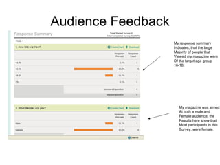

The document provides an evaluation of a media product called "SAMPLE" magazine created by the author. It summarizes the key elements of the magazine including the masthead on the front cover, main image focusing on the lead artist, use of cover lines, contents page layout, and double page article spread. Feedback was gathered from an audience survey that indicated the target age group was being reached and elements like the cover design and article style were engaging. The purpose of the evaluation was to analyze how the magazine challenged or developed conventions of real media.


![Evaluation presentation. [autosaved]](https://cdn.slidesharecdn.com/ss_thumbnails/evaluationpresentation-autosaved-120326055836-phpapp02-thumbnail.jpg?width=640&height=640&fit=bounds)


