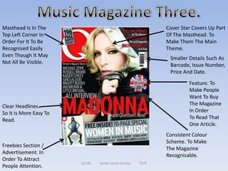
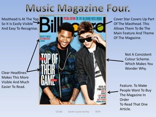
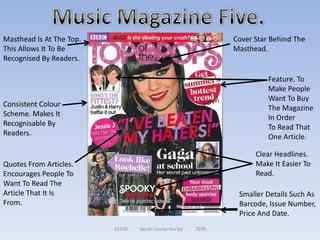
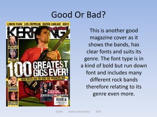
Research!


Sarah – Louise Hurley


  52336   Sarah-Louise Hurley   7079
Text Platform Conventions!


       52336   Sarah-Louise Hurley   7079
What does a text platform convention
              mean?
Text platform conventions are the characteristics
  which are associated with certain types of text
      whether it be newspapers or in this case
      magazines and more in particular, music
      magazines. These include things such as
  headings, images, masthead and also the text
   used on the front. I will now analyse 5 music
 magazine covers of different genres and identify
       the conventions so that I know popular
 conventions and styles to get an idea on what to
     include on my new music magazine cover.

               52336   Sarah-Louise Hurley   7079
Masthead Is In The                                            Cover Star Covers Up Part
Top Left Corner In                                            Of The Masthead. This Is
Order For It To Be                                            To Allow Them To Stand
Recognised Easily                                             Out.
Even Though It May                                                   Consistent Colour
Not All Be Visible.                                                  Scheme. So It Is
                                                                     More
                                                                     Recognisable.
Featured Stories.
These Are Used
In Order To Catch                                                      Clear Headlines.
The Readers Eye                                                        So It Is Easier To
And Make Them                                                          Read.
WANT To Read The
Article.
                                                               Smaller Details Such As
                                                               Barcode, Issue Number,
                                                               Price And Date. So The
Quotes From Articles.                                          Reader Knows A Little
To Also Attract People                                         Bit More About The
                         52336   Sarah-Louise Hurley   7079
To Read The Article.                                           Magazine.
Quotes From Articles.
In Order To Draw                                                    Masthead Is At The Top. In Order
In The Readers Attention.                                           For People To See It Easily And
                                                                    Also Makes It Recognisable.
Clear Headlines.
So It Is More Easy To Read.
                                                                                Consistent Colour
                                                                                Scheme. To Make
Cover Star Covers Up Part                                                       The Magazine
Of The Masthead. To                                                             More
Make Them The Main                                                              Recognisable By
Theme Of The                                                                    Fans Of The
Magazine                                                                        Magazine.


                                                                         Quiz / Incentive To Buy
                                                                         The Magazine So You Can
Feature. To Make People Want To Buy The Magazine In Order                Find Out The Answer To
To Read That One Article.                                                This Question.
                               52336   Sarah-Louise Hurley   7079
Masthead Is In The                                           Cover Star Covers Up Part
Top Left Corner In                                           Of The Masthead. To
Order For It To Be                                           Make Them The Main
Recognised Easily                                            Theme.
Even Though It May
                                                              Smaller Details Such As
Not All Be Visible.
                                                              Barcode, Issue Number,
                                                              Price And Date.
                                                                      Feature. To
                                                                      Make People
                                                                      Want To Buy
Clear Headlines.                                                      The Magazine
So It Is More Easy To                                                 In Order
Read.                                                                 To Read That
                                                                      One Article.
                                                             Consistent Colour
                                                             Scheme. To Make
Freebies Section /
                                                             The Magazine
Advertisement. In
                                                             Recognisable.
Order To Attract
                        52336   Sarah-Louise Hurley   7079
People Attention.
Masthead Is At The Top.                                        Cover Star Covers Up Part
So It Is Easily Visible                                        Of The Masthead. This
And Easy To Recognise.                                         Allows Them To Be The
                                                               Main Feature And Theme
                                                               Of The Magazine.


                                                                     Not A Consistent
                                                                     Colour Scheme.
                                                                     Which Makes You
                                                                     Wonder Why.
Clear Headlines.
Makes This More
Visible And Much
Easier To Read.                                                   Feature. To Make
                                                                  People Want To Buy
                                                                  The Magazine In
                                                                  Order
                                                                  To Read That One
                                                                  Article.
                          52336   Sarah-Louise Hurley   7079
Masthead Is At The Top.                                        Cover Star Behind The
This Allows It To Be                                           Masthead.
Recognised By Readers.

                                                                         Feature. To
                                                                         Make People
                                                                         Want To Buy
Consistent Colour                                                        The Magazine
Scheme. Makes It                                                         In Order
Recognisable By                                                          To Read That
Readers.                                                                 One Article.

                                                                     Clear Headlines.
Quotes From Articles.                                                Make It Easier To
Encourages People To                                                 Read.
Want To Read The
Article That It Is                                              Smaller Details Such As
From.                                                           Barcode, Issue Number,
                                                                Price And Date.
                          52336   Sarah-Louise Hurley   7079
Genre Conventions!


   52336   Sarah-Louise Hurley   7079
What does a genre convention mean?
Each genre will use certain characteristics in order to
portray a specific genre choice. The most common way
  to do this is through the use of colour. Whether it is
 used in a cover, a movie poster or even in an advert on
television these characteristics will be followed in order
   to represent the chosen genre. I will now analyse 3
  different magazine covers show the representations
 which link them to their genres. I will more specifically
     use music magazines which will allow me to see
    popular conventions in order to use these on my
            magazine to represent the genre.

                 52336   Sarah-Louise Hurley   7079
Pink text to suit its target audience of
        young girls and teenage girls who are
        generally into pop music.

        Certain fonts, for example swirly letters are used to
        show innocence but block letters and capital letters
        have also been shown on the cover.

        There is a lot of the colour pink used to represent love
        which is typically the theme to pretty much all pop
        songs.

        The use of a boy band (In this case, One Direction), in
        whom sing pop songs, they also all have smiles on
        their faces.

        Pop songs are generally quite happy themed songs
        therefore bright, happy colours are used on the
        covers.

52336   Sarah-Louise Hurley   7079
Beige colour used on the title to show it as being classic
          but also white on the darker background in order for the
          text to stand out.

          Varied fonts to show the different and varied style of rock
          music.

          The colour scheme used could be to represent the
          different personalities within the genre of rock.

          The use of a rock artist or band (In this case, Aerosmith),
          One member looking sort of angry at the back possibly to
          show a darker side and then the other member looking
          happy almost to show a kind of crazy side, also with the
          help of his weird clothing and accessories.

          Rock songs are generally
          quite dark and mysterious
           themed songs therefore
          dark, angry and sad
          colours are used on the
          covers.
52336   Sarah-Louise Hurley   7079
Red fonts used to show anger, love, loss or death
             for the theme of the music.

             Block letters to stand out and also to show the
             boldness of the music. Could also show the
             meaningfulness of the lyrics.

             A strict colour scheme used in order to show the
             different emotions throughout rap songs.

             The use of a rapper (In this case, Chris Brown)
             who looks rather angry could be to show the
             genre a little bit more.

             Rap songs are songs that
             generally tell a story of
             some sort of story. Therefore the black connotes
             the dark side of these stories, the white for the
             good sides and the red to show anger or death.
52336   Sarah-Louise Hurley   7079
Good And Bad Examples!


      52336   Sarah-Louise Hurley   7079
What Makes A Magazine Good Or
            Bad?
   The certain characteristics that allow us to
   recognise not only the magazine but also its
 genre and whether the conventions used fit its
  theme. This will allow the reader/audience to
relate more to the magazine if it follows not only
 all of the text platform conventions but also the
  genre conventions. In the next few slides I will
 compare 3 different music magazine covers and
say whether they are of a good standard or a bad
                 standard and why…

               52336   Sarah-Louise Hurley   7079
Good Or Bad?
                     In my opinion, this is a
                       good example of a
                         magazine cover
                       Because it suits the
                      artist themselves and
                       also has a frequent
                         colour scheme.

 52336   Sarah-Louise Hurley   7079
Good Or Bad?
                   In my opinion, I think that
                   this magazine cover is bad
                   as it doesn’t suit the artist
                     on the cover, the white
                  background makes her stand
                 out on the magazine which is
                 something she did during her
                 career but the theme of white
                  and blue does not suit her as
                            an artist.

 52336   Sarah-Louise Hurley   7079
Good Or Bad?
                        This is another good
                        magazine cover as it
                       shows the bands, has
                      clear fonts and suits its
                     genre. The font type is in
                   a kind of bold but run down
                      font and includes many
                        different rock bands
                      therefore relating to its
                         genre even more.

 52336   Sarah-Louise Hurley   7079
Asking My Audience!


    52336   Sarah-Louise Hurley   7079
Why Am I Asking My Audience?
  I am asking my audience their opinion on
current magazines in order to find the things
 people like and dislike on magazines, what
    encourages them to buy it, what needs
improving on the current magazines and also
  what sort of colour schemes and genre of
         magazines that they prefer.

              52336   Sarah-Louise Hurley   7079
My Results:
my results show that my audience favour Kerrang as
  it is one of the most popular magazines out of all
  the above as well as the billboard and vibe ones.
      When asked why these were preferred, my
    audience said that It was because the Kerrang
  one stuck with its colour scheme throughout and
   was also the magazine that they buy and that it
  was their favourite genre. Vibe also did the same
    as the Kerrang one where as the billboard one
      was easier to read and featured things that
                 interest my audience.

                 52336   Sarah-Louise Hurley   7079
Drawing Conclusions From My Results:
Therefore from this I have found that I want a clear cover
  that is easy to read but also sticks with a colour scheme
      and also fits its genre. This will make my audience
       favour the magazine cover because it suits their
       preferences. I am thinking of going for more of a
  billboard feel to my magazine cover. Now I need to look
   up different contents pages for the billboard magazine
    and also to look at different double page spreads for
    this magazine in order to see what it includes so that
     way I will be able to plan mine much easier as I will
   have a rough idea of what to include and what not to
                             include.


                   52336   Sarah-Louise Hurley   7079

Research - Main Task

  • 1.
    Research! Sarah – LouiseHurley 52336 Sarah-Louise Hurley 7079
  • 2.
    Text Platform Conventions! 52336 Sarah-Louise Hurley 7079
  • 3.
    What does atext platform convention mean? Text platform conventions are the characteristics which are associated with certain types of text whether it be newspapers or in this case magazines and more in particular, music magazines. These include things such as headings, images, masthead and also the text used on the front. I will now analyse 5 music magazine covers of different genres and identify the conventions so that I know popular conventions and styles to get an idea on what to include on my new music magazine cover. 52336 Sarah-Louise Hurley 7079
  • 4.
    Masthead Is InThe Cover Star Covers Up Part Top Left Corner In Of The Masthead. This Is Order For It To Be To Allow Them To Stand Recognised Easily Out. Even Though It May Consistent Colour Not All Be Visible. Scheme. So It Is More Recognisable. Featured Stories. These Are Used In Order To Catch Clear Headlines. The Readers Eye So It Is Easier To And Make Them Read. WANT To Read The Article. Smaller Details Such As Barcode, Issue Number, Price And Date. So The Quotes From Articles. Reader Knows A Little To Also Attract People Bit More About The 52336 Sarah-Louise Hurley 7079 To Read The Article. Magazine.
  • 5.
    Quotes From Articles. InOrder To Draw Masthead Is At The Top. In Order In The Readers Attention. For People To See It Easily And Also Makes It Recognisable. Clear Headlines. So It Is More Easy To Read. Consistent Colour Scheme. To Make Cover Star Covers Up Part The Magazine Of The Masthead. To More Make Them The Main Recognisable By Theme Of The Fans Of The Magazine Magazine. Quiz / Incentive To Buy The Magazine So You Can Feature. To Make People Want To Buy The Magazine In Order Find Out The Answer To To Read That One Article. This Question. 52336 Sarah-Louise Hurley 7079
  • 6.
    Masthead Is InThe Cover Star Covers Up Part Top Left Corner In Of The Masthead. To Order For It To Be Make Them The Main Recognised Easily Theme. Even Though It May Smaller Details Such As Not All Be Visible. Barcode, Issue Number, Price And Date. Feature. To Make People Want To Buy Clear Headlines. The Magazine So It Is More Easy To In Order Read. To Read That One Article. Consistent Colour Scheme. To Make Freebies Section / The Magazine Advertisement. In Recognisable. Order To Attract 52336 Sarah-Louise Hurley 7079 People Attention.
  • 7.
    Masthead Is AtThe Top. Cover Star Covers Up Part So It Is Easily Visible Of The Masthead. This And Easy To Recognise. Allows Them To Be The Main Feature And Theme Of The Magazine. Not A Consistent Colour Scheme. Which Makes You Wonder Why. Clear Headlines. Makes This More Visible And Much Easier To Read. Feature. To Make People Want To Buy The Magazine In Order To Read That One Article. 52336 Sarah-Louise Hurley 7079
  • 8.
    Masthead Is AtThe Top. Cover Star Behind The This Allows It To Be Masthead. Recognised By Readers. Feature. To Make People Want To Buy Consistent Colour The Magazine Scheme. Makes It In Order Recognisable By To Read That Readers. One Article. Clear Headlines. Quotes From Articles. Make It Easier To Encourages People To Read. Want To Read The Article That It Is Smaller Details Such As From. Barcode, Issue Number, Price And Date. 52336 Sarah-Louise Hurley 7079
  • 9.
    Genre Conventions! 52336 Sarah-Louise Hurley 7079
  • 10.
    What does agenre convention mean? Each genre will use certain characteristics in order to portray a specific genre choice. The most common way to do this is through the use of colour. Whether it is used in a cover, a movie poster or even in an advert on television these characteristics will be followed in order to represent the chosen genre. I will now analyse 3 different magazine covers show the representations which link them to their genres. I will more specifically use music magazines which will allow me to see popular conventions in order to use these on my magazine to represent the genre. 52336 Sarah-Louise Hurley 7079
  • 11.
    Pink text tosuit its target audience of young girls and teenage girls who are generally into pop music. Certain fonts, for example swirly letters are used to show innocence but block letters and capital letters have also been shown on the cover. There is a lot of the colour pink used to represent love which is typically the theme to pretty much all pop songs. The use of a boy band (In this case, One Direction), in whom sing pop songs, they also all have smiles on their faces. Pop songs are generally quite happy themed songs therefore bright, happy colours are used on the covers. 52336 Sarah-Louise Hurley 7079
  • 12.
    Beige colour usedon the title to show it as being classic but also white on the darker background in order for the text to stand out. Varied fonts to show the different and varied style of rock music. The colour scheme used could be to represent the different personalities within the genre of rock. The use of a rock artist or band (In this case, Aerosmith), One member looking sort of angry at the back possibly to show a darker side and then the other member looking happy almost to show a kind of crazy side, also with the help of his weird clothing and accessories. Rock songs are generally quite dark and mysterious themed songs therefore dark, angry and sad colours are used on the covers. 52336 Sarah-Louise Hurley 7079
  • 13.
    Red fonts usedto show anger, love, loss or death for the theme of the music. Block letters to stand out and also to show the boldness of the music. Could also show the meaningfulness of the lyrics. A strict colour scheme used in order to show the different emotions throughout rap songs. The use of a rapper (In this case, Chris Brown) who looks rather angry could be to show the genre a little bit more. Rap songs are songs that generally tell a story of some sort of story. Therefore the black connotes the dark side of these stories, the white for the good sides and the red to show anger or death. 52336 Sarah-Louise Hurley 7079
  • 14.
    Good And BadExamples! 52336 Sarah-Louise Hurley 7079
  • 15.
    What Makes AMagazine Good Or Bad? The certain characteristics that allow us to recognise not only the magazine but also its genre and whether the conventions used fit its theme. This will allow the reader/audience to relate more to the magazine if it follows not only all of the text platform conventions but also the genre conventions. In the next few slides I will compare 3 different music magazine covers and say whether they are of a good standard or a bad standard and why… 52336 Sarah-Louise Hurley 7079
  • 16.
    Good Or Bad? In my opinion, this is a good example of a magazine cover Because it suits the artist themselves and also has a frequent colour scheme. 52336 Sarah-Louise Hurley 7079
  • 17.
    Good Or Bad? In my opinion, I think that this magazine cover is bad as it doesn’t suit the artist on the cover, the white background makes her stand out on the magazine which is something she did during her career but the theme of white and blue does not suit her as an artist. 52336 Sarah-Louise Hurley 7079
  • 18.
    Good Or Bad? This is another good magazine cover as it shows the bands, has clear fonts and suits its genre. The font type is in a kind of bold but run down font and includes many different rock bands therefore relating to its genre even more. 52336 Sarah-Louise Hurley 7079
  • 19.
    Asking My Audience! 52336 Sarah-Louise Hurley 7079
  • 20.
    Why Am IAsking My Audience? I am asking my audience their opinion on current magazines in order to find the things people like and dislike on magazines, what encourages them to buy it, what needs improving on the current magazines and also what sort of colour schemes and genre of magazines that they prefer. 52336 Sarah-Louise Hurley 7079
  • 21.
    My Results: my resultsshow that my audience favour Kerrang as it is one of the most popular magazines out of all the above as well as the billboard and vibe ones. When asked why these were preferred, my audience said that It was because the Kerrang one stuck with its colour scheme throughout and was also the magazine that they buy and that it was their favourite genre. Vibe also did the same as the Kerrang one where as the billboard one was easier to read and featured things that interest my audience. 52336 Sarah-Louise Hurley 7079
  • 22.
    Drawing Conclusions FromMy Results: Therefore from this I have found that I want a clear cover that is easy to read but also sticks with a colour scheme and also fits its genre. This will make my audience favour the magazine cover because it suits their preferences. I am thinking of going for more of a billboard feel to my magazine cover. Now I need to look up different contents pages for the billboard magazine and also to look at different double page spreads for this magazine in order to see what it includes so that way I will be able to plan mine much easier as I will have a rough idea of what to include and what not to include. 52336 Sarah-Louise Hurley 7079