The double page spread uses a simple color scheme and large, clear fonts to maximize readability. A large featured image on the first page draws the reader's eye. Quotes and smaller images are used to highlight key parts of the long-form article. Overall, the layout focuses attention on important elements through contrast and sizing while breaking up dense text for easy reading.
2024.06.01 Introducing a competency framework for languag learning materials ...Sandy Millin
http://sandymillin.wordpress.com/iateflwebinar2024
Published classroom materials form the basis of syllabuses, drive teacher professional development, and have a potentially huge influence on learners, teachers and education systems. All teachers also create their own materials, whether a few sentences on a blackboard, a highly-structured fully-realised online course, or anything in between. Despite this, the knowledge and skills needed to create effective language learning materials are rarely part of teacher training, and are mostly learnt by trial and error.
Knowledge and skills frameworks, generally called competency frameworks, for ELT teachers, trainers and managers have existed for a few years now. However, until I created one for my MA dissertation, there wasn’t one drawing together what we need to know and do to be able to effectively produce language learning materials.
This webinar will introduce you to my framework, highlighting the key competencies I identified from my research. It will also show how anybody involved in language teaching (any language, not just English!), teacher training, managing schools or developing language learning materials can benefit from using the framework.
Normal Labour/ Stages of Labour/ Mechanism of LabourWasim Ak
Normal labor is also termed spontaneous labor, defined as the natural physiological process through which the fetus, placenta, and membranes are expelled from the uterus through the birth canal at term (37 to 42 weeks
How to Build a Module in Odoo 17 Using the Scaffold MethodCeline George
Odoo provides an option for creating a module by using a single line command. By using this command the user can make a whole structure of a module. It is very easy for a beginner to make a module. There is no need to make each file manually. This slide will show how to create a module using the scaffold method.
MATATAG CURRICULUM: ASSESSING THE READINESS OF ELEM. PUBLIC SCHOOL TEACHERS I...NelTorrente
In this research, it concludes that while the readiness of teachers in Caloocan City to implement the MATATAG Curriculum is generally positive, targeted efforts in professional development, resource distribution, support networks, and comprehensive preparation can address the existing gaps and ensure successful curriculum implementation.
Delivering Micro-Credentials in Technical and Vocational Education and TrainingAG2 Design
Explore how micro-credentials are transforming Technical and Vocational Education and Training (TVET) with this comprehensive slide deck. Discover what micro-credentials are, their importance in TVET, the advantages they offer, and the insights from industry experts. Additionally, learn about the top software applications available for creating and managing micro-credentials. This presentation also includes valuable resources and a discussion on the future of these specialised certifications.
For more detailed information on delivering micro-credentials in TVET, visit this https://tvettrainer.com/delivering-micro-credentials-in-tvet/
Exploiting Artificial Intelligence for Empowering Researchers and Faculty, In...Dr. Vinod Kumar Kanvaria
Exploiting Artificial Intelligence for Empowering Researchers and Faculty,
International FDP on Fundamentals of Research in Social Sciences
at Integral University, Lucknow, 06.06.2024
By Dr. Vinod Kumar Kanvaria
June 3, 2024 Anti-Semitism Letter Sent to MIT President Kornbluth and MIT Cor...Levi Shapiro
Letter from the Congress of the United States regarding Anti-Semitism sent June 3rd to MIT President Sally Kornbluth, MIT Corp Chair, Mark Gorenberg
Dear Dr. Kornbluth and Mr. Gorenberg,
The US House of Representatives is deeply concerned by ongoing and pervasive acts of antisemitic
harassment and intimidation at the Massachusetts Institute of Technology (MIT). Failing to act decisively to ensure a safe learning environment for all students would be a grave dereliction of your responsibilities as President of MIT and Chair of the MIT Corporation.
This Congress will not stand idly by and allow an environment hostile to Jewish students to persist. The House believes that your institution is in violation of Title VI of the Civil Rights Act, and the inability or
unwillingness to rectify this violation through action requires accountability.
Postsecondary education is a unique opportunity for students to learn and have their ideas and beliefs challenged. However, universities receiving hundreds of millions of federal funds annually have denied
students that opportunity and have been hijacked to become venues for the promotion of terrorism, antisemitic harassment and intimidation, unlawful encampments, and in some cases, assaults and riots.
The House of Representatives will not countenance the use of federal funds to indoctrinate students into hateful, antisemitic, anti-American supporters of terrorism. Investigations into campus antisemitism by the Committee on Education and the Workforce and the Committee on Ways and Means have been expanded into a Congress-wide probe across all relevant jurisdictions to address this national crisis. The undersigned Committees will conduct oversight into the use of federal funds at MIT and its learning environment under authorities granted to each Committee.
• The Committee on Education and the Workforce has been investigating your institution since December 7, 2023. The Committee has broad jurisdiction over postsecondary education, including its compliance with Title VI of the Civil Rights Act, campus safety concerns over disruptions to the learning environment, and the awarding of federal student aid under the Higher Education Act.
• The Committee on Oversight and Accountability is investigating the sources of funding and other support flowing to groups espousing pro-Hamas propaganda and engaged in antisemitic harassment and intimidation of students. The Committee on Oversight and Accountability is the principal oversight committee of the US House of Representatives and has broad authority to investigate “any matter” at “any time” under House Rule X.
• The Committee on Ways and Means has been investigating several universities since November 15, 2023, when the Committee held a hearing entitled From Ivory Towers to Dark Corners: Investigating the Nexus Between Antisemitism, Tax-Exempt Universities, and Terror Financing. The Committee followed the hearing with letters to those institutions on January 10, 202
Executive Directors Chat Leveraging AI for Diversity, Equity, and InclusionTechSoup
Let’s explore the intersection of technology and equity in the final session of our DEI series. Discover how AI tools, like ChatGPT, can be used to support and enhance your nonprofit's DEI initiatives. Participants will gain insights into practical AI applications and get tips for leveraging technology to advance their DEI goals.
This presentation includes basic of PCOS their pathology and treatment and also Ayurveda correlation of PCOS and Ayurvedic line of treatment mentioned in classics.
Safalta Digital marketing institute in Noida, provide complete applications that encompass a huge range of virtual advertising and marketing additives, which includes search engine optimization, virtual communication advertising, pay-per-click on marketing, content material advertising, internet analytics, and greater. These university courses are designed for students who possess a comprehensive understanding of virtual marketing strategies and attributes.Safalta Digital Marketing Institute in Noida is a first choice for young individuals or students who are looking to start their careers in the field of digital advertising. The institute gives specialized courses designed and certification.
for beginners, providing thorough training in areas such as SEO, digital communication marketing, and PPC training in Noida. After finishing the program, students receive the certifications recognised by top different universitie, setting a strong foundation for a successful career in digital marketing.
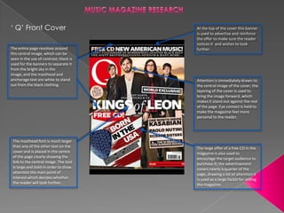
1. ‘ Q’ Front Cover At the top of the cover this banner
is used to advertise and reinforce
the offer to make sure the reader
notices it and wishes to look
The entire page revolves around further.
this central image, which can be
seen in the use of contrast; black is
used for the banners to separate it
from the bright sky in the
image, and the masthead and
anchorage text are white to stand Attention is immediately drawn to
out from the black clothing. the central image of the cover; the
layering of the cover is used to
bring the image forward, which
makes it stand out against the rest
of the page. Eye contact is held to
make the magazine feel more
personal to the reader.
The masthead font is much larger
than any of the other text on the The large offer of a free CD in the
cover and is placed in the centre magazine is also used to
of the page clearly showing the encourage the target audience to
link to the central image. The text purchase it; the advertisement
is large and bold in order to draw covers nearly a quarter of the
attention the main point of page, drawing a lot of attention it
interest which decides whether is used as a large factor for selling
the reader will look further. the magazine.
2. ‘KERRANG’ Front Cover Like most music magazine
covers cleverly layer the central
image between the masthead
and the rest of the contents on
the page. It is used to
immediately attract the
The Masthead is large in font and attention of the reader as it
layered above the sky in the catches their. The subjects of
image, which contrasts with each the image are also holding eye
other making the masthead easy to contact with the reader to make
see. it feel more personal.
The straplines on the cover are
used again to encourage the
reader to look inside the
magazine with interesting
features.
A large advertisement for a
poster special with a secondary
image in the bottom left corner
acts as another incentive for the
reader to purchase the Looking at the colour scheme of
magazine. The image is also the cover, only four base colours
outlined in white which (Black, White, Red and Blue) are
highlights the offer and used to hold the theme of Great
separates it from the rest of the Britain which links to the cover
page so it’s easy to see. story and image and also stand out
well against each other making it
easy to see and read, used very
effectively in the headline.
The cover line on the bottom of the page
is used to show other interesting features
inside the magazine, this is used again to
encourage the reader to look further
though curiosity or interest.
3. ‘Q’ Contents Page
The magazine’s logo is kept in the
left corner of the page for The masthead for the
continuity. contents page is placed
on a white background
with a black font, this
contrast in colour ensures
that it draws attention by
standing out from the
background.
A large central image takes up
most of the page, instantly
Sub headings are used to
drawing the attention of the
separate the articles in order
reader to it, this is used as a
to make the magazine simple
lure to find out why this image
to navigate.
is important. The subject of the
image is holding eye contact to
make it feel more personal to
the reader.
Overall the layout of the page is very simplistic, less is more in this
case as it is easy for the reader to distinguish every feature of the
page.
4. ‘KERRANG’ Contents page
The contents page still has a The page has a simple and
main large image for the most effective use of colours; only
‘important article’, but it is not three base colours are used
central. Just like Q magazine the (black, white and yellow) each of
main image is used as a lure for
them are easy to distinguish
the reader to find out why this
image is used.
against each other due to the
contrast. This makes the page
easy to read and everything easy
to see.
Sub headings are used again, for
An editorial is included on this the same reason to make it easy
contents page, this could make for the reader to navigate the
the magazine feel more personal magazine.
to the reader as they are given
an insight into the lives/work of
the editor.
The use of so many small
Compared to Q magazine the layout of kerrang’s images leaves the page a
contents page is a lot more cluttered and contains a lot little cluttered and generally
more content, this may make it a little difficult for the looks un-appealing, so this
reader to navigate and may look a little un-appealing. would be something I will
try to avoid in my project.
5. ‘KERRANG’ Double Page Spread The font of the masthead
is very large and the The double page spread
colour stands out well uses a simple colour scheme
from the background of black, white and red; this
colour; this makes sure makes sure that everything
that it is easy to read and is easy to see and as these
draws attention to it. colours stand out from each
other.
The main image
for the featured
article takes up
the entire first
page, this
instantly draws The main bulk of the
most of the article is in black font
attention of the which clearly stands
reader as it stands out against the white
out from the rest background of the
of the article. The page, this will make
fact that the the text easy to read
group in the and follow.
image appear to
be having fun
links to the title of
teen spirit as
most teens like to
have fun.
The highlighted quote from the This string of small images is
article is layered over the rest of the used to break up the page and
page making it stand out above the add another point of interest,
other text, this will be read first and the red background is used to
used as a lure for the reader to read stand out against the article to
the featured article. The quote also make sure it is noticed.
links to the them of ‘Teen Spirit’.
6. ‘Q’ Double Page Spread The article seems to be written in the form
of a diary, with sub-headings in a larger
bold font for each section. This again allows
for simple navigation of the article and
The image for the makes sure that it is easy to read.
article is spread
across the width of
the first page, this
makes it stand out
from the rest of the
page. The main lead
singer is holding eye
contact and at the Separate images linked
front of the group to to a certain section of
highlight his the article are used to
importance as well attract attention to
as adding a personal that section, but also
feeling to the to break up the page
reader. making it more
aesthetically pleasing.
The magazine’s logo is kept The font used for the article is in a
in the bottom corner of the black font which clearly stands out
pages to maintain against the white background due to
consistency. the contrast, this makes it easy to
read.