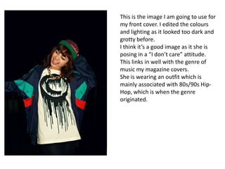
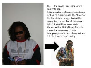
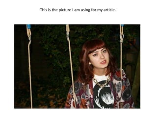
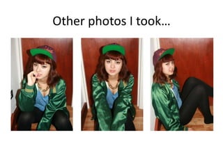
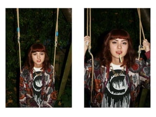
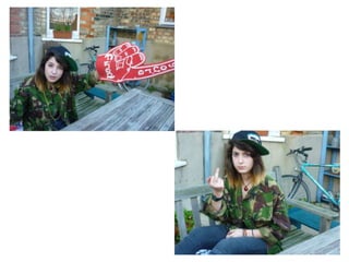
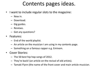
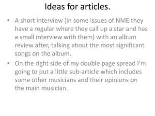
Magazine ideas and planning.
Possible fonts for the title.


I thought the fonts on the left were better than
the other 5 because they look more sleek and stylish.
Although the other fonts seem to fit into the theme of Hip-Hop in a more obvious way,
I think that it may make the magazine look a bit too immature, and possibly even
cheap. Hip-Hop can also seem like a cool lifestyle full of riches, so I think that the more
sophisticated looking fonts may seem more trustworthy.
crystal deco


The same goes for these fonts, the 3 on the left also seem to give out a messy and
cheap look. At first I wanted to match the font with the t-shirt of my model on the
front cover, however this made it look to crammed and messy.
The top right font is the one I am going with, the retro look to it helps with the idea
of style that I want my magazine to give out.
This is the image I am going to use for
my front cover. I edited the colours
and lighting as it looked too dark and
grotty before.
I think it’s a good image as it she is
posing in a “I don’t care” attitude.
This links in well with the genre of
music my magazine covers.
She is wearing an outfit which is
mainly associated with 80s/90s Hip-
Hop, which is when the genre
originated.
This is the image I am using for my
contents page.
It is an obvious reference to an iconic
picture of Biggie Smalls, the “King” of
hip-hop. It is an image that will be
recognised by any fan of the genre.
I think it could link to my stylish
theme, with a hint of irony from the
use of the monopoly money.
I am going to edit the colours as I feel
it looks too dark and boring.
This is the picture I am using for my article.
Other photos I took…
Contents pages ideas.
• I want to include regular slots to the magazine:
   –   New in.
   –   Download.
   –   Gig guides.
   –   Reviews.
   –   Got any questions?
• Features:
   – End of the world playlist.
   – An article on the musician I am using in my contents page.
   – Something on a famous rapper e.g. Eminem.
• Cover Stories:
   – The 50 best hip hop songs of 2012.
   – They’re back! (an article on the revival of old artists).
   – Tamaki Flynn (the name of the front cover and main article musician.
Ideas for articles.
• A short interview (in some issues of NME they
  have a regular where they call up a star and has
  a small interview with them) with an album
  review after, talking about the most significant
  songs on the album.
• On the right side of my double page spread I’m
  going to put a little sub-article which includes
  some other musicians and their opinions on
  the main musician.

Magazine ideas and planning

  • 1.
  • 2.
    Possible fonts forthe title. I thought the fonts on the left were better than the other 5 because they look more sleek and stylish. Although the other fonts seem to fit into the theme of Hip-Hop in a more obvious way, I think that it may make the magazine look a bit too immature, and possibly even cheap. Hip-Hop can also seem like a cool lifestyle full of riches, so I think that the more sophisticated looking fonts may seem more trustworthy.
  • 3.
    crystal deco The samegoes for these fonts, the 3 on the left also seem to give out a messy and cheap look. At first I wanted to match the font with the t-shirt of my model on the front cover, however this made it look to crammed and messy. The top right font is the one I am going with, the retro look to it helps with the idea of style that I want my magazine to give out.
  • 4.
    This is theimage I am going to use for my front cover. I edited the colours and lighting as it looked too dark and grotty before. I think it’s a good image as it she is posing in a “I don’t care” attitude. This links in well with the genre of music my magazine covers. She is wearing an outfit which is mainly associated with 80s/90s Hip- Hop, which is when the genre originated.
  • 5.
    This is theimage I am using for my contents page. It is an obvious reference to an iconic picture of Biggie Smalls, the “King” of hip-hop. It is an image that will be recognised by any fan of the genre. I think it could link to my stylish theme, with a hint of irony from the use of the monopoly money. I am going to edit the colours as I feel it looks too dark and boring.
  • 6.
    This is thepicture I am using for my article.
  • 7.
  • 10.
    Contents pages ideas. •I want to include regular slots to the magazine: – New in. – Download. – Gig guides. – Reviews. – Got any questions? • Features: – End of the world playlist. – An article on the musician I am using in my contents page. – Something on a famous rapper e.g. Eminem. • Cover Stories: – The 50 best hip hop songs of 2012. – They’re back! (an article on the revival of old artists). – Tamaki Flynn (the name of the front cover and main article musician.
  • 11.
    Ideas for articles. •A short interview (in some issues of NME they have a regular where they call up a star and has a small interview with them) with an album review after, talking about the most significant songs on the album. • On the right side of my double page spread I’m going to put a little sub-article which includes some other musicians and their opinions on the main musician.