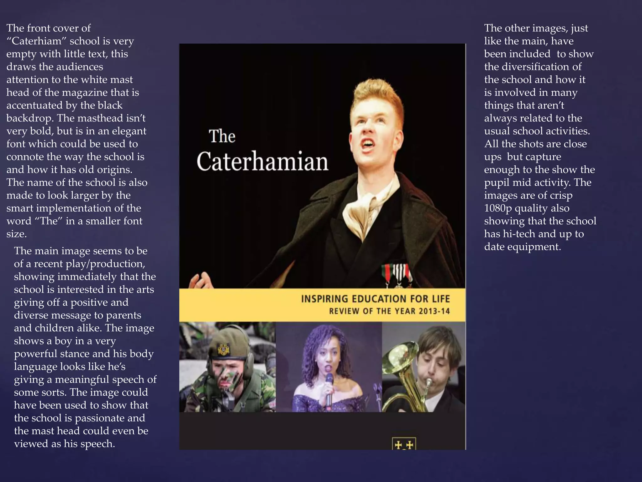
The document summarizes and provides feedback on the design and layout of a school magazine called "Caterhiam". It analyzes several aspects of the magazine's front cover, interior pages, and use of images. The front cover uses a simple design that draws attention to the elegant masthead. Interior pages feature high quality images showing the school's diverse activities and modern technology. While some text is difficult to read, the page layouts and varied images provide insights into school life and appeal to different audiences. Suggestions are made to improve the white space and use of fonts.