Download to read offline
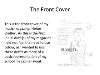
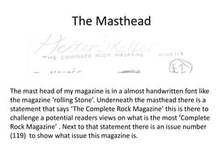
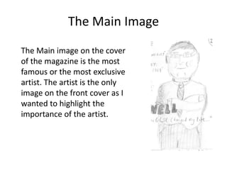
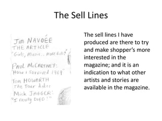
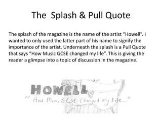
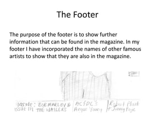

This document provides an overview of the initial draft front cover design for a music magazine called "Helter Skelter". It describes the different elements included on the cover such as the masthead logo in a handwritten font, the issue number, a featured artist image, sell lines to entice readers, a splash quote from the artist, and a footer listing other artists included in the magazine. The purpose of this draft front cover is to represent the basic layout and highlight key elements before adding color to the final design.


