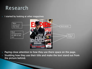
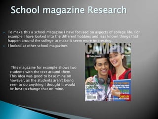
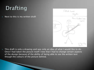
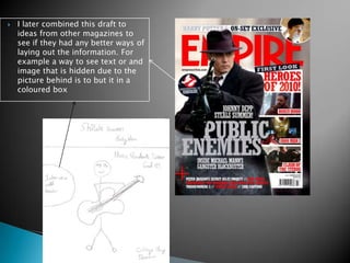
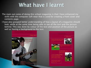
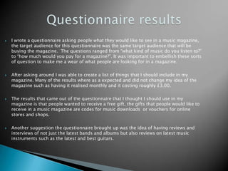
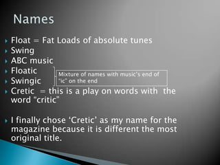
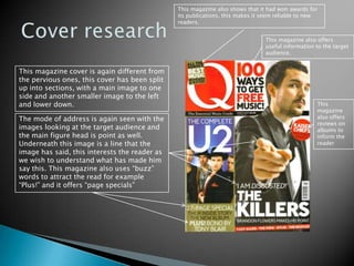
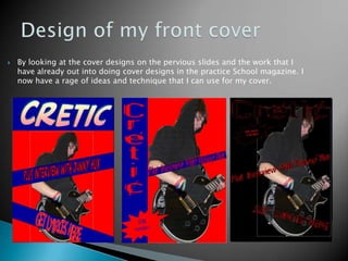
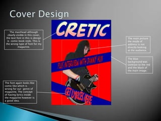
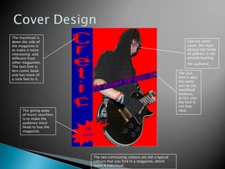
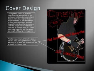
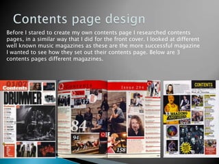
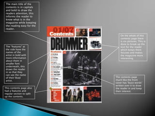
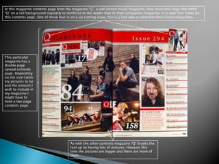
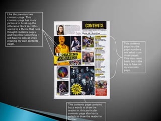
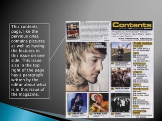
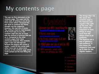
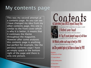
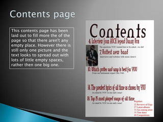
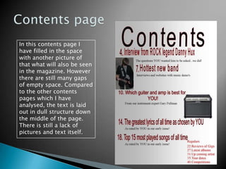
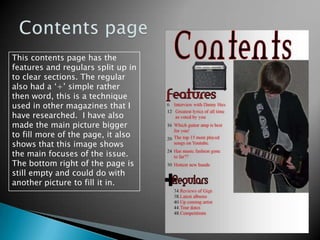
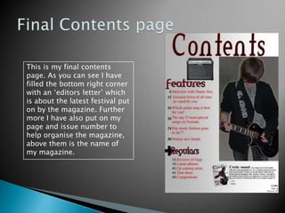
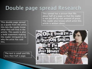
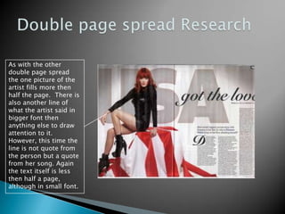
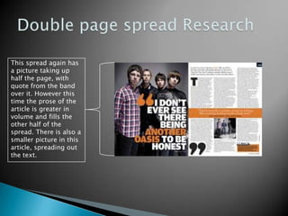
This document contains information about a student's process of designing a school magazine as practice for designing their music magazine. It describes the research and drafting process, including looking at other magazines for inspiration on layout, cover design, and contents page design. The student summarizes what they have learned about using software and understanding magazine design through creating the school magazine. They then discuss plans and research for their music magazine cover and contents page design.
DBS Office Business Center is the pioneer in Business Centers in India. DBS facilitates a fully furnished office, virtual office and conferencing space customized to your business requirements.
Introduction to AI for Nonprofits with Tapp NetworkTechSoup
Dive into the world of AI! Experts Jon Hill and Tareq Monaur will guide you through AI's role in enhancing nonprofit websites and basic marketing strategies, making it easy to understand and apply.
Biological screening of herbal drugs: Introduction and Need for
Phyto-Pharmacological Screening, New Strategies for evaluating
Natural Products, In vitro evaluation techniques for Antioxidants, Antimicrobial and Anticancer drugs. In vivo evaluation techniques
for Anti-inflammatory, Antiulcer, Anticancer, Wound healing, Antidiabetic, Hepatoprotective, Cardio protective, Diuretics and
Antifertility, Toxicity studies as per OECD guidelines
Embracing GenAI - A Strategic ImperativePeter Windle
Artificial Intelligence (AI) technologies such as Generative AI, Image Generators and Large Language Models have had a dramatic impact on teaching, learning and assessment over the past 18 months. The most immediate threat AI posed was to Academic Integrity with Higher Education Institutes (HEIs) focusing their efforts on combating the use of GenAI in assessment. Guidelines were developed for staff and students, policies put in place too. Innovative educators have forged paths in the use of Generative AI for teaching, learning and assessments leading to pockets of transformation springing up across HEIs, often with little or no top-down guidance, support or direction.
This Gasta posits a strategic approach to integrating AI into HEIs to prepare staff, students and the curriculum for an evolving world and workplace. We will highlight the advantages of working with these technologies beyond the realm of teaching, learning and assessment by considering prompt engineering skills, industry impact, curriculum changes, and the need for staff upskilling. In contrast, not engaging strategically with Generative AI poses risks, including falling behind peers, missed opportunities and failing to ensure our graduates remain employable. The rapid evolution of AI technologies necessitates a proactive and strategic approach if we are to remain relevant.
Synthetic Fiber Construction in lab .pptxPavel ( NSTU)
Synthetic fiber production is a fascinating and complex field that blends chemistry, engineering, and environmental science. By understanding these aspects, students can gain a comprehensive view of synthetic fiber production, its impact on society and the environment, and the potential for future innovations. Synthetic fibers play a crucial role in modern society, impacting various aspects of daily life, industry, and the environment. ynthetic fibers are integral to modern life, offering a range of benefits from cost-effectiveness and versatility to innovative applications and performance characteristics. While they pose environmental challenges, ongoing research and development aim to create more sustainable and eco-friendly alternatives. Understanding the importance of synthetic fibers helps in appreciating their role in the economy, industry, and daily life, while also emphasizing the need for sustainable practices and innovation.
How to Make a Field invisible in Odoo 17Celine George
It is possible to hide or invisible some fields in odoo. Commonly using “invisible” attribute in the field definition to invisible the fields. This slide will show how to make a field invisible in odoo 17.
Read| The latest issue of The Challenger is here! We are thrilled to announce that our school paper has qualified for the NATIONAL SCHOOLS PRESS CONFERENCE (NSPC) 2024. Thank you for your unwavering support and trust. Dive into the stories that made us stand out!
Operation “Blue Star” is the only event in the history of Independent India where the state went into war with its own people. Even after about 40 years it is not clear if it was culmination of states anger over people of the region, a political game of power or start of dictatorial chapter in the democratic setup.
The people of Punjab felt alienated from main stream due to denial of their just demands during a long democratic struggle since independence. As it happen all over the word, it led to militant struggle with great loss of lives of military, police and civilian personnel. Killing of Indira Gandhi and massacre of innocent Sikhs in Delhi and other India cities was also associated with this movement.
June 3, 2024 Anti-Semitism Letter Sent to MIT President Kornbluth and MIT Cor...Levi Shapiro
Letter from the Congress of the United States regarding Anti-Semitism sent June 3rd to MIT President Sally Kornbluth, MIT Corp Chair, Mark Gorenberg
Dear Dr. Kornbluth and Mr. Gorenberg,
The US House of Representatives is deeply concerned by ongoing and pervasive acts of antisemitic
harassment and intimidation at the Massachusetts Institute of Technology (MIT). Failing to act decisively to ensure a safe learning environment for all students would be a grave dereliction of your responsibilities as President of MIT and Chair of the MIT Corporation.
This Congress will not stand idly by and allow an environment hostile to Jewish students to persist. The House believes that your institution is in violation of Title VI of the Civil Rights Act, and the inability or
unwillingness to rectify this violation through action requires accountability.
Postsecondary education is a unique opportunity for students to learn and have their ideas and beliefs challenged. However, universities receiving hundreds of millions of federal funds annually have denied
students that opportunity and have been hijacked to become venues for the promotion of terrorism, antisemitic harassment and intimidation, unlawful encampments, and in some cases, assaults and riots.
The House of Representatives will not countenance the use of federal funds to indoctrinate students into hateful, antisemitic, anti-American supporters of terrorism. Investigations into campus antisemitism by the Committee on Education and the Workforce and the Committee on Ways and Means have been expanded into a Congress-wide probe across all relevant jurisdictions to address this national crisis. The undersigned Committees will conduct oversight into the use of federal funds at MIT and its learning environment under authorities granted to each Committee.
• The Committee on Education and the Workforce has been investigating your institution since December 7, 2023. The Committee has broad jurisdiction over postsecondary education, including its compliance with Title VI of the Civil Rights Act, campus safety concerns over disruptions to the learning environment, and the awarding of federal student aid under the Higher Education Act.
• The Committee on Oversight and Accountability is investigating the sources of funding and other support flowing to groups espousing pro-Hamas propaganda and engaged in antisemitic harassment and intimidation of students. The Committee on Oversight and Accountability is the principal oversight committee of the US House of Representatives and has broad authority to investigate “any matter” at “any time” under House Rule X.
• The Committee on Ways and Means has been investigating several universities since November 15, 2023, when the Committee held a hearing entitled From Ivory Towers to Dark Corners: Investigating the Nexus Between Antisemitism, Tax-Exempt Universities, and Terror Financing. The Committee followed the hearing with letters to those institutions on January 10, 202
Francesca Gottschalk - How can education support child empowerment.pptxEduSkills OECD
Francesca Gottschalk from the OECD’s Centre for Educational Research and Innovation presents at the Ask an Expert Webinar: How can education support child empowerment?
Unit 8 - Information and Communication Technology (Paper I).pdfThiyagu K
This slides describes the basic concepts of ICT, basics of Email, Emerging Technology and Digital Initiatives in Education. This presentations aligns with the UGC Paper I syllabus.
2. School magazine I am going to create a front cover and a contents page for a school magazine. I am creating this as a practice opportunity before I attempted to design my music magazine. The reason why I need this practice before I do my music magazine is to become familiar with the software that is used and have a generally better understanding of how magazines are designed. In the long run this will help me with my music magazine. I am expecting my school magazine, although to be good, will not be as good as my finished music magazine. This is because I am aiming to improve on my software skills and magazine ideas to be able to create a more informative and fun magazine.
3. Research I started by looking at other magazines Paying close attention to how they use there space on the page. Studding how they use their title and make the text stand out from the picture behind. Main picture of top story Buzz words Black background to be able to see text What is inside
4. School magazine Research To make this a school magazine I have focused on aspects of college life. For example I have looked into the different hobbies and less known things that happen around the college to make it seem more interesting. I looked at other school magazines This magazine for example shows two students with the text around them. This idea was good to base mine on however, as the students aren't being seen to do anything I thought it would be best to change that on mine.
5. Drafting Next to this is my written draft This draft is only a drawing and was only an idea of what I would like to do. Once I had taken the picture itself I new that I had to change certain aspects of the design because of the ability of being able to see the written text though the colours of the picture behind.
6. I later combined this draft to ideas from other magazines to see if they had any better ways of laying out the information. For example a way to see text or and image that is hidden due to the picture behind is to but it in a coloured box
7. What have I learnt The main out come of doing this school magazine is that I have enhanced my skills with the computer soft wear that is used for creating a front cover and contents page. I have also grasped better understanding of how a layout of a magazine should look, while at the same time being able to see all the text and the picture behind. This was done by colour of the text and position of the picture as well as having a background to the text.
9. Questionnaire results I wrote a questionnaire asking people what they would like to see in a music magazine, the target audience for this questionnaire was the same target audience that will be buying the magazine. The questions ranged from “what kind of music do you listen to?” to “how much would you pay for a magazine?”. It was important to embellish these sorts of question to make me a wear of what people are looking for in a magazine. After asking around I was able to create a list of things that I should include in my magazine. Many of the results where as a expected and did not change my idea of the magazine such as having it realised monthly and it costing roughly £3.00. The results that came out of the questionnaire that I thought I should use in my magazine is that people wanted to receive a free gift, the gifts that people would like to receive in a music magazine are codes for music downloads or vouchers for online stores and shops. Another suggestion the questionnaire brought up was the idea of having reviews and interviews of not just the latest bands and albums but also reviews on latest music instruments such as the latest and best guitars.
10. Names Float = Fat Loads of absolute tunes Swing ABC music Floatic Swingic Cretic = this is a play on words with the word “critic” I finally chose ‘Cretic’ as my name for the magazine because it is different the most original title. Mixture of names with music’s end of “ic” on the end
11. Front cover research Before I started to create my front cover I researched other music magazine by going and looking at three front covers from three different magazines. All the magazines are for a different genre of music, this is so that I can get a wider range of research for different ideas.
12. Cover research The Masthead is styled in a way that shows the genre of the magazine. The cracked capital mast head with the “!” at the end suggests that the magazine is a rock one, I know from my own knowledge that is true. The bands in this magazine are also rock and heavy metal like ‘Paramore’. The mode of address is a personal one with the main image looking at the person who is buying or reading the magazine, this eye contact is done to draw the reader in and make them feel that it is personal. The speech in the speech marks implies that the image has said it, this makes the reader wonder what has made him say this and therefore they buy and read the magazine. This magazine also uses splashes and buzz words to draw the reader in more.
13. Cover Research This front cover is different to the previous one, this cover has less texts, using words to get straight to the point and only has the main image. Once again the image mode of address is looking at the person who is either buying or reading it, this image is also pointing to draw the reader in more. This artist name is also clearly visible to make people aware of who is in this issue of the magazine, it is also a way of selling the issue because this particular music artist is well known a popular.
14. Cover research This magazine also shows that it had won awards for its publications, this makes it seem reliable to new readers. This magazine also offers useful information to the target audience. This magazine cover is again different from the pervious ones, this cover has been split up into sections, with a main image to one side and another smaller image to the left and lower down. This magazine also offers reviews on albums to inform the reader The mode of address is again seen with the images looking at the target audience and the main figure head is point as well. Underneath this image is a line that the image has said, this interests the reader as we wish to understand what has made him say this. This magazine also uses “buzz” words to attract the read for example “Plus!” and it offers “page specials”
15. Design of my front cover By looking at the cover designs on the pervious slides and the work that I have already out into doing cover designs in the practice School magazine. I now have a rage of ideas and technique that I can use for my cover.
16. Cover Design The masthead although clearly visible in this cover, the text font in this is design is comic book style. This is the wrong type of font for my magazine. The main picture the mode of address is not directly looking at the audience. The blue background was contrast to the red and the black of the main image. The font again looks like comic like which is wrong for our genre of magazine. The concept of having lyrics inside the magazine however is a good idea.
17. Cover Design The masthead is down the side of the magazine is to make it more interesting and different from other magazines. The text font is less comic book and has more of a rock feel to it. Like the other cover, the main picture the mode of address is not directly looking the audience. The text font is also the same text as the masthead however, at this size the font is not that clear. The giving away of music vouchers is to make the audience more likely to buy the magazine. The two contrasting colours are not a typical colours that you find in a magazine, which make it individual.
18. Cover Design I changed the colour of my front cover from the red and blue to red and black, I did this because red and black is more like a typical music magazine where as the red and blue is more comic book like. Although its good to stand out has a magazine I felt that people would not feel so “cool” to be reading more of a comic book style magazine and that would put people off buying my magazine. Another issue I had with this front cover was the font. Although I liked the style it was difficult to read, and didn’t stand out as boldly as I wished it to.
19. My final cover For my final cover I combined the styles of my previous covers. I then changed the colour of background from black because it was to dark and I wanted a lighter magazine. I changed the font but kept the colours and this had the desired affect I wanted.
20. Contents page design Before I stared to create my own contents page I researched contents pages, in a similar way that I did for the front cover. I looked at different well known music magazines as these are the more successful magazine I wanted to see how they set out their contents page. Below are 3 contents pages different magazines.
21. The main title of the contents is in capitals and bold to draw the readers attention, this informs the reader to know what is in the magazine while keeping the reading easy for the reader. On the whole of this contents page there is six pictures. This is done to break up the text for the reader which keeps there focuses and makes the magazine more interesting. The “features” at the side have the names of the artist in bold with more information about them in smaller font underneath, this draws the reader in so that they can see the name of their liked artist. The contents page much like the front cover has ‘buzz words’ written over it to draw the reader in and keep their interest. This contents page also had a features and regular section to split up the contents.
22. In this magazine contents page from the magazine “Q”, a well known music magazine, they show their logo (the white “Q” on a red background) regularly to reinforce to the reader that its their companies magazine. It is seen four times on this contents page. One of those four is on a up coming issue, this is a free way to advertise their future magazines. This particular magazine has a double page spread contents page. Depending on the size I wish my pictures to be and the amount I wish to include in my magazine I might have to have a two page contents page. As with the other contents magazine “Q” breaks the text up by having lots of pictures. However this time the pictures are bigger and there are more of them.
23. Like the previous two contents page. This contents page has many pictures to break up the otherwise block text (this seems to a theme that runs thought contents pages and therefore something I will have to look at when creating my own contents page). This contents page has the page numbers and what is on those pages. This may seem basic but is the key to have on my contents page. This contents page contains buzz words to draw the reader in. this particular contents page also has a splash to draw the reader in further.
24. This contents page, like the pervious ones contains pictures as well as having the features in this issue on one side. This issue also in the top right of the page has a paragraph written by the editor about what is in this issue of the magazine.
25. My contents page The things that I do like about this contents page is the features and regulars that split up the text. This also allows the magazine to have things in every issue that will always draw in an audience. The features are a way of getting a new audience, it also keeps the magazine fresh and up to date for the regular readers. This was my first attempted at the contents page. This page had the same style of writing as one of my front covers which I designed this was done to continue the theme thought-out the magazine. However, this had lots of issues. The writing is hard to read because of the front type it is in, this contents page also has an issue with the amount of pictures that are on it. Compared to the other contents pages that I have previously analysed. This contents page is also not well laid out because the bottom left corner is empty. I could fill this corner with either more text or place more pictures on the contents page which could spread out the text filling the page.
26. My contents page This was my second attempt at a contents page. As you can see I have changed my idea from my other contents page, this one is similar to the front cover which is why it is better, it means that it continues the theme throughout the magazine. However after some analyses this contents page is anything but perfect for example, like the pervious contents page I have an empty space in the bottom right of the page and there is only one picture.
27. Contents page This contents page has been laid out to fill more the of the page so that there aren't any empty place. However there is still only one picture and the text looks to spread out with lots of little empty spaces, rather then one big one.
28. Contents page In this contents page I have filled in the space with another picture of that what will also be seen in the magazine. However there are still many gaps of empty space. Compared to the other contents pages which I have analysed, the text is laid out in dull structure down the middle of the page. There is still a lack of pictures and text itself.
29. Contents page This contents page has the features and regulars split up in to clear sections. The regular also had a ‘+’ simple rather then word, this is a technique used in other magazines that I have researched. I have also made the main picture bigger to fill more of the page, it also shows that this image shows the main focuses of the issue. The bottom right of the page is still empty and could do with another picture to fill it in.
30. Final Contents page This is my final contents page. As you can see I have filled the bottom right corner with an ‘editors letter’ which is about the latest festival put on by the magazine. Further more I have also put on my page and issue number to help organise the magazine, above them is the name of my magazine.
31. Double page spread Research Before I started making my double page spread I looked at other professional versions, in a similar way to the front cover and contents page. I choice 3 spreads to analyse before I created my own.
32. Double page spread Research This spread has a picture that fills about half of a page so that the reader is not put off by vast amount of prose. The reader also knows which artist this article is written about. This double page spread as a quote from the artist, this lets the reader know what they will find in the article. This quote is also a bold statement making the reader intrigued as to why the artist has said this. The text is small and fills less then half a page.
33. Double page spread Research As with the other double page spread the one picture of the artist fills more then half the page. There is also another line of what the artist said in bigger font then anything else to draw attention to it. However, this time the line is not quote from the person but a quote from her song. Again the text itself is less then half a page, although in small font.
34. Double page spread Research This spread again has a picture taking up half the page, with quote from the band over it. However this time the prose of the article is greater in volume and fills the other half of the spread. There is also a smaller picture in this article, spreading out the text.
35. Double page spread My first attempt of my spread. This version lacked the main photo on the other half of the page. However it was important to me to get the layout of the text first with a small picture so that I had an idea of how it would look, this also helped showing me what kind of main photo I need on the other half of the page.
36. Double page spread This double page spread has the picture filling the other half of the page. However it does not fill the top right coroner. To fill this I could use a quote from the text. This is done to draw the reader in.
37. Double page spread I have filled in my empty picture with a quote from the article. This is done in the spreads that I have researched to draw in the reader. I have also changed the font of the name of the artist to match the font cover, creating a theme throughout the magazine. In the corner of the spread I also have the title of the magazine, issue number and page number.