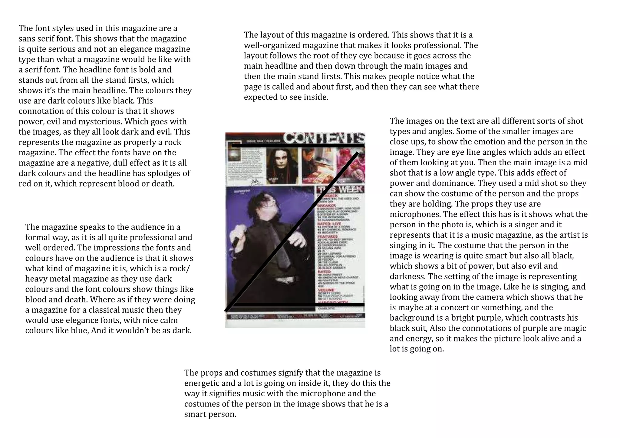
The font styles used in this magazine are a
sans serif font. This shows that the magazine                  The layout of this magazine is ordered. This shows that it is a
is quite serious and not an elegance magazine                  well-organized magazine that makes it looks professional. The
type than what a magazine would be like with                   layout follows the root of they eye because it goes across the
a serif font. The headline font is bold and                    main headline and then down through the main images and
stands out from all the stand firsts, which                    then the main stand firsts. This makes people notice what the
shows it’s the main headline. The colours they                 page is called and about first, and then they can see what there
use are dark colours like black. This                          expected to see inside.
connotation of this colour is that it shows
power, evil and mysterious. Which goes with                                                             The images on the text are all different sorts of shot
the images, as they all look dark and evil. This                                                        types and angles. Some of the smaller images are
represents the magazine as properly a rock                                                              close ups, to show the emotion and the person in the
magazine. The effect the fonts have on the                                                              image. They are eye line angles which adds an effect
magazine are a negative, dull effect as it is all                                                       of them looking at you. Then the main image is a mid
dark colours and the headline has splodges of                                                           shot that is a low angle type. This adds effect of
red on it, which represent blood or death.                                                              power and dominance. They used a mid shot so they
                                                                                                        can show the costume of the person and the props
                                                                                                        they are holding. The props they use are
                                                                                                        microphones. The effect this has is it shows what the
 The magazine speaks to the audience in a                                                               person in the photo is, which is a singer and it
 formal way, as it is all quite professional and                                                        represents that it is a music magazine, as the artist is
 well ordered. The impressions the fonts and                                                            singing in it. The costume that the person in the
 colours have on the audience is that it shows                                                          image is wearing is quite smart but also all black,
 what kind of magazine it is, which is a rock/                                                          which shows a bit of power, but also evil and
 heavy metal magazine as they use dark                                                                  darkness. The setting of the image is representing
 colours and the font colours show things like                                                          what is going on in the image. Like he is singing, and
 blood and death. Where as if they were doing                                                           looking away from the camera which shows that he
 a magazine for a classical music then they                                                             is maybe at a concert or something, and the
 would use elegance fonts, with nice calm                                                               background is a bright purple, which contrasts his
 colours like blue, And it wouldn’t be as dark.                                                         black suit, Also the connotations of purple are magic
                                                                                                        and energy, so it makes the picture look alive and a
                                                                                                        lot is going on.

                                              The props and costumes signify that the magazine is
                                              energetic and a lot is going on inside it, they do this the
                                              way it signifies music with the microphone and the
                                              costumes of the person in the image shows that he is a
                                              smart person.

Contents page 3

  • 1.
    The font stylesused in this magazine are a sans serif font. This shows that the magazine The layout of this magazine is ordered. This shows that it is a is quite serious and not an elegance magazine well-organized magazine that makes it looks professional. The type than what a magazine would be like with layout follows the root of they eye because it goes across the a serif font. The headline font is bold and main headline and then down through the main images and stands out from all the stand firsts, which then the main stand firsts. This makes people notice what the shows it’s the main headline. The colours they page is called and about first, and then they can see what there use are dark colours like black. This expected to see inside. connotation of this colour is that it shows power, evil and mysterious. Which goes with The images on the text are all different sorts of shot the images, as they all look dark and evil. This types and angles. Some of the smaller images are represents the magazine as properly a rock close ups, to show the emotion and the person in the magazine. The effect the fonts have on the image. They are eye line angles which adds an effect magazine are a negative, dull effect as it is all of them looking at you. Then the main image is a mid dark colours and the headline has splodges of shot that is a low angle type. This adds effect of red on it, which represent blood or death. power and dominance. They used a mid shot so they can show the costume of the person and the props they are holding. The props they use are microphones. The effect this has is it shows what the The magazine speaks to the audience in a person in the photo is, which is a singer and it formal way, as it is all quite professional and represents that it is a music magazine, as the artist is well ordered. The impressions the fonts and singing in it. The costume that the person in the colours have on the audience is that it shows image is wearing is quite smart but also all black, what kind of magazine it is, which is a rock/ which shows a bit of power, but also evil and heavy metal magazine as they use dark darkness. The setting of the image is representing colours and the font colours show things like what is going on in the image. Like he is singing, and blood and death. Where as if they were doing looking away from the camera which shows that he a magazine for a classical music then they is maybe at a concert or something, and the would use elegance fonts, with nice calm background is a bright purple, which contrasts his colours like blue, And it wouldn’t be as dark. black suit, Also the connotations of purple are magic and energy, so it makes the picture look alive and a lot is going on. The props and costumes signify that the magazine is energetic and a lot is going on inside it, they do this the way it signifies music with the microphone and the costumes of the person in the image shows that he is a smart person.