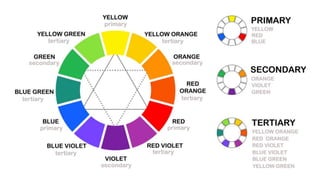
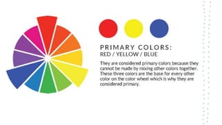
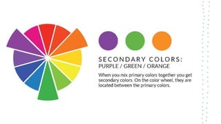
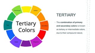
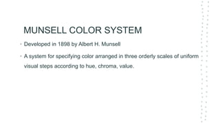
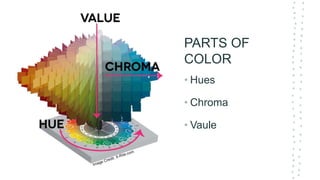
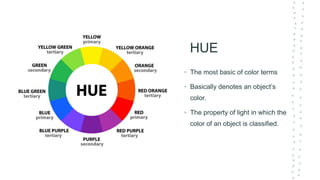
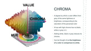
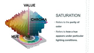
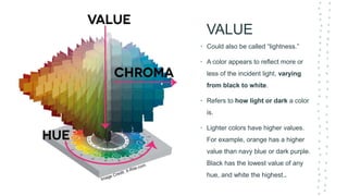
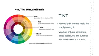
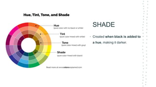
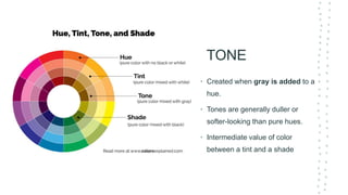
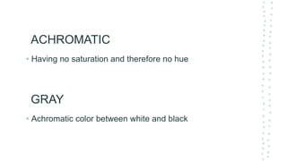
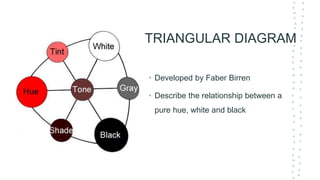
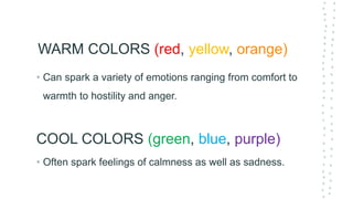
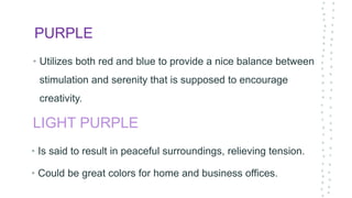
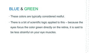
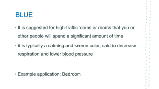
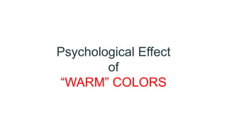
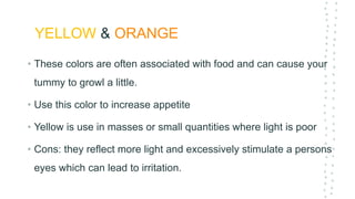
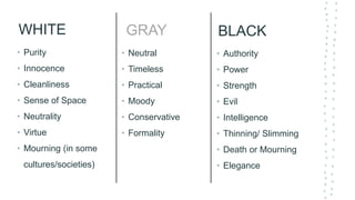
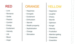
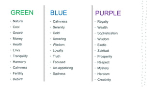
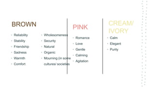
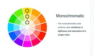
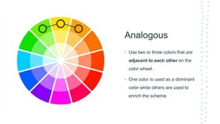
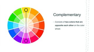
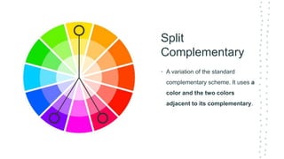
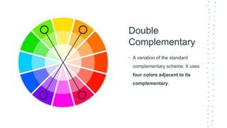
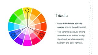
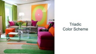
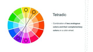
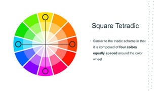
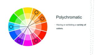
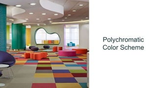
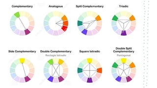
Chromatic Energy
of
Architectural Design
CHROMATIC
• Came from the Greek word “chromatikos” which means “color”
• Anything related to color or color phenomena or sensation
ENERGY
• Greek: “energos” which means “active”
• The capacity of acting or being active
• A fundamental entity of nature that is transferred between parts of a
system in the production of physical change within the system and
usually regarded as the capacity for doing work
COLOR
COLOR
• A phenomenon of light and visual perception that may be described in
terms of an individual's perception of hue, saturation, and tonal value.
• It is an attribute that most clearly distinguishes a form from its
environment
• It affects the visual weight of a form
COLOR
• Colors have psychological effects upon people.
• Colors reflects people’s attitude or their other views in life.
COLOR
THEORY
TERMS
TERTIARY
• The combination of primary
and secondary colors is known
as tertiary or intermediate colors,
due to their compound nature.
MUNSELL COLOR SYSTEM
• Developed in 1898 by Albert H. Munsell
• A system for specifying color arranged in three orderly scales of uniform
visual steps according to hue, chroma, value.
PARTS OF
COLOR
• Hues
• Chroma
• Vaule
HUE
• The most basic of color terms
• Basically denotes an object’s
color.
• The property of light in which the
color of an object is classified.
CHROMA
• A degree by which a color differs from
grey of the same lightness or
brightness; corresponding to the
saturation of the perceived color
• A hue with high chroma has no black,
white or gray in it.
• Adding white, black or gray reduces its
chroma.
• Can be thought of as the brightness
of a color in comparison to white.
SATURATION
• Refers to the purity of
color
• Refers to how a hue
appears under particular
lighting conditions.
VALUE
• Could also be called “lightness.”
• A color appears to reflect more or
less of the incident light, varying
from black to white.
• Refers to how light or dark a color
is.
• Lighter colors have higher values.
For example, orange has a higher
value than navy blue or dark purple.
Black has the lowest value of any
hue, and white the highest..
TINT
• Formed when white is added to a
hue, lightening it.
• Very light tints are sometimes
called pastels, but any pure hue
with white added to it is a tint.
SHADE
• Created when black is added to
a hue, making it darker.
TONE
• Created when gray is added to a
hue.
• Tones are generally duller or
softer-looking than pure hues.
• Intermediate value of color
between a tint and a shade
ACHROMATIC
• Having no saturation and therefore no hue
GRAY
• Achromatic color between white and black
TRIANGULAR DIAGRAM
• Developed by Faber Birren
• Describe the relationship between a
pure hue, white and black
COLOR
THEORY
PSYCHOLOGY
As Good architects
• Must always consider his/her client’s preferred color of the
structure because it will affect his/ her mood.
• Must also know how to combine colors or in order to give life
to the structure
Architects must consider this questions
•Is it too dark or too bright?
Is the color too dull? Or is it too exaggerated?
COLOR PSYCHOLOGY
• The Psychology of color is based on the mental and
emotional effects colors have on sighted people in all facets
of life.
EXAMPLE
• Studies have shown that some people looking at the color red
resulted in an increased heart rate, which then led to
additional adrenaline being pumped into the blood stream.
• You can learn more about how color therapy works and how
light and color affect us.
WARM & COOL
• There are also commonly noted psychological effects of
colors as it relates to two main categories:
WARM COLORS (red, yellow, orange)
• Often spark feelings of calmness as well as sadness.
COOL COLORS (green, blue, purple)
• Can spark a variety of emotions ranging from comfort to
warmth to hostility and anger.
Psychological Effect
of
“COOL” COLORS
PURPLE
• Utilizes both red and blue to provide a nice balance between
stimulation and serenity that is supposed to encourage
creativity.
LIGHT PURPLE
• Is said to result in peaceful surroundings, relieving tension.
• Could be great colors for home and business offices.
BLUE & GREEN
• These colors are typically considered restful.
• There is a bit of scientific logic applied to this – because the
eyes focus the color green directly on the retina, it is said to
be less strainful on your eye muscles.
BLUE
• It is suggested for high-traffic rooms or rooms that you or
other people will spend a significant amount of time
• It is typically a calming and serene color, said to decrease
respiration and lower blood pressure
• Example application: Bedroom
Psychological Effect
of
“WARM” COLORS
Psychological Effect
of
“WARM” COLORS
YELLOW & ORANGE
• These colors are often associated with food and can cause
your tummy to growl a little.
• Use this color to increase appetite
YELLOW & ORANGE
• These colors are often associated with food and can cause your
tummy to growl a little.
• Use this color to increase appetite
• Yellow is use in masses or small quantities where light is poor
• Cons: they reflect more light and excessively stimulate a persons
eyes which can lead to irritation.
Common Trairs that
COLOR DENOTES
RED
• These colors are often associated with food and can cause
your tummy to growl a little.
• Use this color to increase appetite
WHITE
• Purity
• Innocence
• Cleanliness
• Sense of Space
• Neutrality
• Virtue
• Mourning (in some
cultures/societies)
BLACK
• Authority
• Power
• Strength
• Evil
• Intelligence
• Thinning/ Slimming
• Death or Mourning
• Elegance
GRAY
• Neutral
• Timeless
• Practical
• Moody
• Conservative
• Formality
RED
• Love
• Romance
• Gentle
• Passion
• Comfort
• Energy
• Excitement
• Intensity
• Life
• Blood
• Anger
YELLOW
• Happiness
• Laughter
• Cheery
• Warmth
• Optimism
• Hunger
• Intensity
• Frustration
• Attention-getting
• Cheapness
• Cowardice
ORANGE
• Happiness
• Energetic
• Excitement
• Enthusiasm
• Warmth
• Wealth prosperity
• Sophistication
• Change
• Stimulation
GREEN
• Natural
• Cool
• Growth
• Money
• Health
• Envy
• Tranquility
• Harmony
• Calmness
• Fertility
• Rebirth
PURPLE
• Royalty
• Wealth
• Sophistication
• Wisdom
• Exotic
• Spiritual
• Prosperity
• Respect
• Mystery
• Heroism
• Creativity
BLUE
• Calmness
• Serenity
• Cold
• Uncaring
• Wisdom
• Loyalty
• Truth
• Focused
• Un-appetizing
• Sadness
BROWN
• Reliability
• Stability
• Friendship
• Sadness
• Warmth
• Comfort
• Wholesomeness
• Security
• Natural
• Organic
• Mourning (in some
cultures/ societies
PINK
• Romance
• Love
• Gentle
• Calming
• Agitation
CREAM/
IVORY
• Calm
• Elegant
• Purity
COLOR
THEORY
SCHEMES
Monochromatic
• The monochromatic color
scheme uses variations in
lightness and saturation of a
single color.
Monochromatic
Color Scheme
Analogous
• Use two or three colors that are
adjacent to each other on the
color wheel.
• One color is used as a dominant
color while others are used to
enrich the scheme.
Analogous
Color Scheme
Complementary
• Consists of two colors that are
opposite each other on the color
wheel.
Complementary
Color Scheme
Split
Complementary
• A variation of the standard
complementary scheme. It uses a
color and the two colors
adjacent to its complementary.
Split
Complementary
Color Scheme
Double
Complementary
• A variation of the standard
complementary scheme. It uses
four colors adjacent to its
complementary.
Double
Complementary
Color Scheme
Triadic
• Uses three colors equally
spaced around the color wheel.
• This scheme is popular among
artists because it offers strong
visual contrast while retaining
harmony and color richness.
Triadic
Color Scheme
Tetradic
• Combination of two analogous
colors and their complementary
colors on a color wheel.
Tetradic
Color Scheme
Square Tetradic
• Similar to the triadic scheme in that
it is composed of four colors
equally spaced around the color
wheel
Square
Tetradic
Color Scheme
Polychromatic
• Having or exhibiting a variety of
colors.
Polychromatic
Color Scheme
END

Module 3 Color Theory.pptx

  • 1.
  • 2.
    CHROMATIC • Came fromthe Greek word “chromatikos” which means “color” • Anything related to color or color phenomena or sensation
  • 3.
    ENERGY • Greek: “energos”which means “active” • The capacity of acting or being active • A fundamental entity of nature that is transferred between parts of a system in the production of physical change within the system and usually regarded as the capacity for doing work
  • 4.
  • 5.
    COLOR • A phenomenonof light and visual perception that may be described in terms of an individual's perception of hue, saturation, and tonal value. • It is an attribute that most clearly distinguishes a form from its environment • It affects the visual weight of a form
  • 6.
    COLOR • Colors havepsychological effects upon people. • Colors reflects people’s attitude or their other views in life.
  • 7.
  • 11.
    TERTIARY • The combinationof primary and secondary colors is known as tertiary or intermediate colors, due to their compound nature.
  • 12.
    MUNSELL COLOR SYSTEM •Developed in 1898 by Albert H. Munsell • A system for specifying color arranged in three orderly scales of uniform visual steps according to hue, chroma, value.
  • 13.
  • 14.
    HUE • The mostbasic of color terms • Basically denotes an object’s color. • The property of light in which the color of an object is classified.
  • 15.
    CHROMA • A degreeby which a color differs from grey of the same lightness or brightness; corresponding to the saturation of the perceived color • A hue with high chroma has no black, white or gray in it. • Adding white, black or gray reduces its chroma. • Can be thought of as the brightness of a color in comparison to white.
  • 16.
    SATURATION • Refers tothe purity of color • Refers to how a hue appears under particular lighting conditions.
  • 17.
    VALUE • Could alsobe called “lightness.” • A color appears to reflect more or less of the incident light, varying from black to white. • Refers to how light or dark a color is. • Lighter colors have higher values. For example, orange has a higher value than navy blue or dark purple. Black has the lowest value of any hue, and white the highest..
  • 18.
    TINT • Formed whenwhite is added to a hue, lightening it. • Very light tints are sometimes called pastels, but any pure hue with white added to it is a tint.
  • 19.
    SHADE • Created whenblack is added to a hue, making it darker.
  • 20.
    TONE • Created whengray is added to a hue. • Tones are generally duller or softer-looking than pure hues. • Intermediate value of color between a tint and a shade
  • 21.
    ACHROMATIC • Having nosaturation and therefore no hue GRAY • Achromatic color between white and black
  • 22.
    TRIANGULAR DIAGRAM • Developedby Faber Birren • Describe the relationship between a pure hue, white and black
  • 23.
  • 24.
    As Good architects •Must always consider his/her client’s preferred color of the structure because it will affect his/ her mood. • Must also know how to combine colors or in order to give life to the structure
  • 25.
    Architects must considerthis questions •Is it too dark or too bright? Is the color too dull? Or is it too exaggerated?
  • 26.
    COLOR PSYCHOLOGY • ThePsychology of color is based on the mental and emotional effects colors have on sighted people in all facets of life.
  • 27.
    EXAMPLE • Studies haveshown that some people looking at the color red resulted in an increased heart rate, which then led to additional adrenaline being pumped into the blood stream. • You can learn more about how color therapy works and how light and color affect us.
  • 28.
    WARM & COOL •There are also commonly noted psychological effects of colors as it relates to two main categories:
  • 29.
    WARM COLORS (red,yellow, orange) • Often spark feelings of calmness as well as sadness. COOL COLORS (green, blue, purple) • Can spark a variety of emotions ranging from comfort to warmth to hostility and anger.
  • 30.
  • 31.
    PURPLE • Utilizes bothred and blue to provide a nice balance between stimulation and serenity that is supposed to encourage creativity. LIGHT PURPLE • Is said to result in peaceful surroundings, relieving tension. • Could be great colors for home and business offices.
  • 32.
    BLUE & GREEN •These colors are typically considered restful. • There is a bit of scientific logic applied to this – because the eyes focus the color green directly on the retina, it is said to be less strainful on your eye muscles.
  • 33.
    BLUE • It issuggested for high-traffic rooms or rooms that you or other people will spend a significant amount of time • It is typically a calming and serene color, said to decrease respiration and lower blood pressure • Example application: Bedroom
  • 34.
  • 35.
  • 36.
    YELLOW & ORANGE •These colors are often associated with food and can cause your tummy to growl a little. • Use this color to increase appetite
  • 37.
    YELLOW & ORANGE •These colors are often associated with food and can cause your tummy to growl a little. • Use this color to increase appetite • Yellow is use in masses or small quantities where light is poor • Cons: they reflect more light and excessively stimulate a persons eyes which can lead to irritation.
  • 39.
  • 40.
    RED • These colorsare often associated with food and can cause your tummy to growl a little. • Use this color to increase appetite
  • 41.
    WHITE • Purity • Innocence •Cleanliness • Sense of Space • Neutrality • Virtue • Mourning (in some cultures/societies) BLACK • Authority • Power • Strength • Evil • Intelligence • Thinning/ Slimming • Death or Mourning • Elegance GRAY • Neutral • Timeless • Practical • Moody • Conservative • Formality
  • 42.
    RED • Love • Romance •Gentle • Passion • Comfort • Energy • Excitement • Intensity • Life • Blood • Anger YELLOW • Happiness • Laughter • Cheery • Warmth • Optimism • Hunger • Intensity • Frustration • Attention-getting • Cheapness • Cowardice ORANGE • Happiness • Energetic • Excitement • Enthusiasm • Warmth • Wealth prosperity • Sophistication • Change • Stimulation
  • 43.
    GREEN • Natural • Cool •Growth • Money • Health • Envy • Tranquility • Harmony • Calmness • Fertility • Rebirth PURPLE • Royalty • Wealth • Sophistication • Wisdom • Exotic • Spiritual • Prosperity • Respect • Mystery • Heroism • Creativity BLUE • Calmness • Serenity • Cold • Uncaring • Wisdom • Loyalty • Truth • Focused • Un-appetizing • Sadness
  • 44.
    BROWN • Reliability • Stability •Friendship • Sadness • Warmth • Comfort • Wholesomeness • Security • Natural • Organic • Mourning (in some cultures/ societies PINK • Romance • Love • Gentle • Calming • Agitation CREAM/ IVORY • Calm • Elegant • Purity
  • 45.
  • 46.
    Monochromatic • The monochromaticcolor scheme uses variations in lightness and saturation of a single color.
  • 47.
  • 48.
    Analogous • Use twoor three colors that are adjacent to each other on the color wheel. • One color is used as a dominant color while others are used to enrich the scheme.
  • 49.
  • 50.
    Complementary • Consists oftwo colors that are opposite each other on the color wheel.
  • 51.
  • 52.
    Split Complementary • A variationof the standard complementary scheme. It uses a color and the two colors adjacent to its complementary.
  • 53.
  • 54.
    Double Complementary • A variationof the standard complementary scheme. It uses four colors adjacent to its complementary.
  • 55.
  • 56.
    Triadic • Uses threecolors equally spaced around the color wheel. • This scheme is popular among artists because it offers strong visual contrast while retaining harmony and color richness.
  • 57.
  • 58.
    Tetradic • Combination oftwo analogous colors and their complementary colors on a color wheel.
  • 59.
  • 60.
    Square Tetradic • Similarto the triadic scheme in that it is composed of four colors equally spaced around the color wheel
  • 61.
  • 62.
    Polychromatic • Having orexhibiting a variety of colors.
  • 63.
  • 65.