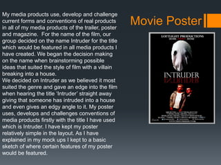
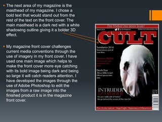
This document discusses how the student's media products for their A2 project use, develop, and challenge conventions of real media. Their main product is a movie trailer for the film "Intruder". Their ancillary products are a film poster and magazine front cover promoting the film.
The student analyzes the conventions they used in each product, such as the title text style, billing block, date, social media links, images, and taglines. They also discuss film techniques like shots, editing, music, and storytelling elements used in the trailer.
The student believes their combination of products is effective because they maintained consistency across the products, like keeping the same title text style. This helps manage continuity and makes
The document analyzes the ways the media product uses, develops, and challenges conventions of real media.
The trailer conforms to zombie horror conventions like a dark tone, props/costumes, and tension building music. However, it challenges conventions by having a female protagonist who is strong rather than a damsel, and shows individual character stories intersecting instead of forming a group.
The poster conforms to conventions like a bold title and credits but challenges conventions by using CCTV footage as the main image rather than characters.
The magazine cover is inspired by real covers but challenges conventions by using four colors instead of three and images from the trailer rather than standalone shots. It develops conventions by adding extra information banners and
The document provides information about various film techniques used in media studies coursework, including match on action, the 180-degree rule, and shot/reverse shot. It then describes the process of planning, filming, and editing a preliminary task and main task project involving a stalker following a girl home. Key challenges included coordinating shots, dealing with wind noise, traffic safety, and ensuring continuity across reshoots. Learning included improving camera skills and continuity, as well as receiving feedback from a screening questionnaire.
A2 Level Media Studies - Evaluation Question No. 1 Art Noble
This document summarizes how the media project used conventions of real thriller films. It discusses how the trailer used conventions like quick cuts, dim lighting, and a three-act structure. Research was done on successful thriller trailers. The website was designed to advertise the film simply without unnecessary interactivity. Inspiration was taken from other thriller film posters to create a poster with a shattered effect and critic quotes. Overall, the project aimed to adhere to thriller conventions while adding some unique elements.
Evaluation Question 2 - How Effective Is The Combination of Your Main Product...Charlotte Daly
The document provides an evaluation of the effectiveness of combining a film poster and magazine double-page spread as promotional products. Key points:
- The poster and magazine spread use similar color schemes and imagery to create synergy between the products and more effectively promote the film.
- Both products incorporate conventions of their genres, like the poster including film credits and the spread using features like pull quotes.
- While the products could have been more creatively different, their coordinated design helps tie them together as promoting the same film.
This document discusses how the media producer's horror film trailer, magazine cover, and poster use, develop, or challenge conventions of real media forms.
The trailer is constructed conventionally, using titles, logos, black-and-white photos, soundtracks, and locations similarly to existing horror film trailers like Ouija. Some techniques like longer black screens and different text alignments challenge conventions slightly. Parallel editing is used to create dramatic irony, challenging genre conventions.
The magazine cover is inspired by Empire magazine, and the poster is inspired by Ouija, making their styles consistent with their inspiration. Mise-en-scene features Halloween costumes and dark clothing to match the genre. Overall, the media products
The document discusses how the media products use, develop, and challenge conventions of real media. It summarizes that the trailer, poster, and website use many typical conventions like including the main character, film title/names, and institutional information. However, some conventions were developed, like adding a rewind to the trailer and changing the poster layout. Some conventions were also challenged, such as switching typical gender roles in the trailer and adding an interactive element to the website homepage. The response analyzes each product individually and concludes that the products fit conventions while also having individualized developments and challenges.
The document discusses ways in which the creator copied elements from other horror genre works like posters, magazines, and trailers to develop their own horror project. Some things copied included color schemes, layouts, fonts, and shots. The creator also discusses ways they developed and challenged elements compared to the original works, such as using different titles, logos, locations, and adding their own short film footage. The goal was to create something intimidating and dramatic for the audience while challenging themselves with new technical aspects.
The media products created used conventions from real products to fit within expected codes. The trailer followed conventions like focusing on the main character, being 30-60 seconds, starting slow and building pace, including text/voiceover, and suspenseful music. The poster included the main characters, release date, actors' names, film name/font, and tagline. The website featured the trailer, navigation, production company name, large film name, and main actor. Some conventions were developed, like adding a rewind to the trailer and unique poster layout. Conventions were also challenged, such as switching expected gender roles in the trailer and adding certification to the poster.
The document summarizes feedback received from a focus group on various media products created to promote the crime film "Crook", including a trailer, magazine cover, and poster. For the trailer, focus group members commented positively on how the music built atmosphere and suspense. For the magazine cover, members noted that the red theme conveyed danger and the cover looked professional. Ratings for the products were mostly positive, with the poster receiving a few 3 and 5 star ratings.
The document summarizes the creation of a film trailer, magazine cover, and poster for a female superhero action film. It discusses how conventions of the genres were followed, such as using dramatic music and titles in the trailer. Conventions were also challenged, like focusing on relationships between female characters instead of only action. Feedback noted that more plot details could have been shown. Various software programs like Photoshop and Premiere Pro were used to edit images and create the media pieces.
The document discusses how the media product uses, develops, and challenges conventions of real media. It followed conventions like focusing on the main character in the trailer, using appropriate trailer lengths, and increasing editing pace. It developed conventions by customizing the color scheme. It challenged conventions by having a female lead instead of male and not showing the killer to build suspense. The document concludes it created professional-looking products that fit with conventions but were also unique.
The document discusses how the media product uses, develops, and challenges conventions of real crime thriller films and their trailers, magazines, and posters. It analyzes how the genre, mise-en-scene, music, themes, and locations both follow and subvert crime film conventions. Regarding trailers, it uses conventions like titles, music, and key moments but challenges the voiceover. The magazine cover uses conventions like the masthead and buzzwords but develops the film title. Finally, the poster uses conventions such as credits, logos, film titles, release dates, and slogans found in real media posters.
The document provides responses to questions about a media production project. It summarizes the ways the media product developed or challenged conventions, including using title screens, logos, score changes, text inserts, shots, editing, and mirror scenes similarly to other media. Feedback found the trailer looked professional due to realistic camerawork and editing, though acting was amateur. While some would see the film due to intriguing plot, others felt the trailer gave too much away. Areas for improvement included using a scarier poster image. The document also details the use of iMovie, Final Cut Pro, LiveType, After Effects, and Photoshop in constructing, researching, and evaluating the project.
The media product uses and challenges some conventions of documentary-style "making of" films. It conforms to conventions like using locations related to the fictional film's story and time period, and including props and costumes that provide context. However, it challenges conventions by having the film discussed be fictional rather than real, and by mixing timeline shots without a clear narrative. Interviews are included to give background as in real "making of" films but the purpose is partly comedic since the featured film is not real.
Pablo used various technologies throughout the construction, research, planning and evaluation stages of his project. During research, he used Blogger to structure his ideas and research trailers on YouTube. He also used Survey Monkey to conduct a survey and social media like Facebook and Twitter to interact with his target audience. For construction, he used a Canon camera and microphone to film and a Macbook with Final Cut Pro to edit, where he utilized effects and precise editing. During evaluation, he created presentations using Prezi and Slideshare to answer questions and share on his blog. He found these presentation tools interactive and useful for breaking up written responses.
The document provides details about the production of an opening title sequence for a crime thriller film called "Fixation". It discusses the inspiration taken from films such as Se7en and Gone Girl. It describes the roles of the production team members, including the director, producer, editor, and director of photography. It discusses the camera work and editing approach, which involved close-ups, varied angles, and color grading to achieve a sinister tone. The production challenged some conventions by revealing the antagonist early and giving the audience an advantage of knowing the villain.
The document discusses the equipment, software, and websites used to create a trailer, poster, and magazine for a film project. A Canon 550D SLR camera was used for filming due to its light weight and ease of use. Final Cut Pro X was used to edit clips, add transitions, titles, and effects to create tension. Music was taken from Purple Planet Music and altered to fit the video. Photoshop and Illustrator were used to design the magazine cover and poster, allowing logos and titles to be precisely positioned. Research websites like Val Morgan and YouTube provided information on target audiences and conventions of trailers. Issues with repetitive footage were overcome through editing techniques in Final Cut Pro X.
Motion graphics and visual effects have evolved significantly since their early uses in film. Motion graphics first appeared in title sequences during the silent film era to convey information about the film. By the 1950s, title sequences incorporated animation and sound to set the mood and portray the film's story. Pioneers like Saul Bass designed minimalist title sequences that effectively summarized the entire film for audiences. Visual effects techniques also advanced, starting with matte painting techniques used by directors like Georges Méliès to create fictional settings. As technology improved, matte painting transitioned to digital techniques and blue/green screen compositing, enabling more advanced CGI effects. Major breakthroughs included the first CGI in Westworld and realistic dinosaurs in Jurassic Park.
The document discusses motion graphics and compositing. It provides examples of effective title sequences from films like The Pink Panther and Catch Me If You Can that set the tone and establish key elements of the story in a concise visual way at the beginning. It also examines the evolution of visual effects techniques from matte painting to CGI, noting how techniques like blue/green screen compositing expanded what stories could be told on film by placing actors in fictional settings.
The document discusses the importance of gaining audience feedback at various stages of creating a media product. It describes getting feedback on a rough cut of their teaser trailer from other students, which highlighted positives like good editing but also areas to improve like shortening the length. Further feedback was gathered on the final teaser cut, poster, and magazine. This feedback confirmed the products cohesively conveyed the genre and satisfied the target audience, ensuring the work would be successful.
This document summarizes Hannah Clark's evaluation of her "Soap Opera Project" coursework. It describes her initial research process of analyzing soap opera trailers on YouTube. For her media product, she created a soap opera trailer titled "Behind Closed Doors." She discusses the conventions she employed, such as dramatic music that builds tension. Feedback indicated her magazine cover could have used more photos. Overall, she learned new skills using equipment and editing software, and gained experience evaluating her work.
The document discusses how the media product uses and challenges conventions of real media forms and genres. It summarizes that the teaser trailer follows conventions of typical duration at just over a minute, and fast pacing, but challenges conventions in its use of sound and inclusion of actor names. The poster follows conventions like eye-catching font and captivating image but challenges conventions of billing block size and inclusion of actor names. The magazine cover follows conventions of character positioning and special edition tagline, but challenges placement of barcode and text size. The film develops crime genre conventions of antagonist/protagonist introduction and hacking narrative/setting but would not fit conventions of forensic crime genres.
William Young created a video game animation project and documentary film trailer and posters to promote a hypothetical documentary about Monty Oum, the creator of the animated web series RWBY. Strengths of William's work included thorough research on inspiration sources, access to online resources, and sticking to a planned schedule. However, the planning could have included more variety in the mood board. The documentary trailer mixed footage, music, and narration well but receiving peer feedback identified areas for improvement like camera angles during dramatized scenes. The posters effectively referenced RWBY while having some minor aesthetic flaws. Overall, the project was an effective tribute aimed at fans of Monty Oum's work.
Lunar Productions created a trailer, poster, and magazine for their horror film "Crow's Field". In the trailer, they used conventions like filters, titles, and musical score while challenging conventions like not including a voiceover. On the poster, they included the film title, credits, and a main image featuring contrasts and symbolism. Overall, Lunar Productions aimed to use conventions to attract audiences while also developing conventions like ambiguous release dates to maintain mystery.
The document provides an evaluation of how a film poster and magazine cover use, develop, or challenge conventions of real media products.
For the film poster: The title, tagline, image, actors' names, billing block, and color scheme generally use conventions seen in real film posters. Some elements like the tagline placement develop conventions.
For the magazine cover: The skyline, title, main cover line, cover lines, puff, and barcode reinforce conventions, while the large central image of the actors develops conventions by filling the entire cover rather than having a background. The color schemes of both are consistent with conventions.
The document discusses how new technologies were used in the construction, planning, research, and evaluation stages of a music video project.
It describes using a Canon camera to film shots for the music video. Final Cut Pro software was used to edit the video and add changing backgrounds. Pixlr software was used to design the digipak and magazine advert. Research involved analyzing other artists' work online. Evaluation questions were presented using tools like YouTube, Prezi, and PowerPoint.
The student created a teaser trailer, poster, and website for a horror film as part of their A2 media studies course. They conducted extensive research into existing horror film conventions to ensure their products adhered to typical codes and genres. Feedback from target audiences helped the student improve their teaser trailer by making scenes faster paced. A variety of media technologies were used at different stages, including YouTube for research, Windows Movie Maker for planning, and editing software to construct the teaser trailer.
Tanaka Tiriboyi evaluated their media products including a film poster, magazine, and trailer. For the poster, Tanaka followed conventions such as including the film title, character image, slogan, and cast/crew information to make it look professional. Some conventions were developed, such as placing the character image in front of the title to emphasize their importance. For the magazine, conventions like the masthead, promotional text, and thumbnail images were used. Developing conventions included overlapping the main image and tagline. The trailer included disclaimers, production logos, camerawork to convey emotion, and mood music as conventions. Developing conventions in the trailer included changing the upbeat soundtrack in the second half for irony. Feedback
The document discusses how new media technologies were used at various stages of creating a horror film marketing package, including a teaser trailer, poster, and magazine cover. Research was conducted online using Google. Photoshop was used to design the magazine cover and edit photos. A digital camera was used to take production stills. Final Cut Pro was used to edit the teaser trailer. Blogger was used to share work online. SlideShare was used to publish a presentation. Throughout the process, technologies helped with construction, research, planning, and sharing of the project.
1) The film uses conventions of horror genre films such as jump cuts, black and white filming, and tense music. However, it also challenges some conventions through its use of multiple cameras in conversations and posters that feature both protagonist and antagonist.
2) Feedback showed that the office scene sound needed balancing, so voice levels were adjusted. A questionnaire was used to gather data rather than interviews for its usability.
3) Traditional media like pencils as well as digital tools like cameras, Adobe software, YouTube and imgur were used at different stages for planning, filming, editing, posters and evaluation. File conversion between different camera formats took time.
The document discusses how the student followed conventions of real film trailers in constructing their own trailer. This included including a green screen at the start, age ratings, and studio logos in familiar places. Feedback on the trailer was positive overall. The student also ensured their magazine and poster ancillary materials matched the trailer in terms of colors, fonts, and characters featured to maintain consistency across products. The student learned from audience feedback that the trailer effectively conveyed the plot and generated interest in watching the full film. A variety of media technologies were used at different stages of the process, including YouTube for research, cameras for filming, and Adobe Premier Pro for trailer editing.
Rory Parker created various media products for a course that followed conventions of real media in the horror genre. This included a magazine cover promoting a horror film with appropriate fonts, colors, and layout. Feedback indicated the cover was effective at conveying the horror genre. For a film trailer, conventions like ominous music and editing techniques were used. Audience research found that horror fans prefer films with death, violence and ambiguous endings. Modern media technologies supported the planning, production and evaluation stages.
The document describes the use of various new media technologies during the research, planning, construction, and evaluation stages of creating a horror film teaser trailer, poster, and magazine cover. Google, IMDb, Empire magazine, Total Film, YouTube, and Wikipedia were used for initial research. Word, Blogger, and a digital camera were used in the planning stage. iMovie, InDesign, Photoshop, and a camera were used for construction. YouTube, questionnaires, a dictaphone, Word, PowerPoint, and Slideshare were used for evaluation.
The document discusses the evaluation of a film trailer created by the author. It describes how the trailer used and challenged conventions of existing media products. Creating an effective combination of comedy and action for the trailer's genre was challenging. Feedback from the target audience helped improve the trailer. A variety of media technologies were used in the research, planning, production, and evaluation stages, including software for storyboarding, editing footage, and publishing the final trailer online. The finished trailer follows Todorov's model of narrative structure. Differences between the planned and final trailer, poster, DVD cover, and magazine cover are also noted.
The document discusses a student's choice to create a promotional package for a new horror film that includes a teaser trailer along with additional promotional materials. The student chose this brief to gain experience with film editing software. They partnered with a friend and created a teaser trailer called "The Descent" along with additional materials like a film poster and magazine cover. Through research of horror conventions, they developed the trailer with techniques like a building soundtrack, darker lighting and faster editing. Their additional materials kept a consistent style and featured the main actress. The student believes their package effectively promoted the film while challenging conventions.
1. The candidate created a film poster, magazine cover, and teaser trailer for their media portfolio that followed conventions of real media products in their genres.
2. Feedback indicated the strengths were title slates, effects, and retro style suiting the sci-fi genre. Improvements could be shorter clips and clearer storyline.
3. The candidate used various media technologies like Blogger, Photoshop, GarageBand, YouTube, and camera equipment to construct, research, plan, and evaluate their portfolio.
The student used various media technologies at different stages of their research project. In the research stage, they used Google, YouTube, and IMDb to research trailers, posters, and magazine covers. To present their research findings, they created Prezi and SlideShare presentations. They also used iMovie to compile their research on magazine covers. In planning their final project, the student created storyboards on StoryboardThat and used Photoshop to design mock posters and magazines. To construct their main product and ancillary texts, the student utilized Final Cut Pro, GarageBand, Motion, Photoshop, and Wix. They published their film trailer on YouTube and chose SlideShare and Prezi for their evaluation presentation
The student used various media technologies at different stages of their research project. In the research stage, they used Google, YouTube, and IMDb to research film trailers, posters, and magazine covers. To present their research findings, they created Prezi and SlideShare presentations. During the planning stage, they created storyboards on StoryboardThat and used Photoshop to design mock posters and magazine covers. To create their final products, the student used Final Cut Pro, GarageBand, Motion, and Photoshop to edit footage, add effects and titles, and design the poster and magazine cover. They published their film trailer on YouTube and used Prezi and SlideShare for their evaluation presentation.
The student used various media technologies at different stages of their research project. In the research stage, they used Google, YouTube, and IMDb to research trailers, posters, and magazine covers. To present their research findings, they created Prezi and SlideShare presentations. They used iMovie to construct their magazine covers. In planning their final product, they created storyboards on StoryboardThat and used Photoshop to design mock posters and magazines. To construct their main product and ancillary texts, they used Final Cut Pro, GarageBand, Motion, Photoshop, and Wix. They uploaded their finished film trailer to YouTube and chose SlideShare and Prezi for their evaluation presentation.
The student used various media technologies at different stages of their project. In research, they used YouTube to analyze existing trailers and see audience feedback. They created a storyboard using a Blackberry and Windows Movie Maker. To film their trailer, they used a digital SLR camera and edited in TrakAx. Photoshop was used to edit still images for the poster and website. The website was created using Wix, which allowed importing images, video, and text but had some limitations. Feedback was gathered through questionnaires and uploading the trailer to YouTube.
The film uses techniques like jump cuts and electronic sound effects that conform to horror genre conventions. It also challenges conventions by using a multi-camera setup for conversations. Audience feedback found the sound quality was weakest, so it was improved. Traditional and digital tools were used at different stages - pencils for storyboards, cameras for filming, Adobe and Microsoft software for editing, Photoshop and InDesign for posters and articles. Technologies allowed flexible creation but also caused issues like incompatible file formats.
The document summarizes how a student used various media technologies at different stages of creating a horror movie trailer for a class project. It discusses researching real horror movie trailers on YouTube and magazines to understand conventions. Planning involved using Word for a shooting schedule and online research for filming locations. Filming used Canon cameras and Photoshop to create Polaroid images. Editing the trailer used Final Cut Pro to cut footage and add effects. Photoshop was also used to design ancillary materials like a movie poster and magazine cover that complemented the trailer. Feedback on a draft led to changes like altering tone cards and adding dialogue and voiceovers.
The document discusses the process of creating promotional materials for a film project including a teaser trailer, poster, and magazine cover. It describes analyzing existing examples to understand conventions of the genre. Feedback was gathered from an audience who felt the locations and visuals matched the crime genre. Some elements like the magazine cover background could be improved. Overall, technology played an important role in research, production, and editing the final materials.
The document describes how the author used various online tools and resources to research and create their film project. They used websites like Art of the Title, Netflix, and YouTube to find inspiration from title sequences in other films. Scoop.it was used to collect research articles and trailers related to their film themes. Google Forms and Piktochart helped with audience research and creating infographics. Final Cut Pro was the editing software used to assemble the footage. Other software like Photoshop, Blogger, Canva, and online resources helped with additional aspects of pre-production, post-production and promotion.
The document provides an evaluation of a student's media coursework project. It summarizes how the student's media product used and challenged conventions of horror film trailers, posters, and magazines. It also discusses how the student incorporated feedback into improving the project, such as speeding up some shots for increased tension. New media technologies like Photoshop, iMovies, and Blogger were used at different stages of production and to showcase the final work.
This presentation was provided by Steph Pollock of The American Psychological Association’s Journals Program, and Damita Snow, of The American Society of Civil Engineers (ASCE), for the initial session of NISO's 2024 Training Series "DEIA in the Scholarly Landscape." Session One: 'Setting Expectations: a DEIA Primer,' was held June 6, 2024.
How to Manage Your Lost Opportunities in Odoo 17 CRMCeline George
Odoo 17 CRM allows us to track why we lose sales opportunities with "Lost Reasons." This helps analyze our sales process and identify areas for improvement. Here's how to configure lost reasons in Odoo 17 CRM
Exploiting Artificial Intelligence for Empowering Researchers and Faculty, In...Dr. Vinod Kumar Kanvaria
Exploiting Artificial Intelligence for Empowering Researchers and Faculty,
International FDP on Fundamentals of Research in Social Sciences
at Integral University, Lucknow, 06.06.2024
By Dr. Vinod Kumar Kanvaria
This slide is special for master students (MIBS & MIFB) in UUM. Also useful for readers who are interested in the topic of contemporary Islamic banking.
How to Fix the Import Error in the Odoo 17Celine George
An import error occurs when a program fails to import a module or library, disrupting its execution. In languages like Python, this issue arises when the specified module cannot be found or accessed, hindering the program's functionality. Resolving import errors is crucial for maintaining smooth software operation and uninterrupted development processes.
How to Setup Warehouse & Location in Odoo 17 InventoryCeline George
In this slide, we'll explore how to set up warehouses and locations in Odoo 17 Inventory. This will help us manage our stock effectively, track inventory levels, and streamline warehouse operations.
Executive Directors Chat Leveraging AI for Diversity, Equity, and InclusionTechSoup
Let’s explore the intersection of technology and equity in the final session of our DEI series. Discover how AI tools, like ChatGPT, can be used to support and enhance your nonprofit's DEI initiatives. Participants will gain insights into practical AI applications and get tips for leveraging technology to advance their DEI goals.
বাংলাদেশের অর্থনৈতিক সমীক্ষা ২০২৪ [Bangladesh Economic Review 2024 Bangla.pdf] কম্পিউটার , ট্যাব ও স্মার্ট ফোন ভার্সন সহ সম্পূর্ণ বাংলা ই-বুক বা pdf বই " সুচিপত্র ...বুকমার্ক মেনু 🔖 ও হাইপার লিংক মেনু 📝👆 যুক্ত ..
আমাদের সবার জন্য খুব খুব গুরুত্বপূর্ণ একটি বই ..বিসিএস, ব্যাংক, ইউনিভার্সিটি ভর্তি ও যে কোন প্রতিযোগিতা মূলক পরীক্ষার জন্য এর খুব ইম্পরট্যান্ট একটি বিষয় ...তাছাড়া বাংলাদেশের সাম্প্রতিক যে কোন ডাটা বা তথ্য এই বইতে পাবেন ...
তাই একজন নাগরিক হিসাবে এই তথ্য গুলো আপনার জানা প্রয়োজন ...।
বিসিএস ও ব্যাংক এর লিখিত পরীক্ষা ...+এছাড়া মাধ্যমিক ও উচ্চমাধ্যমিকের স্টুডেন্টদের জন্য অনেক কাজে আসবে ...
2. Question: 1 in what ways does your media product
use, develop or challenge forms and conventions of real
media products?
For my A2 project I have been asked to create a movie
trailer, film poster and a magazine front cover showing the
film. My media products follow most conventions found in the
horror genre of film, I know this as I have carried out prior
research into horror before commencing with the production
of my media products.
3. My media products use, develop and challenge
current forms and conventions of real products
in all of my media products of the trailer, poster
and magazine. For the name of the film, our
group decided on the name Intruder for the title
which would be featured in all media products I
have created. We began the decision making
on the name when brainstorming possible
ideas that suited the style of film with a villain
breaking into a house.
We decided on Intruder as we believed it most
suited the genre and gave an edge into the film
when hearing the title „Intruder‟ straight away
giving that someone has intruded into a house
and even gives an edgy angle to it. My poster
uses, develops and challenges conventions of
media products firstly with the title I have used
which is Intruder. I have kept my poster
relatively simple in the layout. As I have
explained in my mock ups I kept to a basic
sketch of where certain features of my poster
would be featured.
Movie Poster
4. The title of my poster has Perpetua MT light text. I
have inserted a text and once it is in place I
flipped the text 180` so that the top half of the text
mirrored the bottom half of the text. This is an
effective style as in my research I noticed several
film titles that have used this and with the image
they have used it looks very effective in drawing
people to the poster. I also chose to use this
mirrored affect as it links in with drips of blood
going from the top half being white going into the
bottom half which is of a blood red text mirroring
the top half showing another side to the text. My
main tile section challenges conventions also with
the positioning of my title.
I have place in dead in the centre of my poster
were as I have found the high percentage of
movie posters place their title three quarters of the
way down In the poster. I wanted to place my
main title in the middle as it is where the person
would look first followed by the next main image
which in this case would be the intruder. Having
my text centred it made room for other sections of
the poster to be brought in at a larger size e.g.
images. I tested having the title near the bottom
but it did not look that professional in the sense
that it left no room for my images I would be using
for my poster.
5. Another convention my media product
uses is the Billing block. This is used in
both my poster and also the trailer. The
billing block has been used to give
credit to people who were involved in
this production. The billing block sets
out different categories of the
production such as producers, directors
and writers. We have used this billing
block as it is what is used in real
productions and also their media
products such as movie posters. Our
billing block includes everyone that as
involved in the production from casting
to directing it. All of these roles were for
filled by our group members. As you
can see from the example to the right
we have followed this convention of the
billing block from a blockbuster film to
our own.
6. Another convention used for my poster is the date.
This is used in real media productions and is used to
show when the film‟s release date is. I used existing
conventions using numbering to show the date
instead of using words. Having numbers was more of
an advantage as it made the space for the date
shorter which makes up more room for my poster.
Another convention is the use of a website link. I have
used this convention as every recently released
production will either have a website or if not the film
company‟s website. I have used this with
„WWW.THEINTRUDER.CO.UK‟.
The next convention I have developed is the use of
social media links. I found this effective to a movie
company as the use of this will get the film and any
information out to its audience through social media
sites such as Facebook, twitter and YouTube. When
designing my poster and inserted these entire social
media site with the correct name of our film name.
7. I have used another convention of including a tag
line in my poster. Through researching other
horror posters I came across the use of tag lines
in every poster. This was important to use in my
media product as it is a hook to audience if a
clever quote is to be used for this. In my media
product I have used “Home Sweet Home”. This
clever quote is short but also effective relating
back to a house where our trailer is based at. This
quote is often used when describing a house so I
believe this is a great benefit to my poster.
Images were another convention I challenged in
my products. I have taken two images for my
poster one on top of the other. I challenged the
conventions of the stranger‟s poster which was
released in Spain. I took this and went on to
develop it to make it my own product which I
believe I have done effectively. I have positioned
the protagonist on the top of the two main
characters with the protagonist looking straight
into to camera with the two teenagers looking out
to the distance.
8. My next media product I have created is the movie
trailer with conventions. In our trailer we produced a
voice over to introduce the trailer. To do this and make
it effective we created a script for someone to read out
making the broadcast sound like a radio
broadcast, this was followed up by our group having a
teacher from another class read this message out
while we recorded the speech. We challenged this
convention by putting out own version of a radio
broadcast to it. The next convention we challenged in
our production was the variety of shots we produced.
The first area of shots would be a slow pan. This initial
shot was used for the Maghull sign in which we based
the trailer off showing its initial location. We also used
a pan when shooting the scenery and housing estate
which we would then go onto shoot the interior house
scenes from. We progressed on to use more up close
shots when the trailer moved to an inside location of
the interior house scenes.
Trailer
9. Our first shot type is the medium close up which was a well-
used shot type as all shots were inside the space was
restricted so a medium close up was an ideal size for shot as
it still left room for movement in shot. We moved on to
capture aspects of the house such as shots of the kitchen
sink dripping water with a close up to gather the whole motion
of the tap dripping. Another shot we challenged and used in
our production was an over the shoulder shot going into a
shaky cam.
This shot was from the intruder‟s perspective when he was
standing behind the teenage boy who shows him turning to
look behind him and then going straight into a shaky cam
affect when the character notices the intruder. I found this
type of shot to be interesting to incorporate into our
production because it made the camera work look more
realistic and seem as the intruder to be up close with the
teenagers
10. Another way in which my media trailer challenges a real media product
would be its location, when scouting locations pre-production we wanted
to use establishing outdoor shots of scenery to establish the interior
shots would be away from a city and in a rural location. Interior shots
were filmed from a group members house were all interior shots were
filmed. This being we wanted to have a film inside were aspects from
other films researched such as paranormal activity were creepy and
abnormal things happen when a central protagonist enters the story
plot.
Music is the next section when we challenged conventional uses of
music and changed the style of it. When researching into current movie
trailers of the horror genre we all found the use of earey music with a
chilling edge of creepiness to the them such as Insidious „tip toe through
the tulips‟ song which when listened to instantly makes you think of the
film and its series of films. This style of creepy music with high pitched
audio challenges current media products and we have challenged this
by using a similar audio clip through half the trailer which like the real
media product gives a creepy feel when listening to it. Researching into
horror trailers we noticed certain aspects about cuts in the production of
the trailers. These tend to be fast paced and close to the end climax
with an action packed scene. This would be something we would use
and challenge for conventions when filming and later editing the clips on
the Macs with iMovie.
11. To build up the story we had to tell a plot and
show action sections that would appeal to the
target audience. Dark editing was another area
we used for our trailer when later on in the
trailer the story becomes more intense with
added action scenes so with these, this dark
editing makes the scene look more darker in
the sense of scare quality was essential to be
managed as if the clips were edited incorrectly
and made to look too bright then this would not
appeal to the target audience and also leave
viewers confused on why colours have
changed from dark colours to a sudden bright
change. This style of editing has been seen I a
lot of my research on new trailers such as the
marked ones, Devils Due and Repentance
which all use this style of editing.
Another section like my poster media product
is the billing block which is important to use as
it would show the people involved in our
production of our trailer. Using this convention
made our production even more like the real
thing because it would be used in the film
industry giving credit to the main people in the
production.
12. The next section in which our trailer uses
media conventions is the use of title frames.
We have used fived title frames to add to the
developing story being told. These sections
would break up the trailer through text being
shown on screen. The images on this slide
show all the title frames we have included to
the trailer. The frames are also linked to the
viewer asking them what would you do if your
home became your worst nightmare? The
text was edited through Photoshop with a
rugged aged affect giving it a creepy shadow
with the text. We changed the colour to the
last frame which was Nightmare to give a
bold ending to these title frames with the link
of blood through the blood red colouring in
the text.
The intruder title would follow at the end of
the trailer which connects with the title frames
with the colouring of red and whites.
13. My last ancillary media product is my movie
magazine. For this section I used all sections of
develop challenge and used forms and
conventions of media products. I researched into
many magazines in my chosen genre of horror. I
wanted to research into horror magazines rather
than conventional film magazines such as Total
film as I wanted my magazine to follow the
conventions of our trailer with horror so I believe
keeping it within this genre will make it more
affective.
Researching into many magazines such as
Fangoria which instantly gives away the horror
genre just by its title giving it a unique selling
point and something I wanted to incorporate into
my magazine.
Movie Magazine
14. The next area of my magazine is the
masthead of my magazine. I chose a
bold text that would stand out from the
rest of the text on the front cover. The
main masthead is a dark red with a white
shadowing outline giving it a bolder 3D
effect.
My magazine front cover challenges
current media conventions through the
use of imagery in my front cover. I have
used one main image which helps to
make the front cover more eye catching
with its bold image being dark and being
so large it will catch readers attention. I
have developed the images through the
use of Adobe Photoshop to edit the
images from a raw image into the
finished product it is in the magazine
front cover.
15. The intruder title I have used for my
magazine front cover is the exact same
layout and positioning as found in my
movie poster I have also created. I will
challenge this media convention of
carrying the text on through to different
media products in my magazine which is
seen here in my front cover. The text
layout is still reversed.
Another section of the title is the tag line I
created to accompany the title of the front
cover mains story. For the tag line I used a
quote saying “Are you really safe at
home?” followed with “We go behind the
scenes of the new hit” coming from the
magazines perspective.
16. Modern magazines have used well
recognised social Medias to attract more
people to their website. I have used this
convention of including social media to link
to the magazines name along with social
media logos such as Facebook & Twitter. I
believe this makes my product look more
like the real thing. I wanted to include social
media links down to the fact that all Medias
now a days will include these links in a way
of attracting audiences that use such social
media sites as Twitter, Facebook and
YouTube.
The black screen shot shown below is my
social medias used in the front cover, these
include the twitter bird logo and the „F‟ logo
for Facebook.
17. The next section to my movie magazine is the use
of the Magazine date, magazines website, price
and barcodes. The first section of my magazine is
the issue date, this is a part I wanted to include as
other sections like the website, it is a little added
extra feature but makes the magazine seem more
real as this date is a well-used feature to
magazines as it sets out what date it was issued
on.
Like my other ancillary product I have included the
magazine‟s website. This feature like the social
media links will bring extra customers to view the
link on different platforms. This was a large feature
to include because throughout all my research on
movie magazines this was seen in every front
cover.
18. The last feature was price and barcode, firstly pricing I have
priced my magazine at £3.99. Many movie magazines are
set at a higher price e.g. £4.99-£6.99 but to be more
competitive and still attract my target audience I set mine at
£3.99 a price that is reasonable for a teenage market. I set
my pricing in the same text as used in my front cover and
also placed it on top of the barcode to make it more legible
for anyone reading it. The last section barcode has been
used to allow more efficient purchasing when scanning the
magazine. All products will have this barcode and has been
used for many reasons.
Firstly is the look of it, if it was not to be used then my
magazine would not be able to be scanned when being
purchased. Secondly it makes the overall look of my
magazine more professional having it. I have placed it at
the bottom of my front cover with the price on top of it. I
believe using this convention makes my product look more
like the real thing because I have recognised all magazine
front covers I researched into have used a barcode so was
necessary for me to carry this feature out into my movie
magazine front cover.
19. Question 2: How effective is the combination of your main product and
ancillary texts?
My main product and ancillary are effective with each other for many
purposes. The first one is text styling. My group‟s trailer has used a text
for the tile Intruder which I have kept the same for my two ancillary
products. Research told me that it is rare for a film to change to its text
style when broadcasting the film through other Medias like movie
magazines and social media. So to act on this I have kept the text the
same throughout all three types of media products to manage the
continuity of my films style of film.
Perpetua MT was used in all three which I know makes the film look more
realistic to a real film because changing the style of text in other styles
would be confusing for the audience as it would look like different film all
together if a different text was to be used. I have also kept the styling of
the text the same in both of my ancillary products with the two layers of
text with the bottom layer being flipped to be upside down which is also
included in my movie magazine front cover. Using this same style will
make my products easier to recognise through different types of media
and more professional looking because it is unlikely for a branded film
series to change their text on their products.
20. The billing block is another area of media products I have combined
both main products and ancillary texts. This area was key to giving
credit to those who were involved with the overall production. This was
devolved in Adobe Photoshop for all the different sections that needed
to be mentioned in it. Once complete it was inserted into our trailer at
the end. Finally I have inserted it into my poster. I have placed this at
the base of my poster where the space was available to put text of this
size here.
Image is another area for my media products. From my main media
product the trailer I was inspired for the style of photography to be used
to use for my ancillary products. I was inspired by the dark cuts we have
used in our trailer and the edgy shots of the teenagers who are scared
in these scenes. So to build on this I have used images to act on this
showing the two teenagers with frightened looks on their faces. This I
believe is effective for my poster as I have also inserted the Intruders
face in the background of it adding a sense of creepiness to it.
21. Question 3: What have you learned from your audience feedback?
I have learnt from my audience feedback received many things.
The first way is the constructive criticism I have received from
peer‟s feedback. I printed versions of my poster out and gave it
out to friends and also random people when they had spare time.
The second way of giving it to strangers was a better and more
reliable as they do not know me and would not feel bad if they
found something wrong with it to criticise it.
I would use this criticism to build and change my products to
better my work in the long term. I also gave it to my family
members as a lot of my family work in the media world so would
obviously have a good knowledge of such products as this
poster, I received both good and bad feedback but however I do
not see this to be bad feedback as it will eventually be corrected
and turn into my final product.
22. Another area I have learnt from my audience feedback would
be when carrying out a questionnaire to identify my target
audience in which I would aim my products at. I asked closed
questions to find out straight answers for specific needs I
would need to know for example the age group of the person.
The first question was male or female and there were more
males than females with 70% male and a remaining
30%female. The second question was one of the most
important to be asked. I asked what age are you? I wanted to
ask this as this because it will tell me exactly what is a popular
age range for a trailer to hit a target audience. The most
popular out of all age ranges was the 16-20 and this is the
range I would be targeting. I selected this range as it is a
teenage range and the most likely to go view a horror movie
rather than older ages like the 45+ range with no one selecting
this age.
We used two main characters who are both teenagers so this
would appeal top our audience as well. Another important
question I included in my questionnaire was where does the
user usually view movie trailers. This would tell me what
platforms they would view trailers off. This was important as to
hit my target audience I would use the same platforms to
promote my groups trailer on. The most popular answer for
this out of all options was online through YouTube. This is
where we have published our trailer as it is a wide audience
that uses it and we can gather people‟s opinions through
user‟s comments.
23. Question 4: How did you use new media technologies in the
construction and research, planning and evaluation stages?
I have used new media technologies firstly with my
construction stage of my media products. Firstly I used camera
software to take the raw image files for my media products.
This was done through my Nikon D3X camera. This new
media was used effectively as I have a lot of experience when
using the camera and its settings to alter the images when
taking them.
Blogger was another useful tool that was used in the new
media technologies stage. This was a necessary asset to be
used as it was where all of our work was to be published from.
All coursework would be put on here and could be edited at a
later date to add to a certain post. I have found using blogger
useful because of its simple layout and its accessibility as it is
available on different platforms in which I downloaded onto my
smartphone.
24. Another new technology I have used to create
my media product was Adobe Photoshop. This
tool was a great benefit to my finished product. I
found it easy and was comfortable to use it as I
have had prior experience using this software. It
was the best package to edit my photos on as
using other software‟s for it would not be as good
as the standard of Photoshop.
I found using this package a great benefit as I
had to crop my main two photos down to a size
were they would fit in with the size I needed. If
Photoshop was not to be used to edit my photos
then I believe the images would be of a low
quality and not look as high quality as they do
now. Overall this software was excellent tool to
be used because of its many of options available
to alter images which can benefit my images
being used as this now meant my images could
have more alterations through edits unlike other
software that may have been used, so overall
this was a beneficial package to use for my
images throughout my media products.
25. IMovie was another new technology myself and
our group has used in the editing section of the
trailer. This was the section where the raw
footage would be cut down and edited to piece
together in the needed order of our trailer. This
would be performed on the schools Macs in our
media class room.
Using this software meant we could edit the clips
in a professional editing suite giving the group
more of a stronger benefit instead of using
alternative editing packages such as Windows
Movie Maker. I had little prior experience using
IMovie but quickly became well experienced
when using it to edit the footage. This screen shot
shows the basic layout of the IMovie layout we
have used in class.
26. The next media technology I have used is
YouTube. This tool was necessary to publish
our finished product online through this online
tool to reach a wide audience. We have used
this tool to give our audience a know how about
or trailer with an added benefit of that we can
receive in viewers feedback through online
comments left below the video which can help
improve and alter our productions for future
reference.
The screen shot below shows our actual trailer
once we have published online. Our trailer has
been received positively I believe because of
the amount of views received since publishing it
on YouTube and through other social
medias like Twitter.
27. Microsoft office is the next media technology to be used. This
was simply a necessary package to use for creating any word
document to be uploaded to Blogger. This was beneficially
helpful to my products such as blog posts as creating them in
Microsoft Word came with spell checker so the chances of
publishing any posts on Blogger with misspelled words were to
become less likely to happen. To structure the texts correctly
this was helpful when completing analysis's of trailers which
would include images in between the paragraphs of each other.
Another office product I have used is PowerPoint. I have used
this package when creating my evaluation of the A2 Course.
Which when finishing polished it through my blog with Slide
Share which would allow this document to be inserted onto my
blog.
28. Padlet is another media technology I
have used when gathering research
on my final media product my poster.
Padlet is an online post it note
allowing people to leave comments
which was helpful for my products
when feedback was necessary. On
blogger I have linked in the Padlet in a
blog post to show my final post for my
poster which will receive feedback
from people on my final product.
As you can see from this print screen
the use of Padlet is effective for
collecting feedback with the
comments I have received in this
software.