SlideShare a Scribd company logo
PosterUSE: DEVELOP: CHALLENGE:
One thing I copied from
this folder is the three
colour scheme such as
red, black, and white to
get that horror effect
and also when I did my
audience interviews
they told me that
red, black and white are
horror colours.
Another thing that I
copied are the two
images, I have used a
ghost and a main
character and drag me
to hell uses a main
character and a
monster which is very
similar.
Moreover, the layout of my
poster and the drag me to
hell poster is copied
because my one has to
things to it main character
with a villain and so does
the drag me to hell poster,
the font style is the same
which Is Bell MT, it’s also
the same size. It has a
background just like mine
and it has a dark and light
affect on the images such
as Faith’s face and the
women’s face on the other
poster.
One thing challenged on this is that
fact that the drag me to hell poster
has font on top of the poster, so do I
on mine, but it’s different in font
style, size and colour, my one is put
in 6 words whereas the other one is
in sentences.
Another thing that I have
developed is the use of the
production and company logo. You
can’t see that on the frag me to
hell poster but on mine I have
used it right at the bottom of the
poster.
I have developed my poster by
using dark gradient around the
poster and light in the middle to
be able to see the image of the
people properly.
By using two different
positioning of my photos I
have developed this by making
it look different from the drag
me to hell poster.
One thing I challenged on this is the
fact that I created my own
production company logo and the
distribution logo and I placed that on
my poster, however logos are not
shown on the drag me to hell poster.
Another thing I have challenged from the
drag me to hell poster is using steel
tongs font for the cast and adding the
words coming soon and a release dat.
Whereas this is not shown on the drag
me to hell poster.
Another thing that I have developed is not making
the hero end up being the antagonist at the end and
also developed it by using two antagonists on the
trailer instead of one and the ‘Drag me to hell’ poster
only uses one antagonists.
On this poster I have also
challenged the location of
the background as I have
my back ground in a park
and ‘drag me to hell’
poster has it outside a
house.
MagazineUSE: DEVELOP: CHALLENGE:
One thing I used from
the empire magazine is
the masthead size and
the position of it which
is at the top.
Another thing I have
copied from the
empire magazine is
the words on top of
the masthead but I
used my own phrase
for it.
I have included an
image of one of the
characters in the
cover just like the
empire
magazine, however
the empire magazine
has 2 characters.
One other thing that I
copied from the empire
magazine is the
positioning of the
barcode, they have it
placed on the left side,
but I have mine on the
right side.
One thing that I have
developed from this is
using my own font style
which is bold and looks a
bit like the empire font.
Another thing developed
is changing the position
of the issue date and also
putting on my own issue
date that my magazine
will be released on.
On the empire
magazine we see less
cover lines on the
cover, however I have
used more such as the
ones on the left and
ones at the bottom of
the page.
One other thing is the
colors that I am using
such as red, black and
white for my magazine to
give it that horror effect.
I have used my own image and
used costume and props to make
it interesting and intimidating to
the audience and make them
want to come and watch it.
I have added my own red
cross and beneath that red
cross I have added my extra
cover lines.
I have used my own font style
which I have used on the poster
and I have used it on the magazine
to show the consistency of it.
One thing different on my magazine
is the text, my texts are in small
letters and the ‘Hobbit’ magazine
uses block capitals on it.
Horror Genre TrailerUSE:
I have used something
like this where we wrote
a phrase on the mirror
and they wrote a phrase
on the wall, so this is
something we copied
from the trailer but
changed a bit such as
the words. We have
wrote ‘u are next’ and
they wrote ‘I see you’.
The unforeseen trailer Closed for the season trailer
This is also copied from our trailer the unforeseen you see us running into the park
and there is someone videoing us from the back and in the closed for the season
trailer you see someone running backwards and recording the girl running in
front, which is another thing that I have copied from the trailer.
The shots that we have
copied from the trailer
are close ups, mostly
mid shots and some
long shots to show how
they feel, the location
that they are in and
their facial expressions
to make it intimidating.
USE:
This is another thing I
have copied which is
using the low key lighting
to create that suspense
of the trailer and also it
puts that intimidating
effect to it for the
audience and makes it
dramatic.
Another thing I have copied
is using dialogue in between
to tell the audience what is
happening and give them a
bit of the narrative of the
unforeseen trailer.
Another thing that I have copied is
not revealing the antagonists
face, otherwise it will reveal
everything and won’t be as dramatic
on the film trailer.
This is another copied thing
which is using a park location as
the ‘closed for the season trailer
has the same location on their
trailer.
DEVELOP:
We have wrote our own
titles on the trailer, but
we have not used lots
because it then will take
our shots away and make
our trailer even longer as
our aim was to make it
only 2 minutes long
because it is a normal
trailer not a teaser trailer.
We could have
challenged this and put
a background like the
closed for the season
trailer however we
didn’t because it takes a
lot more time and its
very hard to do.
We have developed our titles by using only small letters and
made then short and snappy. Each shot was at least 2 seconds
long, so that it was quick and like a montage. Whereas the closed
for the season trailer have used block capitals and when I
watched the trailer the shots were at least 3/4 seconds long.
The titles that we have used are telling the audience what is going to
occur but we don’t tell them what is going to happen otherwise our
film trailer will reveal everything that is going to happen in the film.
Which we do not want.
The unforeseen trailer
Closed for the season
DEVELOP:
Another thing I have developed on our
trailer is using two locations such as the
college and also the park, so we have
something that begins in college and
leads it to ending in the park.
Another way that I have developed this is by
adding in our own short film in the trailer, even
though its short it gives the audience a
intimidating feel about the film and used our
own dialogue and other sounds to make it
dramatic.
CHALLENGE:
Closed for the season trailer
The unforeseen trailer
On thing that I have challenged
on our trailer is creating and
designing our own trailer
production and distribution
logos using Photoshop. The
distribution logo is horrific
horror films and the production
logo is the extreme
productions.
Another thing challenged is
putting on our own preview
rating screen at the beginning
to warn the target audience
and this is not used on the
closed for the season trailer
This is the closed for the
season trailer logo they only
have one and we have two. A
distribution and production
logo for our trailer.
Some cinematography shots
that I have challenged are
using high and low angles to
make it even better and
challenge with the closed for
the season trailer.

More Related Content

What's hot

Draft film posters
Draft film postersDraft film posters
Draft film posterserinmcginty
 
Question 4
Question 4Question 4
Question 4dapaz93
 
A2 how does your media product challenge or follow forms and conventions of r...
A2 how does your media product challenge or follow forms and conventions of r...A2 how does your media product challenge or follow forms and conventions of r...
A2 how does your media product challenge or follow forms and conventions of r...
AndyBrown100
 
Medai evaluation
Medai evaluationMedai evaluation
Medai evaluationguest009259
 
A2 Media Film Trailer Evaluation
A2 Media Film Trailer EvaluationA2 Media Film Trailer Evaluation
A2 Media Film Trailer Evaluation
blundenellis
 
FinallllHow effective is the combination of your main product and your ancill...
FinallllHow effective is the combination of your main product and your ancill...FinallllHow effective is the combination of your main product and your ancill...
FinallllHow effective is the combination of your main product and your ancill...katykennedy123
 
How effective is the combination of your main product and your ancillary texts?
How effective is the combination of your main product and your ancillary texts?How effective is the combination of your main product and your ancillary texts?
How effective is the combination of your main product and your ancillary texts?katykennedy123
 
Evaluation q 1 poster
Evaluation q 1 posterEvaluation q 1 poster
Evaluation q 1 posterMaisyDyer
 
Evaluation 1 presentation 2014
Evaluation 1 presentation 2014Evaluation 1 presentation 2014
Evaluation 1 presentation 2014annaquinn_
 
A2 media evaluation new - Oliver Mansfield
A2 media evaluation new - Oliver MansfieldA2 media evaluation new - Oliver Mansfield
A2 media evaluation new - Oliver Mansfieldolivermansfield
 
1. initial plans fmp
1. initial plans fmp1. initial plans fmp
1. initial plans fmp
Louisbiddles7
 
1. initial plans fmp
1. initial plans fmp1. initial plans fmp
1. initial plans fmp
Louisbiddles7
 
Media evaluation
Media evaluationMedia evaluation
Media evaluationowens95
 
How effective is the combination of your main
How effective is the combination of your mainHow effective is the combination of your main
How effective is the combination of your main
JoeUsher123
 
How effective is the combination of your main
How effective is the combination of your mainHow effective is the combination of your main
How effective is the combination of your main
JoeUsher123
 
How effective is the combination of your main
How effective is the combination of your mainHow effective is the combination of your main
How effective is the combination of your main
JoeUsher123
 
Advanced portfolio evaluation
Advanced portfolio evaluationAdvanced portfolio evaluation
Advanced portfolio evaluationAlima Ali
 
How effective is the combination of your main product and ancillary texts?
How effective is the combination of your main product and ancillary texts?How effective is the combination of your main product and ancillary texts?
How effective is the combination of your main product and ancillary texts?chalk94
 

What's hot (20)

Draft film posters
Draft film postersDraft film posters
Draft film posters
 
Question 4
Question 4Question 4
Question 4
 
A2 how does your media product challenge or follow forms and conventions of r...
A2 how does your media product challenge or follow forms and conventions of r...A2 how does your media product challenge or follow forms and conventions of r...
A2 how does your media product challenge or follow forms and conventions of r...
 
Evaluation question 1
Evaluation question 1 Evaluation question 1
Evaluation question 1
 
Medai evaluation
Medai evaluationMedai evaluation
Medai evaluation
 
A2 Media Film Trailer Evaluation
A2 Media Film Trailer EvaluationA2 Media Film Trailer Evaluation
A2 Media Film Trailer Evaluation
 
Media Evaluation
Media EvaluationMedia Evaluation
Media Evaluation
 
FinallllHow effective is the combination of your main product and your ancill...
FinallllHow effective is the combination of your main product and your ancill...FinallllHow effective is the combination of your main product and your ancill...
FinallllHow effective is the combination of your main product and your ancill...
 
How effective is the combination of your main product and your ancillary texts?
How effective is the combination of your main product and your ancillary texts?How effective is the combination of your main product and your ancillary texts?
How effective is the combination of your main product and your ancillary texts?
 
Evaluation q 1 poster
Evaluation q 1 posterEvaluation q 1 poster
Evaluation q 1 poster
 
Evaluation 1 presentation 2014
Evaluation 1 presentation 2014Evaluation 1 presentation 2014
Evaluation 1 presentation 2014
 
A2 media evaluation new - Oliver Mansfield
A2 media evaluation new - Oliver MansfieldA2 media evaluation new - Oliver Mansfield
A2 media evaluation new - Oliver Mansfield
 
1. initial plans fmp
1. initial plans fmp1. initial plans fmp
1. initial plans fmp
 
1. initial plans fmp
1. initial plans fmp1. initial plans fmp
1. initial plans fmp
 
Media evaluation
Media evaluationMedia evaluation
Media evaluation
 
How effective is the combination of your main
How effective is the combination of your mainHow effective is the combination of your main
How effective is the combination of your main
 
How effective is the combination of your main
How effective is the combination of your mainHow effective is the combination of your main
How effective is the combination of your main
 
How effective is the combination of your main
How effective is the combination of your mainHow effective is the combination of your main
How effective is the combination of your main
 
Advanced portfolio evaluation
Advanced portfolio evaluationAdvanced portfolio evaluation
Advanced portfolio evaluation
 
How effective is the combination of your main product and ancillary texts?
How effective is the combination of your main product and ancillary texts?How effective is the combination of your main product and ancillary texts?
How effective is the combination of your main product and ancillary texts?
 

Viewers also liked

Grupo Sys&Procs - Quienes Somos
Grupo Sys&Procs - Quienes SomosGrupo Sys&Procs - Quienes Somos
Grupo Sys&Procs - Quienes Somos
feriadelempleo
 
Medidor de esr_170
Medidor de esr_170Medidor de esr_170
Medidor de esr_170
Abima MantServ
 
Alterações Fisiológicas na Gravidez
Alterações Fisiológicas na GravidezAlterações Fisiológicas na Gravidez
Alterações Fisiológicas na GravidezIsmael de Freitas
 
ASESORIA PARA EL USO DE LA TIC EN LA FORMACION UNID 4
ASESORIA PARA EL USO DE LA TIC EN LA FORMACION UNID 4ASESORIA PARA EL USO DE LA TIC EN LA FORMACION UNID 4
ASESORIA PARA EL USO DE LA TIC EN LA FORMACION UNID 4
ANNYMUGNO
 
Componentes mecânicos
Componentes mecânicosComponentes mecânicos
Componentes mecânicos
Henrique Pinheiro
 
Apresentação Gestão de resíduos
Apresentação Gestão de resíduosApresentação Gestão de resíduos
Apresentação Gestão de resíduos
Leonardo Alves
 

Viewers also liked (7)

Grupo Sys&Procs - Quienes Somos
Grupo Sys&Procs - Quienes SomosGrupo Sys&Procs - Quienes Somos
Grupo Sys&Procs - Quienes Somos
 
Medidor de esr_170
Medidor de esr_170Medidor de esr_170
Medidor de esr_170
 
Grupo 208020 5-trabajo-final
Grupo 208020 5-trabajo-finalGrupo 208020 5-trabajo-final
Grupo 208020 5-trabajo-final
 
Alterações Fisiológicas na Gravidez
Alterações Fisiológicas na GravidezAlterações Fisiológicas na Gravidez
Alterações Fisiológicas na Gravidez
 
ASESORIA PARA EL USO DE LA TIC EN LA FORMACION UNID 4
ASESORIA PARA EL USO DE LA TIC EN LA FORMACION UNID 4ASESORIA PARA EL USO DE LA TIC EN LA FORMACION UNID 4
ASESORIA PARA EL USO DE LA TIC EN LA FORMACION UNID 4
 
Componentes mecânicos
Componentes mecânicosComponentes mecânicos
Componentes mecânicos
 
Apresentação Gestão de resíduos
Apresentação Gestão de resíduosApresentação Gestão de resíduos
Apresentação Gestão de resíduos
 

Similar to Evaluation question 1

Media final evaluation
Media final evaluationMedia final evaluation
Media final evaluationlh193
 
Production of poster and review
Production of poster and reviewProduction of poster and review
Production of poster and reviewbluebirdsyd
 
Evaluation – Question 2
Evaluation – Question 2Evaluation – Question 2
Evaluation – Question 2Jtwumasi
 
A2 media evaluation scary film
A2 media evaluation scary filmA2 media evaluation scary film
A2 media evaluation scary film
lucieminty
 
Poster Progression
Poster ProgressionPoster Progression
Poster Progression
_shannonC
 
Evaluation text
Evaluation textEvaluation text
Evaluation text
t013378
 
Evaluation 2
Evaluation 2Evaluation 2
Evaluation 2
Rebecca Withers
 
Evaluation Question One
Evaluation Question OneEvaluation Question One
Evaluation Question One
freya_blount
 
Evaluation question one
Evaluation question oneEvaluation question one
Evaluation question one
Dylan Pimlott
 
A2 media evaluation
A2 media evaluation A2 media evaluation
A2 media evaluation Roseflaherty
 
My a2 media evaluation part 2
My a2 media evaluation part 2My a2 media evaluation part 2
My a2 media evaluation part 2Bricknell
 
My a2 media evaluation part 2
My a2 media evaluation part 2My a2 media evaluation part 2
My a2 media evaluation part 2Bricknell
 
My a2 media evaluation part 2
My a2 media evaluation part 2My a2 media evaluation part 2
My a2 media evaluation part 2Bricknell
 
Evaluation question 1
Evaluation question 1Evaluation question 1
Evaluation question 1
EmmaRoddy
 
Presentation1
Presentation1Presentation1
Presentation1
Jemmajemmajemma
 

Similar to Evaluation question 1 (20)

Media final evaluation
Media final evaluationMedia final evaluation
Media final evaluation
 
Production of poster and review
Production of poster and reviewProduction of poster and review
Production of poster and review
 
Poster evaluation
Poster evaluationPoster evaluation
Poster evaluation
 
Evaluation
EvaluationEvaluation
Evaluation
 
Evaluation – Question 2
Evaluation – Question 2Evaluation – Question 2
Evaluation – Question 2
 
A2 media evaluation scary film
A2 media evaluation scary filmA2 media evaluation scary film
A2 media evaluation scary film
 
Poster Progression
Poster ProgressionPoster Progression
Poster Progression
 
Evaluation text
Evaluation textEvaluation text
Evaluation text
 
Evaluation 2
Evaluation 2Evaluation 2
Evaluation 2
 
Evaluation Question One
Evaluation Question OneEvaluation Question One
Evaluation Question One
 
Q2
Q2Q2
Q2
 
Evaluation question one
Evaluation question oneEvaluation question one
Evaluation question one
 
A2 media evaluation
A2 media evaluation A2 media evaluation
A2 media evaluation
 
My a2 media evaluation part 2
My a2 media evaluation part 2My a2 media evaluation part 2
My a2 media evaluation part 2
 
My a2 media evaluation part 2
My a2 media evaluation part 2My a2 media evaluation part 2
My a2 media evaluation part 2
 
My a2 media evaluation part 2
My a2 media evaluation part 2My a2 media evaluation part 2
My a2 media evaluation part 2
 
Evaluation question 1
Evaluation question 1Evaluation question 1
Evaluation question 1
 
Poster evaluation
Poster evaluationPoster evaluation
Poster evaluation
 
Presentation1
Presentation1Presentation1
Presentation1
 
Evaluation
EvaluationEvaluation
Evaluation
 

Evaluation question 1

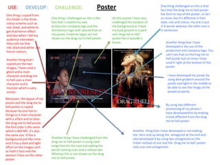
  • 1. PosterUSE: DEVELOP: CHALLENGE: One thing I copied from this folder is the three colour scheme such as red, black, and white to get that horror effect and also when I did my audience interviews they told me that red, black and white are horror colours. Another thing that I copied are the two images, I have used a ghost and a main character and drag me to hell uses a main character and a monster which is very similar. Moreover, the layout of my poster and the drag me to hell poster is copied because my one has to things to it main character with a villain and so does the drag me to hell poster, the font style is the same which Is Bell MT, it’s also the same size. It has a background just like mine and it has a dark and light affect on the images such as Faith’s face and the women’s face on the other poster. One thing challenged on this is that fact that the drag me to hell poster has font on top of the poster, so do I on mine, but it’s different in font style, size and colour, my one is put in 6 words whereas the other one is in sentences. Another thing that I have developed is the use of the production and company logo. You can’t see that on the frag me to hell poster but on mine I have used it right at the bottom of the poster. I have developed my poster by using dark gradient around the poster and light in the middle to be able to see the image of the people properly. By using two different positioning of my photos I have developed this by making it look different from the drag me to hell poster. One thing I challenged on this is the fact that I created my own production company logo and the distribution logo and I placed that on my poster, however logos are not shown on the drag me to hell poster. Another thing I have challenged from the drag me to hell poster is using steel tongs font for the cast and adding the words coming soon and a release dat. Whereas this is not shown on the drag me to hell poster. Another thing that I have developed is not making the hero end up being the antagonist at the end and also developed it by using two antagonists on the trailer instead of one and the ‘Drag me to hell’ poster only uses one antagonists. On this poster I have also challenged the location of the background as I have my back ground in a park and ‘drag me to hell’ poster has it outside a house.
  • 2. MagazineUSE: DEVELOP: CHALLENGE: One thing I used from the empire magazine is the masthead size and the position of it which is at the top. Another thing I have copied from the empire magazine is the words on top of the masthead but I used my own phrase for it. I have included an image of one of the characters in the cover just like the empire magazine, however the empire magazine has 2 characters. One other thing that I copied from the empire magazine is the positioning of the barcode, they have it placed on the left side, but I have mine on the right side. One thing that I have developed from this is using my own font style which is bold and looks a bit like the empire font. Another thing developed is changing the position of the issue date and also putting on my own issue date that my magazine will be released on. On the empire magazine we see less cover lines on the cover, however I have used more such as the ones on the left and ones at the bottom of the page. One other thing is the colors that I am using such as red, black and white for my magazine to give it that horror effect. I have used my own image and used costume and props to make it interesting and intimidating to the audience and make them want to come and watch it. I have added my own red cross and beneath that red cross I have added my extra cover lines. I have used my own font style which I have used on the poster and I have used it on the magazine to show the consistency of it. One thing different on my magazine is the text, my texts are in small letters and the ‘Hobbit’ magazine uses block capitals on it.
  • 3. Horror Genre TrailerUSE: I have used something like this where we wrote a phrase on the mirror and they wrote a phrase on the wall, so this is something we copied from the trailer but changed a bit such as the words. We have wrote ‘u are next’ and they wrote ‘I see you’. The unforeseen trailer Closed for the season trailer This is also copied from our trailer the unforeseen you see us running into the park and there is someone videoing us from the back and in the closed for the season trailer you see someone running backwards and recording the girl running in front, which is another thing that I have copied from the trailer. The shots that we have copied from the trailer are close ups, mostly mid shots and some long shots to show how they feel, the location that they are in and their facial expressions to make it intimidating.
  • 4. USE: This is another thing I have copied which is using the low key lighting to create that suspense of the trailer and also it puts that intimidating effect to it for the audience and makes it dramatic. Another thing I have copied is using dialogue in between to tell the audience what is happening and give them a bit of the narrative of the unforeseen trailer. Another thing that I have copied is not revealing the antagonists face, otherwise it will reveal everything and won’t be as dramatic on the film trailer. This is another copied thing which is using a park location as the ‘closed for the season trailer has the same location on their trailer.
  • 5. DEVELOP: We have wrote our own titles on the trailer, but we have not used lots because it then will take our shots away and make our trailer even longer as our aim was to make it only 2 minutes long because it is a normal trailer not a teaser trailer. We could have challenged this and put a background like the closed for the season trailer however we didn’t because it takes a lot more time and its very hard to do. We have developed our titles by using only small letters and made then short and snappy. Each shot was at least 2 seconds long, so that it was quick and like a montage. Whereas the closed for the season trailer have used block capitals and when I watched the trailer the shots were at least 3/4 seconds long. The titles that we have used are telling the audience what is going to occur but we don’t tell them what is going to happen otherwise our film trailer will reveal everything that is going to happen in the film. Which we do not want. The unforeseen trailer Closed for the season
  • 6. DEVELOP: Another thing I have developed on our trailer is using two locations such as the college and also the park, so we have something that begins in college and leads it to ending in the park. Another way that I have developed this is by adding in our own short film in the trailer, even though its short it gives the audience a intimidating feel about the film and used our own dialogue and other sounds to make it dramatic.
  • 7. CHALLENGE: Closed for the season trailer The unforeseen trailer On thing that I have challenged on our trailer is creating and designing our own trailer production and distribution logos using Photoshop. The distribution logo is horrific horror films and the production logo is the extreme productions. Another thing challenged is putting on our own preview rating screen at the beginning to warn the target audience and this is not used on the closed for the season trailer This is the closed for the season trailer logo they only have one and we have two. A distribution and production logo for our trailer. Some cinematography shots that I have challenged are using high and low angles to make it even better and challenge with the closed for the season trailer.