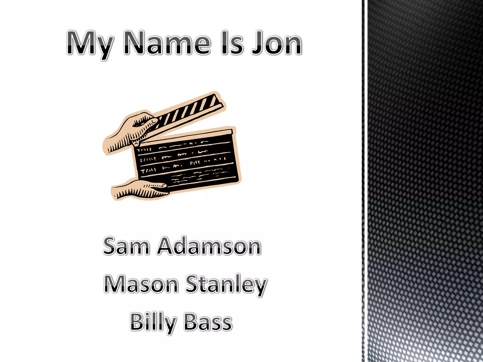
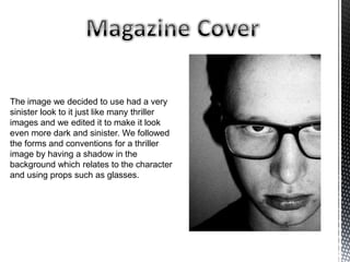
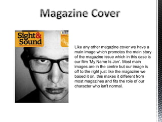
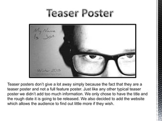
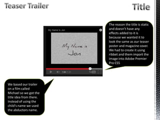
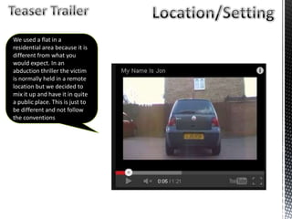
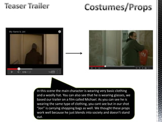
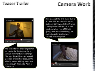
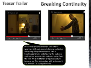
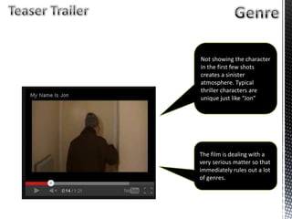
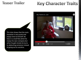
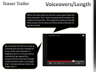
The image we decided to use had a very
sinister look to it just like many thriller
images and we edited it to make it look
even more dark and sinister. We followed
the forms and conventions for a thriller
image by having a shadow in the
background which relates to the character
and using props such as glasses.
Like any other magazine cover we have a
main image which promotes the main story
of the magazine issue which in this case is
our film ‘My Name Is Jon’. Most main
images are in the centre but our image is
off to the right just like the magazine we
based it on, this makes it different from
most magazines and fits the role of our
character who isn't normal.
We followed all other magazines by having
a main cover line on the cover which
linked to the main image. Every magazine
has to have one because it promotes the
magazine by letting readers know what is
inside.
We added a master head that belongs to
Sight And Sound because we thought that
our film relates to most of the films that
feature in Sight and Sound magazines so
we copied their master head.
We think that our magazine cover follow standard forms and conventions as a
thriller magazine cover because it is very similar to the actual issue that we
based ours on, including all the text, images, cover lines, pugs etc.
We used the same image that we used for the magazine cover because we
thought that this is the best picture we took and without even editing it, it
creates a sinister atmosphere which we intended to do. The sinister
atmosphere links to the thriller genre and the fact that you don’t get a lot from
the poster shows that it is only a teaser poster.
Teaser posters don’t give a lot away simply because the fact that they are a
teaser poster and not a full feature poster. Just like any other typical teaser
poster we didn’t add too much information. We only chose to have the title and
the rough date it is going to be released. We also decided to add the website
which allows the audience to find out little more if they wish.
The reason the title is static
and doesn’t have any
effects added to it is
because we wanted it to
look the same as our teaser
poster and magazine cover.
We had to create it using
ribbet and them import the
image into Adobe Premier
Pro CS5
We based our trailer
on a film called
Michael so we got the
title idea from there.
Instead of using the
child's name we used
the abductors name.
We used a flat in a
residential area because it is
different from what you
would expect. In an
abduction thriller the victim
is normally held in a remote
location but we decided to
mix it up and have it in quite
a public place. This is just to
be different and not follow
the conventions
In this scene the main character is wearing very basic clothing
and a woolly hat. You can also see that he is wearing glasses, we
based our trailer on a film called Michael. As you can see he is
wearing the same type of clothing, you cant see but in our shot
“Jon” is carrying shopping bags as well. We thought these props
work well because he just blends into society and doesn’t stand
out.
We chose to use a low-angle shot
to create the feeling that he is
always dominant and in charge.
We also think this shows a good
position of the child because the
child is always looking up to him,
even though this isn't a Point of
View shot.
This is one of the first shots that is
in the trailer and we use this so
audience can try and identify who
this mysterious character is and
work out what type of film its
going to be. By not showing the
main character straight way
creates an atmosphere.
In nearly every shot the main character is
wearing a different piece of clothing and doing
something completely different. This is
breaking continuity and showing the audience
and this is a teaser trailer and not a scene from
the film. We didn’t follow a ‘3 part structure’
because our film isn't packed with action and it
just wouldn’t fit our type of film.
Not showing the character
in the first few shots
creates a sinister
atmosphere. Typical
thriller characters are
unique just like “Jon”
The film is dealing with a
very serious matter so that
immediately rules out a lot
of genres.
This shot shows that the main
character is very quiet and
enjoys time to himself. He
lives in a small flat which he
enjoys his own company but
when he gets lonely he turns
to abducting someone instead
of going out to socialise.
We aimed for the film to be about
a minute but once we inserted all
of our shots and voiceovers it
lengthens out to 1 minute and 21
seconds but we agreed this
amount of time is ok even though
a typical teaser trailer is no longer
than 1 minute whereas others are
longer then 2.
When the shots fade out and the screen goes black the
main character “Jon” starts to speak which enables the
audience to hear him. This makes the audience wonder
what causes him to carry out these actions because he
sounds normal.

Media evaluation

  • 3.
    The image wedecided to use had a very sinister look to it just like many thriller images and we edited it to make it look even more dark and sinister. We followed the forms and conventions for a thriller image by having a shadow in the background which relates to the character and using props such as glasses.
  • 4.
    Like any othermagazine cover we have a main image which promotes the main story of the magazine issue which in this case is our film ‘My Name Is Jon’. Most main images are in the centre but our image is off to the right just like the magazine we based it on, this makes it different from most magazines and fits the role of our character who isn't normal.
  • 5.
    We followed allother magazines by having a main cover line on the cover which linked to the main image. Every magazine has to have one because it promotes the magazine by letting readers know what is inside. We added a master head that belongs to Sight And Sound because we thought that our film relates to most of the films that feature in Sight and Sound magazines so we copied their master head.
  • 6.
    We think thatour magazine cover follow standard forms and conventions as a thriller magazine cover because it is very similar to the actual issue that we based ours on, including all the text, images, cover lines, pugs etc.
  • 8.
    We used thesame image that we used for the magazine cover because we thought that this is the best picture we took and without even editing it, it creates a sinister atmosphere which we intended to do. The sinister atmosphere links to the thriller genre and the fact that you don’t get a lot from the poster shows that it is only a teaser poster.
  • 9.
    Teaser posters don’tgive a lot away simply because the fact that they are a teaser poster and not a full feature poster. Just like any other typical teaser poster we didn’t add too much information. We only chose to have the title and the rough date it is going to be released. We also decided to add the website which allows the audience to find out little more if they wish.
  • 10.
    The reason thetitle is static and doesn’t have any effects added to it is because we wanted it to look the same as our teaser poster and magazine cover. We had to create it using ribbet and them import the image into Adobe Premier Pro CS5 We based our trailer on a film called Michael so we got the title idea from there. Instead of using the child's name we used the abductors name.
  • 11.
    We used aflat in a residential area because it is different from what you would expect. In an abduction thriller the victim is normally held in a remote location but we decided to mix it up and have it in quite a public place. This is just to be different and not follow the conventions
  • 12.
    In this scenethe main character is wearing very basic clothing and a woolly hat. You can also see that he is wearing glasses, we based our trailer on a film called Michael. As you can see he is wearing the same type of clothing, you cant see but in our shot “Jon” is carrying shopping bags as well. We thought these props work well because he just blends into society and doesn’t stand out.
  • 13.
    We chose touse a low-angle shot to create the feeling that he is always dominant and in charge. We also think this shows a good position of the child because the child is always looking up to him, even though this isn't a Point of View shot. This is one of the first shots that is in the trailer and we use this so audience can try and identify who this mysterious character is and work out what type of film its going to be. By not showing the main character straight way creates an atmosphere.
  • 14.
    In nearly everyshot the main character is wearing a different piece of clothing and doing something completely different. This is breaking continuity and showing the audience and this is a teaser trailer and not a scene from the film. We didn’t follow a ‘3 part structure’ because our film isn't packed with action and it just wouldn’t fit our type of film.
  • 15.
    Not showing thecharacter in the first few shots creates a sinister atmosphere. Typical thriller characters are unique just like “Jon” The film is dealing with a very serious matter so that immediately rules out a lot of genres.
  • 16.
    This shot showsthat the main character is very quiet and enjoys time to himself. He lives in a small flat which he enjoys his own company but when he gets lonely he turns to abducting someone instead of going out to socialise.
  • 17.
    We aimed forthe film to be about a minute but once we inserted all of our shots and voiceovers it lengthens out to 1 minute and 21 seconds but we agreed this amount of time is ok even though a typical teaser trailer is no longer than 1 minute whereas others are longer then 2. When the shots fade out and the screen goes black the main character “Jon” starts to speak which enables the audience to hear him. This makes the audience wonder what causes him to carry out these actions because he sounds normal.