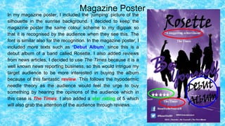
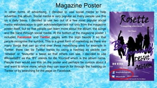
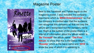
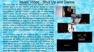
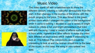
- The document evaluates the effectiveness of combining a main product (album) with ancillary texts (magazine poster, music video)
- The album, poster, and music video were designed to have consistent color schemes, themes, and imagery to link the pieces together
- Key elements like the band's name, song title, and image of silhouettes jumping are replicated across the products for brand recognition
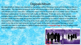
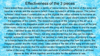
My evaluation question 2, talking about how my my digipak and poster fit the conventions of something or other. Basically done it so that I can complete the A-level and hopefully get something out of my life which probably won't happen as I have no idea of what I am doing but hey, lets live in the moment and not worry about the future until you're there. Then you can break down and cry as you still haven't figured out what you're doing!
The Roman Empire A Historical Colossus.pdfkaushalkr1407
The Roman Empire, a vast and enduring power, stands as one of history's most remarkable civilizations, leaving an indelible imprint on the world. It emerged from the Roman Republic, transitioning into an imperial powerhouse under the leadership of Augustus Caesar in 27 BCE. This transformation marked the beginning of an era defined by unprecedented territorial expansion, architectural marvels, and profound cultural influence.
The empire's roots lie in the city of Rome, founded, according to legend, by Romulus in 753 BCE. Over centuries, Rome evolved from a small settlement to a formidable republic, characterized by a complex political system with elected officials and checks on power. However, internal strife, class conflicts, and military ambitions paved the way for the end of the Republic. Julius Caesar’s dictatorship and subsequent assassination in 44 BCE created a power vacuum, leading to a civil war. Octavian, later Augustus, emerged victorious, heralding the Roman Empire’s birth.
Under Augustus, the empire experienced the Pax Romana, a 200-year period of relative peace and stability. Augustus reformed the military, established efficient administrative systems, and initiated grand construction projects. The empire's borders expanded, encompassing territories from Britain to Egypt and from Spain to the Euphrates. Roman legions, renowned for their discipline and engineering prowess, secured and maintained these vast territories, building roads, fortifications, and cities that facilitated control and integration.
The Roman Empire’s society was hierarchical, with a rigid class system. At the top were the patricians, wealthy elites who held significant political power. Below them were the plebeians, free citizens with limited political influence, and the vast numbers of slaves who formed the backbone of the economy. The family unit was central, governed by the paterfamilias, the male head who held absolute authority.
Culturally, the Romans were eclectic, absorbing and adapting elements from the civilizations they encountered, particularly the Greeks. Roman art, literature, and philosophy reflected this synthesis, creating a rich cultural tapestry. Latin, the Roman language, became the lingua franca of the Western world, influencing numerous modern languages.
Roman architecture and engineering achievements were monumental. They perfected the arch, vault, and dome, constructing enduring structures like the Colosseum, Pantheon, and aqueducts. These engineering marvels not only showcased Roman ingenuity but also served practical purposes, from public entertainment to water supply.
Honest Reviews of Tim Han LMA Course Program.pptxtimhan337
Personal development courses are widely available today, with each one promising life-changing outcomes. Tim Han’s Life Mastery Achievers (LMA) Course has drawn a lot of interest. In addition to offering my frank assessment of Success Insider’s LMA Course, this piece examines the course’s effects via a variety of Tim Han LMA course reviews and Success Insider comments.
How to Make a Field invisible in Odoo 17Celine George
It is possible to hide or invisible some fields in odoo. Commonly using “invisible” attribute in the field definition to invisible the fields. This slide will show how to make a field invisible in odoo 17.
Read| The latest issue of The Challenger is here! We are thrilled to announce that our school paper has qualified for the NATIONAL SCHOOLS PRESS CONFERENCE (NSPC) 2024. Thank you for your unwavering support and trust. Dive into the stories that made us stand out!
Francesca Gottschalk - How can education support child empowerment.pptxEduSkills OECD
Francesca Gottschalk from the OECD’s Centre for Educational Research and Innovation presents at the Ask an Expert Webinar: How can education support child empowerment?
Embracing GenAI - A Strategic ImperativePeter Windle
Artificial Intelligence (AI) technologies such as Generative AI, Image Generators and Large Language Models have had a dramatic impact on teaching, learning and assessment over the past 18 months. The most immediate threat AI posed was to Academic Integrity with Higher Education Institutes (HEIs) focusing their efforts on combating the use of GenAI in assessment. Guidelines were developed for staff and students, policies put in place too. Innovative educators have forged paths in the use of Generative AI for teaching, learning and assessments leading to pockets of transformation springing up across HEIs, often with little or no top-down guidance, support or direction.
This Gasta posits a strategic approach to integrating AI into HEIs to prepare staff, students and the curriculum for an evolving world and workplace. We will highlight the advantages of working with these technologies beyond the realm of teaching, learning and assessment by considering prompt engineering skills, industry impact, curriculum changes, and the need for staff upskilling. In contrast, not engaging strategically with Generative AI poses risks, including falling behind peers, missed opportunities and failing to ensure our graduates remain employable. The rapid evolution of AI technologies necessitates a proactive and strategic approach if we are to remain relevant.
Synthetic Fiber Construction in lab .pptxPavel ( NSTU)
Synthetic fiber production is a fascinating and complex field that blends chemistry, engineering, and environmental science. By understanding these aspects, students can gain a comprehensive view of synthetic fiber production, its impact on society and the environment, and the potential for future innovations. Synthetic fibers play a crucial role in modern society, impacting various aspects of daily life, industry, and the environment. ynthetic fibers are integral to modern life, offering a range of benefits from cost-effectiveness and versatility to innovative applications and performance characteristics. While they pose environmental challenges, ongoing research and development aim to create more sustainable and eco-friendly alternatives. Understanding the importance of synthetic fibers helps in appreciating their role in the economy, industry, and daily life, while also emphasizing the need for sustainable practices and innovation.
2. Introduction
How effective is the combination of your main product and ancillary texts? In this
evaluation post, I will be talking about my three products that I have created which are:
- Digipak/album
- Magazine Poster
- Music Video
I will talk about how I have used synergy through-out the three products and construction of
representation, and the reason behind the design, layout, mise-en-scene, colour scheme
and editing.
3. Digipak/Album
My digipak/album design was inspired by the reason behind the group name and the fact that this is a
debut album. The members jumping in the air with the sunrise in front of them shows a 'rise' in talent
and industry as it is a new start. I chose the colour scheme of purple as it is a unisex colour. This is for
the target audience as it is directed at both males and females. There are some other colours
including black, which is the colour of the silhouette of the people jumping in the air. The back cover
includes tracks that are some about love, and some upbeat songs to have a balance of emotions that
the audience can relate to it. The song of my music video, Shut Up and Dance, is included in this
which is the title of the track/song for my music video. At the back I also added the logo of which
company this band is from which is ‘MINA Entertainment and a copyright logo to keep it safeguarded
from others who try to plagiarize.
4. Digipak/Album
The CD cover is black and white, and I decided to use these two contrasting colours as it stands out.
The black silhouette hands above the white background grabs attention. The contradiction of black
and white is also for the audience, to show that it is aimed at people from all different backgrounds as
diversity is important to respect in society. Other than the CD, I decided to maintain the colour scheme
throughout the digipak so it looks professional rather than switching from colour to colour which may
be confusing. Inside the album, I chose two pictures, one being of a fingerprint and the other of the
band. [2]. One is to represent the identity to show the meaning behind ‘Be yourself’ of having your
own identity. The sunrise represents the upbeat atmosphere which are the other half of the album
songs for example Shut Up and Dance. The CD had 4 hands holding the centre which are the four
people in the band, the silhouette follows the theme as it’s unknown as everyone has their own
identity.
5. Magazine Poster
In my magazine poster, I included the ‘jumping’ picture of the
silhouette in the sunrise background. I decided to keep the
magazine poster the same colour scheme to my digipak so
that it is recognised by the audience when they see this. The
font is similar also for the recognition. In the magazine poster, I
included more texts such as ‘Debut Album’ since this is a
debut album of a band called Rosette. I also added reviews
from news articles, I decided to use The Times because it is a
well known news reporting business, so this would intrigue my
target audience to be more interested in buying the album
because of this fantastic review. This follows the hypodermic
needle theory as the audience would feel the urge to buy
something by hearing the opinions of the audience which in
this case is The Times. I also added a star rating of 5 which
will also grab the attention of the audience through reviews.
6. Magazine Poster
In other forms of advertising, I decided to use social media to help
advertise this album. Social media is very popular as many people use this
on a daily basis. I decided to use two out of a few most popular social
media websites/apps to gain acknowledgement not only from the magazine
poster itself, but so that people can learn more about the album, the songs
and the band through social media. At the bottom of the magazine poster, I
included Facebook and Twitter pages with the logo beside it so that
people recognise the symbol. This is a great form of marketing as there are
many things that can go viral over these networking sites for example in
Twitter, there can be Twitter trends by using a hashtag as people can
‘retweet’ or ‘favourite’ a tweet so that others can see. I decided to use
#RosetteBY as the ‘BY’ stands for Be Yourself which is the album name.
People then would see this on the poster and perhaps be curious about it
and want to know more, which they can search for through the hashtag on
Twitter or by searching for the page on Facebook.
7. Magazine Poster
Next to the Facebook and Twitter logos on the
magazine poster, I also included the company
logo/name which is ‘MINA Entertainment’ so that
the company is credited also that the audience
can recognise this company so that not only the
album get’s recognised but the company name
too. Right at the bottom of the poster there is a
little bit of information about the album which is,
‘Be Yourself’ the album name, ‘The First
Album’ to show that this is the Debut Album,
‘Rosette’ which is the band name and ‘2016’ to
show the year of which it is releasing in.
8. Music Video - Shut Up and DanceThe song Shut Up and Dance was a very popular song in the
summer due to it’s very ‘dancey’ and upbeat rhythm that made
everyone want to dance. I decided to create a music video to this
song because I felt that creating a music video to make people
want to dance not only through the song but the scenes in the
music video was a challenge, yet do-able and fun to create as it
tested my creative skills. Starting from the beginning of the music
video when a teenage girl walks in an empty hall. The ‘pan’ camera
movement I purposely used to show the movements in her head,
as if the audience watching this is looking at the hall the same way
she is. AS it comes behind her head, she see’s her two friends
calling her to dance which then leads to the title of the song and the
band name.
This is a short intro so the audience gets an excited feeling
because they then know that something is about to happen after
this teenage girl walks in the room, being called by her friends that
appear unexpectedly. This is to represent the word ‘memories’ and
many people have memories with music that remind them of a
certain event, therefore I wanted the start to seem like the teenage
girl is reminiscing about her fun and exciting days with her friends,
where the song Shut Up and Dance is part of this memory.
9. Music Video
The video starts off with a kaleidoscope to show the
different colours, creating a ‘colourful’ atmosphere from the
start. It then changes to the scenes of the phone with the
mouth singing to the lyrics. This was filmed in the green
screen room which I changed the colour of the background
when it came to editing. I decided to use a variety of bright
colours to create a fun and bright atmosphere that links
well with the song. I used a variety of effects such as fade
in from white, vignette and other effects to make the video
look different at each scene which makes it interesting to
look at. This follows Pop conventions as it should be
interesting to look at and the scenes should link to the beat
of the music, in this case, the song is very upbeat and
bold.
10. Music Video
The phone in front of the mouth
emphasises the ‘Shut up’ in the song title,
‘Shut Up and Dance’. The mouth is
covered so it’s mute, however there is a
video of a mouth singing the words to
show that you can’t stop singing to this
song because it’s catchy. I added in
scenes of the teenage actors ‘having fun’
in the social room which is to show that
this song is something to have fun with as
it makes you want to dance and create a
‘happy’ vibe.
11. Music Video
Near the bridge, I decided to use a dark background
with spotlights to create a calm atmosphere to match
the beat of the song as the song also slows down. It
then speeds up back to the final chorus in which I
also added effects and used short clips to match the
beat of the song. At the end, there is a scene of four
people walking slowly then jumping in the air. It ends
on a freeze frame which is similar to the picture from
the digipak album and the magazine poster. This
links all three elements together as the audience
recognise this still image. At the end I added in my
logo for my production company ‘Mina Entertainment’
so that the audience recognise the production
company of which the band is signed to.
12. Effectiveness of the 3 pieces
I have linked three pieces together in terms of colour scheme, the theme of the song and
band as a whole and the elements which I have included in all three pieces. The colour
scheme I have made it consecutive as in the digipak the colour scheme is the same as
the magazine poster. This is similar to the music video as I used vibrant colours to show
the boldness of the colours. The distinctive picture of the ‘jumping in the air’ as a
silhouettes also in the magazine poster and the digipak which was also shown at the end
of the music video as a clip which ends with the jump as a freeze frame to end the music
video. I decided to use this so it becomes an icon so it is a form of advertisement.
Following the Dyer’s Star Theory, not only idols are famous but also can be objects,
sayings, actions to represent them. I’ve decided to make this action of jumping in the air
on a freeze frame the icon of Rosette as people will recognise this from the album, the
magazine poster and the music video. I also added in the title of the song and the band
name in all three pieces so that the audience also recognise the name of the band and the
name of the song. This makes the main elements of advertising effective in all three
pieces as they all link together and it is clear for the audience to see.