Este cuento esta dirigido a todos los niños con edades comprendidas entre los 6 y 9 años, aunque esto no es impedimento para que cualquier otro niño lo lea
Este cuento esta dirigido a todos los niños con edades comprendidas entre los 6 y 9 años, aunque esto no es impedimento para que cualquier otro niño lo lea
For my A2 Media Studies, I have to make a film poster for my film Too Close for Comfort. I am doing research into how posters are created by the professionals to five me inspiration and also show me how the professionals make the posters.
For my A2 Media Studies, I have to make a film poster for my film Too Close for Comfort. I am doing research into how posters are created by the professionals to five me inspiration and also show me how the professionals make the posters.
For my A2 Media Studies, I have to make a film poster for my film Too Close for Comfort. I am doing research into how posters are created by the professionals to five me inspiration and also show me how the professionals make the posters.
For my advanced portfolio in Media, I need to create a film trailer and with that a production company logo so I have looked into current logos to see what is already in the market and give me ideas on what to do
I have taken the shots from the actual Hunger Games film trailer which I am replicating for my A2 Media to gain knowledge of using a camera properly and creating a good quality piece.
June 3, 2024 Anti-Semitism Letter Sent to MIT President Kornbluth and MIT Cor...Levi Shapiro
Letter from the Congress of the United States regarding Anti-Semitism sent June 3rd to MIT President Sally Kornbluth, MIT Corp Chair, Mark Gorenberg
Dear Dr. Kornbluth and Mr. Gorenberg,
The US House of Representatives is deeply concerned by ongoing and pervasive acts of antisemitic
harassment and intimidation at the Massachusetts Institute of Technology (MIT). Failing to act decisively to ensure a safe learning environment for all students would be a grave dereliction of your responsibilities as President of MIT and Chair of the MIT Corporation.
This Congress will not stand idly by and allow an environment hostile to Jewish students to persist. The House believes that your institution is in violation of Title VI of the Civil Rights Act, and the inability or
unwillingness to rectify this violation through action requires accountability.
Postsecondary education is a unique opportunity for students to learn and have their ideas and beliefs challenged. However, universities receiving hundreds of millions of federal funds annually have denied
students that opportunity and have been hijacked to become venues for the promotion of terrorism, antisemitic harassment and intimidation, unlawful encampments, and in some cases, assaults and riots.
The House of Representatives will not countenance the use of federal funds to indoctrinate students into hateful, antisemitic, anti-American supporters of terrorism. Investigations into campus antisemitism by the Committee on Education and the Workforce and the Committee on Ways and Means have been expanded into a Congress-wide probe across all relevant jurisdictions to address this national crisis. The undersigned Committees will conduct oversight into the use of federal funds at MIT and its learning environment under authorities granted to each Committee.
• The Committee on Education and the Workforce has been investigating your institution since December 7, 2023. The Committee has broad jurisdiction over postsecondary education, including its compliance with Title VI of the Civil Rights Act, campus safety concerns over disruptions to the learning environment, and the awarding of federal student aid under the Higher Education Act.
• The Committee on Oversight and Accountability is investigating the sources of funding and other support flowing to groups espousing pro-Hamas propaganda and engaged in antisemitic harassment and intimidation of students. The Committee on Oversight and Accountability is the principal oversight committee of the US House of Representatives and has broad authority to investigate “any matter” at “any time” under House Rule X.
• The Committee on Ways and Means has been investigating several universities since November 15, 2023, when the Committee held a hearing entitled From Ivory Towers to Dark Corners: Investigating the Nexus Between Antisemitism, Tax-Exempt Universities, and Terror Financing. The Committee followed the hearing with letters to those institutions on January 10, 202
Biological screening of herbal drugs: Introduction and Need for
Phyto-Pharmacological Screening, New Strategies for evaluating
Natural Products, In vitro evaluation techniques for Antioxidants, Antimicrobial and Anticancer drugs. In vivo evaluation techniques
for Anti-inflammatory, Antiulcer, Anticancer, Wound healing, Antidiabetic, Hepatoprotective, Cardio protective, Diuretics and
Antifertility, Toxicity studies as per OECD guidelines
Welcome to TechSoup New Member Orientation and Q&A (May 2024).pdfTechSoup
In this webinar you will learn how your organization can access TechSoup's wide variety of product discount and donation programs. From hardware to software, we'll give you a tour of the tools available to help your nonprofit with productivity, collaboration, financial management, donor tracking, security, and more.
Model Attribute Check Company Auto PropertyCeline George
In Odoo, the multi-company feature allows you to manage multiple companies within a single Odoo database instance. Each company can have its own configurations while still sharing common resources such as products, customers, and suppliers.
Adversarial Attention Modeling for Multi-dimensional Emotion Regression.pdf
Media evaluation 1
1. In what ways does your media product use,
develop or challenge forms and conventions
of real media products?
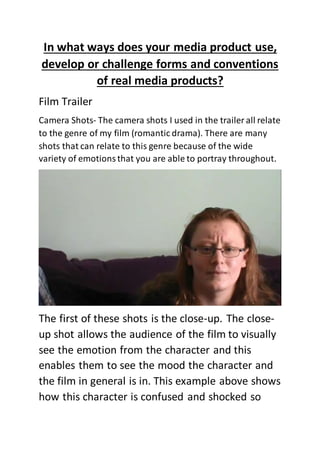
Film Trailer
Camera Shots- The camera shots I used in the trailer all relate
to the genre of my film (romantic drama). There are many
shots that can relate to this genre because of the wide
variety of emotionsthat you are able to portray throughout.
The first of these shots is the close-up. The close-
up shot allows the audience of the film to visually
see the emotion from the character and this
enables them to see the mood the character and
the film in general is in. This example above shows
how this character is confused and shocked so
2. this tells the audience that the drama part of the
trailer is starting. All this is told via the facial
expressions of the character and with the
different genres having the possibility of switching
between each other, it is vitally important that
the audience are kept up to speed with what is
going on in the trailer and in the film itself so this
is why close-ups are important to romantic drama
films and because of this, why they are a
prominent feature in my film trailer.
3. These two screenshots above are examples of the
different types of edits (video transitions) I use in
the trailer. Fades, dissolves and cuts are all
typically used in Romantic Drama films as they
represent the different moods of the film which
romantic dramas have much of. Dissolves show
4. the change in time and as my trailer starts in the
present and looks back into the past, a dissolve is
needed here to change the time of the trailer.
Fades are a more relaxed form of editing and can
be used to slow the pace of the trailer again.
These are used in my trailer in the starting stages
of the trailer as it is looking at her past life which
requires slow paced editing. Cuts are
predominantly used in the drama part of the
trailer which is the case. Cuts create the quick
paced trailer that it should be because it moves
straight from one shot to the next creating a
sense of urgency.
Mise en scene
5. The colour of the diary was purposely chosen to
be red for this film trailer. Red is a typical colour
associated with romance so I thought that it was a
suitable colour to have the diary in.
Sound
The sound was an important part of the creative
process for me. Composing the music myself was
a huge task and was a big challenge to sync the
music into the trailer the way I want it. The
trailer’s soundtrack changed as the mood of the
trailer changed which reinforced to the audience
this change of mood. The soundtrack has the
same constant instrumentation which is strings
and piano which shows the link between the two
genres to the film but the way in which these
instruments are used to create the different
moods allows the soundtrack to stick to the
conventions of the romantic drama film.
The voiceover for the beginning of the trailer is
the female lead. It is very common in romantic
drama films to have one of the lead characters,
especially the female lead, taking the role of the
voiceover as it allows the audience to feel
6. involved with the trailer more as it sounds like the
characters are addressing them directly and it is
claimed that the female lead always has more
thoughts which allows the audience to get a
better in-depth knowledge. At the point of the
drama element of the film starting, the voiceover
changes to a male who is non-related to any
character of the film.
Scenery- The different settings used in the trailer
have been used for effect. As the majority of the
trailer is set inside, the shots I have outside need
to be varied as they break up the inside shots
which could, if you’re not careful, be too boring.
The shots just show how a normal relationship
develops which most of the trailers do and then
when the drama element comes into action, it
goes at a quicker pace, so the location changes
are not as noticeable.
Narrative-
7. Dialogue is a prominent feature of this film trailer
as this is what happens in the majority of
romantic drama films. Dialogue is a primary and
one of the easiest ways of bringing across the
main basic story line and it also allows the
audience to see the relationship develop.
8. The intertitles break up all the action in the trailer
and is often, like in my trailer, supported by a
voiceover to further attract the audience’s
attention. The font was chosen specifically to suit
the genre and audience of the film with the text
displayed more like handwriting which is
commonly associated with romance films and
with the text colour being pink, it reinforces the
romance genre of the film. The black background
enables the pink font to stand out but this
background can also reinforce the drama element
to the film.
9. A very common feature used in romantic drama
films and indeed in my film trailer is the concept
of the boy meets girl idea. This seems to me to be
an effective way of creating a film as that is what
many audiences go for as that is how many
relationships start in real life so the audience can
possibly relate to the characters in the film.
Like most trailers, my film trailer will be left on a
cliff hanger. The whole purpose of doing this is to
allow the audience to feel like they need to know
more which will obviously enable them to go and
watch the film to put an end to the questions that
arise in the head after watching the trailer.
10. Overall, my film trailer does follow the
conventions of a romantic drama film trailer. I
have purposely stuck to these conventions as
when I was researching into what was currently
available in the film market, romantic drama films
which follow the conventions seemed to sell the
best.
11. The main image I
have used is split
into two and is
taken fromthe
trailer itself. This is
the main reason
why the quality of
the pictures ate
not the best
quality possible. I
saw this type of
thing in a different
poster and I think
it is effective as it
shows thepassion
of the relationship
by the two
characters looking
into each other’s
eyes so despite
the characters not
looking directly at
the audience like
many posters do, I
think I have
followed a
convention by the
fact that it shows
a romance film.
The top of the magazine features the two lead actor and actress names. This makes them easily
visible to the audience as they are a selling point to the film. They are written in a white fontto
enable them to fit in with the poster and create some different colour at the top of the poster to
attract the eye.
I have included a
review on my film
poster. Reviews
are a good way of
selling your film to
the audience as
they feel that if
someone popular
likes it then they
will like it too
enabling them to
go and watch the
film. The fact that
the stars arein
yellow and the
text is in black
enables it to stand
out compared to
other things
around it.
The title of the
film is the largest
piece of text on
the page which
follows a
convention of film
posters.
Surprisingly to me,
many posters
feature the title of
the film in the
centre third of the
poster so I have
done that here
and I believe that
it is in an
appropriateplace
as it is easily eye
catching along
with the image.
The certificate of
the film is near
the bottom of the
poster with the
billing block.
Despite being an
important factor,
it will not help sell
the film which is
the main purpose
behind the film
poster.
The billing block is the smallest piece of text on the film
poster. This provides all the production details of the film.
The reason why this is so small is because it doesn’t really
help sell the film to the audience, it is justthere to credit
the main people who werebehind the film.
Underneath the billing block is some other information
regarding the film such as the social media pages, the
release date and the website for the film. This allows the
audience to refer to other pages if they want to know
more about the film and is a standard feature of the
poster.
12. When comparing another romantic drama film poster
to mine, it is clear that there are some similar features.
13. The two lead actor and actress names are at the top of
the poster. The title of the film is again towards the
bottom of the poster like mine and is at the largest
piece of text on the page. The billing block is included
at the bottom of the poster like mine also. Some
differences include that the main image covers the
whole of the poster not just one part of it. There seems
to be a split in that some posters do use the main
image as the background and some do not. I tried to
keep the colour scheme very strict on my poster so
decided against it.
14. The poster below uses a different background and has
a similar concept to mine design wise. I used this
poster in my research to other film trailers so this
poster has influenced me in some ways whilst creating
my own product.
15. It was important that the magazine cover had a colour scheme that it sticks too as that
is what the convention of film magazines is. I chose a dark background as it allows
everything on top of it in a bright colour to stand out which is why the masthead is
white to make it stand out. The masthead is the largest piece of text on the page as it
allows the audience to see the title of the magazine as this is one of the selling points of
the magazine. This is a typical convention of a film magazine.
Under the
masthead,there isa
sloganwith‘reviews
for you’.The word
‘you’isusedto
make the audience
feel like theyare
beingdirectlytalked
at- to involved
them.Underneath
that, the issue
number,date and
price are revealed.
Thisis insmall
writingasit isnot as
importantas other
featuresonthe
poster.
The main image is
goingto be one of
the mainfocuseson
the magazine.Both
characters are
lookingdirectlyat
the camera which
makesitlooklike
theyare lookingout
to the
audience/readerof
the magazine.This
isin the centre of
the cover whichis
arguably,where the
eye focusesinthe
trailer.
Underneaththe
masthead,the
website forthe
magazine isfound.
Withmany paper-
basedmedia
startingand
predictingtobe on
the decrease,
companiesare now
lookingtowardsnew
mediatechnologies
such as the internet
to base their
productsaroundas
that isthe waythat
the mediawill be
going.
Nextisa puff which
givesthe audience
short and snappy
informationof afree
item.Thisisbased
on the boldand
brightcolourof
yellowasitstands
out andthisis an
importantselling
pointof the
magazine asmany
people likefree
things.
To match the top of the magazine cover,Ihave addeda strapline tothe bottomof the filmmagazine covertomake it look
symmetrical inasense andalso,I feel thatthe magazine looksmore professional thisway.Bothcatchthe eye of the audience
because of the boldyellowcolour.
The barcode at the bottomof the magazine coverisa typical and necessaryconventionof afilmposter.Thisallowsthe magazine
to be soldso it isa vital factor.
There are several coverlines/sell linesonthismagazine coverwhich
16. I think my film magazine cover does follow the
conventions of a film magazine cover. It contains all the
necessary features that the magazineneeds to have
such as a masthead, a main image and a bar code and
it also has some anchorage text, sell lines and more. I
have gone for the standard background of black as it
allows everything else on the page to jump out.