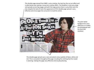
1. This double page spread from NME is very creative, the text has the cut out affect and is alternative sizes, giving a messy but creative effect. The Headline is also very large and spreads across two pages and with the large picture there is very little room for text, despite the lack of room the appearance of this double page spread is very effective and encourages the consumer to read the article. The plain white background is very effective as it makes the photograph and the dark text standout. This double page spread uses a very consistent colour palette of black, white and red. This is consistent throughout the page including the clothing that the model is wearing, making the page very effective and visually pleasing.
2. The structure of this Radar magazine double page spread is very different to that of NME. Radar have place a photograph of the music group “The Teenagers” on one side of the double page spread, the headline connects the pages together as it overlaps onto both pages. This double page spread also leaves very little room for text and is largely focused on the visual aspects of the double page spread. Radar have chosen to use a consistent colour palette of black, white and blue. This improves the magazines appearance and also with the bright blue, helps the magazine to standout and also highlights important pieces of information for the reader.