SlideShare a Scribd company logo
1 of 9
The masthead on this magazine has been placed towards the
top left of the magazine. This is because typically the audience
looks from the top left to the bottom right this is called a z
line, this is when people read a magazine, webpage etc. they
typically look left to right and top to bottom. This is why
magazines tend to have the most important information
within the z line so that people can see the best information.
The mast head (XXI) is highlighted In a bold white text it also
has a red background surrounding the text this makes the
masthead stand out more and with it being in bold it makes
the it stand out to the audience more. White Is also a gender
neutral color which suggests that the magazine is directed
towards a male audience as well as a female audience
The dominant image is a image of the rapper Juice WRLD
otherwise known as (Jared A. Higgins) the image is a mid-shot
of him looking towards the camera from a side angle. The
image of him is shot in high key lighting this is shown by the
light which you can see reflecting on the back of his coat this
suggests quite a upbeat/happy mood. This suggests that the
audience will become happy if they read this magazine, Juice
WRLD is also somebody who Is positive and tries to create
happiness within his music. The image of Juice WRLD is
appealing to the target audience (hip hop enthusiasts) as Juice
WRLD is quite a big influence in modern day rap/hiphop and is
somebody which is looked up to from young teens and also a
majority of adults.
The sub head “Hip-Hops new heroes” is placed under the the
dominant image this has a white background with black text
this is used because black stands out against white suggesting
that the “new artists” will stand out from the rest this draws in
the target audience because they will want to read about the
new artists. Each word also uses a different font which could
suggest each artist is different to another and “Heroes” is in
bold text this stands out from other fonts which again tries to
entice the target audience to buy the magazine.
The subline is a list of upcoming hip hop artists this would
entice hip hop fans to buy the magazine because they
would want to read about the new hip hop stars on the rise.
The reader can also read unreleased news about upcoming
projects which these artists may have in the making
The pull quote is a quote from Juice WRLD the quote “I
wanna change the world” this is a line out of one of recent
songs (Legends) which is dedicated to rappers (lil peep
and XXXTENTACION) who were successful artists before
there deaths. This entices the target audience because
they will want to read and understand the meaning behind
the quote. Just above the quote It has Juice WRLD in a
large text this Is because juice WRLD is the face of the
dominant image this entices the target audience as some
people may recognize the name and want to buy the
magazine.
The 2nd pull quote is a quote from LIL BABY ”I feel like its
already written” this is a reference to his future in the hip hop
scene this is wrote in white text in the top right corner of the
magazine this could be because white is a color which usually
stands out
The main purpose of this magazine is to appeal to as many
fans of hip hop as possible this has done a good job in
appealing to hip hop fans by using big artists at this current
time. The magazine also uses roses as the background this
suggests that the magazine will make you happier if you read it
the roses could’ve also been used because one or juice WRLD’s
new tracks is named roses. The magazine also uses bright
colors such as red , blue and white which give a happy/upbeat
feeling which will attract a wider audience.
Digital
Digital
The subhead “How High?” has two meanings,
the word High could suggest he is high on
cannabis which it’s a well known fact the Wiz
Khalifa smokes cannabis as he is seen smoking
“Joints” in quite a lot of his music videos the
word high could also play of as being how high
he is in the music industry as he has earned
multiple achievements within the music industry.
This suggests that we will understand the actual
meaning by ”high” when we continue to read the
article
The article uses a yellow drop cap this is used to draw the
readers attention and to stand out from the rest of the text. As
when the reader reads through the article their attention will
instantly be drawn to the drop cap this is because the drop cap
is in yellow text which stands out from the black text which is
used in the rest of the article
The by line is used to let the audience know
how wrote the article this is important for two
reasons as the audience could use this to find
other articles written by that specific author. It
is also important for the author as they could
use this to build up a portfolio
The title of the article is “WK” which stands for wiz Khalifa
this is used to make the title shorter, bolder and also make
it look more snappy it also means that there is more room
on the page than had they used his real name. Wiz Khalifa is
also known world wide especially after his song “See you
again” in dedication to the late Paul Walker. The article also
uses a picture of him meaning that the audience will
recognise him via the picture. The title “WK” is also wrote in
two different colours with the W being wrote in black and K
being wrote in yellow. This could be a suggestion to one of
his biggest hits “Black and yellow” starring Snoop Dog.
The dominant image is a image of
American rapper Wiz Khalifa
otherwise known as Cameron
Jibril Thomaz. who was one of the
leading hip hop artists in his prime
in 2015. The image also shows
smoke coming out of his mouth
this suggests the use of cannabis
which is something that he is
known for as in a lot of his videos
you can see him smoking. The
black background could suggest
that the magazine is for males and
females however it mainly applies
to a male audience this is because
the majority of the hip hop
audience is male’s. This image is a
close up mid shot which is shot in
high key lighting which could
suggest happiness which could
entice the reader to purchase the
magazine. The image also shows
smoke coming out of his mouth
this could have been used to
attract the hip hop audience as a
lot of known artists in the hip hop
industry openly smoke cannabis
and wiz khalifa is also a well
known advocate for the
legalisation of cannabis in the us.
Khalifa’s facial expression portrays
him as being quite laid back this
could be used to portray hip hop
artists as being laid back aswell.
The use of the smoke could also
suggest to the audience that the
article is going to be about
cannabis which wiz is open about.
This article has been structured so that the text is at the
bottom of right page. The text has been organised into
two separate paragraphs besides each other this make
the article look neat and tidy rather than messy with
text scattered all over the page which some magazines
do. This also makes the reader be able to understand
what the article is about easier.
The masthead of this magazine is (XXI) this is in a large
white font which has a red background around the text.
The red background makes the white text stand out which
makes it easier for the reader to notice this when to look
at the magazine. This masthead is located at the top left
of the page this is done as stereotypically the audience
skim read front covers of magazines from the top left to
the bottom right this Is called a z line This is also why the
majority of company’s include the main information about
the magazines within the z line. the 2 colours used in the
masthead are considered to be gender neutral this
suggests that the magazine is aimed towards both male
and female it also could suggest that both genders enjoy
hip hop music
The dominant image is of rapper Tupac Amaru Shakur this
image is shot In greyscale this is used to suggest a element of
realism this could be because Tupac was somebody who
used to speak what was on his mind and he used to rap about
topics which we usually not spoke about. The greyscale also
suggests a sense of history which could be used to show that
Tupac will be somebody who will be remembered in history.
The lighting also could suggest how Tupac is a legend of his
time and is somebody who is well respected. The image of
Tupac takes up the majority of the page and also overlaps
the masthead which could suggest that Tupac is the main
sell of the magazine rather than the actual title, the size of
the image also could suggest how big Tupac was in the
music/hip hop industry as he is somebody who many people
look up to due to the fact that he used to speak his mind
rather than hold back. The image draws the readers
attention through the use of Tupac because a lot of people
people look up to him this is something which (XXL)
magazines do a lot as the find somebody who people look up
to for example in some magazines they use Juice WRLD who
is a modern day rap artist. The XXL produces find artists who
the majority of the audience may be able to relate with in
one way or another. The image also shows him looking
directly into the camera this could draw the readers
attention as it could make them feel like he is there.
This magazine uses taglines of people who are featured in the
exclusive interview which his magazine provides this helps to
sell the magazine as a lot of people who are fans of Tupac will
want to see a interview with his family and close friends this
also is used to make to make the XXL magazines stand out as
it shows that they can get exclusive interviews unlike other
magazines which can not. This is also placed towards the
bottom right of the magazine this is because of the z line
where the audience typically read from the top left to bottom
right which is the reason why important information is usually
placed within the z line. The text is also in white writing with a
black border around it this is something which XXL use a lot as
white stands out from black which could suggest that this
brand stands out from a lot of other brands
This magazine uses a sell line “Special Tribute Free” is
used to help sell the magazine because it sows if you
purchase this magazine then you will receive a special
Tupac tribute for free this is something which most
magazines don’t offer which will create a wider
audience for the XXL brand as they offer something
which a lot of other brands don’t
The subline “R.I.P TUPAC SHAKUR” and “2PAC BACK”
is used to attract people to the magazine because it
has been 15 years since his death meaning that people
will want to read about Tupac's memorial. This has
also been wrote in large black text in the middle right
of the screen this is to draw the readers attention and
the large text suggests that it is a important part of the
magazine .
This magazine consists of 3 colours red , black and white this is a change from other
XXL magazines which usually use a range of bright colours to create a happy effect
to the audience. These colours could have been used to create a historic feeling to
the audience.
Print
The dominant image on this article is a mid/long shot of the rapper Eminem this is shot in high key lighting which makes the image
brighter and creates an optimistic/upbeat reaction. This image shows Eminem wiping down a knife which has some blood on it whilst
he is shown to have blood on a white apron and on his face and arms. This entices the audience because they will question why he
has blood all over him and they will be interested and want to read what the article is about. The article has structure this to make it
one of the first things which the reader will recognise due to the majority of readers typically reading from the top left to bottom
right. The Vibe magazine has used Eminem because he has a very big name within the hip hop industry and is a figure who a lot of
people recognise whether or not if they are fans of hip hop. The dominant image which shows Eminem holding the knife covered in
blood suggests death this links back to the article as it is based around when Eminem nearly died
This article uses a pull quote which is
located in the top left of the article meaning
that it will be one of the first things that the
reader will see when they look at the article.
The typography appears in quite a clean
looking font which is easy for the readers to
understand.The typography is also
enlarged which makes the quote stand out
to the audience.The pull quote “I ALMOST
DIEDAND I STILLWENT BACKTO USING”
Is based on Eminem’s drug overdose which
he suffered after taking a number of
different drugs towards the end of 2007
In the bottom right corner of the article it has “EMINEM” with
the E being placed backwards and being highlighted in red.
This has been purposely been positioned here because of the z
line meaning that this will be something which the audience
will see after they see the image of Eminem meaning that if
the reader does not recognise him from the picture then his
name is just to the right of that. The typography stands out
due to the size and also the font which is different to the
standard fonts used in magazines
The simplicity of this article will draw the readers attention due
to the fact that the text Is separated into 3 separate columns with
1 positioned to the left of the dominant image and the other 2
being on the right side of the image this makes this magazine
unique because the article has been split it could also suggest
that the first paragraph is based on Eminem’s life before his
overdose and the the next to paragraphs are about what
happened after the overdose this is in contrast with the pull
quote being positioned directly above the first paragraph. This
also entices the reader because the layout of the article Is easy
for the reader to understand unlike some articles which make it
difficult for the readers to understand.
This article uses the colours red , black and white. The red and black create contrast with the white
background due to black and white being completely opposite. These colours also keep the article
plain and simple rather than having a huge range of different colours and background images. The
colour red is used within this magazine as it has connotations with death this links back to the pull
quote “I ALMOST DIED”
The pro’s which come with digital magazines are that they can be shared around on social media as well as between friends, family or
colleagues easily by either sharing a post or simply copying and pasting a link which can also be sent via text or private message. This
makes digital magazines more interactable than print magazines as print requires you to actually go to a store and buy a copy of the
magazine where digital doesn't. However print magazines mean that the reader can actually read the magazine freely without being
bombarded by advertisements from the websites in which you get the magazine from.
Other Pro’s with digital magazines could include how websites can advertise other magazines in which you may be interested in, as on
websites after you read a magazine it usually pops up asking if you enjoyed that magazine. This means that the website can advertise
magazines to you based on the topics that you enjoy. However, this doesn’t really happen with print magazines as it cannot specifically
target topics which you may enjoy because of the inability to interact with the audience. Digital magazines also appeal to wider audiences
than print as pretty much anybody can access digital magazines .This is because the majority of people in modern day society own mobile
phones, computers and laptops etc, meaning that as long as you have internet you can access digital magazines. The majority of people
would also rather use digital as they can not be ruined whereas print magazines can be ruined if ripped accidently or water is spilt on it.
Additionally, there is the issue of storage, digital magazines can be downloaded and saved for example an apple iphone user can save
these into their iphone magazine rack on their phone meaning that you can read back at the old magazines at any point in time. In contrast
people don’t tend to revisit a print magazine as they take up space at home or the office and multiple print magazines cause clutter which
is why most people dispose of print magazines or put them in a drawer somewhere which means that they are easily forgotten about once
they have been read.
Digital magazines however, still hasvecons , you have to use mobile data when you are reading the magazines outside of your home or wifi
whilst at home.This means that if you don’t have a lot of data you are more than likely going to use up all of your data pretty quickly
resulting in additional charges from your provider or being unable to finish reading the digital magazine. If there are issues with your wifi
service at home, you would not be able to read the magazine online. Digital magazines also create less jobs than print magazines although
they both require people to write the magazines articles and design the layout of the magazine a print magazine also requires people to
print the magazines whereas a digital magazine is simply uploaded this means that less jobs are required from a digital perspective.
Opportunities and Limitations – Digital and print magazines
Opportunities and Limitations – Digital and print magazines (Part 2)
Some cons of print magazines are that sometimes stores might not sell the magazine which you want or they may sell out
of a particular copy, meaning that you may have to buy from websites like amazon etc.This will more than likely cost more
as you will have to pay postage fees etc and you may wait days for delivery.This problem does not arise with digital
magazines as you read them from your device rather than having to buy a paper copy of the magazine.
Pro’s with print magazines are that as long as you have spare cash, you can go along to a shop and buy a magazine whereas
digital magazines require constant internet connection. Print magazines are also useful for people who commute to work
as they do not require mobile data and a lot of the time when travelling via train or metro, mobile phone or device signal is
non-existent , meaning that you would not be able to continuously view a digital magazine without interruptions .Another
pro with print is that you are more likely going to remember what certain parts are about because it is in first hand, with
digital magazine ads usually pop up which can distract your attention to the magazine
Overall, I think that both types of magazines have opportunities and limitations. Due to the fact that the audience may not
all have access to the technology required to buy digital magazines I believe that print magazines have an edge over digital
at the moment due to the fact that anybody can purchase them from a variety of places such as newsagents, supermarkets
etc which is more suitable for quite a lot of people and especially the older and less technical generation who may not
understand modern technology. Digital magazines are aimed towards the younger and more technical generation for
example teenagers and younger adults, in comparison, print magazines are usually bought by older people.Therefore, the
average age of the consumer dictates which magazine will be most popular and determines the target audience of both
print and digital magazines.
TechnicalConsiderations
technical considerations of print magazines: the size of the magazines are usually in a4.You also need to consider what size
and style of fonts will be used in the magazine as usually magazine use quite a clean and simple fond making it easy for the
readers to understand the size of the text is usually rather small allowing more information to be wrote. Print magazine also
usually use the rgb color mode. Print magazines also use bleed lines to ensure that all of the text stays on the pageThey also
use gutter lines which separate the columns making it easier for the reader to navigate through the text.You also need to take
into consideration how the reader will navigate through the magazine most magazines use content pages which highlight what
information is going to be on what page making it easier for the reader to find what they want to read.You also need to take
into consideration how the article is laid out as the readers of print magazines will be flipping through pages rather than
scrolling down a page meaning that you need to balance out the content on each page.The main consideration with print
magazines is where the readers will be able to purchase the magazine from as most print magazines are available from
supermarkets local shops etc.
Technical considerations of digital magazines: With digital magazines you need to take the fact that not all applications fully
support digital magazines meaning that the layout of the magazine could have “Glitches” and not show the layout in which the
author would have intended.You also need to take into consider the fact that not all devices support digital magazines
especially with digital magazines being rather new a lot of the older devices may not support digital magazines which could
possibly stop you seeing the magazine full stop or could make some buttons on the device will not fully sync with the magazine
which could give the reader a bad experience and cause frustration. Another consideration which needs to be took into
consideration would be the fact that some colors and fonts don’t fully translate over to digital magazine which could make the
magazine look bad and throw the reader of the magazine it could also make the fonts unreadable.You also must take into
consideration how the reader will navigate through the magazine as you don’t want the reader to miss essential/important
information my accidently skipping past a pageYou also need think about how video files or images will be viewed as you want
the reader to see images or videos.You also need to take into consideration weather the reader will constantly have to keep
zooming in and out to view certain parts of the magazine as this can be annoying/ frustrating for the reader.
Distribution
The distribution of a print magazine is important as they are usually sold in places like supermarkets,
newsagents and train stations due to the following reasons:
• Many people visit supermarkets on a regular basis to do their food shopping they are likely to see the
magazine and purchase it. Supermarkets also have an online shopping facility for convenience and a
magazine can also be purchased with the weekly shop without having to leave the house.
• Newsagents are useful for people because the majority of neighbourhoods have a local newsagent
meaning that it is easily accessible for people regardless of age or gender.
• Train stations have both mini supermarkets and newsagents, there is a lot of footfall in a train station and
people will purchase magazines from these stores to read during their commute.
Print magazines can also be found in music gigs, festivals, airports, petrol stations, cinemas and also some
magazine/bookstores. However, one issue with a print magazine is the distribution from print to the vendor this
is both more expensive and time consuming due to the costs of and the time taken in transit. However, on the
flip side this also creates jobs for publishers and delivery drivers.
The fact that a high number of the audience are moving to digital format will lead to loss of jobs for printers as
the print magazine will more than likely not sell as well as digital magazines will meaning smaller numbers of
the magazine are sent to print and in turn potential job losses. Additionally, the requirement for delivery drivers
to transport the magazines to the vendor will slowly decline reducing the need for drivers in this field.
Distribution
Digital magazines do not require the use of printers or delivery drivers making these more financially viable
for the company. Distribution of the digital magazine entails the use of the preferred design software
followed by the successful online distribution to the preferred marketplace such as Apple’s app store ,
Amazon and Google play for example at the push of a button.This is more convenient to publishers due to
cost effectiveness as well as convenience to readers because these marketplaces are visited online by
millions of people each day creating a bigger audience for the magazine. Using sites such as amazon also
means that you could see advertisements for the magazine prior to deciding to purchase. Additionally, an
extra revenue stream for the magazine publishers is created through online pop up advertisements for
other companies, you do not have much of a choice about viewing these online however with a print
magazine these are more easily ignored.
In a nutshell costs of print magazine distribution are likely to be higher than those involved with the digital
magazine however, more jobs are sustained as a result of not moving completely to the digital era.

More Related Content

What's hot

Task 3 analysis of 3 double page spreads
Task 3   analysis of 3 double page spreadsTask 3   analysis of 3 double page spreads
Task 3 analysis of 3 double page spreadsasmediae12
 
Media portfolio
Media portfolioMedia portfolio
Media portfolio1sokol
 
Research into a similar magazine and Indepth study into my specific genre
Research into a similar magazine and Indepth study into my specific genreResearch into a similar magazine and Indepth study into my specific genre
Research into a similar magazine and Indepth study into my specific genreAudhFerd
 
Unit 30 lo2
Unit 30 lo2Unit 30 lo2
Unit 30 lo2JNaunton
 
Front cover analysis (2)
Front cover analysis (2)Front cover analysis (2)
Front cover analysis (2)jgamble14
 
Front Cover Overview
Front Cover Overview Front Cover Overview
Front Cover Overview rachaeldrake_
 
Research & planning signs & signifiers - textual analysis
Research & planning   signs & signifiers - textual analysisResearch & planning   signs & signifiers - textual analysis
Research & planning signs & signifiers - textual analysisKeananAdams
 
Statement of intent
Statement of intentStatement of intent
Statement of intentomarc17
 
Hip-Hop Weekly Analysis
Hip-Hop Weekly AnalysisHip-Hop Weekly Analysis
Hip-Hop Weekly AnalysisJosh Brett
 
Research & planning signs & signifiers - textual analysis
Research & planning   signs & signifiers - textual analysisResearch & planning   signs & signifiers - textual analysis
Research & planning signs & signifiers - textual analysisKeananAdams
 
Photo Shoot Plan- Planning and Research
Photo Shoot Plan- Planning and ResearchPhoto Shoot Plan- Planning and Research
Photo Shoot Plan- Planning and ResearchDan Sgarbini
 
Front page statement of intent
Front page statement of intentFront page statement of intent
Front page statement of intentlilflickmania
 

What's hot (13)

Question 1
Question 1Question 1
Question 1
 
Task 3 analysis of 3 double page spreads
Task 3   analysis of 3 double page spreadsTask 3   analysis of 3 double page spreads
Task 3 analysis of 3 double page spreads
 
Media portfolio
Media portfolioMedia portfolio
Media portfolio
 
Research into a similar magazine and Indepth study into my specific genre
Research into a similar magazine and Indepth study into my specific genreResearch into a similar magazine and Indepth study into my specific genre
Research into a similar magazine and Indepth study into my specific genre
 
Unit 30 lo2
Unit 30 lo2Unit 30 lo2
Unit 30 lo2
 
Front cover analysis (2)
Front cover analysis (2)Front cover analysis (2)
Front cover analysis (2)
 
Front Cover Overview
Front Cover Overview Front Cover Overview
Front Cover Overview
 
Research & planning signs & signifiers - textual analysis
Research & planning   signs & signifiers - textual analysisResearch & planning   signs & signifiers - textual analysis
Research & planning signs & signifiers - textual analysis
 
Statement of intent
Statement of intentStatement of intent
Statement of intent
 
Hip-Hop Weekly Analysis
Hip-Hop Weekly AnalysisHip-Hop Weekly Analysis
Hip-Hop Weekly Analysis
 
Research & planning signs & signifiers - textual analysis
Research & planning   signs & signifiers - textual analysisResearch & planning   signs & signifiers - textual analysis
Research & planning signs & signifiers - textual analysis
 
Photo Shoot Plan- Planning and Research
Photo Shoot Plan- Planning and ResearchPhoto Shoot Plan- Planning and Research
Photo Shoot Plan- Planning and Research
 
Front page statement of intent
Front page statement of intentFront page statement of intent
Front page statement of intent
 

Similar to Media assignment magazines newest

Media assignment magazines newest
Media assignment magazines newestMedia assignment magazines newest
Media assignment magazines newestlaytonmensforth
 
Rap magazine article
Rap magazine articleRap magazine article
Rap magazine articleEmma Sanders
 
Evaluation
EvaluationEvaluation
Evaluationtonym17
 
Magazine deconstruction
Magazine deconstructionMagazine deconstruction
Magazine deconstructiontrishamedia
 
Magazine evaluation 3
Magazine evaluation 3Magazine evaluation 3
Magazine evaluation 3nayibsufi
 
Magazine Evaluation
Magazine Evaluation Magazine Evaluation
Magazine Evaluation nayibsufi
 
Magazine research
Magazine researchMagazine research
Magazine researchwendsz
 
Task 2a fc nme analysis 2
Task 2a fc nme analysis 2Task 2a fc nme analysis 2
Task 2a fc nme analysis 2rachelcave1999
 
The conventions of the magazine front cover
The conventions of the magazine front coverThe conventions of the magazine front cover
The conventions of the magazine front coverkylemcgarveyy1
 
Magazine research
Magazine researchMagazine research
Magazine researchashhillfilm
 
Music magazine analysis
Music magazine analysisMusic magazine analysis
Music magazine analysistomgoodyear
 
Hip Hop magazine analysis
Hip Hop magazine analysisHip Hop magazine analysis
Hip Hop magazine analysisJoeGriffiths
 
Magazine media evaluation
Magazine media evaluationMagazine media evaluation
Magazine media evaluationmarie_kamara
 
Industry analysis
Industry analysisIndustry analysis
Industry analysisdammyalaka
 
Front Cover Analysis
Front Cover AnalysisFront Cover Analysis
Front Cover AnalysisPhil_Harrison
 
Analysis of Cover, Double Page Spread & Contents Page
Analysis of Cover, Double Page Spread & Contents Page Analysis of Cover, Double Page Spread & Contents Page
Analysis of Cover, Double Page Spread & Contents Page shania1999
 
Music magazine analysis
Music magazine analysisMusic magazine analysis
Music magazine analysistomgoodyear
 

Similar to Media assignment magazines newest (20)

Media assignment magazines newest
Media assignment magazines newestMedia assignment magazines newest
Media assignment magazines newest
 
Rap magazine article
Rap magazine articleRap magazine article
Rap magazine article
 
Evaluation
EvaluationEvaluation
Evaluation
 
Magazine deconstruction
Magazine deconstructionMagazine deconstruction
Magazine deconstruction
 
Log book.ashx
Log book.ashxLog book.ashx
Log book.ashx
 
Magazine evaluation 3
Magazine evaluation 3Magazine evaluation 3
Magazine evaluation 3
 
Magazine Evaluation
Magazine Evaluation Magazine Evaluation
Magazine Evaluation
 
Magazine research
Magazine researchMagazine research
Magazine research
 
Task 2a fc nme analysis 2
Task 2a fc nme analysis 2Task 2a fc nme analysis 2
Task 2a fc nme analysis 2
 
The conventions of the magazine front cover
The conventions of the magazine front coverThe conventions of the magazine front cover
The conventions of the magazine front cover
 
The source magazine
The source magazineThe source magazine
The source magazine
 
Magazine research
Magazine researchMagazine research
Magazine research
 
Music magazine analysis
Music magazine analysisMusic magazine analysis
Music magazine analysis
 
Hip Hop magazine analysis
Hip Hop magazine analysisHip Hop magazine analysis
Hip Hop magazine analysis
 
Magazine media evaluation
Magazine media evaluationMagazine media evaluation
Magazine media evaluation
 
Industry analysis
Industry analysisIndustry analysis
Industry analysis
 
Front Cover Analysis
Front Cover AnalysisFront Cover Analysis
Front Cover Analysis
 
Radial Analasies
Radial AnalasiesRadial Analasies
Radial Analasies
 
Analysis of Cover, Double Page Spread & Contents Page
Analysis of Cover, Double Page Spread & Contents Page Analysis of Cover, Double Page Spread & Contents Page
Analysis of Cover, Double Page Spread & Contents Page
 
Music magazine analysis
Music magazine analysisMusic magazine analysis
Music magazine analysis
 

More from laytonmensforth

More from laytonmensforth (20)

Unit 2 learning aim b
Unit 2 learning aim bUnit 2 learning aim b
Unit 2 learning aim b
 
Learning aim d
Learning aim dLearning aim d
Learning aim d
 
Script tracked
Script trackedScript tracked
Script tracked
 
Radio and videogames scripts
Radio and videogames scriptsRadio and videogames scripts
Radio and videogames scripts
 
Presentation2
Presentation2Presentation2
Presentation2
 
Presentation2
Presentation2Presentation2
Presentation2
 
Screenwriting (1)
Screenwriting (1)Screenwriting (1)
Screenwriting (1)
 
Media poster pitch 2 1 2 (1)
Media poster pitch 2 1 2 (1)Media poster pitch 2 1 2 (1)
Media poster pitch 2 1 2 (1)
 
Media poster pitch 2 1 2
Media poster pitch 2 1 2Media poster pitch 2 1 2
Media poster pitch 2 1 2
 
Media poster pitch 2 1
Media poster pitch 2 1Media poster pitch 2 1
Media poster pitch 2 1
 
Presentation2
Presentation2Presentation2
Presentation2
 
Editing techniques
Editing techniquesEditing techniques
Editing techniques
 
igfdon
igfdonigfdon
igfdon
 
Sinle camera production
Sinle camera productionSinle camera production
Sinle camera production
 
Media campaign movie 2
Media campaign movie 2Media campaign movie 2
Media campaign movie 2
 
Pre production evaluation
Pre production evaluationPre production evaluation
Pre production evaluation
 
Magazine content ideas
Magazine content ideas Magazine content ideas
Magazine content ideas
 
Magazine production log
Magazine production logMagazine production log
Magazine production log
 
Magazine content ideas repaired
Magazine content ideas     repairedMagazine content ideas     repaired
Magazine content ideas repaired
 
Scanned from a xerox multifunction printer
Scanned from a xerox multifunction printerScanned from a xerox multifunction printer
Scanned from a xerox multifunction printer
 

Recently uploaded

PROCESS RECORDING FORMAT.docx
PROCESS      RECORDING        FORMAT.docxPROCESS      RECORDING        FORMAT.docx
PROCESS RECORDING FORMAT.docxPoojaSen20
 
Seal of Good Local Governance (SGLG) 2024Final.pptx
Seal of Good Local Governance (SGLG) 2024Final.pptxSeal of Good Local Governance (SGLG) 2024Final.pptx
Seal of Good Local Governance (SGLG) 2024Final.pptxnegromaestrong
 
Unit-IV- Pharma. Marketing Channels.pptx
Unit-IV- Pharma. Marketing Channels.pptxUnit-IV- Pharma. Marketing Channels.pptx
Unit-IV- Pharma. Marketing Channels.pptxVishalSingh1417
 
psychiatric nursing HISTORY COLLECTION .docx
psychiatric  nursing HISTORY  COLLECTION  .docxpsychiatric  nursing HISTORY  COLLECTION  .docx
psychiatric nursing HISTORY COLLECTION .docxPoojaSen20
 
Class 11th Physics NEET formula sheet pdf
Class 11th Physics NEET formula sheet pdfClass 11th Physics NEET formula sheet pdf
Class 11th Physics NEET formula sheet pdfAyushMahapatra5
 
The basics of sentences session 2pptx copy.pptx
The basics of sentences session 2pptx copy.pptxThe basics of sentences session 2pptx copy.pptx
The basics of sentences session 2pptx copy.pptxheathfieldcps1
 
Z Score,T Score, Percential Rank and Box Plot Graph
Z Score,T Score, Percential Rank and Box Plot GraphZ Score,T Score, Percential Rank and Box Plot Graph
Z Score,T Score, Percential Rank and Box Plot GraphThiyagu K
 
Grant Readiness 101 TechSoup and Remy Consulting
Grant Readiness 101 TechSoup and Remy ConsultingGrant Readiness 101 TechSoup and Remy Consulting
Grant Readiness 101 TechSoup and Remy ConsultingTechSoup
 
Measures of Central Tendency: Mean, Median and Mode
Measures of Central Tendency: Mean, Median and ModeMeasures of Central Tendency: Mean, Median and Mode
Measures of Central Tendency: Mean, Median and ModeThiyagu K
 
ComPTIA Overview | Comptia Security+ Book SY0-701
ComPTIA Overview | Comptia Security+ Book SY0-701ComPTIA Overview | Comptia Security+ Book SY0-701
ComPTIA Overview | Comptia Security+ Book SY0-701bronxfugly43
 
microwave assisted reaction. General introduction
microwave assisted reaction. General introductionmicrowave assisted reaction. General introduction
microwave assisted reaction. General introductionMaksud Ahmed
 
Measures of Dispersion and Variability: Range, QD, AD and SD
Measures of Dispersion and Variability: Range, QD, AD and SDMeasures of Dispersion and Variability: Range, QD, AD and SD
Measures of Dispersion and Variability: Range, QD, AD and SDThiyagu K
 
Role Of Transgenic Animal In Target Validation-1.pptx
Role Of Transgenic Animal In Target Validation-1.pptxRole Of Transgenic Animal In Target Validation-1.pptx
Role Of Transgenic Animal In Target Validation-1.pptxNikitaBankoti2
 
Introduction to Nonprofit Accounting: The Basics
Introduction to Nonprofit Accounting: The BasicsIntroduction to Nonprofit Accounting: The Basics
Introduction to Nonprofit Accounting: The BasicsTechSoup
 
On National Teacher Day, meet the 2024-25 Kenan Fellows
On National Teacher Day, meet the 2024-25 Kenan FellowsOn National Teacher Day, meet the 2024-25 Kenan Fellows
On National Teacher Day, meet the 2024-25 Kenan FellowsMebane Rash
 
ICT role in 21st century education and it's challenges.
ICT role in 21st century education and it's challenges.ICT role in 21st century education and it's challenges.
ICT role in 21st century education and it's challenges.MaryamAhmad92
 
Presentation by Andreas Schleicher Tackling the School Absenteeism Crisis 30 ...
Presentation by Andreas Schleicher Tackling the School Absenteeism Crisis 30 ...Presentation by Andreas Schleicher Tackling the School Absenteeism Crisis 30 ...
Presentation by Andreas Schleicher Tackling the School Absenteeism Crisis 30 ...EduSkills OECD
 
Food Chain and Food Web (Ecosystem) EVS, B. Pharmacy 1st Year, Sem-II
Food Chain and Food Web (Ecosystem) EVS, B. Pharmacy 1st Year, Sem-IIFood Chain and Food Web (Ecosystem) EVS, B. Pharmacy 1st Year, Sem-II
Food Chain and Food Web (Ecosystem) EVS, B. Pharmacy 1st Year, Sem-IIShubhangi Sonawane
 

Recently uploaded (20)

PROCESS RECORDING FORMAT.docx
PROCESS      RECORDING        FORMAT.docxPROCESS      RECORDING        FORMAT.docx
PROCESS RECORDING FORMAT.docx
 
Mehran University Newsletter Vol-X, Issue-I, 2024
Mehran University Newsletter Vol-X, Issue-I, 2024Mehran University Newsletter Vol-X, Issue-I, 2024
Mehran University Newsletter Vol-X, Issue-I, 2024
 
Seal of Good Local Governance (SGLG) 2024Final.pptx
Seal of Good Local Governance (SGLG) 2024Final.pptxSeal of Good Local Governance (SGLG) 2024Final.pptx
Seal of Good Local Governance (SGLG) 2024Final.pptx
 
Unit-IV- Pharma. Marketing Channels.pptx
Unit-IV- Pharma. Marketing Channels.pptxUnit-IV- Pharma. Marketing Channels.pptx
Unit-IV- Pharma. Marketing Channels.pptx
 
psychiatric nursing HISTORY COLLECTION .docx
psychiatric  nursing HISTORY  COLLECTION  .docxpsychiatric  nursing HISTORY  COLLECTION  .docx
psychiatric nursing HISTORY COLLECTION .docx
 
Class 11th Physics NEET formula sheet pdf
Class 11th Physics NEET formula sheet pdfClass 11th Physics NEET formula sheet pdf
Class 11th Physics NEET formula sheet pdf
 
The basics of sentences session 2pptx copy.pptx
The basics of sentences session 2pptx copy.pptxThe basics of sentences session 2pptx copy.pptx
The basics of sentences session 2pptx copy.pptx
 
Z Score,T Score, Percential Rank and Box Plot Graph
Z Score,T Score, Percential Rank and Box Plot GraphZ Score,T Score, Percential Rank and Box Plot Graph
Z Score,T Score, Percential Rank and Box Plot Graph
 
Grant Readiness 101 TechSoup and Remy Consulting
Grant Readiness 101 TechSoup and Remy ConsultingGrant Readiness 101 TechSoup and Remy Consulting
Grant Readiness 101 TechSoup and Remy Consulting
 
Measures of Central Tendency: Mean, Median and Mode
Measures of Central Tendency: Mean, Median and ModeMeasures of Central Tendency: Mean, Median and Mode
Measures of Central Tendency: Mean, Median and Mode
 
ComPTIA Overview | Comptia Security+ Book SY0-701
ComPTIA Overview | Comptia Security+ Book SY0-701ComPTIA Overview | Comptia Security+ Book SY0-701
ComPTIA Overview | Comptia Security+ Book SY0-701
 
microwave assisted reaction. General introduction
microwave assisted reaction. General introductionmicrowave assisted reaction. General introduction
microwave assisted reaction. General introduction
 
Measures of Dispersion and Variability: Range, QD, AD and SD
Measures of Dispersion and Variability: Range, QD, AD and SDMeasures of Dispersion and Variability: Range, QD, AD and SD
Measures of Dispersion and Variability: Range, QD, AD and SD
 
Role Of Transgenic Animal In Target Validation-1.pptx
Role Of Transgenic Animal In Target Validation-1.pptxRole Of Transgenic Animal In Target Validation-1.pptx
Role Of Transgenic Animal In Target Validation-1.pptx
 
Introduction to Nonprofit Accounting: The Basics
Introduction to Nonprofit Accounting: The BasicsIntroduction to Nonprofit Accounting: The Basics
Introduction to Nonprofit Accounting: The Basics
 
On National Teacher Day, meet the 2024-25 Kenan Fellows
On National Teacher Day, meet the 2024-25 Kenan FellowsOn National Teacher Day, meet the 2024-25 Kenan Fellows
On National Teacher Day, meet the 2024-25 Kenan Fellows
 
ICT role in 21st century education and it's challenges.
ICT role in 21st century education and it's challenges.ICT role in 21st century education and it's challenges.
ICT role in 21st century education and it's challenges.
 
Asian American Pacific Islander Month DDSD 2024.pptx
Asian American Pacific Islander Month DDSD 2024.pptxAsian American Pacific Islander Month DDSD 2024.pptx
Asian American Pacific Islander Month DDSD 2024.pptx
 
Presentation by Andreas Schleicher Tackling the School Absenteeism Crisis 30 ...
Presentation by Andreas Schleicher Tackling the School Absenteeism Crisis 30 ...Presentation by Andreas Schleicher Tackling the School Absenteeism Crisis 30 ...
Presentation by Andreas Schleicher Tackling the School Absenteeism Crisis 30 ...
 
Food Chain and Food Web (Ecosystem) EVS, B. Pharmacy 1st Year, Sem-II
Food Chain and Food Web (Ecosystem) EVS, B. Pharmacy 1st Year, Sem-IIFood Chain and Food Web (Ecosystem) EVS, B. Pharmacy 1st Year, Sem-II
Food Chain and Food Web (Ecosystem) EVS, B. Pharmacy 1st Year, Sem-II
 

Media assignment magazines newest

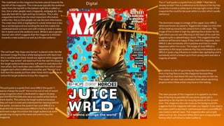
  • 1. The masthead on this magazine has been placed towards the top left of the magazine. This is because typically the audience looks from the top left to the bottom right this is called a z line, this is when people read a magazine, webpage etc. they typically look left to right and top to bottom. This is why magazines tend to have the most important information within the z line so that people can see the best information. The mast head (XXI) is highlighted In a bold white text it also has a red background surrounding the text this makes the masthead stand out more and with it being in bold it makes the it stand out to the audience more. White Is also a gender neutral color which suggests that the magazine is directed towards a male audience as well as a female audience The dominant image is a image of the rapper Juice WRLD otherwise known as (Jared A. Higgins) the image is a mid-shot of him looking towards the camera from a side angle. The image of him is shot in high key lighting this is shown by the light which you can see reflecting on the back of his coat this suggests quite a upbeat/happy mood. This suggests that the audience will become happy if they read this magazine, Juice WRLD is also somebody who Is positive and tries to create happiness within his music. The image of Juice WRLD is appealing to the target audience (hip hop enthusiasts) as Juice WRLD is quite a big influence in modern day rap/hiphop and is somebody which is looked up to from young teens and also a majority of adults. The sub head “Hip-Hops new heroes” is placed under the the dominant image this has a white background with black text this is used because black stands out against white suggesting that the “new artists” will stand out from the rest this draws in the target audience because they will want to read about the new artists. Each word also uses a different font which could suggest each artist is different to another and “Heroes” is in bold text this stands out from other fonts which again tries to entice the target audience to buy the magazine. The subline is a list of upcoming hip hop artists this would entice hip hop fans to buy the magazine because they would want to read about the new hip hop stars on the rise. The reader can also read unreleased news about upcoming projects which these artists may have in the making The pull quote is a quote from Juice WRLD the quote “I wanna change the world” this is a line out of one of recent songs (Legends) which is dedicated to rappers (lil peep and XXXTENTACION) who were successful artists before there deaths. This entices the target audience because they will want to read and understand the meaning behind the quote. Just above the quote It has Juice WRLD in a large text this Is because juice WRLD is the face of the dominant image this entices the target audience as some people may recognize the name and want to buy the magazine. The 2nd pull quote is a quote from LIL BABY ”I feel like its already written” this is a reference to his future in the hip hop scene this is wrote in white text in the top right corner of the magazine this could be because white is a color which usually stands out The main purpose of this magazine is to appeal to as many fans of hip hop as possible this has done a good job in appealing to hip hop fans by using big artists at this current time. The magazine also uses roses as the background this suggests that the magazine will make you happier if you read it the roses could’ve also been used because one or juice WRLD’s new tracks is named roses. The magazine also uses bright colors such as red , blue and white which give a happy/upbeat feeling which will attract a wider audience. Digital
  • 2. Digital The subhead “How High?” has two meanings, the word High could suggest he is high on cannabis which it’s a well known fact the Wiz Khalifa smokes cannabis as he is seen smoking “Joints” in quite a lot of his music videos the word high could also play of as being how high he is in the music industry as he has earned multiple achievements within the music industry. This suggests that we will understand the actual meaning by ”high” when we continue to read the article The article uses a yellow drop cap this is used to draw the readers attention and to stand out from the rest of the text. As when the reader reads through the article their attention will instantly be drawn to the drop cap this is because the drop cap is in yellow text which stands out from the black text which is used in the rest of the article The by line is used to let the audience know how wrote the article this is important for two reasons as the audience could use this to find other articles written by that specific author. It is also important for the author as they could use this to build up a portfolio The title of the article is “WK” which stands for wiz Khalifa this is used to make the title shorter, bolder and also make it look more snappy it also means that there is more room on the page than had they used his real name. Wiz Khalifa is also known world wide especially after his song “See you again” in dedication to the late Paul Walker. The article also uses a picture of him meaning that the audience will recognise him via the picture. The title “WK” is also wrote in two different colours with the W being wrote in black and K being wrote in yellow. This could be a suggestion to one of his biggest hits “Black and yellow” starring Snoop Dog. The dominant image is a image of American rapper Wiz Khalifa otherwise known as Cameron Jibril Thomaz. who was one of the leading hip hop artists in his prime in 2015. The image also shows smoke coming out of his mouth this suggests the use of cannabis which is something that he is known for as in a lot of his videos you can see him smoking. The black background could suggest that the magazine is for males and females however it mainly applies to a male audience this is because the majority of the hip hop audience is male’s. This image is a close up mid shot which is shot in high key lighting which could suggest happiness which could entice the reader to purchase the magazine. The image also shows smoke coming out of his mouth this could have been used to attract the hip hop audience as a lot of known artists in the hip hop industry openly smoke cannabis and wiz khalifa is also a well known advocate for the legalisation of cannabis in the us. Khalifa’s facial expression portrays him as being quite laid back this could be used to portray hip hop artists as being laid back aswell. The use of the smoke could also suggest to the audience that the article is going to be about cannabis which wiz is open about. This article has been structured so that the text is at the bottom of right page. The text has been organised into two separate paragraphs besides each other this make the article look neat and tidy rather than messy with text scattered all over the page which some magazines do. This also makes the reader be able to understand what the article is about easier.
  • 3. The masthead of this magazine is (XXI) this is in a large white font which has a red background around the text. The red background makes the white text stand out which makes it easier for the reader to notice this when to look at the magazine. This masthead is located at the top left of the page this is done as stereotypically the audience skim read front covers of magazines from the top left to the bottom right this Is called a z line This is also why the majority of company’s include the main information about the magazines within the z line. the 2 colours used in the masthead are considered to be gender neutral this suggests that the magazine is aimed towards both male and female it also could suggest that both genders enjoy hip hop music The dominant image is of rapper Tupac Amaru Shakur this image is shot In greyscale this is used to suggest a element of realism this could be because Tupac was somebody who used to speak what was on his mind and he used to rap about topics which we usually not spoke about. The greyscale also suggests a sense of history which could be used to show that Tupac will be somebody who will be remembered in history. The lighting also could suggest how Tupac is a legend of his time and is somebody who is well respected. The image of Tupac takes up the majority of the page and also overlaps the masthead which could suggest that Tupac is the main sell of the magazine rather than the actual title, the size of the image also could suggest how big Tupac was in the music/hip hop industry as he is somebody who many people look up to due to the fact that he used to speak his mind rather than hold back. The image draws the readers attention through the use of Tupac because a lot of people people look up to him this is something which (XXL) magazines do a lot as the find somebody who people look up to for example in some magazines they use Juice WRLD who is a modern day rap artist. The XXL produces find artists who the majority of the audience may be able to relate with in one way or another. The image also shows him looking directly into the camera this could draw the readers attention as it could make them feel like he is there. This magazine uses taglines of people who are featured in the exclusive interview which his magazine provides this helps to sell the magazine as a lot of people who are fans of Tupac will want to see a interview with his family and close friends this also is used to make to make the XXL magazines stand out as it shows that they can get exclusive interviews unlike other magazines which can not. This is also placed towards the bottom right of the magazine this is because of the z line where the audience typically read from the top left to bottom right which is the reason why important information is usually placed within the z line. The text is also in white writing with a black border around it this is something which XXL use a lot as white stands out from black which could suggest that this brand stands out from a lot of other brands This magazine uses a sell line “Special Tribute Free” is used to help sell the magazine because it sows if you purchase this magazine then you will receive a special Tupac tribute for free this is something which most magazines don’t offer which will create a wider audience for the XXL brand as they offer something which a lot of other brands don’t The subline “R.I.P TUPAC SHAKUR” and “2PAC BACK” is used to attract people to the magazine because it has been 15 years since his death meaning that people will want to read about Tupac's memorial. This has also been wrote in large black text in the middle right of the screen this is to draw the readers attention and the large text suggests that it is a important part of the magazine . This magazine consists of 3 colours red , black and white this is a change from other XXL magazines which usually use a range of bright colours to create a happy effect to the audience. These colours could have been used to create a historic feeling to the audience. Print
  • 4. The dominant image on this article is a mid/long shot of the rapper Eminem this is shot in high key lighting which makes the image brighter and creates an optimistic/upbeat reaction. This image shows Eminem wiping down a knife which has some blood on it whilst he is shown to have blood on a white apron and on his face and arms. This entices the audience because they will question why he has blood all over him and they will be interested and want to read what the article is about. The article has structure this to make it one of the first things which the reader will recognise due to the majority of readers typically reading from the top left to bottom right. The Vibe magazine has used Eminem because he has a very big name within the hip hop industry and is a figure who a lot of people recognise whether or not if they are fans of hip hop. The dominant image which shows Eminem holding the knife covered in blood suggests death this links back to the article as it is based around when Eminem nearly died This article uses a pull quote which is located in the top left of the article meaning that it will be one of the first things that the reader will see when they look at the article. The typography appears in quite a clean looking font which is easy for the readers to understand.The typography is also enlarged which makes the quote stand out to the audience.The pull quote “I ALMOST DIEDAND I STILLWENT BACKTO USING” Is based on Eminem’s drug overdose which he suffered after taking a number of different drugs towards the end of 2007 In the bottom right corner of the article it has “EMINEM” with the E being placed backwards and being highlighted in red. This has been purposely been positioned here because of the z line meaning that this will be something which the audience will see after they see the image of Eminem meaning that if the reader does not recognise him from the picture then his name is just to the right of that. The typography stands out due to the size and also the font which is different to the standard fonts used in magazines The simplicity of this article will draw the readers attention due to the fact that the text Is separated into 3 separate columns with 1 positioned to the left of the dominant image and the other 2 being on the right side of the image this makes this magazine unique because the article has been split it could also suggest that the first paragraph is based on Eminem’s life before his overdose and the the next to paragraphs are about what happened after the overdose this is in contrast with the pull quote being positioned directly above the first paragraph. This also entices the reader because the layout of the article Is easy for the reader to understand unlike some articles which make it difficult for the readers to understand. This article uses the colours red , black and white. The red and black create contrast with the white background due to black and white being completely opposite. These colours also keep the article plain and simple rather than having a huge range of different colours and background images. The colour red is used within this magazine as it has connotations with death this links back to the pull quote “I ALMOST DIED”
  • 5. The pro’s which come with digital magazines are that they can be shared around on social media as well as between friends, family or colleagues easily by either sharing a post or simply copying and pasting a link which can also be sent via text or private message. This makes digital magazines more interactable than print magazines as print requires you to actually go to a store and buy a copy of the magazine where digital doesn't. However print magazines mean that the reader can actually read the magazine freely without being bombarded by advertisements from the websites in which you get the magazine from. Other Pro’s with digital magazines could include how websites can advertise other magazines in which you may be interested in, as on websites after you read a magazine it usually pops up asking if you enjoyed that magazine. This means that the website can advertise magazines to you based on the topics that you enjoy. However, this doesn’t really happen with print magazines as it cannot specifically target topics which you may enjoy because of the inability to interact with the audience. Digital magazines also appeal to wider audiences than print as pretty much anybody can access digital magazines .This is because the majority of people in modern day society own mobile phones, computers and laptops etc, meaning that as long as you have internet you can access digital magazines. The majority of people would also rather use digital as they can not be ruined whereas print magazines can be ruined if ripped accidently or water is spilt on it. Additionally, there is the issue of storage, digital magazines can be downloaded and saved for example an apple iphone user can save these into their iphone magazine rack on their phone meaning that you can read back at the old magazines at any point in time. In contrast people don’t tend to revisit a print magazine as they take up space at home or the office and multiple print magazines cause clutter which is why most people dispose of print magazines or put them in a drawer somewhere which means that they are easily forgotten about once they have been read. Digital magazines however, still hasvecons , you have to use mobile data when you are reading the magazines outside of your home or wifi whilst at home.This means that if you don’t have a lot of data you are more than likely going to use up all of your data pretty quickly resulting in additional charges from your provider or being unable to finish reading the digital magazine. If there are issues with your wifi service at home, you would not be able to read the magazine online. Digital magazines also create less jobs than print magazines although they both require people to write the magazines articles and design the layout of the magazine a print magazine also requires people to print the magazines whereas a digital magazine is simply uploaded this means that less jobs are required from a digital perspective. Opportunities and Limitations – Digital and print magazines
  • 6. Opportunities and Limitations – Digital and print magazines (Part 2) Some cons of print magazines are that sometimes stores might not sell the magazine which you want or they may sell out of a particular copy, meaning that you may have to buy from websites like amazon etc.This will more than likely cost more as you will have to pay postage fees etc and you may wait days for delivery.This problem does not arise with digital magazines as you read them from your device rather than having to buy a paper copy of the magazine. Pro’s with print magazines are that as long as you have spare cash, you can go along to a shop and buy a magazine whereas digital magazines require constant internet connection. Print magazines are also useful for people who commute to work as they do not require mobile data and a lot of the time when travelling via train or metro, mobile phone or device signal is non-existent , meaning that you would not be able to continuously view a digital magazine without interruptions .Another pro with print is that you are more likely going to remember what certain parts are about because it is in first hand, with digital magazine ads usually pop up which can distract your attention to the magazine Overall, I think that both types of magazines have opportunities and limitations. Due to the fact that the audience may not all have access to the technology required to buy digital magazines I believe that print magazines have an edge over digital at the moment due to the fact that anybody can purchase them from a variety of places such as newsagents, supermarkets etc which is more suitable for quite a lot of people and especially the older and less technical generation who may not understand modern technology. Digital magazines are aimed towards the younger and more technical generation for example teenagers and younger adults, in comparison, print magazines are usually bought by older people.Therefore, the average age of the consumer dictates which magazine will be most popular and determines the target audience of both print and digital magazines.
  • 7. TechnicalConsiderations technical considerations of print magazines: the size of the magazines are usually in a4.You also need to consider what size and style of fonts will be used in the magazine as usually magazine use quite a clean and simple fond making it easy for the readers to understand the size of the text is usually rather small allowing more information to be wrote. Print magazine also usually use the rgb color mode. Print magazines also use bleed lines to ensure that all of the text stays on the pageThey also use gutter lines which separate the columns making it easier for the reader to navigate through the text.You also need to take into consideration how the reader will navigate through the magazine most magazines use content pages which highlight what information is going to be on what page making it easier for the reader to find what they want to read.You also need to take into consideration how the article is laid out as the readers of print magazines will be flipping through pages rather than scrolling down a page meaning that you need to balance out the content on each page.The main consideration with print magazines is where the readers will be able to purchase the magazine from as most print magazines are available from supermarkets local shops etc. Technical considerations of digital magazines: With digital magazines you need to take the fact that not all applications fully support digital magazines meaning that the layout of the magazine could have “Glitches” and not show the layout in which the author would have intended.You also need to take into consider the fact that not all devices support digital magazines especially with digital magazines being rather new a lot of the older devices may not support digital magazines which could possibly stop you seeing the magazine full stop or could make some buttons on the device will not fully sync with the magazine which could give the reader a bad experience and cause frustration. Another consideration which needs to be took into consideration would be the fact that some colors and fonts don’t fully translate over to digital magazine which could make the magazine look bad and throw the reader of the magazine it could also make the fonts unreadable.You also must take into consideration how the reader will navigate through the magazine as you don’t want the reader to miss essential/important information my accidently skipping past a pageYou also need think about how video files or images will be viewed as you want the reader to see images or videos.You also need to take into consideration weather the reader will constantly have to keep zooming in and out to view certain parts of the magazine as this can be annoying/ frustrating for the reader.
  • 8. Distribution The distribution of a print magazine is important as they are usually sold in places like supermarkets, newsagents and train stations due to the following reasons: • Many people visit supermarkets on a regular basis to do their food shopping they are likely to see the magazine and purchase it. Supermarkets also have an online shopping facility for convenience and a magazine can also be purchased with the weekly shop without having to leave the house. • Newsagents are useful for people because the majority of neighbourhoods have a local newsagent meaning that it is easily accessible for people regardless of age or gender. • Train stations have both mini supermarkets and newsagents, there is a lot of footfall in a train station and people will purchase magazines from these stores to read during their commute. Print magazines can also be found in music gigs, festivals, airports, petrol stations, cinemas and also some magazine/bookstores. However, one issue with a print magazine is the distribution from print to the vendor this is both more expensive and time consuming due to the costs of and the time taken in transit. However, on the flip side this also creates jobs for publishers and delivery drivers. The fact that a high number of the audience are moving to digital format will lead to loss of jobs for printers as the print magazine will more than likely not sell as well as digital magazines will meaning smaller numbers of the magazine are sent to print and in turn potential job losses. Additionally, the requirement for delivery drivers to transport the magazines to the vendor will slowly decline reducing the need for drivers in this field.
  • 9. Distribution Digital magazines do not require the use of printers or delivery drivers making these more financially viable for the company. Distribution of the digital magazine entails the use of the preferred design software followed by the successful online distribution to the preferred marketplace such as Apple’s app store , Amazon and Google play for example at the push of a button.This is more convenient to publishers due to cost effectiveness as well as convenience to readers because these marketplaces are visited online by millions of people each day creating a bigger audience for the magazine. Using sites such as amazon also means that you could see advertisements for the magazine prior to deciding to purchase. Additionally, an extra revenue stream for the magazine publishers is created through online pop up advertisements for other companies, you do not have much of a choice about viewing these online however with a print magazine these are more easily ignored. In a nutshell costs of print magazine distribution are likely to be higher than those involved with the digital magazine however, more jobs are sustained as a result of not moving completely to the digital era.