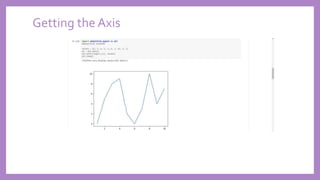
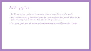
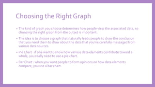
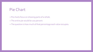
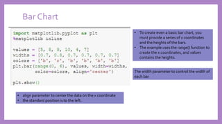
UNIT 4 : DATA
VISUALIZATION
DataVisualization
• Most people visualize information better than textual information
• Even if one can deal with the abstraction of textual data with ease, performing
data analysis is all about communication.
• Unless one can communicate his/her ideas to other people, the act of obtaining,
shaping, and analyzing the data has little value beyond your own personal needs.
• Fortunately, Python makes the task of converting your textual data into graphics
relatively easy using MatPlotLib, which is actually a simulation of the MATLAB
application.
MATLAB and MatPlotLib
• both use the same sort of state machine to perform tasks and they have a similar
method of defining graphic elements.
• A number of people feel that MatPlotLib is superior to MATLAB because you can
do things like perform tasks using less code when working with MatPlotLib than
when using MATLAB
• Others have noted that the transition from MATLAB to MatPlotLib is relatively
straightforward.
• Actually it depends thinking of persons. You may find that you like to experiment
with data using MATLAB and then create applications based on your findings
using Python with MatPlotLib.
Starting with Graph
• A graph or chart is simply a visual representation of numeric data
• MatPlotLib makes a large number of graph and chart types available to you.
• Of course, you can choose any of the common graph and graph types such as bar
charts, line graphs, or pie charts.
• As with MATLAB, you also have access to a huge number of statistical plot types,
such as boxplots, error bar charts, and histograms.
• However, it’s important to remember that you can combine graphic elements in
an almost infinite number of ways to create your own presentation of data no
matter how complex that data might be.
Types of graphs support by MatPlotLib
https://matplotlib.org/gallery.html
Defining the Plot
plt.plot() function to create a plot using x-axis
values between 1 and 11 and y-axis values as
they appear in values.
Calling plot.show() displays the plot in a
separate dialog box,
Defining the Plot
Drawing multiple lines and plots
We encounter many situations in which need to use multiple
plot lines, such as when comparing two sets of values.
To create such plots using MatPlotLib, need to call plt.plot()
multiple times — once for each plot line, as shown in the above
example.
Drawing multiple lines and plots
SavingWork to disk
• When you do need to save a copy of your work to disk for later reference or to use
it as part of a larger report, you save the graphic programmatically using the
plt.savefig() function, as shown in the following code:
In this case, you must provide a minimum of two inputs. The first input is the filename. You
may optionally include a path for saving the file. The second input is the file format. In this
case, the example saves the file in Portable Network Graphic (PNG) format, but you have
other options: Portable Document Format (PDF), Postscript (PS), Encapsulated Postscript
(EPS), and ScalableVector Graphics (SVG).
calling plt.ioff() turns plot
interaction off.
SavingWork to disk
Getting the axes
• The axes define the x and y plane of the graphic.
• The x axis runs horizontally, and the y axis runs vertically.
• In many cases, you can allow MatPlotLib to perform any required formatting for
you.
• However, sometimes you need to obtain access to the axes and format them
manually.The following code shows how to obtain access to the axes for a plot
Getting the Axis
Formatting the Axes
• Simply displaying the axes won’t be enough in many cases.You want to change
the way MatPlotLib displays them.
Formatting the Axes
set_xlim() and set_ylim() calls
change the axes limits — the
length of each axis
set_xticks() and set_yticks()
calls change the ticks used to
display data
Adding grids
• Grid lines enable you to see the precise value of each element of a graph.
• You can more quickly determine both the x and y coordinates, which allow you to
perform comparisons of individual points with greater ease.
• Of course, grids also add noise and make seeing the actual flow of data harder.
Adding grids
Defining Line Appearance
Working with Line Styles
• The line style appears as a third
argument to the plot() function call.
• You simply provide the desired string for
the line type.
Working with Line Styles
Using Colors
Using Colors
As with line styles, the color appears
in a string as the third argument to
the plot() function call
Adding Markers
Using Labels,Annotations and Legends
• To fully document your graph, you usually have to resort to labels, annotations, and
legends. Each of these elements has a different purpose, as follows:
• Label: Provides positive identification of a particular data element or grouping. The
purpose is to make it easy for the viewer to know the name or kind of data illustrated.
• Annotation: Augments the information the viewer can immediately see about the data
with notes, sources, or other useful information. In contrast to a label, the purpose of
annotation is to help extend the viewer’s knowledge of the data rather than simply
identify it.
• Legend: Presents a listing of the data groups within the graph and often provides cues
(such as line type or color) to make identification of the data group easier. For example, all
the red points may belong to group A, while all the blue points may belong to group B.
Adding Labels
• Labels help people understand the significance of each axis of any graph you
create.
• Without labels, the values portrayed don’t have any significance. In addition to a
moniker, such as rainfall, you can also add units of measure, such as inches or
centimeters, so that your audience knows how to interpret the data shown.
Adding Labels
Annotating the Chart
The call to annotate() provides the
labeling you need.
You must provide a location for the
annotation by using the xy parameter,
as well as provide text to place at the
location by using the s parameter.
Annotating the Chart
Creating Legend
Creating Legend
Choosing the Right Graph
• The kind of graph you choose determines how people view the associated data, so
choosing the right graph from the outset is important.
• The idea is to choose a graph that naturally leads people to draw the conclusion
that you need them to draw about the data that you’ve carefully massaged from
various data sources.
• Pie Chart : if one want to show how various data elements contribute toward a
whole, you really need to use a pie chart.
• Bar Chart : when you want people to form opinions on how data elements
compare, you use a bar chart.
Pie Chart
• Pie charts focus on showing parts of a whole.
• The entire pie would be 100 percent.
• The question is how much of that percentage each value occupies.
Pie Chart
The essential part of a pie chart is the values
You could create a basic pie chart using just
the values as input.
The colors parameter lets you choose custom
colors for each pie wedge.
You use the labels parameter to identify each
wedge.
In many cases, you need to make one wedge
stand out from the others, so you add the
explode parameter with list of explode
values. A value of 0 keeps the wedge in place
— any other value moves the wedge out
from the center of the pie.
Pie Chart
Bar Chart
• To create even a basic bar chart, you
must provide a series of x coordinates
and the heights of the bars.
• The example uses the range() function to
create the x coordinates, and values
contains the heights.
The width parameter to control the width of
each bar
• align parameter to center the data on the x coordinate
• the standard position is to the left.
Bar Chart
Showing Distributions using Histograms
• Histograms categorize data by breaking it into bins, where each bin contains a
subset of the data range.
• A histogram then displays the number of items in each bin so that you can see the
distribution of data and the progression of data from bin to bin.
• In most cases, you see a curve of some type, such as a bell curve.
Histograms
Boxplot
• Boxplots provide a means of depicting groups of numbers through their quartiles
• A boxplot may also have lines, called whiskers, indicating data outside the upper
and lower quartiles.
• The spacing shown within a boxplot helps indicate the skew and dispersion of the
data.
• The following example shows how to create a boxplot with randomized data.
Boxplot
Box Plot
Scatter Plot
• Scatterplots show clusters of data rather than trends (as with line graphs) or
discrete values (as with bar charts).
• The purpose of a scatterplot is to help you see data patterns.The
Scatter Plot
The example begins by generating random x and y coordinates. For each x coordinate, you must have a
corresponding y coordinate. It’s possible to create a scatterplot using just the x and y coordinates.
The s parameter determines the size of each data point.
The marker parameter determines the data point shape.
You use the c parameter to define the colors for all the
data points.
Advanced Scatter Plot
• Scatterplots are especially important for data science because they can show data
patterns that aren’t obvious when viewed in other ways.
• You can see data groupings with relative ease and help the viewer understand
when data belongs to a particular group.
Advanced Scatter Plot
Showing Correlations
• In some cases, you need to know the general direction that your data is taking
when looking at a scatterplot.
• Even if you create a clear depiction of the groups, the actual direction that the
data is taking as a whole may not be clear. In this case, you add a trendline to the
output.
Time Series
Plotting trends over time
Developing undirected graph
• an undirected graph simply shows connections between nodes.
• The output doesn’t provide a direction from one node to the next.
• For example, when establishing connectivity between web pages, no direction is
implied.
Developing Directed graph
UNIT_4_data visualization.pptx

UNIT_4_data visualization.pptx

  • 1.
    UNIT 4 :DATA VISUALIZATION
  • 2.
    DataVisualization • Most peoplevisualize information better than textual information • Even if one can deal with the abstraction of textual data with ease, performing data analysis is all about communication. • Unless one can communicate his/her ideas to other people, the act of obtaining, shaping, and analyzing the data has little value beyond your own personal needs. • Fortunately, Python makes the task of converting your textual data into graphics relatively easy using MatPlotLib, which is actually a simulation of the MATLAB application.
  • 3.
    MATLAB and MatPlotLib •both use the same sort of state machine to perform tasks and they have a similar method of defining graphic elements. • A number of people feel that MatPlotLib is superior to MATLAB because you can do things like perform tasks using less code when working with MatPlotLib than when using MATLAB • Others have noted that the transition from MATLAB to MatPlotLib is relatively straightforward. • Actually it depends thinking of persons. You may find that you like to experiment with data using MATLAB and then create applications based on your findings using Python with MatPlotLib.
  • 4.
    Starting with Graph •A graph or chart is simply a visual representation of numeric data • MatPlotLib makes a large number of graph and chart types available to you. • Of course, you can choose any of the common graph and graph types such as bar charts, line graphs, or pie charts. • As with MATLAB, you also have access to a huge number of statistical plot types, such as boxplots, error bar charts, and histograms. • However, it’s important to remember that you can combine graphic elements in an almost infinite number of ways to create your own presentation of data no matter how complex that data might be.
  • 5.
    Types of graphssupport by MatPlotLib https://matplotlib.org/gallery.html
  • 6.
    Defining the Plot plt.plot()function to create a plot using x-axis values between 1 and 11 and y-axis values as they appear in values. Calling plot.show() displays the plot in a separate dialog box,
  • 7.
  • 8.
    Drawing multiple linesand plots We encounter many situations in which need to use multiple plot lines, such as when comparing two sets of values. To create such plots using MatPlotLib, need to call plt.plot() multiple times — once for each plot line, as shown in the above example.
  • 9.
  • 10.
    SavingWork to disk •When you do need to save a copy of your work to disk for later reference or to use it as part of a larger report, you save the graphic programmatically using the plt.savefig() function, as shown in the following code: In this case, you must provide a minimum of two inputs. The first input is the filename. You may optionally include a path for saving the file. The second input is the file format. In this case, the example saves the file in Portable Network Graphic (PNG) format, but you have other options: Portable Document Format (PDF), Postscript (PS), Encapsulated Postscript (EPS), and ScalableVector Graphics (SVG). calling plt.ioff() turns plot interaction off.
  • 11.
  • 12.
    Getting the axes •The axes define the x and y plane of the graphic. • The x axis runs horizontally, and the y axis runs vertically. • In many cases, you can allow MatPlotLib to perform any required formatting for you. • However, sometimes you need to obtain access to the axes and format them manually.The following code shows how to obtain access to the axes for a plot
  • 13.
  • 14.
    Formatting the Axes •Simply displaying the axes won’t be enough in many cases.You want to change the way MatPlotLib displays them.
  • 15.
    Formatting the Axes set_xlim()and set_ylim() calls change the axes limits — the length of each axis set_xticks() and set_yticks() calls change the ticks used to display data
  • 16.
    Adding grids • Gridlines enable you to see the precise value of each element of a graph. • You can more quickly determine both the x and y coordinates, which allow you to perform comparisons of individual points with greater ease. • Of course, grids also add noise and make seeing the actual flow of data harder.
  • 17.
  • 18.
  • 19.
    Working with LineStyles • The line style appears as a third argument to the plot() function call. • You simply provide the desired string for the line type.
  • 20.
  • 21.
  • 22.
    Using Colors As withline styles, the color appears in a string as the third argument to the plot() function call
  • 23.
  • 24.
    Using Labels,Annotations andLegends • To fully document your graph, you usually have to resort to labels, annotations, and legends. Each of these elements has a different purpose, as follows: • Label: Provides positive identification of a particular data element or grouping. The purpose is to make it easy for the viewer to know the name or kind of data illustrated. • Annotation: Augments the information the viewer can immediately see about the data with notes, sources, or other useful information. In contrast to a label, the purpose of annotation is to help extend the viewer’s knowledge of the data rather than simply identify it. • Legend: Presents a listing of the data groups within the graph and often provides cues (such as line type or color) to make identification of the data group easier. For example, all the red points may belong to group A, while all the blue points may belong to group B.
  • 25.
    Adding Labels • Labelshelp people understand the significance of each axis of any graph you create. • Without labels, the values portrayed don’t have any significance. In addition to a moniker, such as rainfall, you can also add units of measure, such as inches or centimeters, so that your audience knows how to interpret the data shown.
  • 26.
  • 27.
    Annotating the Chart Thecall to annotate() provides the labeling you need. You must provide a location for the annotation by using the xy parameter, as well as provide text to place at the location by using the s parameter.
  • 28.
  • 29.
  • 30.
  • 31.
    Choosing the RightGraph • The kind of graph you choose determines how people view the associated data, so choosing the right graph from the outset is important. • The idea is to choose a graph that naturally leads people to draw the conclusion that you need them to draw about the data that you’ve carefully massaged from various data sources. • Pie Chart : if one want to show how various data elements contribute toward a whole, you really need to use a pie chart. • Bar Chart : when you want people to form opinions on how data elements compare, you use a bar chart.
  • 32.
    Pie Chart • Piecharts focus on showing parts of a whole. • The entire pie would be 100 percent. • The question is how much of that percentage each value occupies.
  • 33.
    Pie Chart The essentialpart of a pie chart is the values You could create a basic pie chart using just the values as input. The colors parameter lets you choose custom colors for each pie wedge. You use the labels parameter to identify each wedge. In many cases, you need to make one wedge stand out from the others, so you add the explode parameter with list of explode values. A value of 0 keeps the wedge in place — any other value moves the wedge out from the center of the pie.
  • 34.
  • 35.
    Bar Chart • Tocreate even a basic bar chart, you must provide a series of x coordinates and the heights of the bars. • The example uses the range() function to create the x coordinates, and values contains the heights. The width parameter to control the width of each bar • align parameter to center the data on the x coordinate • the standard position is to the left.
  • 36.
  • 37.
    Showing Distributions usingHistograms • Histograms categorize data by breaking it into bins, where each bin contains a subset of the data range. • A histogram then displays the number of items in each bin so that you can see the distribution of data and the progression of data from bin to bin. • In most cases, you see a curve of some type, such as a bell curve.
  • 38.
  • 39.
    Boxplot • Boxplots providea means of depicting groups of numbers through their quartiles • A boxplot may also have lines, called whiskers, indicating data outside the upper and lower quartiles. • The spacing shown within a boxplot helps indicate the skew and dispersion of the data. • The following example shows how to create a boxplot with randomized data.
  • 40.
  • 41.
  • 42.
    Scatter Plot • Scatterplotsshow clusters of data rather than trends (as with line graphs) or discrete values (as with bar charts). • The purpose of a scatterplot is to help you see data patterns.The
  • 43.
    Scatter Plot The examplebegins by generating random x and y coordinates. For each x coordinate, you must have a corresponding y coordinate. It’s possible to create a scatterplot using just the x and y coordinates. The s parameter determines the size of each data point. The marker parameter determines the data point shape. You use the c parameter to define the colors for all the data points.
  • 44.
    Advanced Scatter Plot •Scatterplots are especially important for data science because they can show data patterns that aren’t obvious when viewed in other ways. • You can see data groupings with relative ease and help the viewer understand when data belongs to a particular group.
  • 45.
  • 46.
    Showing Correlations • Insome cases, you need to know the general direction that your data is taking when looking at a scatterplot. • Even if you create a clear depiction of the groups, the actual direction that the data is taking as a whole may not be clear. In this case, you add a trendline to the output.
  • 48.
  • 50.
  • 51.
  • 52.
    Developing undirected graph •an undirected graph simply shows connections between nodes. • The output doesn’t provide a direction from one node to the next. • For example, when establishing connectivity between web pages, no direction is implied.
  • 55.