MODULE: 6 DATA
ANALYTICS FOR IOT
SOLUTIONS
MODULE: 6 DATA ANALYTICS FOR IOT SOLUTIONS
• Data generation, Data gathering, Data Pre-processing, data analyzation, application of analytics,
Exploratory Data Analysis, vertical-specific algorithms.
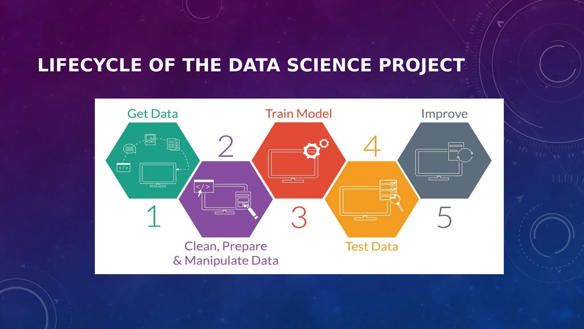
LIFECYCLE OF THE DATA SCIENCE PROJECT
APPLICATION OF EXPLORATORY DATA
ANALYSIS (EDA)
• What is EDA ?
• Aim of EDA
• EDA Tools
• EDA Techniques
• EDA vs CDA
• Steps of EDA
• Application of EDA with personal email
WHAT IS EXPLORATORY DATA ANALYSIS
REF:HTTPS://WWW.IBM.COM/CLOUD/LEARN/EXPLORATORY-DATA-ANALYSIS#TOC-TYPES-OF-E-64HSTW2A
• Exploratory data analysis (EDA) is used by data scientists to analyze and
investigate data sets and summarize their main characteristics, often
employing data visualization methods
• It helps determine how best to manipulate data sources to get the answers
you need, making it easier for data scientists to discover patterns, spot
anomalies, test a hypothesis, or check assumptions
WHAT IS EXPLORATORY DATA ANALYSIS
• EDA is primarily used to see what data can reveal beyond the formal modeling or hypothesis
testing task and provides a better understanding of data set variables and the relationships
between them
• It can also help determine if the statistical techniques you are considering for data analysis
are appropriate
• Originally developed by American mathematician John Tukey in the 1970s, EDA techniques
continue to be a widely used method in the data discovery process today.
AIM OF EDA
• Maximize insight into a dataset
• Uncover underlying structure (relationship)
• Extract important variables
• Detect outliers and anomalies
• Test underlying assumptions
• Develop valid models
• Determine optimal factor settings (Xs)
VISUAL AIDS FOR EDA
• Line chart
• Bar chart
• Scatter plot
• Area plot and
• stacked plot
• Pie chart
• Table chart
• Polar chart
• Histogram
• Lollipop chart
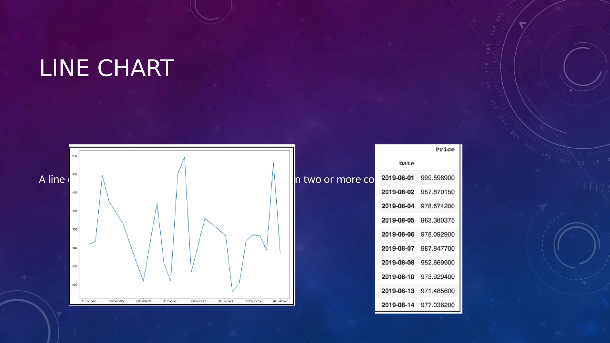
LINE CHART
A line chart is used to illustrate the relationship between two or more continuous variables.
Scatter plots can be constructed in the following two
situations:
1) When one continuous variable is dependent on another variable, which is under
the control of the observer
2) When both continuous variables are independent
There are two important concepts—independent variable and dependent variable. In
statistical modeling or mathematical modeling, the values of dependent variables rely
on the values of independent variables. The dependent variable is the outcome
variable being studied. The independent variables are also referred to as regressors.
The takeaway message here is that scatter plots are used when we need to show the
relationship between two variables, and hence are sometimes referred to as
correlation plots.
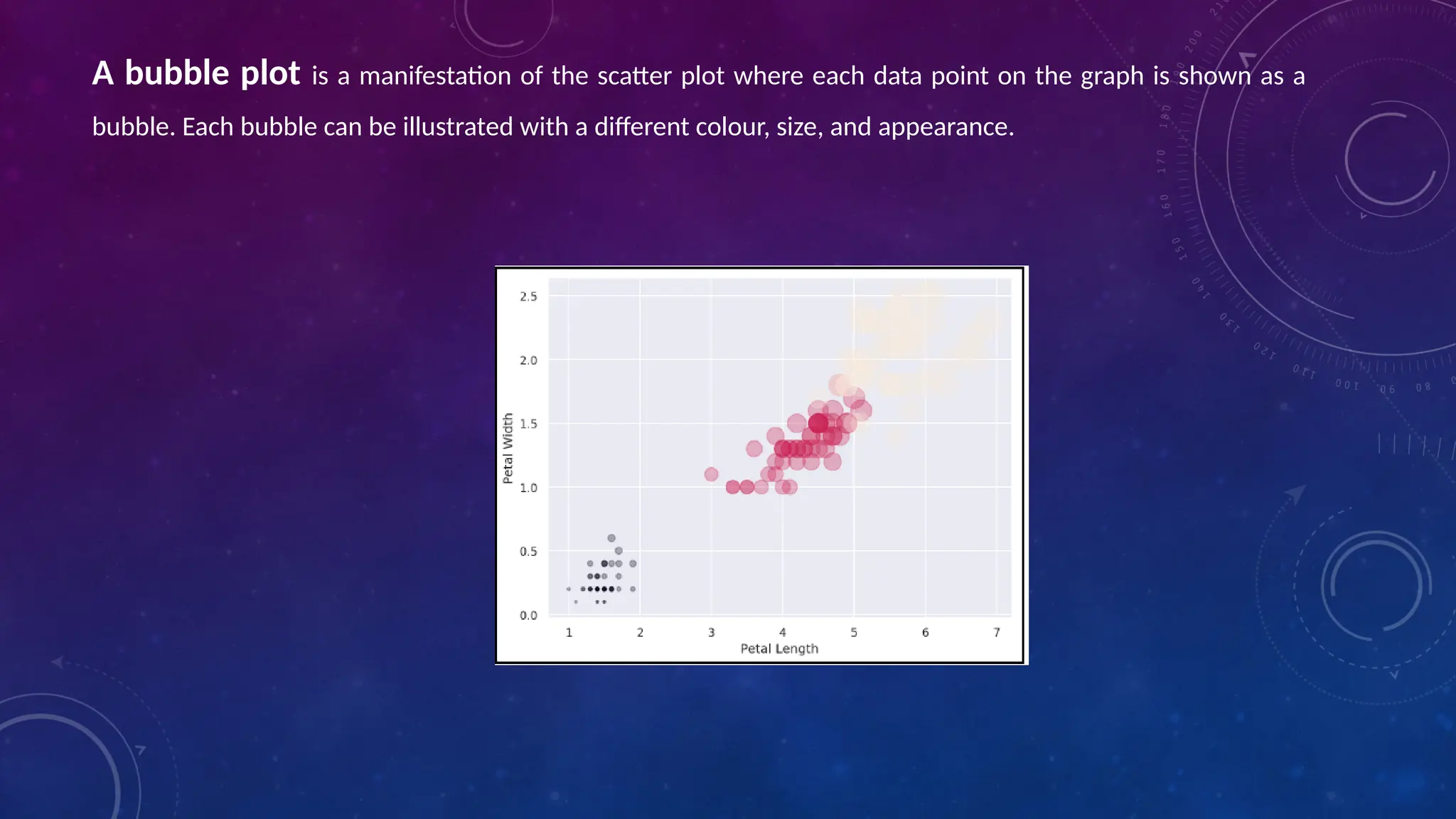
A bubble plot is a manifestation of the scatter plot where each data point on the graph is shown as a
bubble. Each bubble can be illustrated with a different colour, size, and appearance.
• The stacked plot can be useful when we want to visualize the cumulative effect of multiple variables
being plotted on the y axis.
• The purpose of the pie chart is to communicate proportions and it is
• widely accepted.
• Histogram plots are used to depict the distribution of any continuous variable. These types of plots are
very popular in statistical analysis
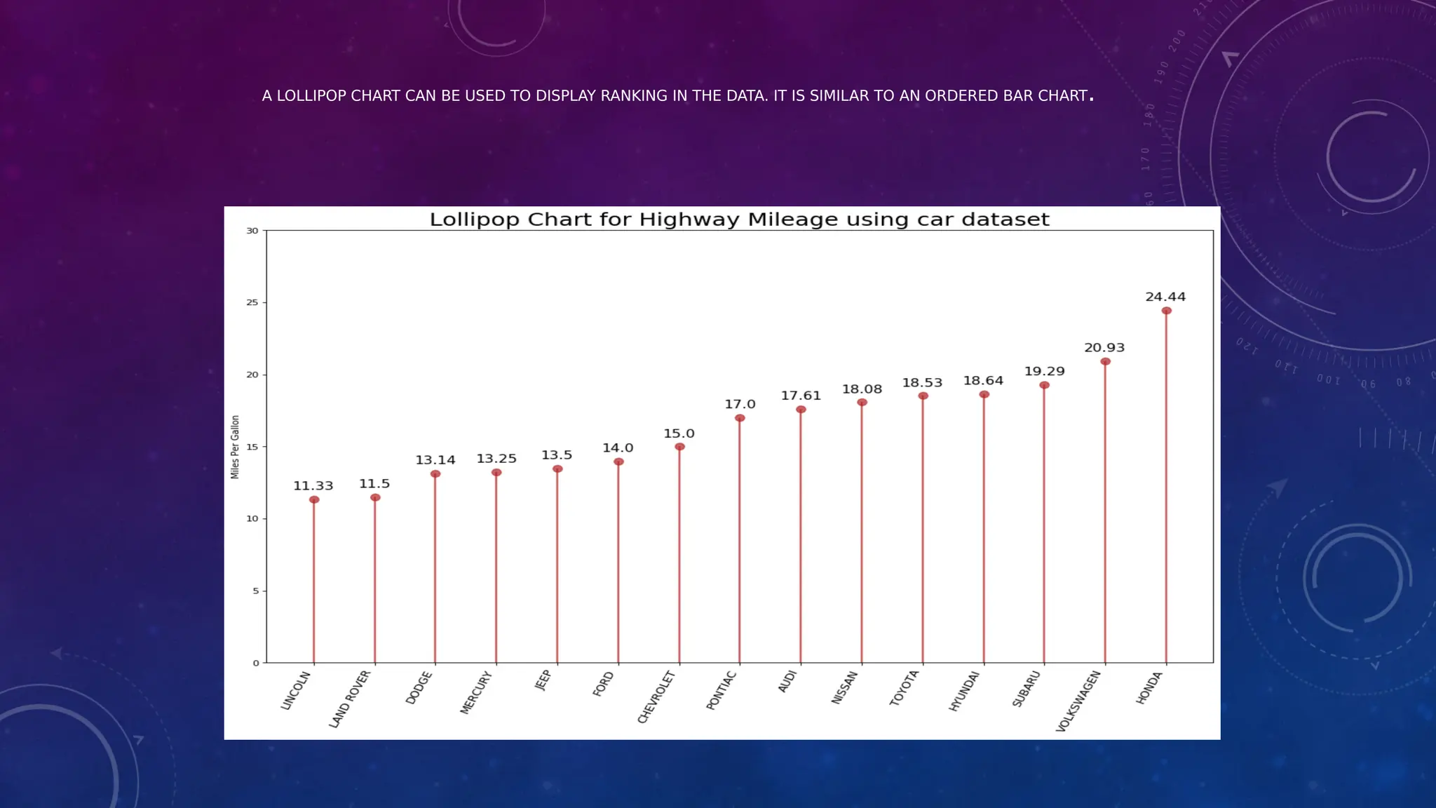
• A lollipop chart can be used to display ranking in the data. It is similar to an ordered bar chart.
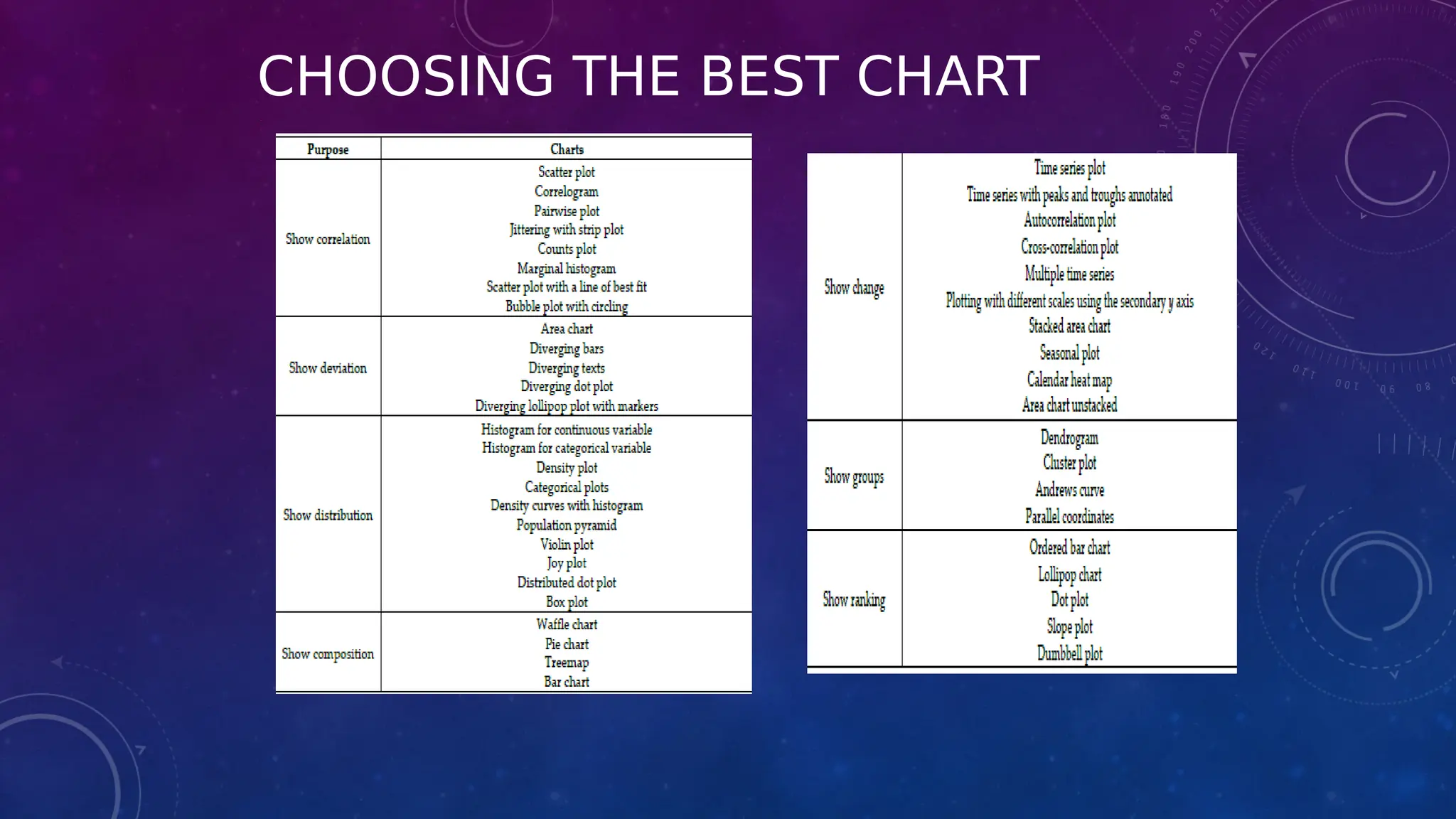
CHOOSING THE BEST CHART
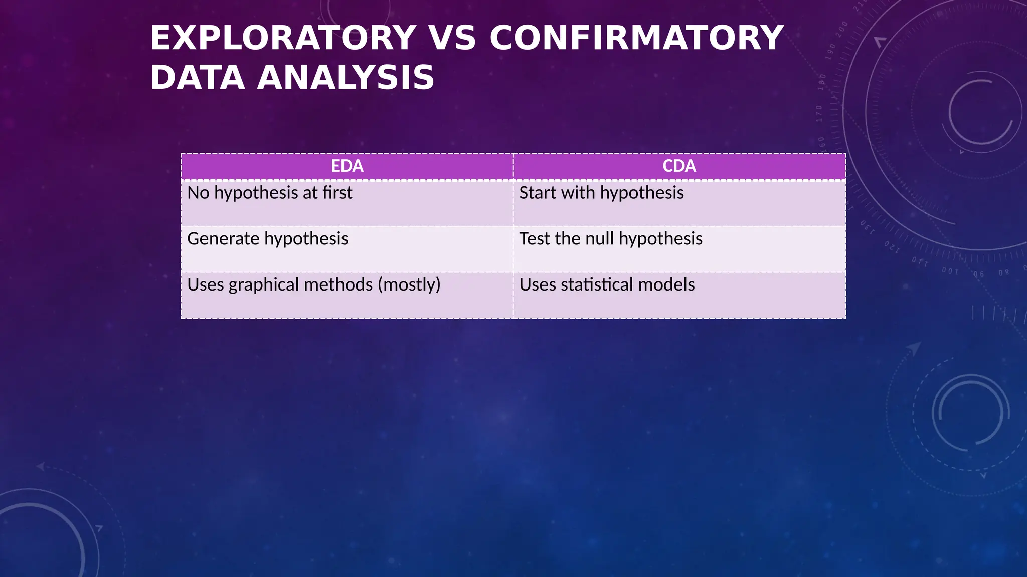
EXPLORATORY VS CONFIRMATORY
DATA ANALYSIS
EDA CDA
No hypothesis at first Start with hypothesis
Generate hypothesis Test the null hypothesis
Uses graphical methods (mostly) Uses statistical models
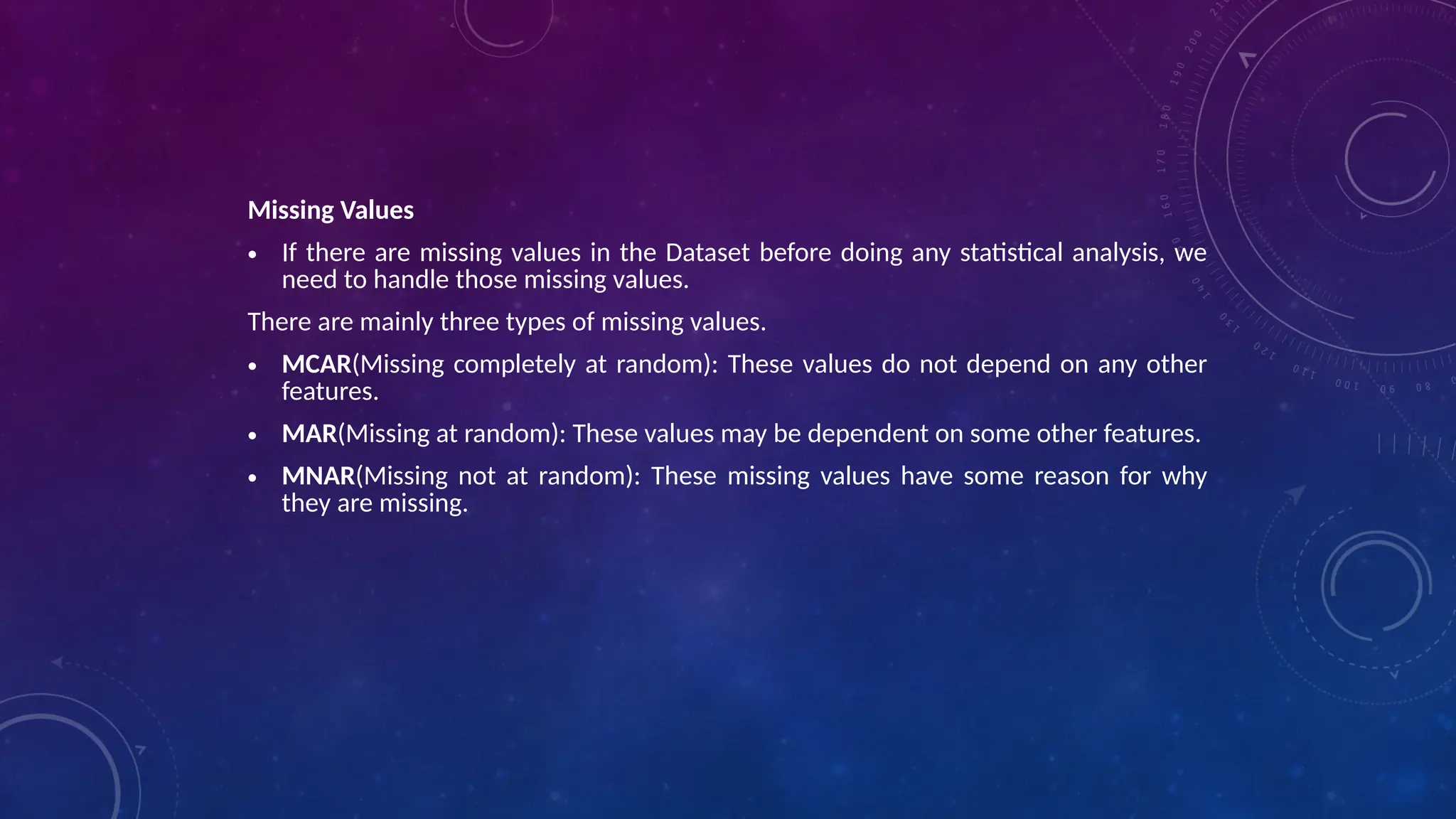
Missing Values
• If there are missing values in the Dataset before doing any statistical analysis, we
need to handle those missing values.
There are mainly three types of missing values.
• MCAR(Missing completely at random): These values do not depend on any other
features.
• MAR(Missing at random): These values may be dependent on some other features.
• MNAR(Missing not at random): These missing values have some reason for why
they are missing.
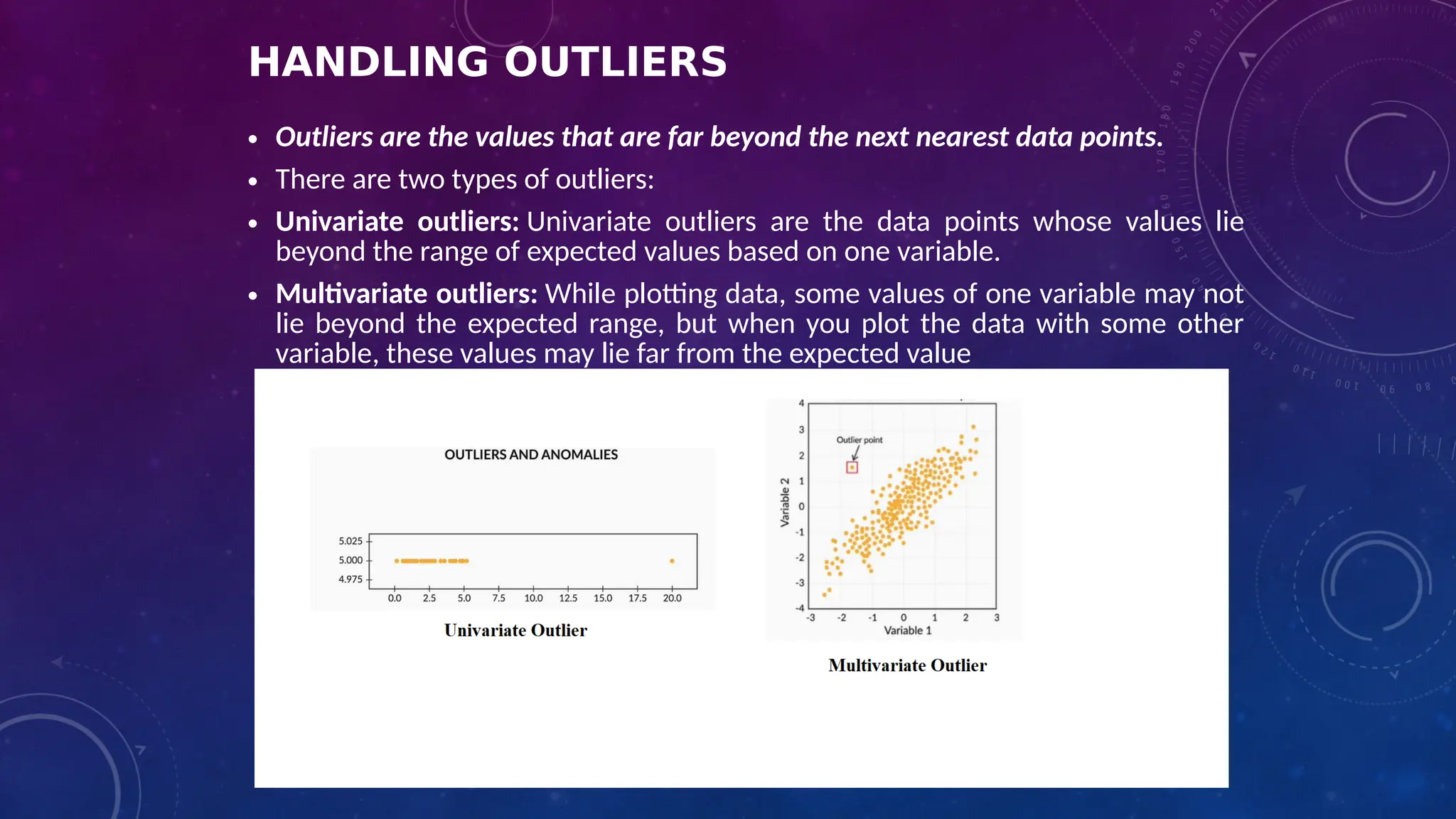
HANDLING OUTLIERS
• Outliers are the values that are far beyond the next nearest data points.
• There are two types of outliers:
• Univariate outliers: Univariate outliers are the data points whose values lie
beyond the range of expected values based on one variable.
• Multivariate outliers: While plotting data, some values of one variable may not
lie beyond the expected range, but when you plot the data with some other
variable, these values may lie far from the expected value
Box plot: In descriptive statistics, a box plot is a method for graphically depicting groups of
numerical data through their quartiles. Box plots may also have lines extending vertically
from the boxes (whiskers) indicating variability outside the upper and lower quartiles, hence
the terms box-and-whisker plot and box-and-whisker diagram. Outliers will appear separate
from the plot.
Outliers can be dropped only if it is a garbage value. Example: height of an adult = 0 ft. This
cannot be true, as the height cannot be a string value. In this case, outliers can be removed.
If the outliers have extreme values, they can be removed. For example, if all the data points
are clustered between zero to 10, but one point lies at 100, then we can remove this point.
If you cannot drop outliers, you can normalize the data. This way, the extreme data points
are pulled to a similar range.
• Normal Distribution or Symmetric Distribution : If a box plot has equal
proportions around the median, we can say distribution is symmetric or
normal.
• Positively Skewed : For a distribution that is positively skewed, the box plot will
show the median closer to the lower or bottom quartile.
A distribution is considered "Positively Skewed" when mean > median. It means
the data constitute higher frequency of high valued scores.
• Negatively Skewed : For a distribution that is negatively skewed, the box plot
will show the median closer to the upper or top quartile.
A distribution is considered "Negatively Skewed" when mean < median. It means
the data constitute higher frequency of low valued scores.
DIFFERENTIATE BETWEEN UNIVARIATE, BIVARIATE, AND MULTIVARIATE ANALYSIS
•Univariate – When we analyze one variable at a time, it is called univariate data analysis. This
analysis aims to describe the variable in question and find patterns that exist within it.
Example: height of students
•Bivariate – Bivariate data involves two different variables. The analysis of this type of data
deals with causes and relationships. The investigation determines the relationship between the
two variables, where one of the variables is the target variable. Example: temperature and ice
cream sales in the summer season.
•Multivariate – Analyzing three or more variables together is categorized under multivariate
data analysis. It is similar to a bivariate but contains more than one dependent variable.
Example: data for house price prediction
MENTION THE TWO KINDS OF TARGET VARIABLES FOR
PREDICTIVE MODELING
• Numerical/Continuous variable – Variables whose values lie within a range, could be any value in
that range and the time of prediction, values are not bound to be from the same range too.
• For example: Height of students – 5; 5.1; 6; 6.7; 7; 4.5; 5.11
Here the range of the values is (4,7)
And, the height of some new students can/cannot be any value from this range.
• Categorical variable – Variables that can take on one of a limited, and usually fixed, number of
possible values, assigning each individual or other unit of observation to a particular group on the
basis of some qualitative property.
A categorical variable that can take on exactly two values is termed a binary variable or a
dichotomous variable. Categorical variables with more than two possible values are called
polytomous variables
• For example: Exam Result: Pass, Fail (Binary categorical variable)
The blood-type of a person: A, B, O, AB (polytomous categorical variable)
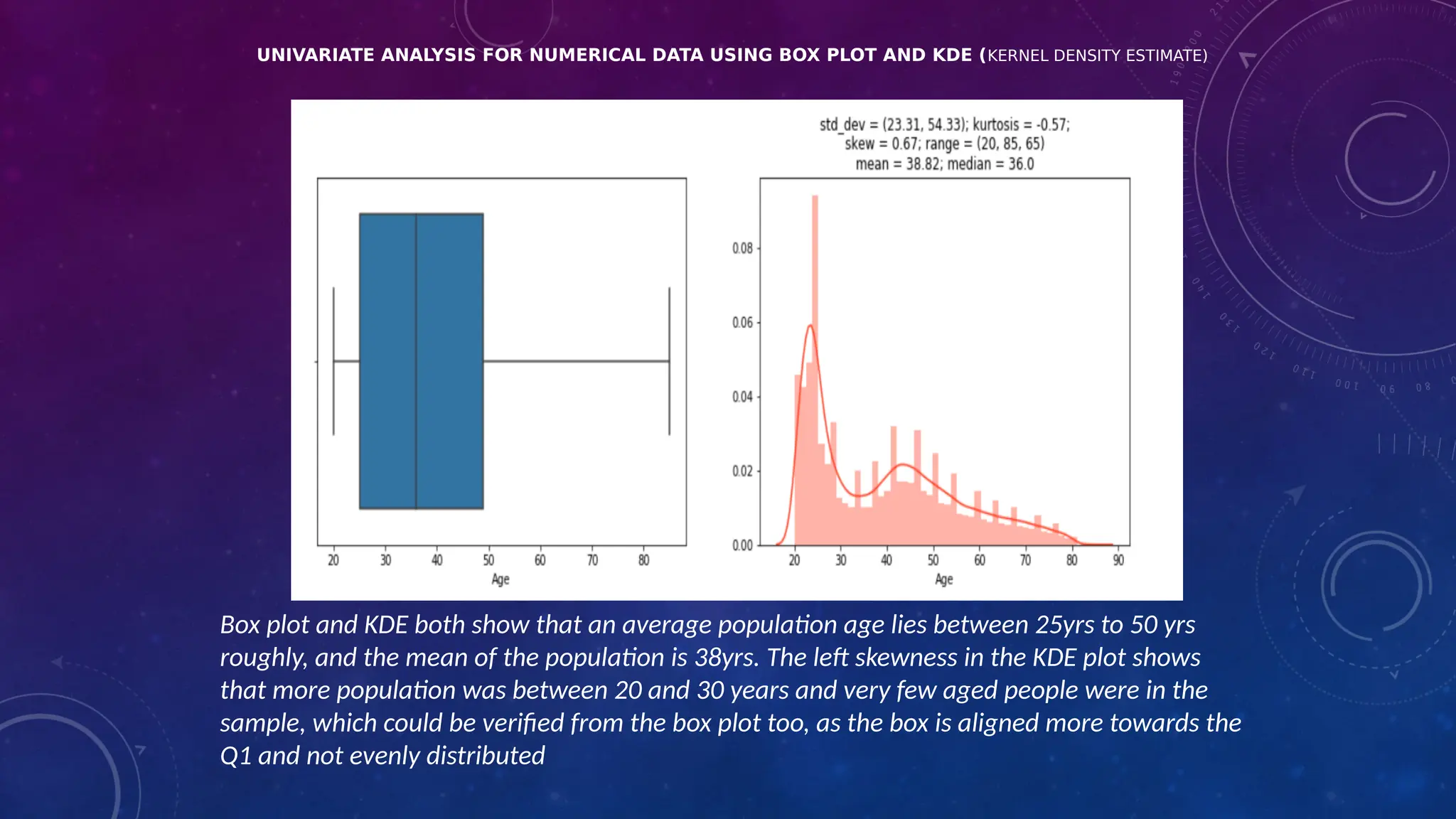
UNIVARIATE ANALYSIS FOR NUMERICAL DATA USING BOX PLOT AND KDE (KERNEL DENSITY ESTIMATE)
Box plot and KDE both show that an average population age lies between 25yrs to 50 yrs
roughly, and the mean of the population is 38yrs. The left skewness in the KDE plot shows
that more population was between 20 and 30 years and very few aged people were in the
sample, which could be verified from the box plot too, as the box is aligned more towards the
Q1 and not evenly distributed
UNIVARIATE ANALYSIS FOR
CATEGORICAL VARIABLES
Bar plots and Pie Charts are a great way to analyze categorical variables to
understand the categorical data.
Here, the Barplot and Pie chart shows that “Course” Course_Type was highest in
number with 51.3 % people subscribing to such courses, followed by “Program”
Course_Type, with the least number of “Degree” Course_Type with only 0.3%
subscribing to such courses
BIVARIATE ANALYSIS FOR NUMERICAL-NUMERICAL
• Bivariate analysis can be performed for any two sets of variables, Bivariate analysis is
performed using an independent variable and the dependent variable.
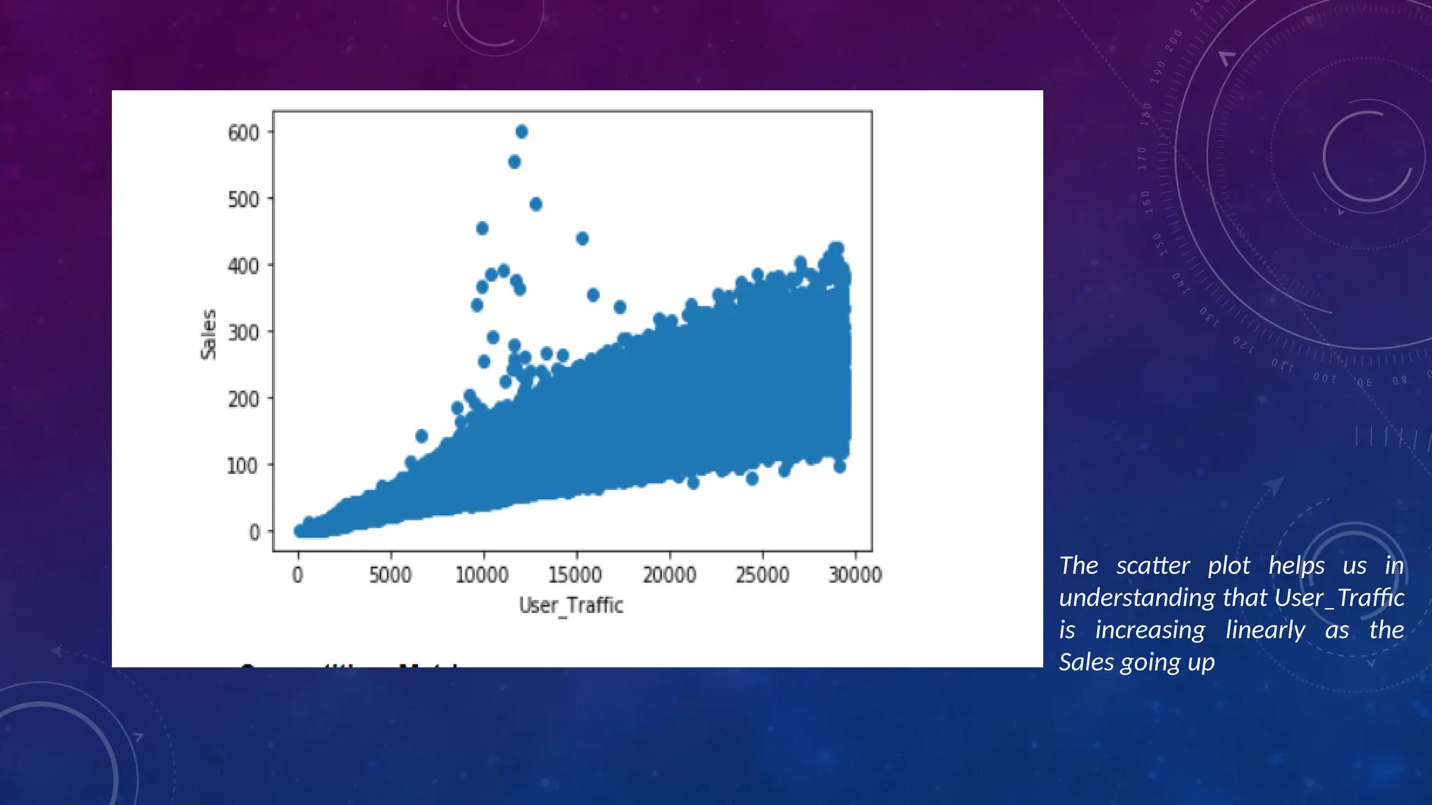
• Numerical-Numerical – Here, one of the numerical variables is the target variable and the
other one is any other independent numerical variable. A Scatter plot is a great way for
understanding numerical-numerical variable data relationships. In the example shown, sales is
the target numerical variable plotted on the y-axis against user-traffic numerical variables on
the x-axis
Types:
Scatter Plot
Pair Plot
Correlation Matrix
The scatter plot helps us in
understanding that User_Traffic
is increasing linearly as the
Sales going up
BIVARIATE CATEGORICAL —
CATEGORICAL ANALYSIS
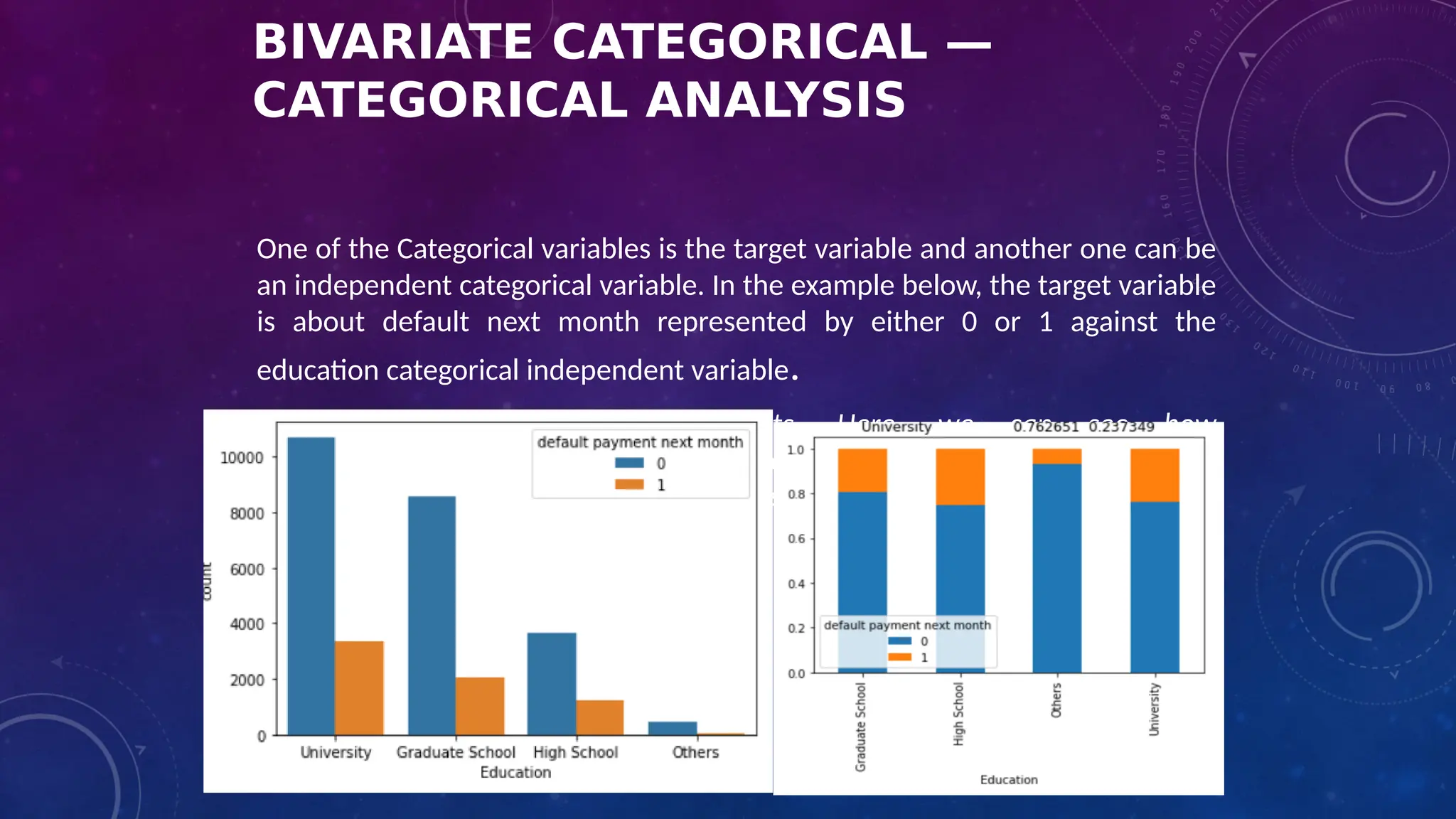
One of the Categorical variables is the target variable and another one can be
an independent categorical variable. In the example below, the target variable
is about default next month represented by either 0 or 1 against the
education categorical independent variable.
double bar or stacked bar charts. Here, we can see how
defaulters( represented by 1: orange color) are highest in number for High
School then University and then for Others category even when they are so
less in number.
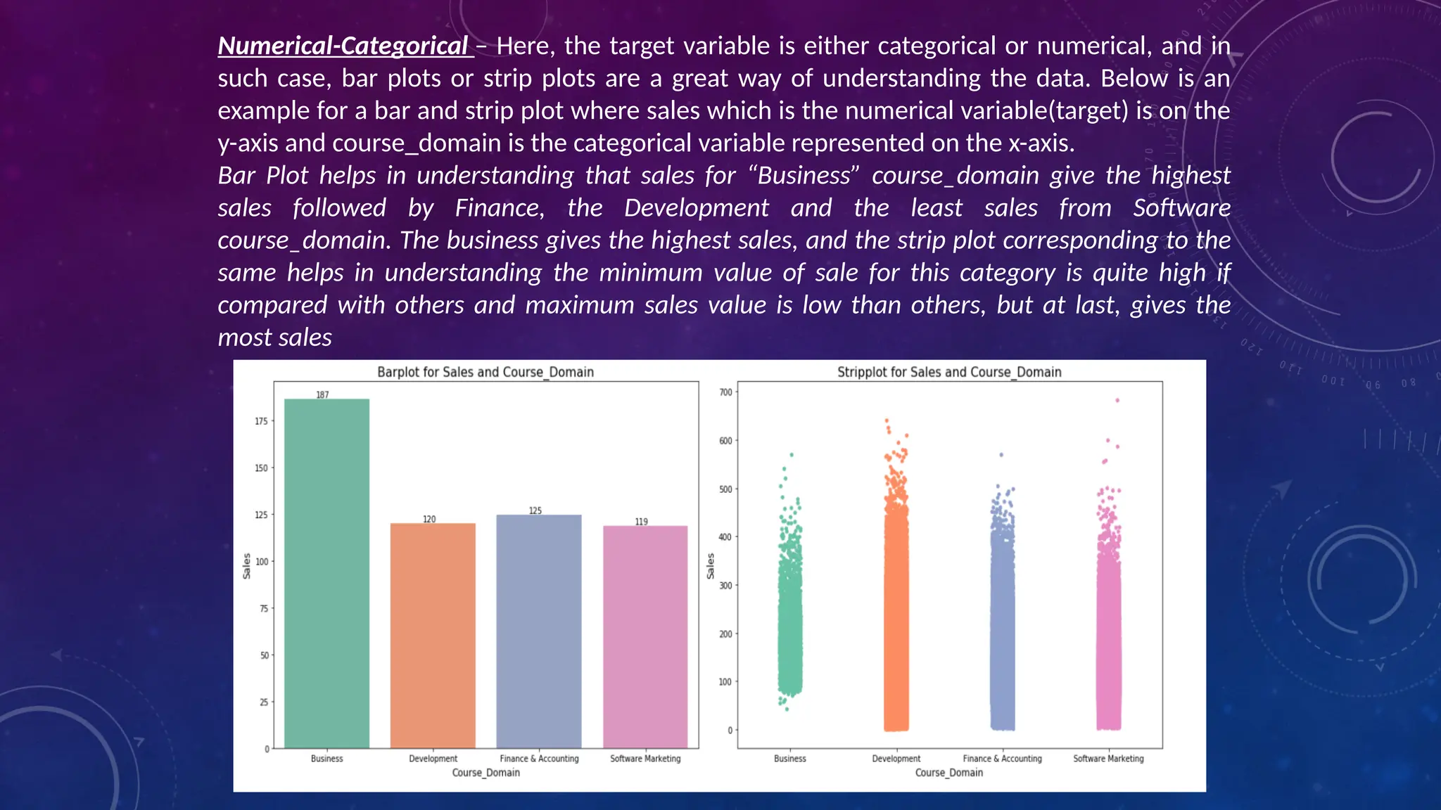
Numerical-Categorical – Here, the target variable is either categorical or numerical, and in
such case, bar plots or strip plots are a great way of understanding the data. Below is an
example for a bar and strip plot where sales which is the numerical variable(target) is on the
y-axis and course_domain is the categorical variable represented on the x-axis.
Bar Plot helps in understanding that sales for “Business” course_domain give the highest
sales followed by Finance, the Development and the least sales from Software
course_domain. The business gives the highest sales, and the strip plot corresponding to the
same helps in understanding the minimum value of sale for this category is quite high if
compared with others and maximum sales value is low than others, but at last, gives the
most sales
A LOLLIPOP CHART CAN BE USED TO DISPLAY RANKING IN THE DATA. IT IS SIMILAR TO AN ORDERED BAR CHART.
HOW CAN THE DATA BE NORMALIZED/
FEATURE SCALING?
• Data can be normalized by either transforming the data or by
scaling the data down in a particular range.
1. Transformation – If the data is left-skewed (negtaive skew),
log transformation is the best way to make them behave in the
normal distribution, and if the data is right-skewed (positive
skew), exponential transformation helps in transforming them
into a normal distribution.
2. Scaling – There are two scalers used on a wide base
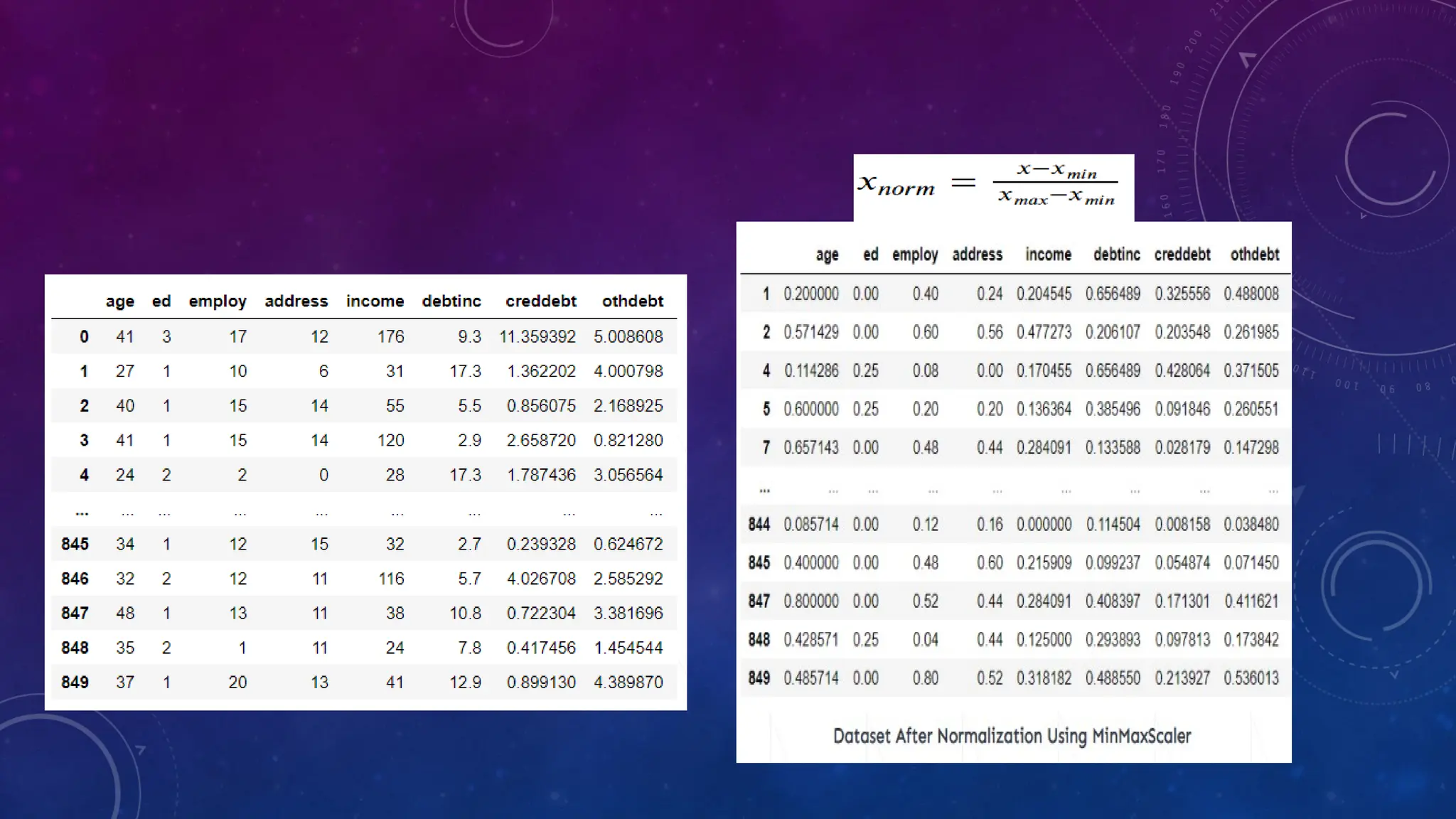
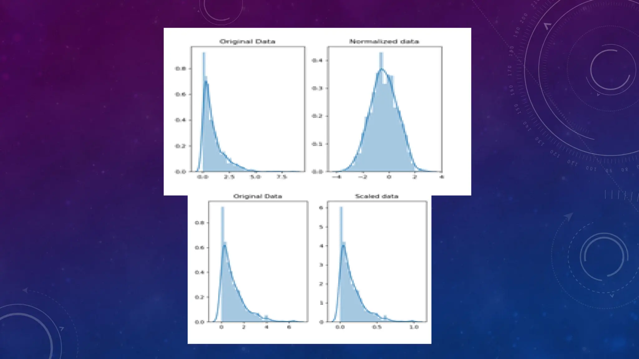
• Normalization (Min-Max Scaler): This scales down the data between 0 and 1 range
where minimum value corresponds to 0 and maximum was 1.
A value is normalized as follows: y = (x – min) / (max – min), where the minimum and
maximum values pertain to the value x being normalized
• Standardization (Standard Scaler): This scaler helps in making a normal distribution in
standard normal distribution where the mean is represented by 0 and the standard
deviation is represented by 1.A value is standardized as follows: y = (x – mean) /
standard_deviation
Note: If the distribution of the quantity is normal, then it should be standardized, otherwise,
the data should be normalized. Standardization can give values that are both positive and
negative centered around zero. It may be desirable to normalize data after it has been
standardized.
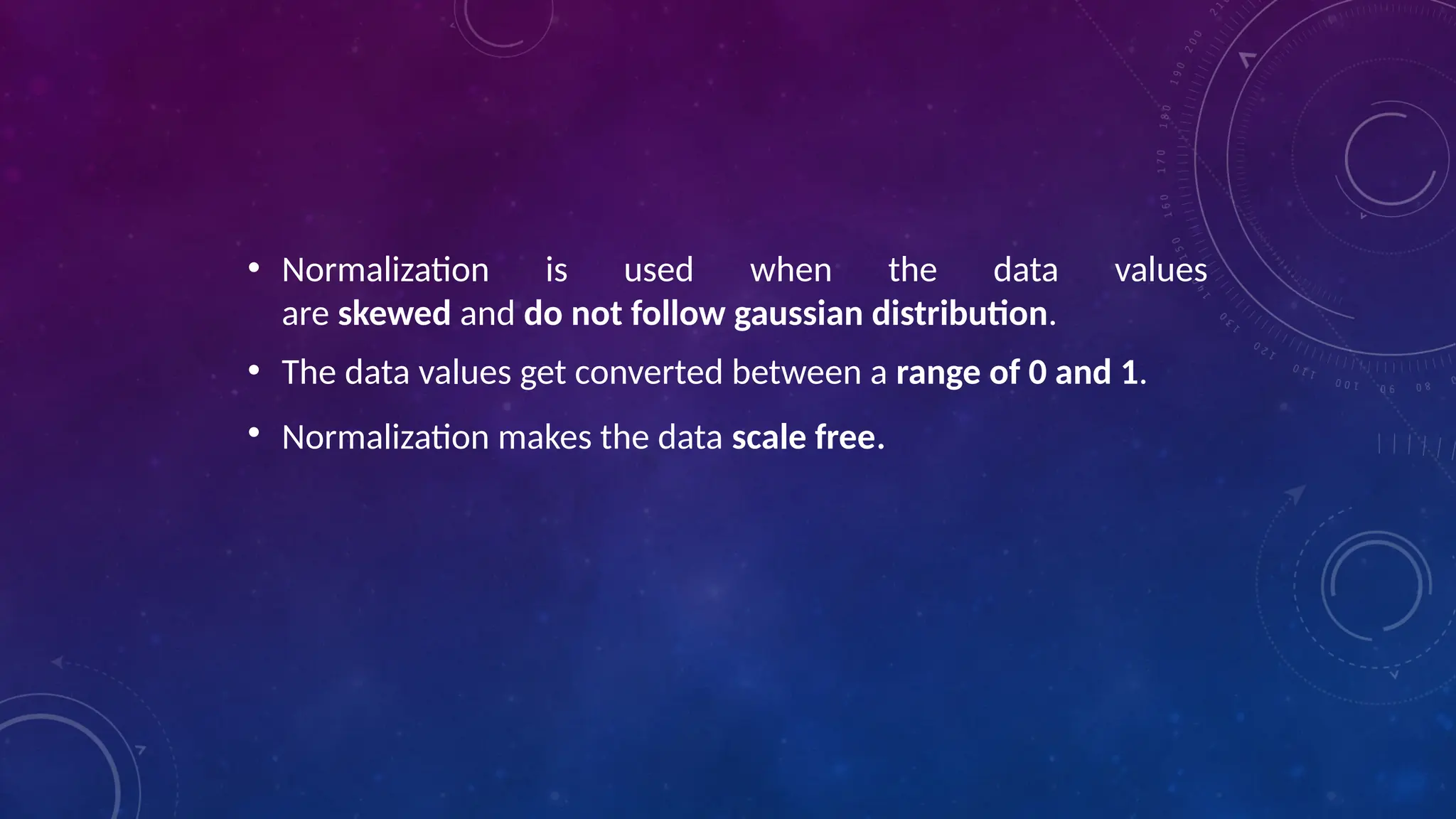
• Normalization is used when the data values
are skewed and do not follow gaussian distribution.
• The data values get converted between a range of 0 and 1.
• Normalization makes the data scale free.
• Standardization is used on the data values that are normally
distributed. Further, by applying standardization, we tend to
make the mean of the dataset as 0 and the standard deviation
equivalent to 1.
• That is, by standardizing the values, we get the following
statistics of the data distribution
• mean = 0
• standard deviation = 1
• the data set becomes self explanatory and easy to analyze as
the mean turns down to 0 and it happens to have an unit
variance.
EXPLORATORY DATA ANALYSIS TECHNIQUES
• There are four exploratory data analysis techniques that data experts use, which include:
• Univariate Non-Graphical
• This is the simplest type of EDA, where data has a single variable. Since there is only one variable, data professionals do not have to
deal with relationships.
• Univariate Graphical
• Non-graphical techniques do not present the complete picture of data. Therefore, for comprehensive EDA, data specialists
implement graphical methods, such as stem-and-leaf plots, box plots, and histograms.
EXPLORATORY DATA ANALYSIS TECHNIQUES
• Multivariate Non-Graphical
• Multivariate data consists of several variables. Non-graphic multivariate EDA methods illustrate relationships between 2 or more
data variables using statistics or cross-tabulation
• Multivariate Graphical
• This EDA technique makes use of graphics to show relationships between 2 or more datasets. The widely-used multivariate graphics
include bar chart, bar plot, heat map, bubble chart, run chart, multivariate chart, and scatter plot.
STEPS OF EDA
• Generate good research questions
• Data restructuring: You may need to make new variables from the existing ones
• Instead of using two variables, obtaining rates or percentages of them
• Creating dummy variables for categorical variables
• Based on the research questions, use appropriate graphical tools and obtain descriptive statistics. Try to understand
the data structure, relationships, anomalies, unexpected behaviors
STEPS OF EDA
• Try to identify confusing variables, interaction relations and multicollinearity, if any.
• Handle missing observations
• Decide on the need of transformation (on response and/or explanatory variables)
• Decide on the hypothesis based on your research questions
AFTER EDA
• Confirmatory Data Analysis: Verify the hypothesis by statistical analysis
• Get conclusions and present the results using various graphical representation
APPLICATION OF
EDA
APPLICATION OF EDA
HANDS-ON
TOPIC COVERED:
• LOADING THE DATASET
• DATA TRANSFORMATION
• DATA ANALYSIS
OUTCOME:
YOU WILL LEARN ABOUT HOW TO EXPORT ALL YOUR EMAILS AS A DATASET, HOW TO USE IMPORT THEM INSIDE A
PANDAS DATAFRAME, HOW TO VISUALIZE THEM, AND THE DIFFERENT TYPES OF INSIGHTS YOU CAN GAIN.
REF: BOOK: HANDS-ON EXPLORATORY DATA ANALYSIS WITH PYTHON BY SURESH KUMAR MUKHIYA USMAN AHMED.
CHAPTER 3
EDA WITH PERSONAL EMAIL- STEP 1
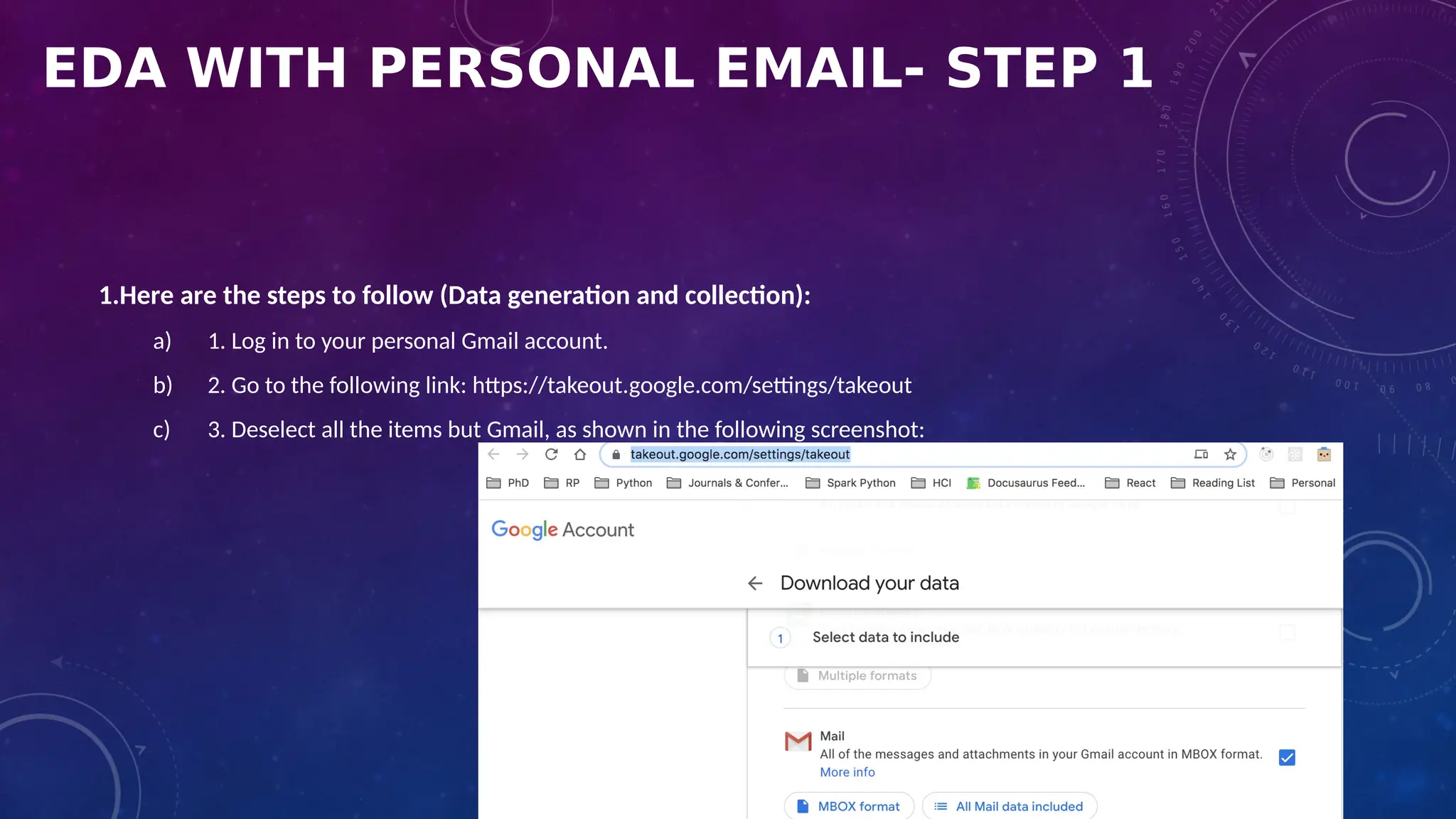
1.Here are the steps to follow (Data generation and collection):
a) 1. Log in to your personal Gmail account.
b) 2. Go to the following link: https://takeout.google.com/settings/takeout
c) 3. Deselect all the items but Gmail, as shown in the following screenshot:
EDA WITH PERSONAL EMAIL-STEP 1
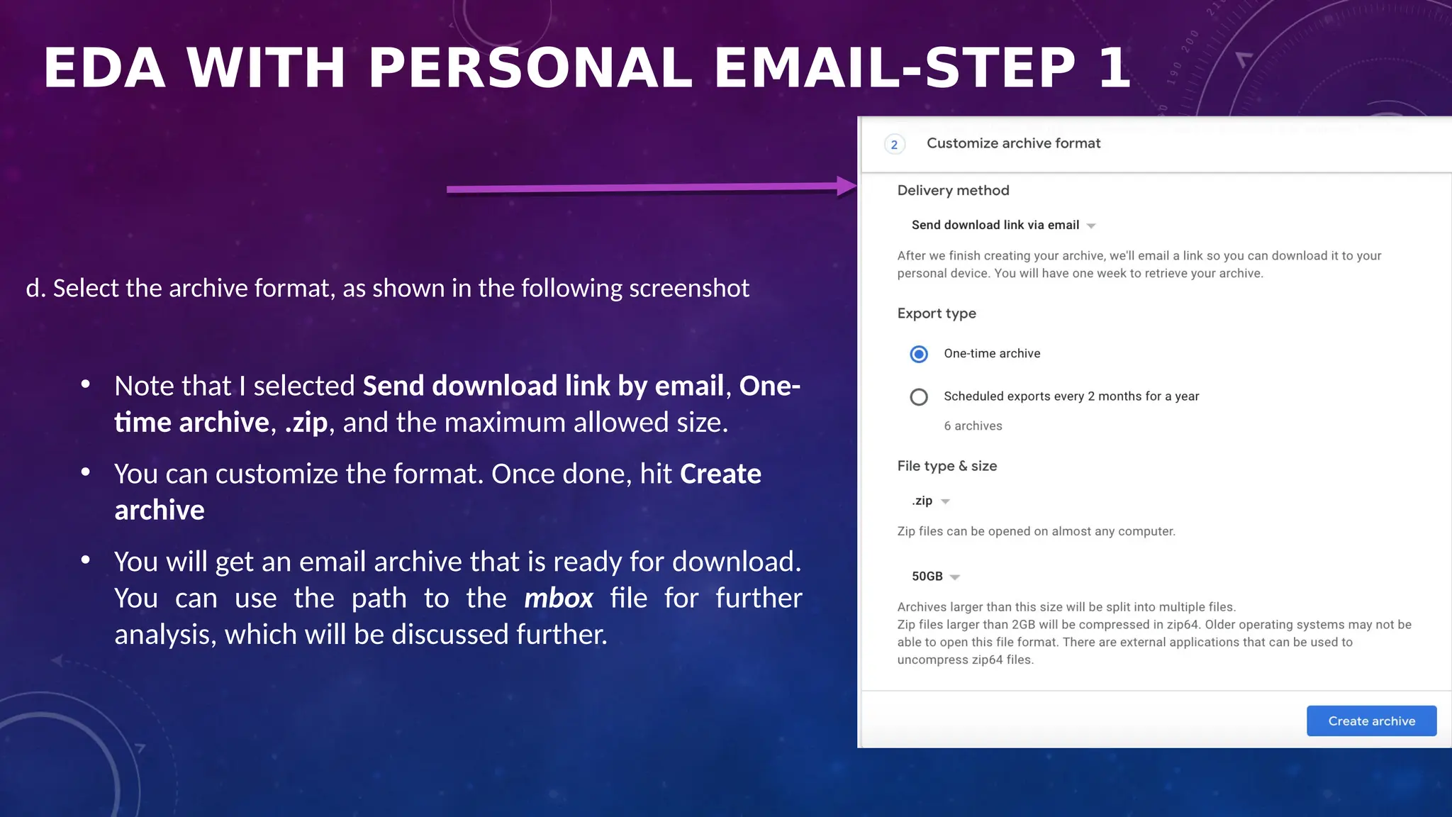
d. Select the archive format, as shown in the following screenshot
• Note that I selected Send download link by email, One-
time archive, .zip, and the maximum allowed size.
• You can customize the format. Once done, hit Create
archive
• You will get an email archive that is ready for download.
You can use the path to the mbox file for further
analysis, which will be discussed further.
EDA WITH PERSONAL EMAIL-STEP 2
Loading the dataset
• I loaded my own personal email from Google Mail. For privacy reasons, You shouldn't share the
dataset. However, I will show you different EDA operations that you can perform to analyze several
aspects of your email behavior:
1. Let's load the required libraries:
• import numpy as np
• import pandas as pd
• import matplotlib.pyplot as plt
• Note that for this analysis, we need to have the mailbox package installed. If it is not installed on your system, it can be
added to your Python build using the pip install mailbox instruction.
EDA WITH PERSONAL EMAIL-STEP 2
Loading the dataset
2. When you have loaded the libraries, load the dataset:
• import mailbox
• mboxfile = "PATH TO DOWNLOADED MBOX FIL"
• mbox = mailbox.mbox(mboxfile)
• mbox
• Note that it is essential that you replace the mbox file path with your own path.
• The output of the preceding code is as follows:
<mailbox.mbox at 0x7f124763f5c0>
• The output indicates that the mailbox has been successfully created.
EDA WITH PERSONAL EMAIL-STEP 2
Loading the dataset
3. Next, let's see the list of available keys::
for key in mbox[0].keys():
print(key)
• The output of the preceding code is as follows:
• The preceding output shows the list of keys that are present in
the extracted dataset.
EDA WITH PERSONAL EMAIL-STEP 3
A. Data Transformation
• Although there are a lot of
objects returned by the
extracted data, we do not need
all the items. We will only
extract the required fields.
• Data cleansing is one of the
essential steps in the data
analysis phase.
• For our analysis, all we need is
data for the following: subject,
from, date, to, label, and
thread.
B. Data cleansing
Let's create a CSV file with only the required fields. Let's start with the
following steps
1. Import the csv package:
• import csv
2. Create a CSV file with only the required attributes:
with open('mailbox.csv', 'w') as outputfile:
writer = csv.writer(outputfile)
writer.writerow(['subject','from','date','to','label','thread'])
for message in mbox:
writer.writerow([
message['subject'],
message['from'],
message['date'],
message['to'],
message['X-Gmail-Labels'],
message['X-GM-THRID']
]
)
• The preceding output is a csv file named mailbox.csv. Next, instead of loading the
mbox file, we can use the CSV file for loading, which will be smaller than the
original dataset.
EDA WITH PERSONAL EMAIL-STEP 3
C. Loading the CSV file
• We will load the CSV file.
Refer to the following code
block:
dfs=pd.read_csv('mailbox.csv',
names=['subject', 'from', 'date',
'to',
'label', 'thread'])
• The preceding code will
generate a pandas data frame
with only the required fields
stored in the CSV file
D. Converting the date
• Next, we will convert the date.
• Check the datatypes of each column as shown here:
• dfs.dtypes
• The output of the preceding code is as follows:
• Note that a date field is an object. So, we need to convert it into a
DateTime argument.
• In the next step, we are going to convert the date field into an
actual DateTime argument. We can do this by using the pandas
to_datetime() method. See the following code:
dfs['date'] = dfs['date'].apply(lambda x: pd.to_datetime(x,
errors='coerce', utc=True))
EDA WITH PERSONAL EMAIL-STEP 3
E. Removing NaN values
• Next, we are going to remove NaN values from the field.
• We can do this as follows:
• dfs = dfs[dfs['date'].notna()]
• Next, it is good to save the preprocessed file into a separate CSV file in case we need it again.
• We can save the data frame into a separate CSV file as follows:
• dfs.to_csv('gmail.csv')
EDA WITH PERSONAL EMAIL-STEP 4
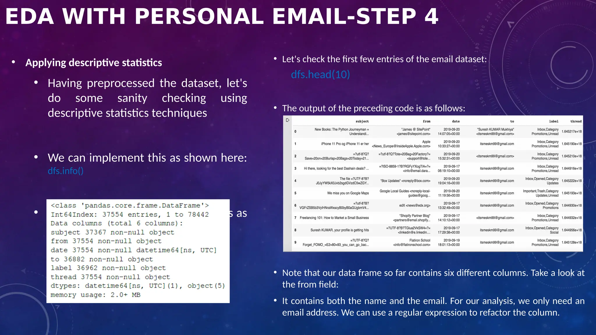
• Applying descriptive statistics
• Having preprocessed the dataset, let's
do some sanity checking using
descriptive statistics techniques
• We can implement this as shown here:
dfs.info()
• The output of the preceding code is as
follows:
• Let's check the first few entries of the email dataset:
dfs.head(10)
• The output of the preceding code is as follows:
• Note that our data frame so far contains six different columns. Take a look at
the from field:
• It contains both the name and the email. For our analysis, we only need an
email address. We can use a regular expression to refactor the column.
EDA WITH PERSONAL EMAIL-STEP 5
• Data refactoring
1. First of all, import the regular
expression package:
import re
2. Next, let's create a function that takes
an entire string from any column and
extracts an email address:
def extract_email_ID(string):
email = re.findall(r'<(.+?)>', string)
if not email:
email = list(filter(lambda y: '@' in y,
string.split()))
return email[0] if email else np.nan
3. Next, let's apply the function to the from column:
dfs['from'] = dfs['from'].apply(lambda x: extract_email_ID(x))
4. Next, we are going to refactor the label field. The logic is
simple. If an email is from your email address, then it is the sent
email. Otherwise, it is a received email, that is, an inbox email:
myemail = 'itsmeskm99@gmail.com'
dfs['label'] = dfs['from'].apply(lambda x: 'sent' if x==myemail
else 'inbox')
EDA WITH PERSONAL EMAIL-STEP 6
• Dropping columns
1. Note that the to column only contains your own email. So, we can drop this
dfs.drop(columns='to', inplace=True)
2. This drops the to column from the data frame. Let's display the first 10 entries now:
dfs.head(10)
The output of the preceding code is as follows: Check the preceding output. The fields are cleaned. The data is transformed into
the correct format.
EDA WITH PERSONAL EMAIL-STEP 7
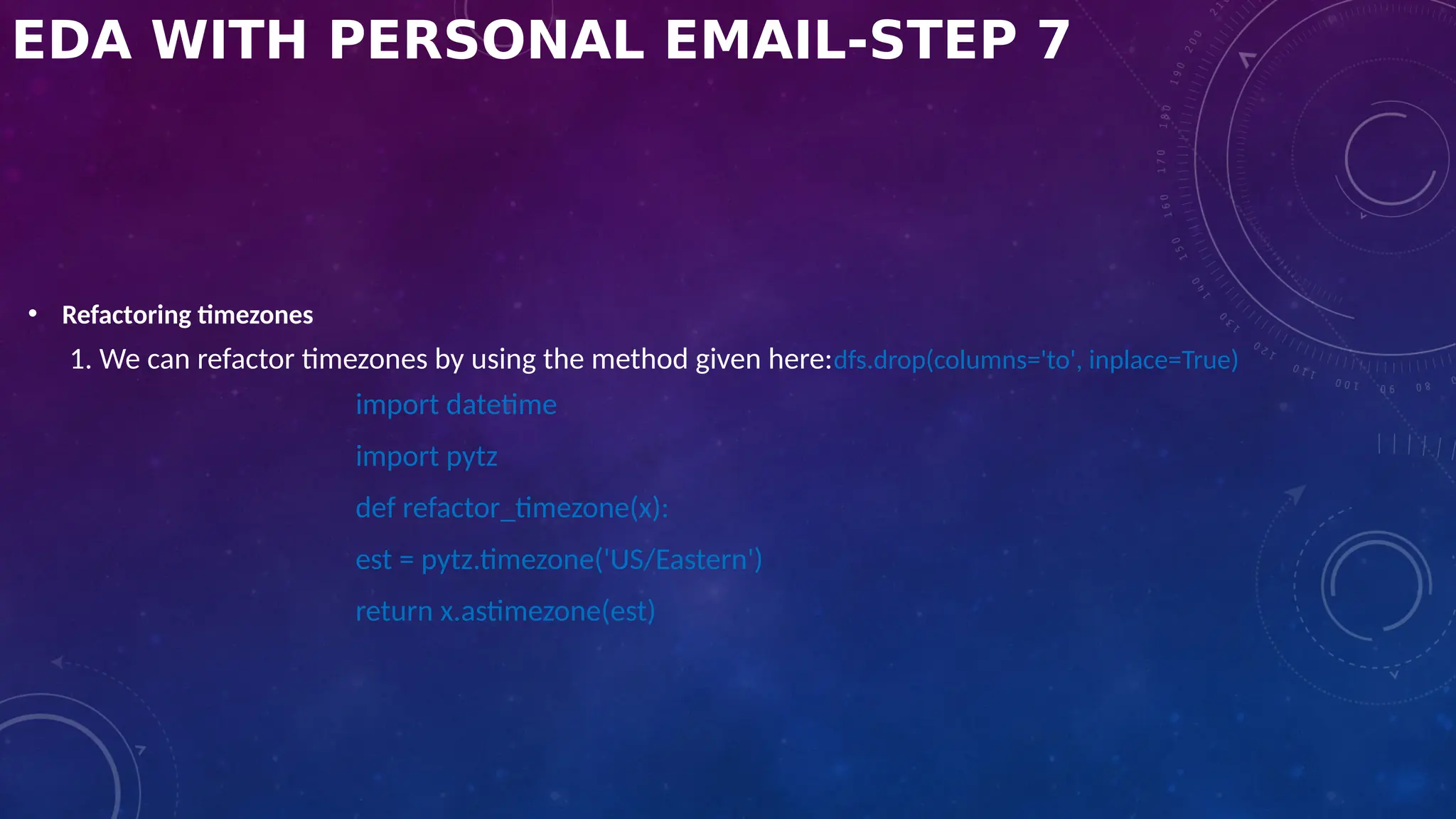
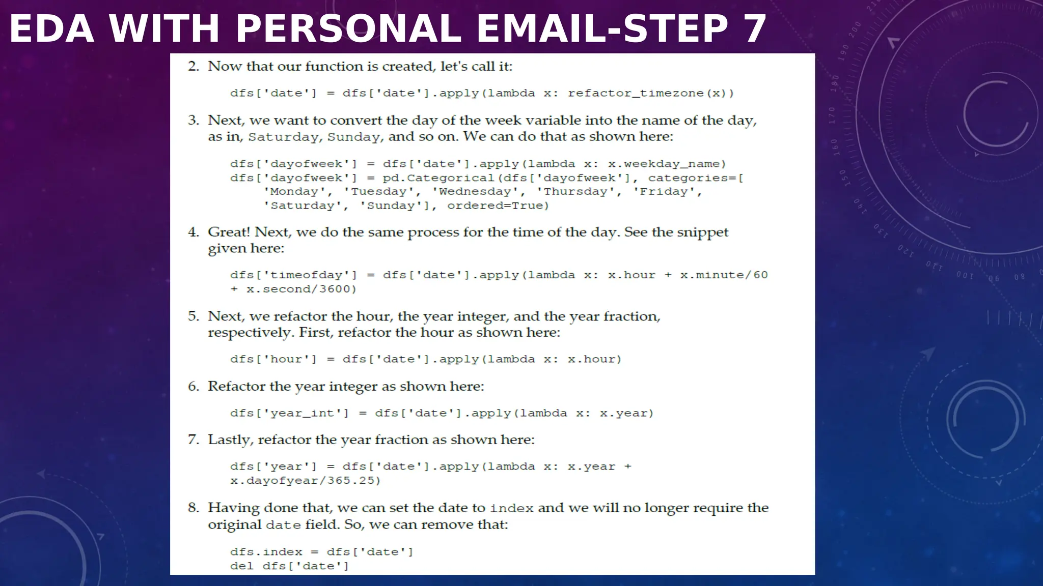
• Refactoring timezones
1. We can refactor timezones by using the method given here:dfs.drop(columns='to', inplace=True)
import datetime
import pytz
def refactor_timezone(x):
est = pytz.timezone('US/Eastern')
return x.astimezone(est)
EDA WITH PERSONAL EMAIL-STEP 7
DATA ANALYSIS
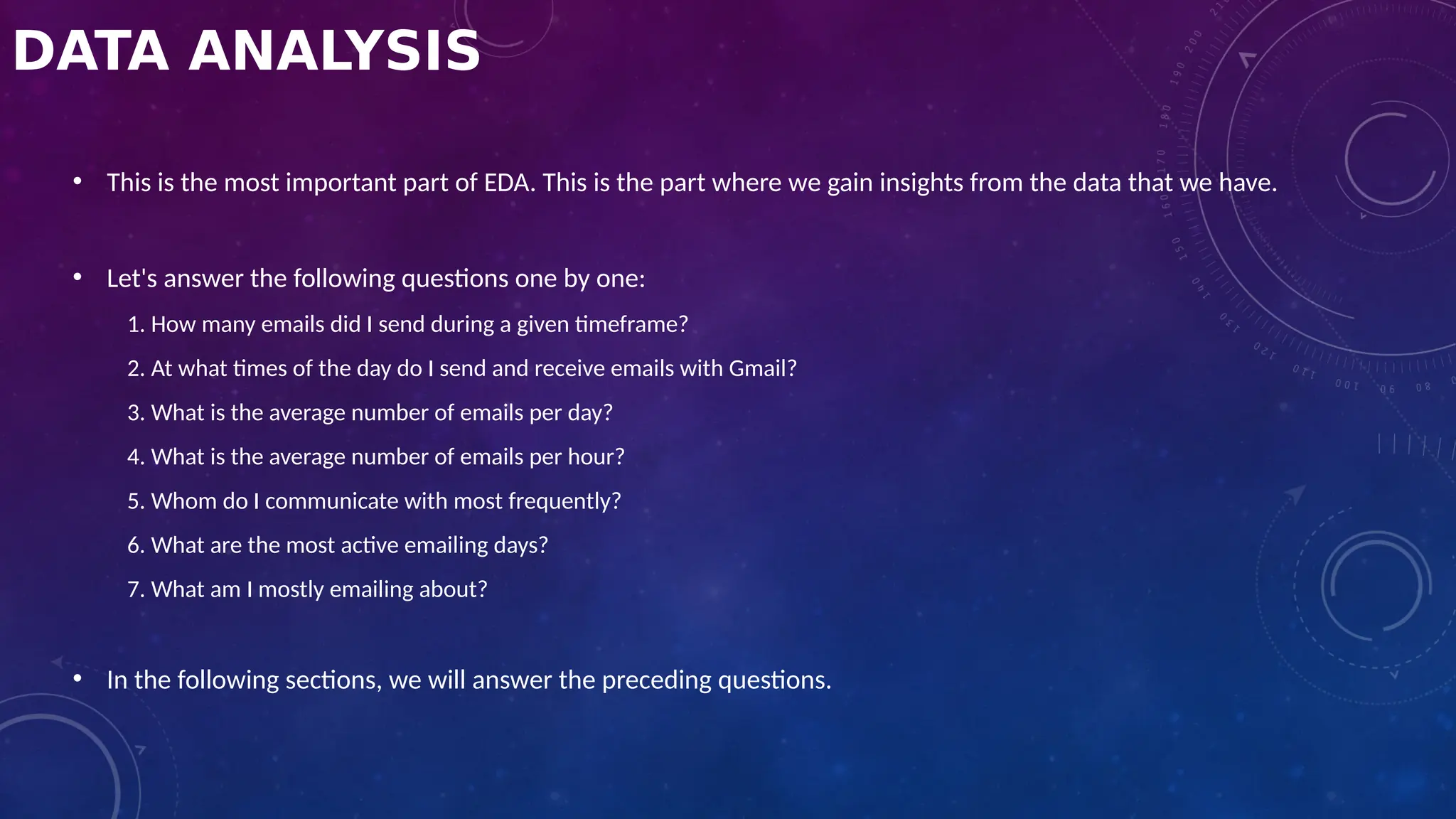
• This is the most important part of EDA. This is the part where we gain insights from the data that we have.
• Let's answer the following questions one by one:
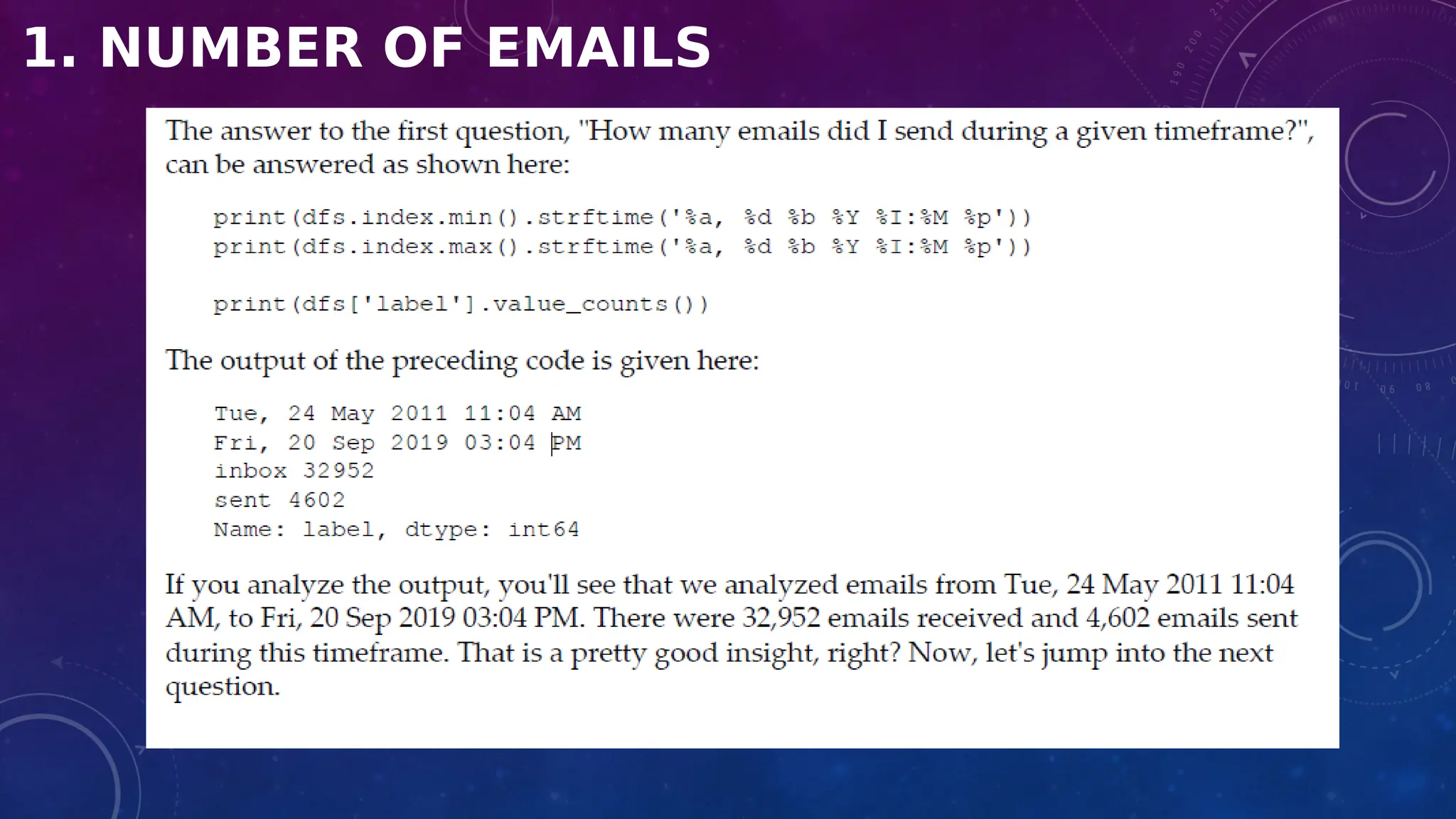
1. How many emails did I send during a given timeframe?
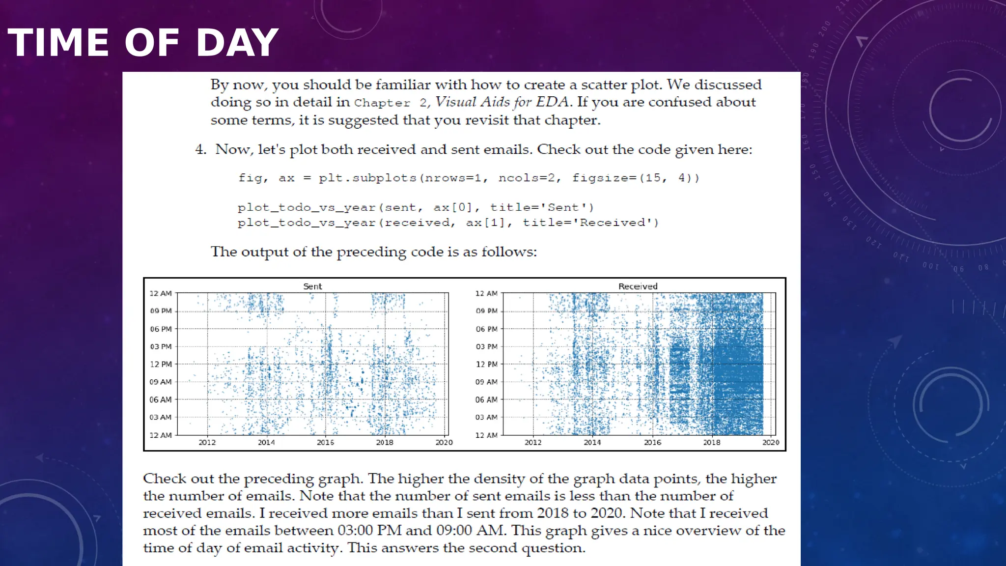
2. At what times of the day do I send and receive emails with Gmail?
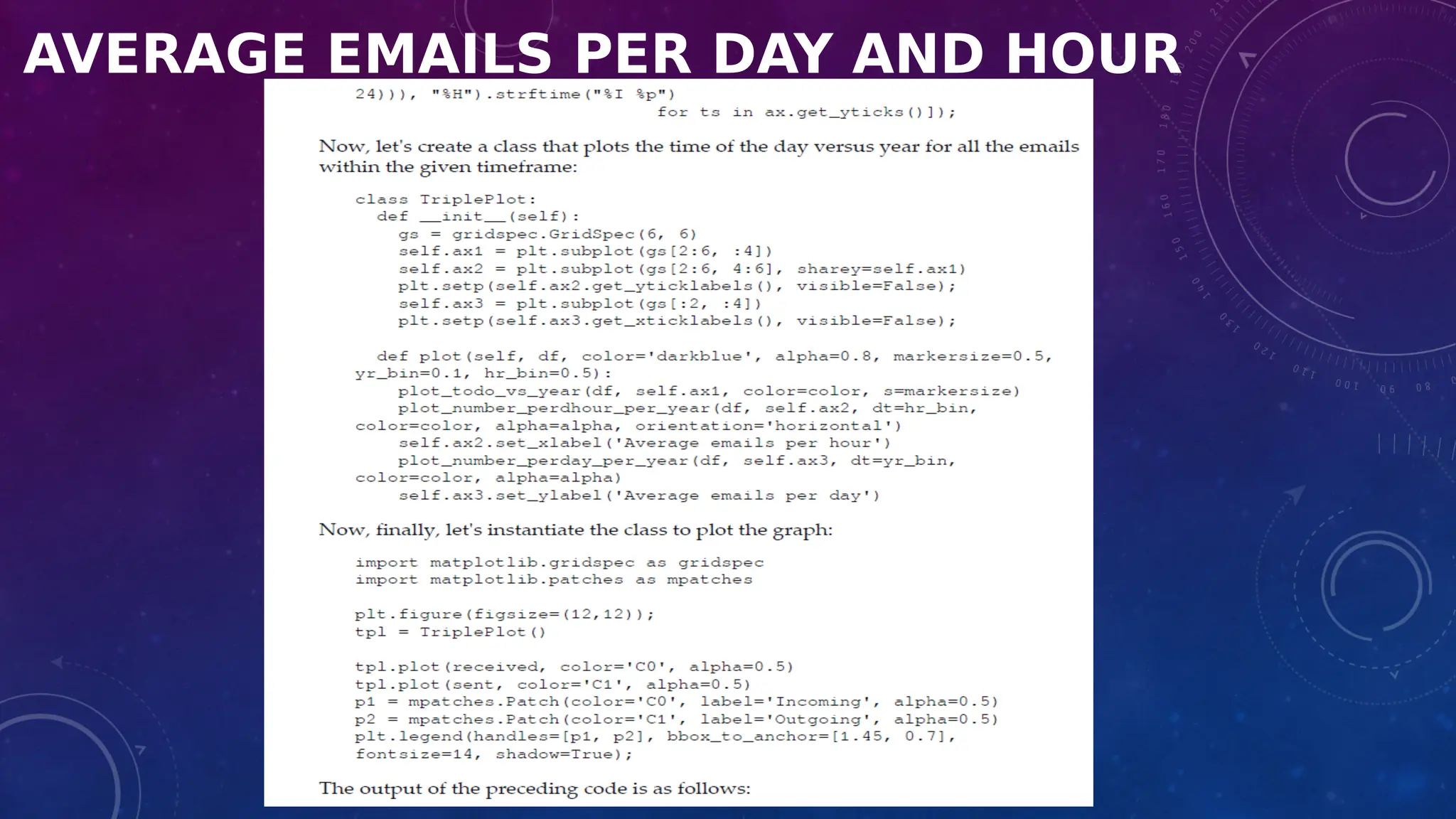
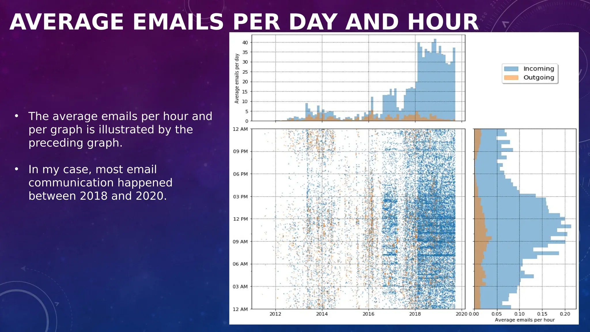
3. What is the average number of emails per day?
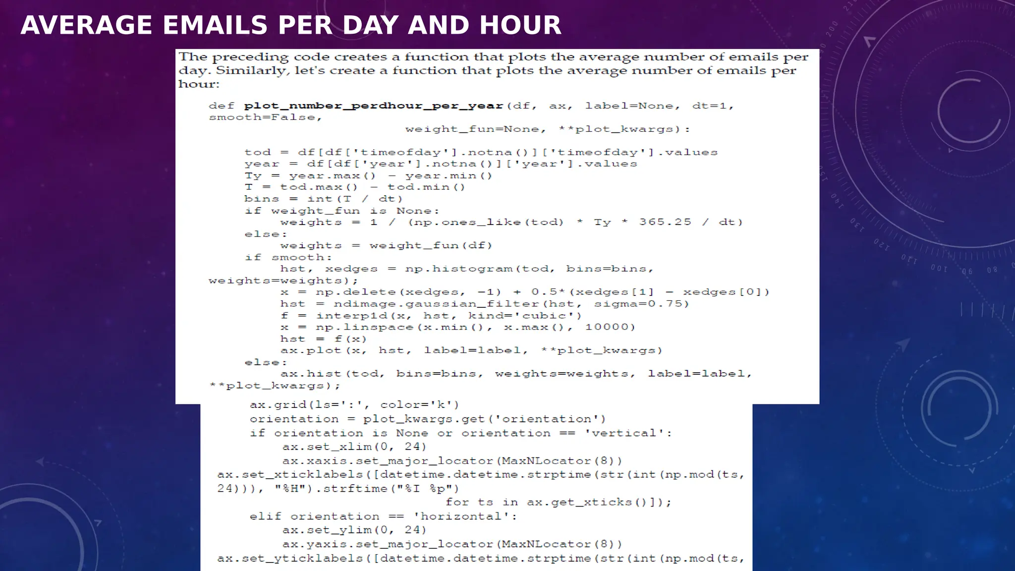
4. What is the average number of emails per hour?
5. Whom do I communicate with most frequently?
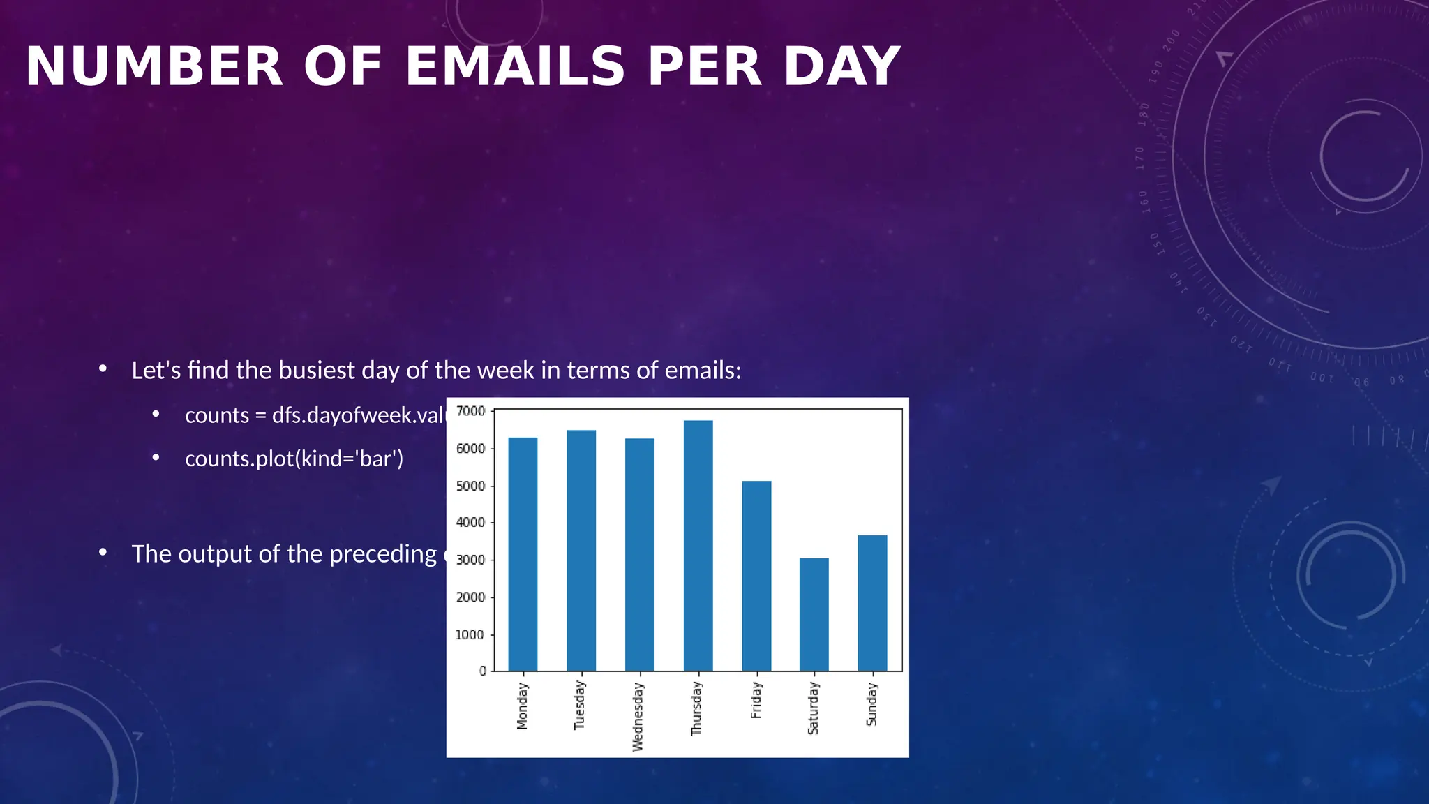
6. What are the most active emailing days?
7. What am I mostly emailing about?
• In the following sections, we will answer the preceding questions.
1. NUMBER OF EMAILS
TIME OF DAY
TIME OF DAY
AVERAGE EMAILS PER DAY AND HOUR
• The average emails per hour and
per graph is illustrated by the
preceding graph.
• In my case, most email
communication happened
between 2018 and 2020.
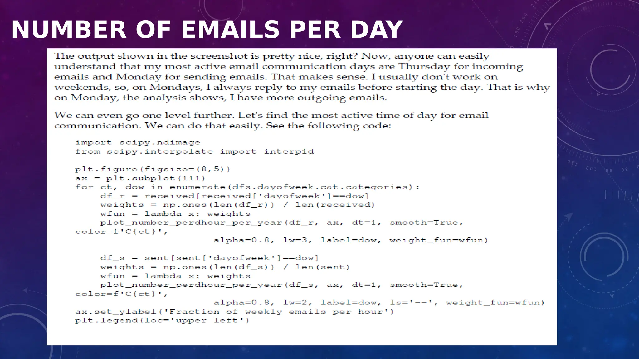
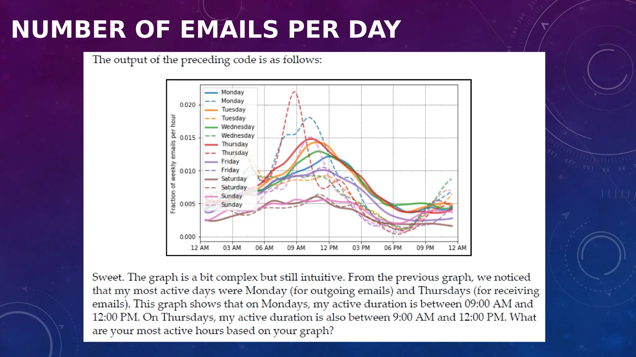
NUMBER OF EMAILS PER DAY
• Let's find the busiest day of the week in terms of emails:
• counts = dfs.dayofweek.value_counts(sort=False)
• counts.plot(kind='bar')
• The output of the preceding code is as follows:
NUMBER OF EMAILS PER DAY
SUMMARY
• We imported data from our own Gmail accounts in mbox format.
• We loaded the dataset and performed some primitive EDA techniques, including data loading, data
transformation, and data analysis.
• We also tried to answer some basic questions about email communication.
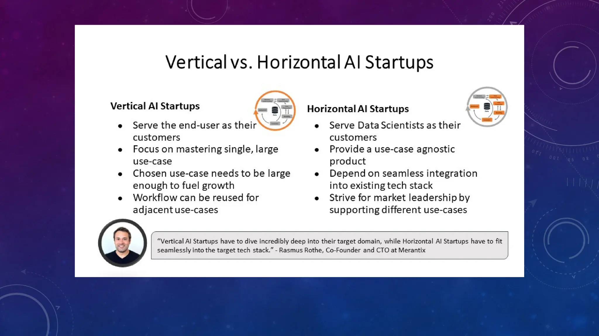
VERTICAL VS. HORIZONTAL DATA SCIENTISTS
Vertical data scientists have very deep knowledge in some narrow field.
They might be computer scientists very familiar with computational complexity of all sorting algorithms
Or
Software engineer with years of experience writing Python code (including graphic libraries) applied to API
development and web crawling technology
OR
Database guy with strong data modeling, data warehousing, graph databases, Hadoop and NoSQL
expertise. Or a predictive modeler expert in Bayesian networks, SAS and SVM.
HORIZONTAL DATA SCIENTISTS
• They are a blend of business analysts, statisticians, computer scientists and domain experts. They
combine vision with technical knowledge
• They know about more modern, data-driven techniques applicable to unstructured, streaming, and big
data
• They can design robust, efficient, simple, replicable and scalable code and algorithms.
Horizontal data scientists also come with the following features:
• They have some familiarity with six sigma concepts. In essence, speed is more important than perfection, for these analytic practitioners.
• They have experience in producing success stories out of large, complicated, messy data sets - including in measuring the success.
• Experience in identifying the real problem to be solved, the data sets (external and internal) they need, the data base structures they need, the
metrics they need, rather than being passive consumers of data sets produced or gathered by third parties lacking the skills to collect / create
the right data.
• They know rules of thumb and pitfalls to avoid, more than theoretical concepts. However they have a bit more than just basic knowledge of
computational complexity, good sampling and design of experiment, robust statistics and cross-validation, modern data base design and
programming languages (R, scripting languages, Map Reduce concepts, SQL)
• Advanced Excel and visualization skills.
• They can help produce useful dashboards (the ones that people really use on a daily basis to make decisions) or alternate tools to
communicate insights found in data (orally, by email or automatically - and sometimes in real time machine-to-machine mode).
• They think outside the box.
• They are innovators who create truly useful stuff
Vertical data scientists are the by-product of our rigid University system which trains people to become either
a computer scientist, a statistician, an operations research or a MBA guy - but not all the four at the same time.
This is one of the reasons of offering data science program and why recruiters can't find data scientists.
Mostly they find and recruit vertical data scientists. Companies are not yet used to identifying horizontal data
scientists - the true money makers and ROI generators among analytic professionals.
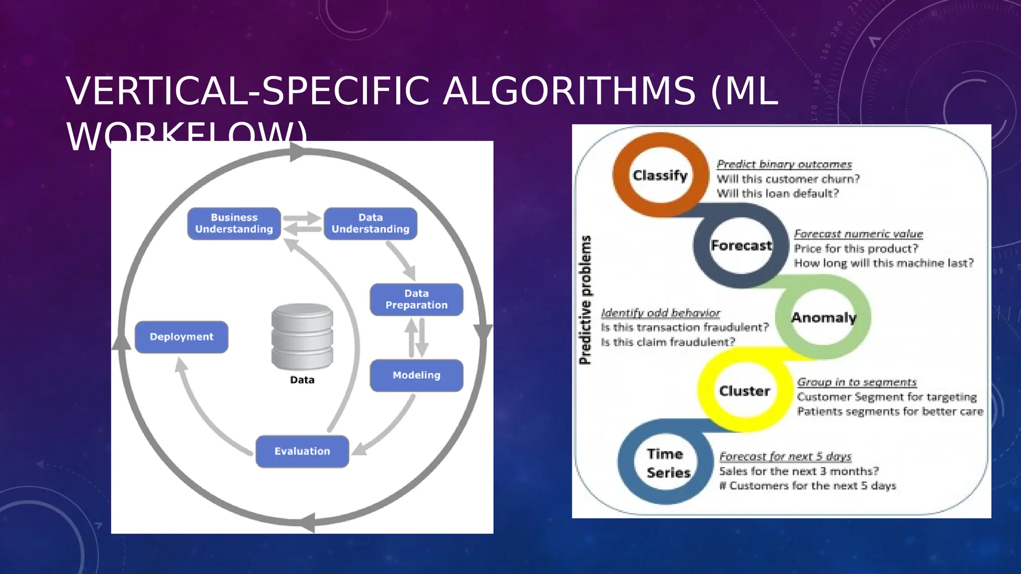
VERTICAL-SPECIFIC ALGORITHMS (ML
WORKFLOW)
DETAILED CLASSIFICATION OF ML
TECHNIQUES
• Part 1: Data Pre-processing (before ML)
• Part 2: Regression
 Simple Linear Regression
 Multiple Linear Regression
 Polynomial Regression
 Support Vector Regression (SVR)
 Decision Tree Regression
 Random Forest Regression
 Evaluating Regression Models Performance(KPI): R^2, RMSE, Cross fold validation and Score
74
06/17/2021
CONT..
Part 3: Classification
 Logistic Regression
 K-Nearest Neighbors (K-NN)
 Support Vector Machine (SVM)
 Kernel SVM
 Naive Bayes
 Decision Tree Classification
 Random Forest Classification
 Evaluating Classification Models Performance: Confusion matrix, Recall, Precision, Sensitivity / specificity
75
06/17/2021
CONT..
Part 4: Clustering
 K-Means Clustering
 Hierarchical Clustering
Part 5: Association Rule Learning
Part 6: Reinforcement Learning
Part 7: Natural Language Processing
Part 8: Deep Learning:
 Artificial Neural Networks (ANN)
 Convolutional Neural Networks (CNN)
76
06/17/2021
CONT..
Part 9: Dimensionality Reduction
 Principal Component Analysis (PCA)
 Linear Discriminant Analysis (LDA)
 Kernel PCA
Part 10: Model Selection and Deployment
77
06/17/2021
REFERENCE
• Book: Hands-On Exploratory Data Analysis with Python by Suresh Kumar Mukhiya Usman Ahmed. Chapter 3 & 11.
• https://www.datasciencecentral.com/profiles/blogs/vertical-vs-horizontal-data-scientists.
• https://towardsdatascience.com/vertical-vs-horizontal-ai-startups-e2bdec23aa16

Data_Analytics_for_IoT_Solutions.pptx.pdf

  • 1.
    MODULE: 6 DATA ANALYTICSFOR IOT SOLUTIONS
  • 2.
    MODULE: 6 DATAANALYTICS FOR IOT SOLUTIONS • Data generation, Data gathering, Data Pre-processing, data analyzation, application of analytics, Exploratory Data Analysis, vertical-specific algorithms.
  • 3.
    LIFECYCLE OF THEDATA SCIENCE PROJECT
  • 4.
    APPLICATION OF EXPLORATORYDATA ANALYSIS (EDA) • What is EDA ? • Aim of EDA • EDA Tools • EDA Techniques • EDA vs CDA • Steps of EDA • Application of EDA with personal email
  • 5.
    WHAT IS EXPLORATORYDATA ANALYSIS REF:HTTPS://WWW.IBM.COM/CLOUD/LEARN/EXPLORATORY-DATA-ANALYSIS#TOC-TYPES-OF-E-64HSTW2A • Exploratory data analysis (EDA) is used by data scientists to analyze and investigate data sets and summarize their main characteristics, often employing data visualization methods • It helps determine how best to manipulate data sources to get the answers you need, making it easier for data scientists to discover patterns, spot anomalies, test a hypothesis, or check assumptions
  • 6.
    WHAT IS EXPLORATORYDATA ANALYSIS • EDA is primarily used to see what data can reveal beyond the formal modeling or hypothesis testing task and provides a better understanding of data set variables and the relationships between them • It can also help determine if the statistical techniques you are considering for data analysis are appropriate • Originally developed by American mathematician John Tukey in the 1970s, EDA techniques continue to be a widely used method in the data discovery process today.
  • 7.
    AIM OF EDA •Maximize insight into a dataset • Uncover underlying structure (relationship) • Extract important variables • Detect outliers and anomalies • Test underlying assumptions • Develop valid models • Determine optimal factor settings (Xs)
  • 8.
    VISUAL AIDS FOREDA • Line chart • Bar chart • Scatter plot • Area plot and • stacked plot • Pie chart • Table chart • Polar chart • Histogram • Lollipop chart
  • 9.
    LINE CHART A linechart is used to illustrate the relationship between two or more continuous variables.
  • 11.
    Scatter plots canbe constructed in the following two situations: 1) When one continuous variable is dependent on another variable, which is under the control of the observer 2) When both continuous variables are independent There are two important concepts—independent variable and dependent variable. In statistical modeling or mathematical modeling, the values of dependent variables rely on the values of independent variables. The dependent variable is the outcome variable being studied. The independent variables are also referred to as regressors. The takeaway message here is that scatter plots are used when we need to show the relationship between two variables, and hence are sometimes referred to as correlation plots.
  • 12.
    A bubble plotis a manifestation of the scatter plot where each data point on the graph is shown as a bubble. Each bubble can be illustrated with a different colour, size, and appearance.
  • 13.
    • The stackedplot can be useful when we want to visualize the cumulative effect of multiple variables being plotted on the y axis. • The purpose of the pie chart is to communicate proportions and it is • widely accepted. • Histogram plots are used to depict the distribution of any continuous variable. These types of plots are very popular in statistical analysis • A lollipop chart can be used to display ranking in the data. It is similar to an ordered bar chart.
  • 14.
  • 15.
    EXPLORATORY VS CONFIRMATORY DATAANALYSIS EDA CDA No hypothesis at first Start with hypothesis Generate hypothesis Test the null hypothesis Uses graphical methods (mostly) Uses statistical models
  • 16.
    Missing Values • Ifthere are missing values in the Dataset before doing any statistical analysis, we need to handle those missing values. There are mainly three types of missing values. • MCAR(Missing completely at random): These values do not depend on any other features. • MAR(Missing at random): These values may be dependent on some other features. • MNAR(Missing not at random): These missing values have some reason for why they are missing.
  • 17.
    HANDLING OUTLIERS • Outliersare the values that are far beyond the next nearest data points. • There are two types of outliers: • Univariate outliers: Univariate outliers are the data points whose values lie beyond the range of expected values based on one variable. • Multivariate outliers: While plotting data, some values of one variable may not lie beyond the expected range, but when you plot the data with some other variable, these values may lie far from the expected value
  • 18.
    Box plot: Indescriptive statistics, a box plot is a method for graphically depicting groups of numerical data through their quartiles. Box plots may also have lines extending vertically from the boxes (whiskers) indicating variability outside the upper and lower quartiles, hence the terms box-and-whisker plot and box-and-whisker diagram. Outliers will appear separate from the plot. Outliers can be dropped only if it is a garbage value. Example: height of an adult = 0 ft. This cannot be true, as the height cannot be a string value. In this case, outliers can be removed. If the outliers have extreme values, they can be removed. For example, if all the data points are clustered between zero to 10, but one point lies at 100, then we can remove this point. If you cannot drop outliers, you can normalize the data. This way, the extreme data points are pulled to a similar range.
  • 19.
    • Normal Distributionor Symmetric Distribution : If a box plot has equal proportions around the median, we can say distribution is symmetric or normal. • Positively Skewed : For a distribution that is positively skewed, the box plot will show the median closer to the lower or bottom quartile. A distribution is considered "Positively Skewed" when mean > median. It means the data constitute higher frequency of high valued scores. • Negatively Skewed : For a distribution that is negatively skewed, the box plot will show the median closer to the upper or top quartile. A distribution is considered "Negatively Skewed" when mean < median. It means the data constitute higher frequency of low valued scores.
  • 20.
    DIFFERENTIATE BETWEEN UNIVARIATE,BIVARIATE, AND MULTIVARIATE ANALYSIS •Univariate – When we analyze one variable at a time, it is called univariate data analysis. This analysis aims to describe the variable in question and find patterns that exist within it. Example: height of students •Bivariate – Bivariate data involves two different variables. The analysis of this type of data deals with causes and relationships. The investigation determines the relationship between the two variables, where one of the variables is the target variable. Example: temperature and ice cream sales in the summer season. •Multivariate – Analyzing three or more variables together is categorized under multivariate data analysis. It is similar to a bivariate but contains more than one dependent variable. Example: data for house price prediction
  • 21.
    MENTION THE TWOKINDS OF TARGET VARIABLES FOR PREDICTIVE MODELING • Numerical/Continuous variable – Variables whose values lie within a range, could be any value in that range and the time of prediction, values are not bound to be from the same range too. • For example: Height of students – 5; 5.1; 6; 6.7; 7; 4.5; 5.11 Here the range of the values is (4,7) And, the height of some new students can/cannot be any value from this range. • Categorical variable – Variables that can take on one of a limited, and usually fixed, number of possible values, assigning each individual or other unit of observation to a particular group on the basis of some qualitative property. A categorical variable that can take on exactly two values is termed a binary variable or a dichotomous variable. Categorical variables with more than two possible values are called polytomous variables • For example: Exam Result: Pass, Fail (Binary categorical variable) The blood-type of a person: A, B, O, AB (polytomous categorical variable)
  • 22.
    UNIVARIATE ANALYSIS FORNUMERICAL DATA USING BOX PLOT AND KDE (KERNEL DENSITY ESTIMATE) Box plot and KDE both show that an average population age lies between 25yrs to 50 yrs roughly, and the mean of the population is 38yrs. The left skewness in the KDE plot shows that more population was between 20 and 30 years and very few aged people were in the sample, which could be verified from the box plot too, as the box is aligned more towards the Q1 and not evenly distributed
  • 23.
    UNIVARIATE ANALYSIS FOR CATEGORICALVARIABLES Bar plots and Pie Charts are a great way to analyze categorical variables to understand the categorical data. Here, the Barplot and Pie chart shows that “Course” Course_Type was highest in number with 51.3 % people subscribing to such courses, followed by “Program” Course_Type, with the least number of “Degree” Course_Type with only 0.3% subscribing to such courses
  • 24.
    BIVARIATE ANALYSIS FORNUMERICAL-NUMERICAL • Bivariate analysis can be performed for any two sets of variables, Bivariate analysis is performed using an independent variable and the dependent variable. • Numerical-Numerical – Here, one of the numerical variables is the target variable and the other one is any other independent numerical variable. A Scatter plot is a great way for understanding numerical-numerical variable data relationships. In the example shown, sales is the target numerical variable plotted on the y-axis against user-traffic numerical variables on the x-axis Types: Scatter Plot Pair Plot Correlation Matrix
  • 25.
    The scatter plothelps us in understanding that User_Traffic is increasing linearly as the Sales going up
  • 26.
    BIVARIATE CATEGORICAL — CATEGORICALANALYSIS One of the Categorical variables is the target variable and another one can be an independent categorical variable. In the example below, the target variable is about default next month represented by either 0 or 1 against the education categorical independent variable. double bar or stacked bar charts. Here, we can see how defaulters( represented by 1: orange color) are highest in number for High School then University and then for Others category even when they are so less in number.
  • 27.
    Numerical-Categorical – Here,the target variable is either categorical or numerical, and in such case, bar plots or strip plots are a great way of understanding the data. Below is an example for a bar and strip plot where sales which is the numerical variable(target) is on the y-axis and course_domain is the categorical variable represented on the x-axis. Bar Plot helps in understanding that sales for “Business” course_domain give the highest sales followed by Finance, the Development and the least sales from Software course_domain. The business gives the highest sales, and the strip plot corresponding to the same helps in understanding the minimum value of sale for this category is quite high if compared with others and maximum sales value is low than others, but at last, gives the most sales
  • 28.
    A LOLLIPOP CHARTCAN BE USED TO DISPLAY RANKING IN THE DATA. IT IS SIMILAR TO AN ORDERED BAR CHART.
  • 29.
    HOW CAN THEDATA BE NORMALIZED/ FEATURE SCALING? • Data can be normalized by either transforming the data or by scaling the data down in a particular range. 1. Transformation – If the data is left-skewed (negtaive skew), log transformation is the best way to make them behave in the normal distribution, and if the data is right-skewed (positive skew), exponential transformation helps in transforming them into a normal distribution.
  • 30.
    2. Scaling –There are two scalers used on a wide base • Normalization (Min-Max Scaler): This scales down the data between 0 and 1 range where minimum value corresponds to 0 and maximum was 1. A value is normalized as follows: y = (x – min) / (max – min), where the minimum and maximum values pertain to the value x being normalized • Standardization (Standard Scaler): This scaler helps in making a normal distribution in standard normal distribution where the mean is represented by 0 and the standard deviation is represented by 1.A value is standardized as follows: y = (x – mean) / standard_deviation Note: If the distribution of the quantity is normal, then it should be standardized, otherwise, the data should be normalized. Standardization can give values that are both positive and negative centered around zero. It may be desirable to normalize data after it has been standardized.
  • 31.
    • Normalization isused when the data values are skewed and do not follow gaussian distribution. • The data values get converted between a range of 0 and 1. • Normalization makes the data scale free.
  • 33.
    • Standardization isused on the data values that are normally distributed. Further, by applying standardization, we tend to make the mean of the dataset as 0 and the standard deviation equivalent to 1. • That is, by standardizing the values, we get the following statistics of the data distribution • mean = 0 • standard deviation = 1 • the data set becomes self explanatory and easy to analyze as the mean turns down to 0 and it happens to have an unit variance.
  • 35.
    EXPLORATORY DATA ANALYSISTECHNIQUES • There are four exploratory data analysis techniques that data experts use, which include: • Univariate Non-Graphical • This is the simplest type of EDA, where data has a single variable. Since there is only one variable, data professionals do not have to deal with relationships. • Univariate Graphical • Non-graphical techniques do not present the complete picture of data. Therefore, for comprehensive EDA, data specialists implement graphical methods, such as stem-and-leaf plots, box plots, and histograms.
  • 36.
    EXPLORATORY DATA ANALYSISTECHNIQUES • Multivariate Non-Graphical • Multivariate data consists of several variables. Non-graphic multivariate EDA methods illustrate relationships between 2 or more data variables using statistics or cross-tabulation • Multivariate Graphical • This EDA technique makes use of graphics to show relationships between 2 or more datasets. The widely-used multivariate graphics include bar chart, bar plot, heat map, bubble chart, run chart, multivariate chart, and scatter plot.
  • 37.
    STEPS OF EDA •Generate good research questions • Data restructuring: You may need to make new variables from the existing ones • Instead of using two variables, obtaining rates or percentages of them • Creating dummy variables for categorical variables • Based on the research questions, use appropriate graphical tools and obtain descriptive statistics. Try to understand the data structure, relationships, anomalies, unexpected behaviors
  • 38.
    STEPS OF EDA •Try to identify confusing variables, interaction relations and multicollinearity, if any. • Handle missing observations • Decide on the need of transformation (on response and/or explanatory variables) • Decide on the hypothesis based on your research questions
  • 39.
    AFTER EDA • ConfirmatoryData Analysis: Verify the hypothesis by statistical analysis • Get conclusions and present the results using various graphical representation
  • 40.
  • 41.
    APPLICATION OF EDA HANDS-ON TOPICCOVERED: • LOADING THE DATASET • DATA TRANSFORMATION • DATA ANALYSIS OUTCOME: YOU WILL LEARN ABOUT HOW TO EXPORT ALL YOUR EMAILS AS A DATASET, HOW TO USE IMPORT THEM INSIDE A PANDAS DATAFRAME, HOW TO VISUALIZE THEM, AND THE DIFFERENT TYPES OF INSIGHTS YOU CAN GAIN. REF: BOOK: HANDS-ON EXPLORATORY DATA ANALYSIS WITH PYTHON BY SURESH KUMAR MUKHIYA USMAN AHMED. CHAPTER 3
  • 42.
    EDA WITH PERSONALEMAIL- STEP 1 1.Here are the steps to follow (Data generation and collection): a) 1. Log in to your personal Gmail account. b) 2. Go to the following link: https://takeout.google.com/settings/takeout c) 3. Deselect all the items but Gmail, as shown in the following screenshot:
  • 43.
    EDA WITH PERSONALEMAIL-STEP 1 d. Select the archive format, as shown in the following screenshot • Note that I selected Send download link by email, One- time archive, .zip, and the maximum allowed size. • You can customize the format. Once done, hit Create archive • You will get an email archive that is ready for download. You can use the path to the mbox file for further analysis, which will be discussed further.
  • 44.
    EDA WITH PERSONALEMAIL-STEP 2 Loading the dataset • I loaded my own personal email from Google Mail. For privacy reasons, You shouldn't share the dataset. However, I will show you different EDA operations that you can perform to analyze several aspects of your email behavior: 1. Let's load the required libraries: • import numpy as np • import pandas as pd • import matplotlib.pyplot as plt • Note that for this analysis, we need to have the mailbox package installed. If it is not installed on your system, it can be added to your Python build using the pip install mailbox instruction.
  • 45.
    EDA WITH PERSONALEMAIL-STEP 2 Loading the dataset 2. When you have loaded the libraries, load the dataset: • import mailbox • mboxfile = "PATH TO DOWNLOADED MBOX FIL" • mbox = mailbox.mbox(mboxfile) • mbox • Note that it is essential that you replace the mbox file path with your own path. • The output of the preceding code is as follows: <mailbox.mbox at 0x7f124763f5c0> • The output indicates that the mailbox has been successfully created.
  • 46.
    EDA WITH PERSONALEMAIL-STEP 2 Loading the dataset 3. Next, let's see the list of available keys:: for key in mbox[0].keys(): print(key) • The output of the preceding code is as follows: • The preceding output shows the list of keys that are present in the extracted dataset.
  • 47.
    EDA WITH PERSONALEMAIL-STEP 3 A. Data Transformation • Although there are a lot of objects returned by the extracted data, we do not need all the items. We will only extract the required fields. • Data cleansing is one of the essential steps in the data analysis phase. • For our analysis, all we need is data for the following: subject, from, date, to, label, and thread. B. Data cleansing Let's create a CSV file with only the required fields. Let's start with the following steps 1. Import the csv package: • import csv 2. Create a CSV file with only the required attributes: with open('mailbox.csv', 'w') as outputfile: writer = csv.writer(outputfile) writer.writerow(['subject','from','date','to','label','thread']) for message in mbox: writer.writerow([ message['subject'], message['from'], message['date'], message['to'], message['X-Gmail-Labels'], message['X-GM-THRID'] ] ) • The preceding output is a csv file named mailbox.csv. Next, instead of loading the mbox file, we can use the CSV file for loading, which will be smaller than the original dataset.
  • 48.
    EDA WITH PERSONALEMAIL-STEP 3 C. Loading the CSV file • We will load the CSV file. Refer to the following code block: dfs=pd.read_csv('mailbox.csv', names=['subject', 'from', 'date', 'to', 'label', 'thread']) • The preceding code will generate a pandas data frame with only the required fields stored in the CSV file D. Converting the date • Next, we will convert the date. • Check the datatypes of each column as shown here: • dfs.dtypes • The output of the preceding code is as follows: • Note that a date field is an object. So, we need to convert it into a DateTime argument. • In the next step, we are going to convert the date field into an actual DateTime argument. We can do this by using the pandas to_datetime() method. See the following code: dfs['date'] = dfs['date'].apply(lambda x: pd.to_datetime(x, errors='coerce', utc=True))
  • 49.
    EDA WITH PERSONALEMAIL-STEP 3 E. Removing NaN values • Next, we are going to remove NaN values from the field. • We can do this as follows: • dfs = dfs[dfs['date'].notna()] • Next, it is good to save the preprocessed file into a separate CSV file in case we need it again. • We can save the data frame into a separate CSV file as follows: • dfs.to_csv('gmail.csv')
  • 50.
    EDA WITH PERSONALEMAIL-STEP 4 • Applying descriptive statistics • Having preprocessed the dataset, let's do some sanity checking using descriptive statistics techniques • We can implement this as shown here: dfs.info() • The output of the preceding code is as follows: • Let's check the first few entries of the email dataset: dfs.head(10) • The output of the preceding code is as follows: • Note that our data frame so far contains six different columns. Take a look at the from field: • It contains both the name and the email. For our analysis, we only need an email address. We can use a regular expression to refactor the column.
  • 51.
    EDA WITH PERSONALEMAIL-STEP 5 • Data refactoring 1. First of all, import the regular expression package: import re 2. Next, let's create a function that takes an entire string from any column and extracts an email address: def extract_email_ID(string): email = re.findall(r'<(.+?)>', string) if not email: email = list(filter(lambda y: '@' in y, string.split())) return email[0] if email else np.nan 3. Next, let's apply the function to the from column: dfs['from'] = dfs['from'].apply(lambda x: extract_email_ID(x)) 4. Next, we are going to refactor the label field. The logic is simple. If an email is from your email address, then it is the sent email. Otherwise, it is a received email, that is, an inbox email: myemail = 'itsmeskm99@gmail.com' dfs['label'] = dfs['from'].apply(lambda x: 'sent' if x==myemail else 'inbox')
  • 52.
    EDA WITH PERSONALEMAIL-STEP 6 • Dropping columns 1. Note that the to column only contains your own email. So, we can drop this dfs.drop(columns='to', inplace=True) 2. This drops the to column from the data frame. Let's display the first 10 entries now: dfs.head(10) The output of the preceding code is as follows: Check the preceding output. The fields are cleaned. The data is transformed into the correct format.
  • 53.
    EDA WITH PERSONALEMAIL-STEP 7 • Refactoring timezones 1. We can refactor timezones by using the method given here:dfs.drop(columns='to', inplace=True) import datetime import pytz def refactor_timezone(x): est = pytz.timezone('US/Eastern') return x.astimezone(est)
  • 54.
    EDA WITH PERSONALEMAIL-STEP 7
  • 55.
    DATA ANALYSIS • Thisis the most important part of EDA. This is the part where we gain insights from the data that we have. • Let's answer the following questions one by one: 1. How many emails did I send during a given timeframe? 2. At what times of the day do I send and receive emails with Gmail? 3. What is the average number of emails per day? 4. What is the average number of emails per hour? 5. Whom do I communicate with most frequently? 6. What are the most active emailing days? 7. What am I mostly emailing about? • In the following sections, we will answer the preceding questions.
  • 56.
  • 57.
  • 58.
  • 59.
    AVERAGE EMAILS PERDAY AND HOUR
  • 60.
    AVERAGE EMAILS PERDAY AND HOUR
  • 61.
    AVERAGE EMAILS PERDAY AND HOUR
  • 62.
    AVERAGE EMAILS PERDAY AND HOUR • The average emails per hour and per graph is illustrated by the preceding graph. • In my case, most email communication happened between 2018 and 2020.
  • 63.
    NUMBER OF EMAILSPER DAY • Let's find the busiest day of the week in terms of emails: • counts = dfs.dayofweek.value_counts(sort=False) • counts.plot(kind='bar') • The output of the preceding code is as follows:
  • 64.
  • 65.
  • 66.
  • 67.
    SUMMARY • We importeddata from our own Gmail accounts in mbox format. • We loaded the dataset and performed some primitive EDA techniques, including data loading, data transformation, and data analysis. • We also tried to answer some basic questions about email communication.
  • 68.
    VERTICAL VS. HORIZONTALDATA SCIENTISTS Vertical data scientists have very deep knowledge in some narrow field. They might be computer scientists very familiar with computational complexity of all sorting algorithms Or Software engineer with years of experience writing Python code (including graphic libraries) applied to API development and web crawling technology OR Database guy with strong data modeling, data warehousing, graph databases, Hadoop and NoSQL expertise. Or a predictive modeler expert in Bayesian networks, SAS and SVM.
  • 69.
    HORIZONTAL DATA SCIENTISTS •They are a blend of business analysts, statisticians, computer scientists and domain experts. They combine vision with technical knowledge • They know about more modern, data-driven techniques applicable to unstructured, streaming, and big data • They can design robust, efficient, simple, replicable and scalable code and algorithms.
  • 70.
    Horizontal data scientistsalso come with the following features: • They have some familiarity with six sigma concepts. In essence, speed is more important than perfection, for these analytic practitioners. • They have experience in producing success stories out of large, complicated, messy data sets - including in measuring the success. • Experience in identifying the real problem to be solved, the data sets (external and internal) they need, the data base structures they need, the metrics they need, rather than being passive consumers of data sets produced or gathered by third parties lacking the skills to collect / create the right data. • They know rules of thumb and pitfalls to avoid, more than theoretical concepts. However they have a bit more than just basic knowledge of computational complexity, good sampling and design of experiment, robust statistics and cross-validation, modern data base design and programming languages (R, scripting languages, Map Reduce concepts, SQL) • Advanced Excel and visualization skills. • They can help produce useful dashboards (the ones that people really use on a daily basis to make decisions) or alternate tools to communicate insights found in data (orally, by email or automatically - and sometimes in real time machine-to-machine mode). • They think outside the box. • They are innovators who create truly useful stuff
  • 71.
    Vertical data scientistsare the by-product of our rigid University system which trains people to become either a computer scientist, a statistician, an operations research or a MBA guy - but not all the four at the same time. This is one of the reasons of offering data science program and why recruiters can't find data scientists. Mostly they find and recruit vertical data scientists. Companies are not yet used to identifying horizontal data scientists - the true money makers and ROI generators among analytic professionals.
  • 72.
  • 73.
    DETAILED CLASSIFICATION OFML TECHNIQUES • Part 1: Data Pre-processing (before ML) • Part 2: Regression  Simple Linear Regression  Multiple Linear Regression  Polynomial Regression  Support Vector Regression (SVR)  Decision Tree Regression  Random Forest Regression  Evaluating Regression Models Performance(KPI): R^2, RMSE, Cross fold validation and Score 74 06/17/2021
  • 74.
    CONT.. Part 3: Classification Logistic Regression  K-Nearest Neighbors (K-NN)  Support Vector Machine (SVM)  Kernel SVM  Naive Bayes  Decision Tree Classification  Random Forest Classification  Evaluating Classification Models Performance: Confusion matrix, Recall, Precision, Sensitivity / specificity 75 06/17/2021
  • 75.
    CONT.. Part 4: Clustering K-Means Clustering  Hierarchical Clustering Part 5: Association Rule Learning Part 6: Reinforcement Learning Part 7: Natural Language Processing Part 8: Deep Learning:  Artificial Neural Networks (ANN)  Convolutional Neural Networks (CNN) 76 06/17/2021
  • 76.
    CONT.. Part 9: DimensionalityReduction  Principal Component Analysis (PCA)  Linear Discriminant Analysis (LDA)  Kernel PCA Part 10: Model Selection and Deployment 77 06/17/2021
  • 78.
    REFERENCE • Book: Hands-OnExploratory Data Analysis with Python by Suresh Kumar Mukhiya Usman Ahmed. Chapter 3 & 11. • https://www.datasciencecentral.com/profiles/blogs/vertical-vs-horizontal-data-scientists. • https://towardsdatascience.com/vertical-vs-horizontal-ai-startups-e2bdec23aa16