Download to read offline
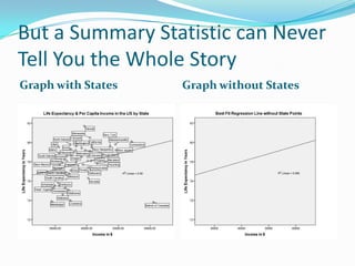
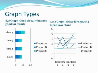
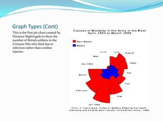
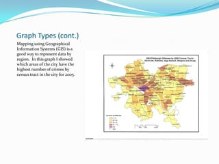


Statistics can be used to describe patterns in data but can also be misused or misinterpreted. There are different types of statistics including measures of central tendency, measures of spread, and probability. Graphs are useful for visualizing data but can be misleading without proper context or labels. Advanced statistical software packages and online resources make powerful data visualization and sharing of insights possible. Proper statistical reasoning requires considering multiple perspectives and being transparent about any limitations in the data or analysis.


