We got the requirement for re-designing the Management Information System for our organization as many employees was facing the problem in the system related to usability and interaction of the system with users.
We initiate with different research methods like Heuristic evaluation, Interviews, Surveys, Competitive analysis to find out the problem objectives of the system and from those objectives, we started working on the improvements of User Experience, System Interaction and User Interface to make User-Centric Design.
We also did the usability testing on the final design and made some iterations from the users' feedback.
To find out the problem objectives we need to empathise with the users to get to know what they are feeling while using the current system. For that we categorised our research into two
parts - Primary Research and Secondary Research.
In Primary Research, We anaylised the users by taking interviews, prepared questionnaires, Direct observation and Heuristic Evaluation of the present design which helps us to find out the bottle neck areas of the system.
From Secondary Research, We were able to analyse the challenges faced by different types of users and the what are the technological challenges are there which affecting the tasks
performed by users in the system.
All of us must have heard this proverb umpteen number of times in our lives. However, when it comes to elicitation, we tend to forget the same.Elicitation is possibly the most important job we business analysts do. I am surprised that many of us understand only few facets of elicitation such as requirements gathering and recording.Elicitation is much more than requirements gathering and recording. A good elicitation activity can significantly reduce effort in changes in requirements and subsequent changes to design, construction and testing activities.Here is an attempt to make our elicitation exercises more effective.
Project Tracker app is a Power App application developed using Model Driven App approach.
This Application lets Managers and team members to measure the progress of the team at project and its intended activities.
Project Tracker app, is a one place stop to track and manage:
Project against technologies and nature of activities.
Resource allocation against the projects.
Tasks, and Issues of the projects.
Milestones and Dependencies, if any.
- what is UX?
- why is it important?
- a brief history and future of UX
- general ux principles
- enterprise ux
- ux project approach
- ui design principles
- ux tools
A brief introduction to User Experience (UX) Research (in English and Bahasa Indonesia). This lecture was delivered on 19th February 2019 at Ciputra University, Surabaya, Indonesia.
Topic: UI/UX DESIGN IN AGILE PROCESS
Why do we integrate design into our Agile process?
As we all know, the Agile Manifesto is well-received and successfully adopted as it is today thanks to the 12 underpinning principles. While “good design” is one main reason that “enhances agility”, “Agile processes promote sustainable development”.
At Axon Active, it’s important for us to do everything Agile and work with one another collaboratively in Collaboration Model. It gets people on the same page, makes everyone engage more with the product, encourages them to share more creative ideas, and gives them the flexibility they need to improve themselves.
Indeed, Designers and Developers can collaborate more closely and effectively, and subsequently integrating design into Agile process will yield numerous benefits.
For that reason, Scrum Breakfast Da Nang this October will be the very chance for you to learn:
• How to successfully integrate design into Agile process in practice
• How different Collaboration Model is from traditional model
• The benefits of Collaboration Model when done correctly
this is a project related to schedule of meetings and this project provides details about the room and equipment present in that room for meeting..
this is a general description about the project and UML diagrams of the project..
The development and coding of project is not yet finalized.
Impact Mapping - delivering what really matters!Christian Hassa
Product backlogs are much too often flooded with user stories, thwarting the basic agile tenet “Build – Measure – Learn”. Diligent adherence to agile rituals and short iterative cycles will not help if this driving factor is missing. This often leads to efficient teams building the wrong product, or, even worse, just investing into iterative delivery without reaping any of its benefits.
Impact mapping is a method that can spark this drive: it supports an iterative approach to product design that is often neglected when user story lists are simply prioritised in the product backlog. The method is highly visual and supports the entire project team throughout the process of discovering, prioritising and detailing customers’ requirements together.
Everything you need to know about design system.pdfKoru UX Design
Oftentimes, people tend to confuse a design system with a style guide, or even design principles. The truth is that a design system comprises all of these and more.
To know more about how a design system can benefit your product, read our free guide.
The Design System is an essential part of today's UX world which provides agility and performance in the longer term. Atomic Design is a part of Design System for designers and developers to build the parts of a complete design.
Slides for a few events i was lucky to give a talk this year. From my experiences of building a design system for the product team. Figma and storybook js are introduced.
Topics include:
Principles of user interface
UI design process
Design principles
Wireframe
Graphic icon, image and colour physiology
User experience and research
Student information management system project report ii.pdfKamal Acharya
Our project explains about the student management. This project mainly explains the various actions related to student details. This project shows some ease in adding, editing and deleting the student details. It also provides a less time consuming process for viewing, adding, editing and deleting the marks of the students.
this is the computer science project that i created for my friends to submit in the finals for 12th standard. the pages are jumbled up but other than that everything is good.
Event Management System Vb Net Project Report.pdfKamal Acharya
In present era, the scopes of information technology growing with a very fast .We do not see any are untouched from this industry. The scope of information technology has become wider includes: Business and industry. Household Business, Communication, Education, Entertainment, Science, Medicine, Engineering, Distance Learning, Weather Forecasting. Carrier Searching and so on.
My project named “Event Management System” is software that store and maintained all events coordinated in college. It also helpful to print related reports. My project will help to record the events coordinated by faculties with their Name, Event subject, date & details in an efficient & effective ways.
In my system we have to make a system by which a user can record all events coordinated by a particular faculty. In our proposed system some more featured are added which differs it from the existing system such as security.
The "E-learning Management System" has been developed to override the problems prevailing in the practicing manual system. This software is supported to eliminate and in some cases reduce the hardships faced by this existing system. Moreover this system is designed for the particular need of the company to carry out operations in a smooth and effective manner.
Similar to 
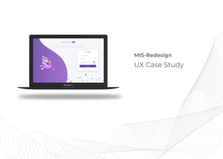
Management Information System UX Case study (20)
While looking at ways to improve and reiterate the designs of a banking app, I came across the ICICI bank mobile application.
Even though it was getting the job done, it did not showcase some important aspects.
Do send me a message as I have a few more ideas on how they would be helpful for your business.
Aditya Mehta Foundation - Marketing Strategy by Shreya, ASILVERSEAchin Gupta
Aditya Mehta Foundation came to us for helping them improve their donations and social media visiblity. We did much more for them and devised a proper marketing funnel to help them out.
Epiphany labs - A Product Management AssignmentAchin Gupta
SECTION 1
Describe two projects or initiatives you executed in the past that created a measurable impact in the app’s growth - earnings, installs, engagement or retention. Please include the following in your answer:
a) Your contribution
b) The impact
c) The change in metrics
d) AppStore link for the app
SECTION 2
Problem 1
StickMe Notes (available on App Store) is a paid subscription app with 3 price points (Monthly, Semi-annual and Yearly). You are the product manager for StickMe Notes and you realise that your monthly earnings are diminishing month over month without any change in install numbers and free trials.
1.1 How will you go about analysing the fall in revenue?
1.2 What can be some of the possible causes, without making any assumptions?
Problem 2
From the following list of iOS apps, please choose a mobile app that you like, but you feel can be improved -
● Google Pay
● Ola
● TikTok
● Arogya Setu
● Zomato
● Make My Trip
● Myntra
● Urban clap
● Big Basket
2.1 Please specify any one feature that you would like to improve for the app
2.2 Please share a detailed PRD along with wireframes/screenshots for that one feature.
Social media report - European String Teachers AssociationAchin Gupta
Why was a Social Media Campaign needed for a music-based company?
- Increasing Brand Awareness
- Boosting Sales
- Optimising all Social Media Handles
- Building a relationship with ESTA’s audience
Solr and How it can be used in products - By Achin GuptaAchin Gupta
Followed a Professional Open Source model to target organizations evaluating or already using the Apache Lucene/Solr open source search platform for their search and back-end analysis applications.
Connect Conference 2022: Passive House - Economic and Environmental Solution...TE Studio
Passive House: The Economic and Environmental Solution for Sustainable Real Estate. Lecture by Tim Eian of TE Studio Passive House Design in November 2022 in Minneapolis.
- The Built Environment
- Let's imagine the perfect building
- The Passive House standard
- Why Passive House targets
- Clean Energy Plans?!
- How does Passive House compare and fit in?
- The business case for Passive House real estate
- Tools to quantify the value of Passive House
- What can I do?
- Resources
Can AI do good? at 'offtheCanvas' India HCI preludeAlan Dix
Invited talk at 'offtheCanvas' IndiaHCI prelude, 29th June 2024.
https://www.alandix.com/academic/talks/offtheCanvas-IndiaHCI2024/
The world is being changed fundamentally by AI and we are constantly faced with newspaper headlines about its harmful effects. However, there is also the potential to both ameliorate theses harms and use the new abilities of AI to transform society for the good. Can you make the difference?
Book Formatting: Quality Control Checks for DesignersConfidence Ago
This presentation was made to help designers who work in publishing houses or format books for printing ensure quality.
Quality control is vital to every industry. This is why every department in a company need create a method they use in ensuring quality. This, perhaps, will not only improve the quality of products and bring errors to the barest minimum, but take it to a near perfect finish.
It is beyond a moot point that a good book will somewhat be judged by its cover, but the content of the book remains king. No matter how beautiful the cover, if the quality of writing or presentation is off, that will be a reason for readers not to come back to the book or recommend it.
So, this presentation points designers to some important things that may be missed by an editor that they could eventually discover and call the attention of the editor.
Transforming Brand Perception and Boosting Profitabilityaaryangarg12
In today's digital era, the dynamics of brand perception, consumer behavior, and profitability have been profoundly reshaped by the synergy of branding, social media, and website design. This research paper investigates the transformative power of these elements in influencing how individuals perceive brands and products and how this transformation can be harnessed to drive sales and profitability for businesses.
Through an exploration of brand psychology and consumer behavior, this study sheds light on the intricate ways in which effective branding strategies, strategic social media engagement, and user-centric website design contribute to altering consumers' perceptions. We delve into the principles that underlie successful brand transformations, examining how visual identity, messaging, and storytelling can captivate and resonate with target audiences.
Methodologically, this research employs a comprehensive approach, combining qualitative and quantitative analyses. Real-world case studies illustrate the impact of branding, social media campaigns, and website redesigns on consumer perception, sales figures, and profitability. We assess the various metrics, including brand awareness, customer engagement, conversion rates, and revenue growth, to measure the effectiveness of these strategies.
The results underscore the pivotal role of cohesive branding, social media influence, and website usability in shaping positive brand perceptions, influencing consumer decisions, and ultimately bolstering sales and profitability. This paper provides actionable insights and strategic recommendations for businesses seeking to leverage branding, social media, and website design as potent tools to enhance their market position and financial success.
Maximize Your Content with Beautiful Assets : Content & Asset for Landing Page pmgdscunsri
Figma is a cloud-based design tool widely used by designers for prototyping, UI/UX design, and real-time collaboration. With features such as precision pen tools, grid system, and reusable components, Figma makes it easy for teams to work together on design projects. Its flexibility and accessibility make Figma a top choice in the digital age.
2. We got the requirement for re-designing the Management Information System for our
organization as many employees was facing the problem in the system related to usabiltiy and
interaction of system with users.
We initiate with different research methods like Heuristic evaluation, Interviews, Surveys,
Competative analysis to find out the problem objectives of the system and from those
objectives we started working on the improvements of User Experience, System Interaction and
User Interface to make User Centric Design.
We also did the usability testing on the final design and made some iterations from the users
feedback.
Previous Design
Why we are Re-designing it
TECH
3. Define Ideate PrototypeEmpathize
Heuristic
Evaluation
Interviews
Primary
Research
Questionnaire
Direct
Observation
Secondary
Research Technology
Background
Personas
& Scenarios
Case
Study
Problem
Identification Primary &
Secondary
Needs
Concept
Generation
Phase
Visual Ergonomic
Approach
User Interface
Wireframing
Concept
Validation
Hick’s Law
Gestalt Law
1. Proximity
2.Similarity
3.Continuation
4.Common Fate
5.Figure & Foreground
Law of
Similarity
Information Flow
Heuristic Evaluation
Guerrilla Usability Testing
User Role
Test
Design Process
4. Primary Research1
To find out the problem objectives we need to empathise with the users to get to know what
they are feeling while using the current system. For that we categorised our research into two
parts - Primary Research and Secondary Research.
In Primary Research, We anaylised the users by taking interviews, prepared questionnaires,
Direct observation and Heuristic Evaluation of the present design which helps us to find out the
bottle neck areas of the system.
From Secondary Research, We were able to analysed the challenges faced by different types of
users and the what are the technological challenges are there which affecting the tasks
performed by users in the system.
Empathize
Heuristics
Visibility of primary
information first
Use simple language
User control and freedom
Consistency in the system
Recognition rather than
recall
Aesthetic and minimalist
design
Error prevention
User Roles in system
Customization of
elements
Security and
Confidentiality
Notes
Information should appear in a natural and
logical order
Language of the system should be simple
like words, phrases should be familiar to
the user
Users often choose system functions by
default and will need a clearly marked
“emergancy exit” to leave the unwanted
state without going through a long flow.
Types of elements used in the system
should have same theme such as forms in
any section must have a similar layout and
same goes for other elements like buttons,
cards, icons etc.
Minimize the user’s memory load by
making objects, actions and options more
visible. User should not have to remember
information from one section to another
Any of the section should not contain
information which is irrelevant or rarely
needed.Number of steps to complete any
process should be minimum.
Eliminate error-prone conditions and
present users with a confirmation option
before they commit to any action. Provide
error messages if some conditions cannot
be eliminated.
System’s layout should be visible according
to the user role. There should not be other
step to open the layout on the basis of user
roles
User should have freedom to arrange
elements of the dashboard on the basis of
his/her requirement.
As system will be used internally, there
should be security check in the sections
where critical information is present and
the users should be verfied with passwords
and other verfication methods.
Severity
2.5
(Out of 5)
4
2
3.5
2.5
1
4
4
3
4
Recommendation
Some primary information is missing
which should be present on the dashboard
like leave status, updates, Team Leaves
after that secondary information should be
visible
Language used in the present design is
easy and understated though there are
extra words added which can be avoided
There is no flow for any process , everything
is independent which breaks any process
in multiple separate screens
There are some elements which follows the
consistency part like card style, buttons,
table format but there are also some other
elements which are not consistent like
icons used in the system are different in
different section both linear and filled
icons are used and strokes of linear icons
are also different
User has to recall for the some tasks to
perform any action like for leaves ,he/she
has to go to calendar section then holiday
section then after he/she will apply for
leave
Aesthetically the interface is not appealing
and use of vibrant color pallete led user to
leave the system as soon as possible
Error messages are present in whole
system wherever necessary
System opens based on the user type
User can arrange his/her dashboard based
of the requirement but there is no way to
pass the this information to the user
Verification of user is two step process
where user is verified through different
layers
Heuristic Evaluation
5. Secondary Research2
DEMOGRAPHICS
Role : Manager
Age : 36
Department : Product Team
GOALS
• To check the tasks, working hours and leaves of team members
• To check the goals and appraisal forms of team members
• Get contact information of any employee
• Check holidays and leaves status
• Not able to access required information related to team member easily
• To get any contact information, he has to click on the separate section and then find out the person
• There is no one section where all information related to holidays and leaves are there
PAIN POINTS
EMPLOYEE
MANAGER
DEMOGRAPHICS
Role : Software Engineer
Age : 27
Department : Product Team
GOALS
• To check Log In hours daily
• To fill timesheet in minimum time span
• Get contact information quickly of other employees
• To get update of leaves and holidays
PAIN POINTS
• He has to fill verify his account every time he log’s in
• There are series of steps to fill a single timesheet which is hectic on daily basis
• To get any contact information, he has to click on the separate section and then find out the person
• Finding difficulty during planning leaves as leaves and holidays are in two different sections
Personas
Empathize
6. Technology Background
The current design has been made from a pre defined
template where controls and other elements are already
defined and slight modifications has been done in the design.
Theme based templates gives the bad user experience and
also the design cannot be user centric as the theme will
designed on other requirement and our requirement is
different and we are trying to fixing it in this theme forcefully
which eventually results into bad user experience and
decreases the usability of the system which makes the system
useless and users will also adapt bad user experience
functions.
To solve this issue the focus will be on the requirements firstly
and accordingly technology will be updated based on the
requirement of the design instead of picking some theme.
Empathize
Secondary Research2
7. Affinity Mapping
Activities
• Open MIS by logging
office Id
• Some other sections
mostly used are
knowledge
base,Appraisal
management and
Birthdays
• Use MIS multiple times
in a day, mostly for
Employee Directory and
Working Hours
• Check sections of
dashboard , mostly Log
IN and Log OUT timings,
Employee directory,
Holidays, Leaves,LNSA
and Timesheet
Limitation of
Technology
• Present design is
developed on a pre
defined template
which has some
limitations in terms
of elements such as
card design, Button,
Grid structure and
many more
Behaviours &
Motivation
• Users never share
feedback and adapt
to the present
design, find other
ways to tackle the
issues they are
facing while using
MIS
• To save time they
never bother to
focus on the time
they are spending
on any section
which can be
reduced if sections
are designed by
focussing on UX and
usablity of elements
Goals & Needs
• Minimum time
should spend on
accessing of any
section
• Number of clicks
should be reduced
to save efforts and
time of the user
• Similar sections
present in the
current design
should merged or
should be relatable
to process task or
information easily
• Design should be
easy for every user
belongs any
department
Frustations
• MIS Log in is two
step process where
verification
increases time
sometimes
• To get contact
information, user
has to click multiple
times and also has
to type
• Knowledge base
section doen’t
display files on the
first screen and it is
quite difficult for
new users to find
the tutorial
files(specially
trainees)
• For layout,
everything is bold
and user cannot stay
on the dashboard
for long time
• Filling timesheet is
very hectic as user
has to perform
similar steps again
and again which can
be reduced
Empathize
8. Define
Problem Identification1
1. The current MIS system is very basic, lack functionality, visual representation and smooth user
interaction with any task flow.
2. To perform any task, a user has to refer multiple modules as there is no proper flow to perform any
task independently.
3. Due to lack of consistency and ambiguity in the differentiation of primary and secondary tasks,
users are facing bad user experience which is affecting the usablity of the system.
In this case study, we are focussing on the three parts of MIS system’s current problem which are
- Usablility
- Consistency
- Remove ambiguity between Primary and Secondary tasks
9. Define
Primary and Secondary Needs2
User Role3
Secondary need of the system to provide a customisable interface to the user to organize the sections
based on their needs. Modules which counts under secondary information are policy information,
knowledge base, organization structure, forms, feedback, assest allocation.
Primary needs of system is to give easily access to any section of the system and user can perform any
task in short interval of time with an ease. The primary information user will get can be Timesheet
completion, Working hours, Leave Information, LNSA, Appraisal Management and other Employee
Contact details.
Employee Manager Admin
10. Ideate
Email id
Side Panel
User Info
Employee Directory
Timesheet
Leave
LNSA
Asset Allocation
Management
- Project Mgmt
- Team Mgmt
- Appraisal Mgmt
Others
- Forms
- Policy
- Knowledge Base
- Feedback
- Organisation
structure
Today’s Hrs
- In Time
- Out Time
Yesterday’s Hrs
- In Time
- Out Time
Average Hrs
Current
Updates
Birthdays
Work
Anniversaries
Leave Counter
Apply Leave
LWP Tracker
Name
In Time
Out Time
Total Hrs
Name
Date
Total Days
Search
Notification
User Profile
Working Hrs All Updates Leaves Team Attendance Team Leaves Header
Log In
Dashboard
Password User Verification Wall
Information Flow1
11. Prototype
Concept Generation1
From all the findings, We’ve tried to make the system user-centric design, which will give a better user
experience and easy interaction with the system. In the design, We’ve improved the tasks flow and
made their execution independent and also minimize the task completion time.
All the sections of the design are designed on the basis of Visual ergonomics where we focussed on
these factors -
1. Visually demanding work tasks and leisure activities
2.Cognitive load on the user while performing any task or simple checking the dashboard for basic
information
3. Design the work system such that employees can perform a variety of different tasks
4. Readability and Legibility of every module
12. Prototype
Showing some primary low fidelity wireframes below :
Log In Screen
Employee Directory Appraisal Management
Dashboard Leave
User Interface - Guidelines
13. Prototype
User Interface - Guidelines
Color Pallete
#5D38DB
R 93
G 56
B 219
#CA7ACA
R 202
G 122
B 202
#00C48C
R 0
G 196
B 140
#1F2536
R 31
G 37
B 54
#31394F
R 49
G 57
B 79
#016177
R 1
G 97
B 119
#0AA0C2
R 10
G 160
B 194
#0084F4
R 0
G 132
B 244
#FFCF5C
R 255
G 207
B 92
#FF647C
R 255
G 100
B 124
#00C48C
R 0
G 196
B 140
Primary Colors
Secondary Colors
14. Prototype
User Interface - Guidelines
Typography
Text Colors
Heading #2C2B2B R 44 G 43 B 43
Sub -Heading #727373 R 114 G 115 B 115
Text #A5A5A5 R 165 G 165 B 165
A AAa AaLatoMontserrat
Semibold
Heading 14pt
Sub -Heading 12pt
Bold Regular Bold
Sub -Heading 12pt
Text 12pt
17. Prototype
Concept Validation2
In our new MIS design, We followed diiferent types of validation to make the design more user
friendly. Some UX laws used for validation are -
Hick’s Law Law of Similarity Gestalt Law