Download to read offline

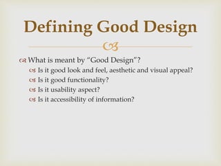
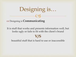
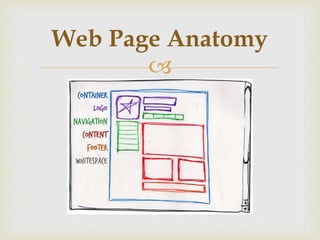


1. Good design is about effective communication through functionality, usability, accessibility and brand alignment. 2. Every web page has basic elements like a container, identity/logo, navigation, content and whitespace that follow design principles. 3. User experience design must consider the context of different devices, screens, users, and data to create intuitive, focused interfaces that minimize cognitive load through hierarchy, simplicity and perceptual grouping principles.