Analysis of "The beauty of data visualization" by David McCandless
•Download as PPTX, PDF•
1 like•458 views

This presentation is created during Data Analytics Internship under Prof. Sameer Mathur, IIM Lucknow.
Report
Share
Report
Share

Recommended
E-learning and data: two peas in a pod
The document discusses learning analytics, which is defined as the measurement, collection, analysis, and reporting of data about learners and learning environments to understand and optimize the learning process. It outlines why learning analytics is important to comprehend future work needs, make training behaviors and needs more visible, and inform learning. The document then discusses how to implement learning analytics through gathering relevant data points, looking for data sources, starting small, and measuring the right things. Finally, it outlines a future for learning analytics that includes diverse learning times and places, personalized learning, free learner choice, and more humanized learning.
2011 mcleodhokitika
The document discusses how the new information and economic landscapes have changed work and skills. It notes that individuals now have a voice online, can easily find and work with others. To be successful, people must master information, be economically productive, and develop skills like critical thinking, problem solving, collaboration and creativity rather than skills suited for routine manual labor. Schools need to prepare students for these changes by teaching skills relevant to today's interconnected world.
Data Visualization: Cognitive Psychology and Design Principles
I presented a version of this at a P&G Pet Care Global F&A Lunch and Learn. P&G-specific slides have been removed. Content from a Dan Young (P&G Corporate CMK) presentation shared with permission.
The big data revolution in healthcare
Digital data collection through mobile phones and the internet is more efficient than traditional paper-based methods. Paper-based collection of data such as vaccination rates in Indonesia could take 6 months or more for analysis due to slow data entry, whereas digital collection platforms allow near real-time access to data. This allows for better decision making by managers as they can more precisely measure outcomes, make better predictions, and target interventions driven by data rather than intuition alone. Digital tools like Magpie provide a simple way for Indian managers to collect and organize the data they need for faster, smarter decision making.
11.15.12 CBIG Event - Dan Sweet\'s Presentation
"Data Visualization- Cognitive Psychology and Design Principles for Effective Visual Communication”
The Project is the People
With project success rates not shifting significantly over the last 15 years there has to be a better way. People-centric project management is a simpler, more natural, more human, and ultimately more successful way to understand projects.
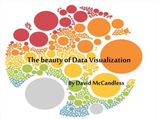
The beauty of Data Visualization
David McCandless creates beautiful data visualizations called infographics that reveal unexpected insights from complex datasets. By turning information like worldwide military spending or Facebook status updates into simple diagrams, McCandless is able to tease out unseen patterns. Good design, he suggests, is the best way to navigate information overload and change how we see the world. The document then provides examples of McCandless' infographics and discusses how visualizing data in this way can provide insights.
Infographic evernote
The document discusses infographics and the social media tool Evernote. It defines infographics as visual representations that aid comprehension of text-based content, such as signs, charts, maps or diagrams. The document explores the power of infographics in teaching and learning, and how they can be used to tell stories, identify relationships among data, and engage users. It also notes potential issues with confusing formats and author bias. Finally, the document recommends Evernote as a tool to create and organize infographic content and lists several free online tools that can be used to create infographics.
Recommended
E-learning and data: two peas in a pod
The document discusses learning analytics, which is defined as the measurement, collection, analysis, and reporting of data about learners and learning environments to understand and optimize the learning process. It outlines why learning analytics is important to comprehend future work needs, make training behaviors and needs more visible, and inform learning. The document then discusses how to implement learning analytics through gathering relevant data points, looking for data sources, starting small, and measuring the right things. Finally, it outlines a future for learning analytics that includes diverse learning times and places, personalized learning, free learner choice, and more humanized learning.
2011 mcleodhokitika
The document discusses how the new information and economic landscapes have changed work and skills. It notes that individuals now have a voice online, can easily find and work with others. To be successful, people must master information, be economically productive, and develop skills like critical thinking, problem solving, collaboration and creativity rather than skills suited for routine manual labor. Schools need to prepare students for these changes by teaching skills relevant to today's interconnected world.
Data Visualization: Cognitive Psychology and Design Principles
I presented a version of this at a P&G Pet Care Global F&A Lunch and Learn. P&G-specific slides have been removed. Content from a Dan Young (P&G Corporate CMK) presentation shared with permission.
The big data revolution in healthcare
Digital data collection through mobile phones and the internet is more efficient than traditional paper-based methods. Paper-based collection of data such as vaccination rates in Indonesia could take 6 months or more for analysis due to slow data entry, whereas digital collection platforms allow near real-time access to data. This allows for better decision making by managers as they can more precisely measure outcomes, make better predictions, and target interventions driven by data rather than intuition alone. Digital tools like Magpie provide a simple way for Indian managers to collect and organize the data they need for faster, smarter decision making.
11.15.12 CBIG Event - Dan Sweet\'s Presentation
"Data Visualization- Cognitive Psychology and Design Principles for Effective Visual Communication”
The Project is the People
With project success rates not shifting significantly over the last 15 years there has to be a better way. People-centric project management is a simpler, more natural, more human, and ultimately more successful way to understand projects.
The beauty of Data Visualization
David McCandless creates beautiful data visualizations called infographics that reveal unexpected insights from complex datasets. By turning information like worldwide military spending or Facebook status updates into simple diagrams, McCandless is able to tease out unseen patterns. Good design, he suggests, is the best way to navigate information overload and change how we see the world. The document then provides examples of McCandless' infographics and discusses how visualizing data in this way can provide insights.
Infographic evernote
The document discusses infographics and the social media tool Evernote. It defines infographics as visual representations that aid comprehension of text-based content, such as signs, charts, maps or diagrams. The document explores the power of infographics in teaching and learning, and how they can be used to tell stories, identify relationships among data, and engage users. It also notes potential issues with confusing formats and author bias. Finally, the document recommends Evernote as a tool to create and organize infographic content and lists several free online tools that can be used to create infographics.
Personalization, Beyond Recommenders by Edward Chenard
This document provides an overview of Edward Chenard's career in personalization and recommenders over 20 years. It discusses his work leading data science teams at Fortune 500 companies and building over 50 data-driven products. The document then outlines Chenard's quest to understand the missing pieces in personalization, as algorithms and more data did not always solve issues. This led him on a global journey and to consider factors like human behavior, context, design, and behavioral economics. The document emphasizes that personalization must solve the contradiction between standardization and individuality.
Personalization, beyond recommenders
The document provides an overview of Edward Chenard's career in personalization and recommenders over 20 years. It discusses his work leading data science and engineering teams at Fortune 500 companies, building over 50 data-driven products. The document then outlines Chenard's quest to understand the missing pieces in personalization, as algorithms and more data did not always solve issues. This led him on a global journey incorporating design, behavioral science, data governance, and understanding how identity and experiences are constructed through networks rather than just data alone.
Data Literacy at IFRC 2017
The International Federation of the Red Cross Red Crescent Societies (IFRC) is supporting a data-driven organization that makes evidence-based decisions. In the Humanitarian and business world, there is a data revolution. Data skills and data readiness are key components to achieve and meet the changing needs.growing a data-driven organization that makes evidence-based decisions. Our IFRC Data Literacy plan is 4 fold - connect emerging and new leaders, build learning zones, create content/products and measure impact. This is an overview of the 2017 Data Literacy Program.
Learn more - http://media.ifrc.org/ifrc/theme/data/
About IFRC - http://www.ifrc.org/
Icon Credits via the Noun Project: TNS, TukTuk, Look and Feel and Thibault Geoffrey
Created by Heather Leson. Detailed notes include resources and credits. Contact heather.leson at IFRC dot ORG
democratization of data sql-konferenz
"Don’t worry about people stealing an idea. If it’s original, you will have to ram it down their throats.” Howard Aiken, Founder of Harvard’s Computing Science Program.
Data is moving so fast these days, and there is a shift whereby people are paying for value, not technology. This is where cloud computing comes in: it is very empowering, because anyone with an internet connection can access it. With Power BI in the cloud, small businesses are liberated with the ability to use the same tools and techniques to explore ideas as larger organisations.
In this session, we will look at understanding the Power BI components and tools available in the cloud, including the Power BI Admin Center, Power Query, Power Pivot, Power View and Power Map. We will look at how to use them will accelerate ideas and help to clarify decisions, and related to this, discuss the roles within IT and the business in relation to these tools. We will also look at business puzzles versus business mysteries, a definition evoked by Malcolm Gladwell (Blink, Outliers) in relation to Power BI.
“Out there in some garage is an entrepreneur who’s forging a bullet with your company’s name on it,” said Gary Hamel, a management guru. With Power BI, let’s see how you can translate your ideas in to a message that people can see, using cloud as an empowerment tool.
The Secrets of Highly Effective Virtual, Dispersed and Remote Virtual IT Serv...
Virtual, Dispersed and Remote ITSM teams face unique challenges created by the tyranny of distance and time. This presentation uses a range of case studies to provide real life lessons for overcoming the challenges and creating a high performing virtual, dispersed or remote team.
Webinar: Communications Made Beautiful With Adobe - 2018-09-11
When running a campaign for your nonprofit, it’s important to have consistency when it comes to branding and design. In this presentation, we’ll cover how you can use Adobe Illustrator and Photoshop to brighten up your collateral. You'll learn how to create consistency across brochures, social media posts, web banners, and any other relevant collateral. This is appropriate for those who are new to design and need a few tips and tricks to get started!
Info Viz by Liz
This presentation is designed as an introduction to information visualization and aims to provide details about:
- Key ideas and techniques related to the creation and critique of visualizations
- What levers visualizations help us pull as designers
- Why visualizations are useful and how they relate to user goals
- Various motivations, trade-offs, and responsibilities surrounding visualizations
TED - Data Visualization - Summary and Conversation Lesson
David McCandless talks about how we can use visualizations to make data more meaningful. Have your students watch for homework and then discuss during class.
Data Visualization using Word Clouds
This document discusses data visualization and provides best practices for visualizing data. It defines data visualization as translating information into visual formats like charts and graphs to make insights and trends easier for people to understand. The document recommends finding the story in the data, cleaning and sorting it, selecting appropriate visual elements to represent it, avoiding exaggeration, and citing sources. It highlights how visuals help illustrate data creatively, uncover new insights, engage audiences, represent big data, and drive decision making. The importance of using word clouds to reveal audience thoughts in an exciting, emotional, and engaging way is also covered, along with ten examples of word cloud generating tools.
Data visualization
The document discusses the importance and power of visualizing data through various graphic representations. It notes that visualizing information allows us to transform it into an "information map" that is easier to explore and understand when feeling overwhelmed by data. It also states that working with data in a visual way can reveal interesting patterns and emergent insights. Additionally, the document highlights that the eye is highly sensitive to visual patterns and variations, and combining visual and conceptual languages can enhance understanding. Finally, it emphasizes that visualizing information can provide elegant solutions to problems and questions in an efficient manner.
Making Your Message Stick in an Infographic World - Littworld 2015
This document discusses the use of infographics to communicate information visually. It defines infographics as visual representations of data or ideas that convey complex information quickly and easily. The benefits of infographics noted include that 90% of information is transmitted visually to the brain and that visuals are better understood than text. Key tips for creating effective infographics include having a process, getting data right, integrating a visual theme, making the graphic actionable, and considering how it will be used. Different types of data that can be visualized are also listed. The document promotes using infographics as part of an overall communication ecosystem and provides an example of how infographic content could be used across different mediums.
Data Visualization & UX
Data Visualization is about helping people gain knowledge from data. The focus of this workshop is on approaches to turn data into actionable insights, combining heuristics for visual analytics with techniques from user-experience design. Participants will learn how to choose and create data visualizations driven by user-oriented objectives, through presentations and an in-class exercise. The class exercise will be conducted in small groups. Workshop class size is limited to 60 participants, on a first-come, first-served basis.
Preparing for an Uncertain Future
This document discusses the changing role of learning and development (L&D) practitioners and the skills they will need for the future. It notes that L&D will transition from being "learning providers" to "architects of continuous development." Key future skills identified include generating on-demand content, building learning ecosystems, facilitating interactions, curating rather than creating content, and shifting from teaching skills to building effective learning habits. The role of L&D will change from employee-centric to network-centric learning.
Is Enterprise Data Literacy Possible?
Enterprise data literacy. A worthy objective? Certainly! A realistic goal? That remains to be seen. As companies consider investing in data literacy education, questions arise about its value and purpose. While the destination – having a data-fluent workforce – is attractive, we wonder how (and if) we can get there.
Kicking off this webinar series, we begin with a panel discussion to explore the landscape of literacy, including expert positions and results from focus groups:
- why it matters,
- what it means,
- what gets in the way,
- who needs it (and how much they need),
- what companies believe it will accomplish.
In this engaging discussion about literacy, we will set the stage for future webinars to answer specific questions and feature successful literacy efforts.
Week2 day1slide
This document discusses the importance and benefits of data visualization. It notes that data visualization is the process of transforming numbers into graphs or images to reveal new insights and patterns in the data. It explains that visualizing data makes it easier to understand than raw numbers, allows people to see underlying patterns and insights, and gives a fuller picture than any single dataset alone by allowing comparison of relative data. The document advocates that managers should recognize the value of visualizing data to better analyze and make decisions based on the insights it provides.
Visualization
The document discusses the importance and benefits of data visualization. It notes that data visualization can help make large amounts of data more understandable by providing visual context and representations. It also suggests that data visualization can help reveal patterns and insights that may not be obvious from raw data alone. Finally, it states that visualization can help managers more easily find and understand relevant data to inform important decisions.
Data Literacy
Data Literacy is all about understanding and arguing with data and what it takes to become a data literate.
Social Media Measurement by Daniel Backhaus at Infuz
Presented October 2nd at Digital East 2012 in the Advanced Social Media Track.
Discusses the need for robust SM metrics while emphasizing the importance of rigorous analysis and sound business strategy as guiding principles for social media.
People focused content Strategy: Tips and tools to get your strategy off the ...
This step-by-step approach to content strategy is designed for beginners and more advanced content strategist. It breaks down the steps needed to build out a content strategy -- all with a focus of putting people first.
UX STRAT Europe 2018: Dr. Eva Deckers, Philips Design
This document discusses data-enabled design and Philips' work in this area. It describes challenges designers face in working with data and intelligence, and Philips' goals to gather user data, translate data into insights, integrate data design with service design, grow impact of data visualization, and create tools to explore data and intelligence. The document outlines showcase projects involving using patient-tracked health data and a smart bottle. It discusses design narratives and lessons learned from a project tracking baby data to benefit healthcare professionals. Philips' agenda is also summarized.
Analysis of "You may not need big data after all - Jeanne W. Ross, Cynthia M....
Analysis of "You may not need big data after all - Jeanne W. Ross, Cynthia M....Dheepika Chokkalingam
The document discusses how companies can improve decision making through better use of existing data resources rather than relying on big data. It argues that companies first need to learn how to effectively analyze and use the data already in their core systems to support operational decisions before pursuing big data. It provides four key practices of companies with strong evidence-based decision making cultures: 1) establishing a single source of performance data, 2) providing real-time feedback to decision makers, 3) regularly updating business rules based on facts, and 4) coaching employees to make data-driven decisions.Analysis of "Big data hype and reality - Gregory Piatetsky-Shapiro"
This presentation is created during Data Analytics Internship under Prof. Sameer Mathur, IIM Lucknow.
More Related Content
Similar to Analysis of "The beauty of data visualization" by David McCandless
Personalization, Beyond Recommenders by Edward Chenard
This document provides an overview of Edward Chenard's career in personalization and recommenders over 20 years. It discusses his work leading data science teams at Fortune 500 companies and building over 50 data-driven products. The document then outlines Chenard's quest to understand the missing pieces in personalization, as algorithms and more data did not always solve issues. This led him on a global journey and to consider factors like human behavior, context, design, and behavioral economics. The document emphasizes that personalization must solve the contradiction between standardization and individuality.
Personalization, beyond recommenders
The document provides an overview of Edward Chenard's career in personalization and recommenders over 20 years. It discusses his work leading data science and engineering teams at Fortune 500 companies, building over 50 data-driven products. The document then outlines Chenard's quest to understand the missing pieces in personalization, as algorithms and more data did not always solve issues. This led him on a global journey incorporating design, behavioral science, data governance, and understanding how identity and experiences are constructed through networks rather than just data alone.
Data Literacy at IFRC 2017
The International Federation of the Red Cross Red Crescent Societies (IFRC) is supporting a data-driven organization that makes evidence-based decisions. In the Humanitarian and business world, there is a data revolution. Data skills and data readiness are key components to achieve and meet the changing needs.growing a data-driven organization that makes evidence-based decisions. Our IFRC Data Literacy plan is 4 fold - connect emerging and new leaders, build learning zones, create content/products and measure impact. This is an overview of the 2017 Data Literacy Program.
Learn more - http://media.ifrc.org/ifrc/theme/data/
About IFRC - http://www.ifrc.org/
Icon Credits via the Noun Project: TNS, TukTuk, Look and Feel and Thibault Geoffrey
Created by Heather Leson. Detailed notes include resources and credits. Contact heather.leson at IFRC dot ORG
democratization of data sql-konferenz
"Don’t worry about people stealing an idea. If it’s original, you will have to ram it down their throats.” Howard Aiken, Founder of Harvard’s Computing Science Program.
Data is moving so fast these days, and there is a shift whereby people are paying for value, not technology. This is where cloud computing comes in: it is very empowering, because anyone with an internet connection can access it. With Power BI in the cloud, small businesses are liberated with the ability to use the same tools and techniques to explore ideas as larger organisations.
In this session, we will look at understanding the Power BI components and tools available in the cloud, including the Power BI Admin Center, Power Query, Power Pivot, Power View and Power Map. We will look at how to use them will accelerate ideas and help to clarify decisions, and related to this, discuss the roles within IT and the business in relation to these tools. We will also look at business puzzles versus business mysteries, a definition evoked by Malcolm Gladwell (Blink, Outliers) in relation to Power BI.
“Out there in some garage is an entrepreneur who’s forging a bullet with your company’s name on it,” said Gary Hamel, a management guru. With Power BI, let’s see how you can translate your ideas in to a message that people can see, using cloud as an empowerment tool.
The Secrets of Highly Effective Virtual, Dispersed and Remote Virtual IT Serv...
Virtual, Dispersed and Remote ITSM teams face unique challenges created by the tyranny of distance and time. This presentation uses a range of case studies to provide real life lessons for overcoming the challenges and creating a high performing virtual, dispersed or remote team.
Webinar: Communications Made Beautiful With Adobe - 2018-09-11
When running a campaign for your nonprofit, it’s important to have consistency when it comes to branding and design. In this presentation, we’ll cover how you can use Adobe Illustrator and Photoshop to brighten up your collateral. You'll learn how to create consistency across brochures, social media posts, web banners, and any other relevant collateral. This is appropriate for those who are new to design and need a few tips and tricks to get started!
Info Viz by Liz
This presentation is designed as an introduction to information visualization and aims to provide details about:
- Key ideas and techniques related to the creation and critique of visualizations
- What levers visualizations help us pull as designers
- Why visualizations are useful and how they relate to user goals
- Various motivations, trade-offs, and responsibilities surrounding visualizations
TED - Data Visualization - Summary and Conversation Lesson
David McCandless talks about how we can use visualizations to make data more meaningful. Have your students watch for homework and then discuss during class.
Data Visualization using Word Clouds
This document discusses data visualization and provides best practices for visualizing data. It defines data visualization as translating information into visual formats like charts and graphs to make insights and trends easier for people to understand. The document recommends finding the story in the data, cleaning and sorting it, selecting appropriate visual elements to represent it, avoiding exaggeration, and citing sources. It highlights how visuals help illustrate data creatively, uncover new insights, engage audiences, represent big data, and drive decision making. The importance of using word clouds to reveal audience thoughts in an exciting, emotional, and engaging way is also covered, along with ten examples of word cloud generating tools.
Data visualization
The document discusses the importance and power of visualizing data through various graphic representations. It notes that visualizing information allows us to transform it into an "information map" that is easier to explore and understand when feeling overwhelmed by data. It also states that working with data in a visual way can reveal interesting patterns and emergent insights. Additionally, the document highlights that the eye is highly sensitive to visual patterns and variations, and combining visual and conceptual languages can enhance understanding. Finally, it emphasizes that visualizing information can provide elegant solutions to problems and questions in an efficient manner.
Making Your Message Stick in an Infographic World - Littworld 2015
This document discusses the use of infographics to communicate information visually. It defines infographics as visual representations of data or ideas that convey complex information quickly and easily. The benefits of infographics noted include that 90% of information is transmitted visually to the brain and that visuals are better understood than text. Key tips for creating effective infographics include having a process, getting data right, integrating a visual theme, making the graphic actionable, and considering how it will be used. Different types of data that can be visualized are also listed. The document promotes using infographics as part of an overall communication ecosystem and provides an example of how infographic content could be used across different mediums.
Data Visualization & UX
Data Visualization is about helping people gain knowledge from data. The focus of this workshop is on approaches to turn data into actionable insights, combining heuristics for visual analytics with techniques from user-experience design. Participants will learn how to choose and create data visualizations driven by user-oriented objectives, through presentations and an in-class exercise. The class exercise will be conducted in small groups. Workshop class size is limited to 60 participants, on a first-come, first-served basis.
Preparing for an Uncertain Future
This document discusses the changing role of learning and development (L&D) practitioners and the skills they will need for the future. It notes that L&D will transition from being "learning providers" to "architects of continuous development." Key future skills identified include generating on-demand content, building learning ecosystems, facilitating interactions, curating rather than creating content, and shifting from teaching skills to building effective learning habits. The role of L&D will change from employee-centric to network-centric learning.
Is Enterprise Data Literacy Possible?
Enterprise data literacy. A worthy objective? Certainly! A realistic goal? That remains to be seen. As companies consider investing in data literacy education, questions arise about its value and purpose. While the destination – having a data-fluent workforce – is attractive, we wonder how (and if) we can get there.
Kicking off this webinar series, we begin with a panel discussion to explore the landscape of literacy, including expert positions and results from focus groups:
- why it matters,
- what it means,
- what gets in the way,
- who needs it (and how much they need),
- what companies believe it will accomplish.
In this engaging discussion about literacy, we will set the stage for future webinars to answer specific questions and feature successful literacy efforts.
Week2 day1slide
This document discusses the importance and benefits of data visualization. It notes that data visualization is the process of transforming numbers into graphs or images to reveal new insights and patterns in the data. It explains that visualizing data makes it easier to understand than raw numbers, allows people to see underlying patterns and insights, and gives a fuller picture than any single dataset alone by allowing comparison of relative data. The document advocates that managers should recognize the value of visualizing data to better analyze and make decisions based on the insights it provides.
Visualization
The document discusses the importance and benefits of data visualization. It notes that data visualization can help make large amounts of data more understandable by providing visual context and representations. It also suggests that data visualization can help reveal patterns and insights that may not be obvious from raw data alone. Finally, it states that visualization can help managers more easily find and understand relevant data to inform important decisions.
Data Literacy
Data Literacy is all about understanding and arguing with data and what it takes to become a data literate.
Social Media Measurement by Daniel Backhaus at Infuz
Presented October 2nd at Digital East 2012 in the Advanced Social Media Track.
Discusses the need for robust SM metrics while emphasizing the importance of rigorous analysis and sound business strategy as guiding principles for social media.
People focused content Strategy: Tips and tools to get your strategy off the ...
This step-by-step approach to content strategy is designed for beginners and more advanced content strategist. It breaks down the steps needed to build out a content strategy -- all with a focus of putting people first.
UX STRAT Europe 2018: Dr. Eva Deckers, Philips Design
This document discusses data-enabled design and Philips' work in this area. It describes challenges designers face in working with data and intelligence, and Philips' goals to gather user data, translate data into insights, integrate data design with service design, grow impact of data visualization, and create tools to explore data and intelligence. The document outlines showcase projects involving using patient-tracked health data and a smart bottle. It discusses design narratives and lessons learned from a project tracking baby data to benefit healthcare professionals. Philips' agenda is also summarized.
Similar to Analysis of "The beauty of data visualization" by David McCandless (20)
Personalization, Beyond Recommenders by Edward Chenard
Personalization, Beyond Recommenders by Edward Chenard
The Secrets of Highly Effective Virtual, Dispersed and Remote Virtual IT Serv...
The Secrets of Highly Effective Virtual, Dispersed and Remote Virtual IT Serv...
Webinar: Communications Made Beautiful With Adobe - 2018-09-11
Webinar: Communications Made Beautiful With Adobe - 2018-09-11
TED - Data Visualization - Summary and Conversation Lesson
TED - Data Visualization - Summary and Conversation Lesson
Making Your Message Stick in an Infographic World - Littworld 2015
Making Your Message Stick in an Infographic World - Littworld 2015
Social Media Measurement by Daniel Backhaus at Infuz
Social Media Measurement by Daniel Backhaus at Infuz
People focused content Strategy: Tips and tools to get your strategy off the ...
People focused content Strategy: Tips and tools to get your strategy off the ...
UX STRAT Europe 2018: Dr. Eva Deckers, Philips Design
UX STRAT Europe 2018: Dr. Eva Deckers, Philips Design
More from Dheepika Chokkalingam
Analysis of "You may not need big data after all - Jeanne W. Ross, Cynthia M....
Analysis of "You may not need big data after all - Jeanne W. Ross, Cynthia M....Dheepika Chokkalingam
The document discusses how companies can improve decision making through better use of existing data resources rather than relying on big data. It argues that companies first need to learn how to effectively analyze and use the data already in their core systems to support operational decisions before pursuing big data. It provides four key practices of companies with strong evidence-based decision making cultures: 1) establishing a single source of performance data, 2) providing real-time feedback to decision makers, 3) regularly updating business rules based on facts, and 4) coaching employees to make data-driven decisions.Analysis of "Big data hype and reality - Gregory Piatetsky-Shapiro"
This presentation is created during Data Analytics Internship under Prof. Sameer Mathur, IIM Lucknow.
Analysis of "Stop searching for that elusive data scientist - Michael Schrage"
This presentation is created during Data Analytics Internship under Prof. Sameer Mathur, IIM Lucknow.
Analysis of TED Talk "The big data revolution in healthcare by Joel Selanikio"
This presentation is created during Data Analytics Internship under Prof. Sameer Mathur, IIM Lucknow.
Analysis of "A leader's guide to data analytics - Florian Zettelmeyer"
Florian Zettelmeyer discusses the importance of analytical thinking skills over technical skills. He provides four guidelines for effective analytics: 1) Start with understanding the business problem; 2) Understand how the data was generated; 3) Leverage domain expertise to interpret results; and 4) Have a culture where established ideas can be questioned based on data, not just assumptions. The document also discusses the relevance of these concepts for Indian managers, noting analytics can help decision-making if managers have some data science knowledge to ensure quality and prevent faulty assumptions.
Analysis of "A Predictive Analytics Primer" by Thomas H. Davenport
This presentation is created during Data Analytics Internship under Prof. Sameer Mathur, IIM Lucknow.
Analysis of "The best stats you've ever seen" by Hans Rosling
This presentation is created during Data Analytics Internship under Prof. Sameer Mathur, IIM Lucknow.
Analysis of "Data is worthless if you don't communicate it" by Thomas H. Dave...
Analysis of "Data is worthless if you don't communicate it" by Thomas H. Dave...Dheepika Chokkalingam
This presentation is created during Data Analytics Internship under Prof. Sameer Mathur, IIM Lucknow.Analysis of "Are you Data Driven by Thomas C. Redman"
This presentation is created during Data Analytics Internship under Prof. Sameer Mathur, IIM Lucknow.
Analysis of Make data more human - TED Talk by Jer Thopr
This presentation is created during Data Analytics Internship under Prof. Sameer Mathur, IIM Lucknow.
How to start thinking like a data scientist - Article Analysis
This presentation is created during Data Analytics Internship under Prof. Sameer Mathur, IIM Lucknow.
What do we do with all this big data - TED Talk Analysis
This presentation is created during Data Analytics Internship under Prof. Sameer Mathur, IIM Lucknow.
Analysis of "Data Scientist: the sexiest job of 21st century - Thomas H.Daven...
Analysis of "Data Scientist: the sexiest job of 21st century - Thomas H.Daven...Dheepika Chokkalingam
This presentation is created during Data Analytics Internship under Prof. Sameer Mathur, IIM Lucknow.Analysis of "Why you should love statistics? - TED Talk by Alan Smith" - Dhee...
Analysis of "Why you should love statistics? - TED Talk by Alan Smith" - Dhee...Dheepika Chokkalingam
This presentation is created during Data Analytics Internship under Prof. Sameer Mathur, IIM Lucknow.VR 360 relax - Marketing Plan of Google Play Store App
This presentation describes the marketing plan of Google Play Store App - VR 360 Relax. It is created during Marketing Internship under Prof. Sameer Mathur, iIM Lucknow
Natureview farm - Case Study
Natureview Farm manufactures and markets refrigerated yogurt cups. It aims to increase revenue from $13 million to $20 million in 2001. It considers three options: 1) Expand 6 SKU cup sizes into supermarkets, 2) Expand 4 SKU larger cup sizes nationally, or 3) Introduce 2 SKU children's multipacks in natural food stores. It chooses option 2 to expand larger cup sizes nationally in supermarkets as it will generate the needed $7 million revenue increase while maintaining relationships in natural food stores.
Starbucks Case Study - Dheepika
Starbucks - Case study by Dheepika during Marketing Internship under Prof. Sameer Mathur, IIM Lucknow
More from Dheepika Chokkalingam (17)
Analysis of "You may not need big data after all - Jeanne W. Ross, Cynthia M....
Analysis of "You may not need big data after all - Jeanne W. Ross, Cynthia M....
Analysis of "Big data hype and reality - Gregory Piatetsky-Shapiro"
Analysis of "Big data hype and reality - Gregory Piatetsky-Shapiro"
Analysis of "Stop searching for that elusive data scientist - Michael Schrage"
Analysis of "Stop searching for that elusive data scientist - Michael Schrage"
Analysis of TED Talk "The big data revolution in healthcare by Joel Selanikio"
Analysis of TED Talk "The big data revolution in healthcare by Joel Selanikio"
Analysis of "A leader's guide to data analytics - Florian Zettelmeyer"
Analysis of "A leader's guide to data analytics - Florian Zettelmeyer"
Analysis of "A Predictive Analytics Primer" by Thomas H. Davenport
Analysis of "A Predictive Analytics Primer" by Thomas H. Davenport
Analysis of "The best stats you've ever seen" by Hans Rosling
Analysis of "The best stats you've ever seen" by Hans Rosling
Analysis of "Data is worthless if you don't communicate it" by Thomas H. Dave...
Analysis of "Data is worthless if you don't communicate it" by Thomas H. Dave...
Analysis of "Are you Data Driven by Thomas C. Redman"
Analysis of "Are you Data Driven by Thomas C. Redman"
Analysis of Make data more human - TED Talk by Jer Thopr
Analysis of Make data more human - TED Talk by Jer Thopr
How to start thinking like a data scientist - Article Analysis
How to start thinking like a data scientist - Article Analysis
What do we do with all this big data - TED Talk Analysis
What do we do with all this big data - TED Talk Analysis
Analysis of "Data Scientist: the sexiest job of 21st century - Thomas H.Daven...
Analysis of "Data Scientist: the sexiest job of 21st century - Thomas H.Daven...
Analysis of "Why you should love statistics? - TED Talk by Alan Smith" - Dhee...
Analysis of "Why you should love statistics? - TED Talk by Alan Smith" - Dhee...
VR 360 relax - Marketing Plan of Google Play Store App
VR 360 relax - Marketing Plan of Google Play Store App
Recently uploaded
一比一原版悉尼大学毕业证如何办理
原版一模一样【微信:741003700 】【悉尼大学毕业证成绩单】【微信:741003700 】学位证,留信认证(真实可查,永久存档)原件一模一样纸张工艺/offer、雅思、外壳等材料/诚信可靠,可直接看成品样本,帮您解决无法毕业带来的各种难题!外壳,原版制作,诚信可靠,可直接看成品样本。行业标杆!精益求精,诚心合作,真诚制作!多年品质 ,按需精细制作,24小时接单,全套进口原装设备。十五年致力于帮助留学生解决难题,包您满意。
本公司拥有海外各大学样板无数,能完美还原。
1:1完美还原海外各大学毕业材料上的工艺:水印,阴影底纹,钢印LOGO烫金烫银,LOGO烫金烫银复合重叠。文字图案浮雕、激光镭射、紫外荧光、温感、复印防伪等防伪工艺。材料咨询办理、认证咨询办理请加学历顾问Q/微741003700
【主营项目】
一.毕业证【q微741003700】成绩单、使馆认证、教育部认证、雅思托福成绩单、学生卡等!
二.真实使馆公证(即留学回国人员证明,不成功不收费)
三.真实教育部学历学位认证(教育部存档!教育部留服网站永久可查)
四.办理各国各大学文凭(一对一专业服务,可全程监控跟踪进度)
如果您处于以下几种情况:
◇在校期间,因各种原因未能顺利毕业……拿不到官方毕业证【q/微741003700】
◇面对父母的压力,希望尽快拿到;
◇不清楚认证流程以及材料该如何准备;
◇回国时间很长,忘记办理;
◇回国马上就要找工作,办给用人单位看;
◇企事业单位必须要求办理的
◇需要报考公务员、购买免税车、落转户口
◇申请留学生创业基金
留信网认证的作用:
1:该专业认证可证明留学生真实身份
2:同时对留学生所学专业登记给予评定
3:国家专业人才认证中心颁发入库证书
4:这个认证书并且可以归档倒地方
5:凡事获得留信网入网的信息将会逐步更新到个人身份内,将在公安局网内查询个人身份证信息后,同步读取人才网入库信息
6:个人职称评审加20分
7:个人信誉贷款加10分
8:在国家人才网主办的国家网络招聘大会中纳入资料,供国家高端企业选择人才
办理悉尼大学毕业证【微信:741003700 】外观非常简单,由纸质材料制成,上面印有校徽、校名、毕业生姓名、专业等信息。
办理悉尼大学毕业证【微信:741003700 】格式相对统一,各专业都有相应的模板。通常包括以下部分:
校徽:象征着学校的荣誉和传承。
校名:学校英文全称
授予学位:本部分将注明获得的具体学位名称。
毕业生姓名:这是最重要的信息之一,标志着该证书是由特定人员获得的。
颁发日期:这是毕业正式生效的时间,也代表着毕业生学业的结束。
其他信息:根据不同的专业和学位,可能会有一些特定的信息或章节。
办理悉尼大学毕业证【微信:741003700 】价值很高,需要妥善保管。一般来说,应放置在安全、干燥、防潮的地方,避免长时间暴露在阳光下。如需使用,最好使用复印件而不是原件,以免丢失。
综上所述,办理悉尼大学毕业证【微信:741003700 】是证明身份和学历的高价值文件。外观简单庄重,格式统一,包括重要的个人信息和发布日期。对持有人来说,妥善保管是非常重要的。
一比一原版马来西亚博特拉大学毕业证(upm毕业证)如何办理
原版一模一样【微信:741003700 】【马来西亚博特拉大学毕业证(upm毕业证)成绩单】【微信:741003700 】学位证,留信认证(真实可查,永久存档)原件一模一样纸张工艺/offer、雅思、外壳等材料/诚信可靠,可直接看成品样本,帮您解决无法毕业带来的各种难题!外壳,原版制作,诚信可靠,可直接看成品样本。行业标杆!精益求精,诚心合作,真诚制作!多年品质 ,按需精细制作,24小时接单,全套进口原装设备。十五年致力于帮助留学生解决难题,包您满意。
本公司拥有海外各大学样板无数,能完美还原。
1:1完美还原海外各大学毕业材料上的工艺:水印,阴影底纹,钢印LOGO烫金烫银,LOGO烫金烫银复合重叠。文字图案浮雕、激光镭射、紫外荧光、温感、复印防伪等防伪工艺。材料咨询办理、认证咨询办理请加学历顾问Q/微741003700
【主营项目】
一.毕业证【q微741003700】成绩单、使馆认证、教育部认证、雅思托福成绩单、学生卡等!
二.真实使馆公证(即留学回国人员证明,不成功不收费)
三.真实教育部学历学位认证(教育部存档!教育部留服网站永久可查)
四.办理各国各大学文凭(一对一专业服务,可全程监控跟踪进度)
如果您处于以下几种情况:
◇在校期间,因各种原因未能顺利毕业……拿不到官方毕业证【q/微741003700】
◇面对父母的压力,希望尽快拿到;
◇不清楚认证流程以及材料该如何准备;
◇回国时间很长,忘记办理;
◇回国马上就要找工作,办给用人单位看;
◇企事业单位必须要求办理的
◇需要报考公务员、购买免税车、落转户口
◇申请留学生创业基金
留信网认证的作用:
1:该专业认证可证明留学生真实身份
2:同时对留学生所学专业登记给予评定
3:国家专业人才认证中心颁发入库证书
4:这个认证书并且可以归档倒地方
5:凡事获得留信网入网的信息将会逐步更新到个人身份内,将在公安局网内查询个人身份证信息后,同步读取人才网入库信息
6:个人职称评审加20分
7:个人信誉贷款加10分
8:在国家人才网主办的国家网络招聘大会中纳入资料,供国家高端企业选择人才
办理马来西亚博特拉大学毕业证(upm毕业证)【微信:741003700 】外观非常简单,由纸质材料制成,上面印有校徽、校名、毕业生姓名、专业等信息。
办理马来西亚博特拉大学毕业证(upm毕业证)【微信:741003700 】格式相对统一,各专业都有相应的模板。通常包括以下部分:
校徽:象征着学校的荣誉和传承。
校名:学校英文全称
授予学位:本部分将注明获得的具体学位名称。
毕业生姓名:这是最重要的信息之一,标志着该证书是由特定人员获得的。
颁发日期:这是毕业正式生效的时间,也代表着毕业生学业的结束。
其他信息:根据不同的专业和学位,可能会有一些特定的信息或章节。
办理马来西亚博特拉大学毕业证(upm毕业证)【微信:741003700 】价值很高,需要妥善保管。一般来说,应放置在安全、干燥、防潮的地方,避免长时间暴露在阳光下。如需使用,最好使用复印件而不是原件,以免丢失。
综上所述,办理马来西亚博特拉大学毕业证(upm毕业证)【微信:741003700 】是证明身份和学历的高价值文件。外观简单庄重,格式统一,包括重要的个人信息和发布日期。对持有人来说,妥善保管是非常重要的。
Salesforce AI + Data Community Tour Slides - Canarias
Slides for the Salesforce AI + Data Community Tour in Las Palmas de Gran Canaria
一比一原版加拿大渥太华大学毕业证(uottawa毕业证书)如何办理
原版一模一样【微信:741003700 】【渥太华大学毕业证(uottawa毕业证书)成绩单】【微信:741003700 】学位证,留信认证(真实可查,永久存档)原件一模一样纸张工艺/offer、雅思、外壳等材料/诚信可靠,可直接看成品样本,帮您解决无法毕业带来的各种难题!外壳,原版制作,诚信可靠,可直接看成品样本。行业标杆!精益求精,诚心合作,真诚制作!多年品质 ,按需精细制作,24小时接单,全套进口原装设备。十五年致力于帮助留学生解决难题,包您满意。
本公司拥有海外各大学样板无数,能完美还原。
1:1完美还原海外各大学毕业材料上的工艺:水印,阴影底纹,钢印LOGO烫金烫银,LOGO烫金烫银复合重叠。文字图案浮雕、激光镭射、紫外荧光、温感、复印防伪等防伪工艺。材料咨询办理、认证咨询办理请加学历顾问Q/微741003700
【主营项目】
一.毕业证【q微741003700】成绩单、使馆认证、教育部认证、雅思托福成绩单、学生卡等!
二.真实使馆公证(即留学回国人员证明,不成功不收费)
三.真实教育部学历学位认证(教育部存档!教育部留服网站永久可查)
四.办理各国各大学文凭(一对一专业服务,可全程监控跟踪进度)
如果您处于以下几种情况:
◇在校期间,因各种原因未能顺利毕业……拿不到官方毕业证【q/微741003700】
◇面对父母的压力,希望尽快拿到;
◇不清楚认证流程以及材料该如何准备;
◇回国时间很长,忘记办理;
◇回国马上就要找工作,办给用人单位看;
◇企事业单位必须要求办理的
◇需要报考公务员、购买免税车、落转户口
◇申请留学生创业基金
留信网认证的作用:
1:该专业认证可证明留学生真实身份
2:同时对留学生所学专业登记给予评定
3:国家专业人才认证中心颁发入库证书
4:这个认证书并且可以归档倒地方
5:凡事获得留信网入网的信息将会逐步更新到个人身份内,将在公安局网内查询个人身份证信息后,同步读取人才网入库信息
6:个人职称评审加20分
7:个人信誉贷款加10分
8:在国家人才网主办的国家网络招聘大会中纳入资料,供国家高端企业选择人才
办理渥太华大学毕业证(uottawa毕业证书)【微信:741003700 】外观非常简单,由纸质材料制成,上面印有校徽、校名、毕业生姓名、专业等信息。
办理渥太华大学毕业证(uottawa毕业证书)【微信:741003700 】格式相对统一,各专业都有相应的模板。通常包括以下部分:
校徽:象征着学校的荣誉和传承。
校名:学校英文全称
授予学位:本部分将注明获得的具体学位名称。
毕业生姓名:这是最重要的信息之一,标志着该证书是由特定人员获得的。
颁发日期:这是毕业正式生效的时间,也代表着毕业生学业的结束。
其他信息:根据不同的专业和学位,可能会有一些特定的信息或章节。
办理渥太华大学毕业证(uottawa毕业证书)【微信:741003700 】价值很高,需要妥善保管。一般来说,应放置在安全、干燥、防潮的地方,避免长时间暴露在阳光下。如需使用,最好使用复印件而不是原件,以免丢失。
综上所述,办理渥太华大学毕业证(uottawa毕业证书)【微信:741003700 】是证明身份和学历的高价值文件。外观简单庄重,格式统一,包括重要的个人信息和发布日期。对持有人来说,妥善保管是非常重要的。
一比一原版(uom毕业证书)曼彻斯特大学毕业证如何办理
原版一模一样【微信:741003700 】【(uom毕业证书)曼彻斯特大学毕业证成绩单】【微信:741003700 】学位证,留信认证(真实可查,永久存档)原件一模一样纸张工艺/offer、雅思、外壳等材料/诚信可靠,可直接看成品样本,帮您解决无法毕业带来的各种难题!外壳,原版制作,诚信可靠,可直接看成品样本。行业标杆!精益求精,诚心合作,真诚制作!多年品质 ,按需精细制作,24小时接单,全套进口原装设备。十五年致力于帮助留学生解决难题,包您满意。
本公司拥有海外各大学样板无数,能完美还原。
1:1完美还原海外各大学毕业材料上的工艺:水印,阴影底纹,钢印LOGO烫金烫银,LOGO烫金烫银复合重叠。文字图案浮雕、激光镭射、紫外荧光、温感、复印防伪等防伪工艺。材料咨询办理、认证咨询办理请加学历顾问Q/微741003700
【主营项目】
一.毕业证【q微741003700】成绩单、使馆认证、教育部认证、雅思托福成绩单、学生卡等!
二.真实使馆公证(即留学回国人员证明,不成功不收费)
三.真实教育部学历学位认证(教育部存档!教育部留服网站永久可查)
四.办理各国各大学文凭(一对一专业服务,可全程监控跟踪进度)
如果您处于以下几种情况:
◇在校期间,因各种原因未能顺利毕业……拿不到官方毕业证【q/微741003700】
◇面对父母的压力,希望尽快拿到;
◇不清楚认证流程以及材料该如何准备;
◇回国时间很长,忘记办理;
◇回国马上就要找工作,办给用人单位看;
◇企事业单位必须要求办理的
◇需要报考公务员、购买免税车、落转户口
◇申请留学生创业基金
留信网认证的作用:
1:该专业认证可证明留学生真实身份
2:同时对留学生所学专业登记给予评定
3:国家专业人才认证中心颁发入库证书
4:这个认证书并且可以归档倒地方
5:凡事获得留信网入网的信息将会逐步更新到个人身份内,将在公安局网内查询个人身份证信息后,同步读取人才网入库信息
6:个人职称评审加20分
7:个人信誉贷款加10分
8:在国家人才网主办的国家网络招聘大会中纳入资料,供国家高端企业选择人才
办理(uom毕业证书)曼彻斯特大学毕业证【微信:741003700 】外观非常简单,由纸质材料制成,上面印有校徽、校名、毕业生姓名、专业等信息。
办理(uom毕业证书)曼彻斯特大学毕业证【微信:741003700 】格式相对统一,各专业都有相应的模板。通常包括以下部分:
校徽:象征着学校的荣誉和传承。
校名:学校英文全称
授予学位:本部分将注明获得的具体学位名称。
毕业生姓名:这是最重要的信息之一,标志着该证书是由特定人员获得的。
颁发日期:这是毕业正式生效的时间,也代表着毕业生学业的结束。
其他信息:根据不同的专业和学位,可能会有一些特定的信息或章节。
办理(uom毕业证书)曼彻斯特大学毕业证【微信:741003700 】价值很高,需要妥善保管。一般来说,应放置在安全、干燥、防潮的地方,避免长时间暴露在阳光下。如需使用,最好使用复印件而不是原件,以免丢失。
综上所述,办理(uom毕业证书)曼彻斯特大学毕业证【微信:741003700 】是证明身份和学历的高价值文件。外观简单庄重,格式统一,包括重要的个人信息和发布日期。对持有人来说,妥善保管是非常重要的。
一比一原版斯威本理工大学毕业证(swinburne毕业证)如何办理
原版一模一样【微信:741003700 】【斯威本理工大学毕业证(swinburne毕业证)成绩单】【微信:741003700 】学位证,留信认证(真实可查,永久存档)原件一模一样纸张工艺/offer、雅思、外壳等材料/诚信可靠,可直接看成品样本,帮您解决无法毕业带来的各种难题!外壳,原版制作,诚信可靠,可直接看成品样本。行业标杆!精益求精,诚心合作,真诚制作!多年品质 ,按需精细制作,24小时接单,全套进口原装设备。十五年致力于帮助留学生解决难题,包您满意。
本公司拥有海外各大学样板无数,能完美还原。
1:1完美还原海外各大学毕业材料上的工艺:水印,阴影底纹,钢印LOGO烫金烫银,LOGO烫金烫银复合重叠。文字图案浮雕、激光镭射、紫外荧光、温感、复印防伪等防伪工艺。材料咨询办理、认证咨询办理请加学历顾问Q/微741003700
【主营项目】
一.毕业证【q微741003700】成绩单、使馆认证、教育部认证、雅思托福成绩单、学生卡等!
二.真实使馆公证(即留学回国人员证明,不成功不收费)
三.真实教育部学历学位认证(教育部存档!教育部留服网站永久可查)
四.办理各国各大学文凭(一对一专业服务,可全程监控跟踪进度)
如果您处于以下几种情况:
◇在校期间,因各种原因未能顺利毕业……拿不到官方毕业证【q/微741003700】
◇面对父母的压力,希望尽快拿到;
◇不清楚认证流程以及材料该如何准备;
◇回国时间很长,忘记办理;
◇回国马上就要找工作,办给用人单位看;
◇企事业单位必须要求办理的
◇需要报考公务员、购买免税车、落转户口
◇申请留学生创业基金
留信网认证的作用:
1:该专业认证可证明留学生真实身份
2:同时对留学生所学专业登记给予评定
3:国家专业人才认证中心颁发入库证书
4:这个认证书并且可以归档倒地方
5:凡事获得留信网入网的信息将会逐步更新到个人身份内,将在公安局网内查询个人身份证信息后,同步读取人才网入库信息
6:个人职称评审加20分
7:个人信誉贷款加10分
8:在国家人才网主办的国家网络招聘大会中纳入资料,供国家高端企业选择人才
办理斯威本理工大学毕业证(swinburne毕业证)【微信:741003700 】外观非常简单,由纸质材料制成,上面印有校徽、校名、毕业生姓名、专业等信息。
办理斯威本理工大学毕业证(swinburne毕业证)【微信:741003700 】格式相对统一,各专业都有相应的模板。通常包括以下部分:
校徽:象征着学校的荣誉和传承。
校名:学校英文全称
授予学位:本部分将注明获得的具体学位名称。
毕业生姓名:这是最重要的信息之一,标志着该证书是由特定人员获得的。
颁发日期:这是毕业正式生效的时间,也代表着毕业生学业的结束。
其他信息:根据不同的专业和学位,可能会有一些特定的信息或章节。
办理斯威本理工大学毕业证(swinburne毕业证)【微信:741003700 】价值很高,需要妥善保管。一般来说,应放置在安全、干燥、防潮的地方,避免长时间暴露在阳光下。如需使用,最好使用复印件而不是原件,以免丢失。
综上所述,办理斯威本理工大学毕业证(swinburne毕业证)【微信:741003700 】是证明身份和学历的高价值文件。外观简单庄重,格式统一,包括重要的个人信息和发布日期。对持有人来说,妥善保管是非常重要的。
Sid Sigma educational and problem solving power point- Six Sigma.ppt
Sid Sigma educational and problem solving power point
社内勉強会資料_Hallucination of LLMs .
社内エンジニア・リサーチャー勉強会の発表資料「Hallucination of LLMs」を公開しました!
大規模言語モデル(LLM)に起こるハルシネーションのメカニズムと、それらを軽減する方法について紹介しています。
一比一原版多伦多大学毕业证(UofT毕业证书)学历如何办理
办理【微信号:176555708】【办理(UofT毕业证书)】【微信号:176555708】《成绩单、外壳、offer、真实留信官方学历认证(永久存档/真实可查)》采用学校原版纸张、特殊工艺完全按照原版一比一制作(包括:隐形水印,阴影底纹,钢印LOGO烫金烫银,LOGO烫金烫银复合重叠,文字图案浮雕,激光镭射,紫外荧光,温感,复印防伪)行业标杆!精益求精,诚心合作,真诚制作!多年品质 ,按需精细制作,24小时接单,全套进口原装设备,十五年致力于帮助留学生解决难题,业务范围有加拿大、英国、澳洲、韩国、美国、新加坡,新西兰等学历材料,包您满意。
【我们承诺采用的是学校原版纸张(纸质、底色、纹路)我们拥有全套进口原装设备,特殊工艺都是采用不同机器制作,仿真度基本可以达到100%,所有工艺效果都可提前给客户展示,不满意可以根据客户要求进行调整,直到满意为止!】
【业务选择办理准则】
一、工作未确定,回国需先给父母、亲戚朋友看下文凭的情况,办理一份就读学校的毕业证【微信号:176555708】文凭即可
二、回国进私企、外企、自己做生意的情况,这些单位是不查询毕业证真伪的,而且国内没有渠道去查询国外文凭的真假,也不需要提供真实教育部认证。鉴于此,办理一份毕业证【微信号:176555708】即可
三、进国企,银行,事业单位,考公务员等等,这些单位是必需要提供真实教育部认证的,办理教育部认证所需资料众多且烦琐,所有材料您都必须提供原件,我们凭借丰富的经验,快捷的绿色通道帮您快速整合材料,让您少走弯路。
留信网认证的作用:
1:该专业认证可证明留学生真实身份
2:同时对留学生所学专业登记给予评定
3:国家专业人才认证中心颁发入库证书
4:这个认证书并且可以归档倒地方
5:凡事获得留信网入网的信息将会逐步更新到个人身份内,将在公安局网内查询个人身份证信息后,同步读取人才网入库信息
6:个人职称评审加20分
7:个人信誉贷款加10分
8:在国家人才网主办的国家网络招聘大会中纳入资料,供国家高端企业选择人才
留信网服务项目:
1、留学生专业人才库服务(留信分析)
2、国(境)学习人员提供就业推荐信服务
3、留学人员区块链存储服务
【关于价格问题(保证一手价格)】
我们所定的价格是非常合理的,而且我们现在做得单子大多数都是代理和回头客户介绍的所以一般现在有新的单子 我给客户的都是第一手的代理价格,因为我想坦诚对待大家 不想跟大家在价格方面浪费时间
对于老客户或者被老客户介绍过来的朋友,我们都会适当给一些优惠。
选择实体注册公司办理,更放心,更安全!我们的承诺:客户在留信官方认证查询网站查询到认证通过结果后付款,不成功不收费!
Discovering Digital Process Twins for What-if Analysis: a Process Mining Appr...
This webinar discusses the limitations of traditional approaches for business process simulation based on had-crafted model with restrictive assumptions. It shows how process mining techniques can be assembled together to discover high-fidelity digital twins of end-to-end processes from event data.
06-20-2024-AI Camp Meetup-Unstructured Data and Vector Databases
Tech Talk: Unstructured Data and Vector Databases
Speaker: Tim Spann (Zilliz)
Abstract: In this session, I will discuss the unstructured data and the world of vector databases, we will see how they different from traditional databases. In which cases you need one and in which you probably don’t. I will also go over Similarity Search, where do you get vectors from and an example of a Vector Database Architecture. Wrapping up with an overview of Milvus.
Introduction
Unstructured data, vector databases, traditional databases, similarity search
Vectors
Where, What, How, Why Vectors? We’ll cover a Vector Database Architecture
Introducing Milvus
What drives Milvus' Emergence as the most widely adopted vector database
Hi Unstructured Data Friends!
I hope this video had all the unstructured data processing, AI and Vector Database demo you needed for now. If not, there’s a ton more linked below.
My source code is available here
https://github.com/tspannhw/
Let me know in the comments if you liked what you saw, how I can improve and what should I show next? Thanks, hope to see you soon at a Meetup in Princeton, Philadelphia, New York City or here in the Youtube Matrix.
Get Milvused!
https://milvus.io/
Read my Newsletter every week!
https://github.com/tspannhw/FLiPStackWeekly/blob/main/141-10June2024.md
For more cool Unstructured Data, AI and Vector Database videos check out the Milvus vector database videos here
https://www.youtube.com/@MilvusVectorDatabase/videos
Unstructured Data Meetups -
https://www.meetup.com/unstructured-data-meetup-new-york/
https://lu.ma/calendar/manage/cal-VNT79trvj0jS8S7
https://www.meetup.com/pro/unstructureddata/
https://zilliz.com/community/unstructured-data-meetup
https://zilliz.com/event
Twitter/X: https://x.com/milvusio https://x.com/paasdev
LinkedIn: https://www.linkedin.com/company/zilliz/ https://www.linkedin.com/in/timothyspann/
GitHub: https://github.com/milvus-io/milvus https://github.com/tspannhw
Invitation to join Discord: https://discord.com/invite/FjCMmaJng6
Blogs: https://milvusio.medium.com/ https://www.opensourcevectordb.cloud/ https://medium.com/@tspann
https://www.meetup.com/unstructured-data-meetup-new-york/events/301383476/?slug=unstructured-data-meetup-new-york&eventId=301383476
https://www.aicamp.ai/event/eventdetails/W2024062014
一比一原版(lbs毕业证书)伦敦商学院毕业证如何办理
原版一模一样【微信:741003700 】【(lbs毕业证书)伦敦商学院毕业证成绩单】【微信:741003700 】学位证,留信认证(真实可查,永久存档)原件一模一样纸张工艺/offer、雅思、外壳等材料/诚信可靠,可直接看成品样本,帮您解决无法毕业带来的各种难题!外壳,原版制作,诚信可靠,可直接看成品样本。行业标杆!精益求精,诚心合作,真诚制作!多年品质 ,按需精细制作,24小时接单,全套进口原装设备。十五年致力于帮助留学生解决难题,包您满意。
本公司拥有海外各大学样板无数,能完美还原。
1:1完美还原海外各大学毕业材料上的工艺:水印,阴影底纹,钢印LOGO烫金烫银,LOGO烫金烫银复合重叠。文字图案浮雕、激光镭射、紫外荧光、温感、复印防伪等防伪工艺。材料咨询办理、认证咨询办理请加学历顾问Q/微741003700
【主营项目】
一.毕业证【q微741003700】成绩单、使馆认证、教育部认证、雅思托福成绩单、学生卡等!
二.真实使馆公证(即留学回国人员证明,不成功不收费)
三.真实教育部学历学位认证(教育部存档!教育部留服网站永久可查)
四.办理各国各大学文凭(一对一专业服务,可全程监控跟踪进度)
如果您处于以下几种情况:
◇在校期间,因各种原因未能顺利毕业……拿不到官方毕业证【q/微741003700】
◇面对父母的压力,希望尽快拿到;
◇不清楚认证流程以及材料该如何准备;
◇回国时间很长,忘记办理;
◇回国马上就要找工作,办给用人单位看;
◇企事业单位必须要求办理的
◇需要报考公务员、购买免税车、落转户口
◇申请留学生创业基金
留信网认证的作用:
1:该专业认证可证明留学生真实身份
2:同时对留学生所学专业登记给予评定
3:国家专业人才认证中心颁发入库证书
4:这个认证书并且可以归档倒地方
5:凡事获得留信网入网的信息将会逐步更新到个人身份内,将在公安局网内查询个人身份证信息后,同步读取人才网入库信息
6:个人职称评审加20分
7:个人信誉贷款加10分
8:在国家人才网主办的国家网络招聘大会中纳入资料,供国家高端企业选择人才
办理(lbs毕业证书)伦敦商学院毕业证【微信:741003700 】外观非常简单,由纸质材料制成,上面印有校徽、校名、毕业生姓名、专业等信息。
办理(lbs毕业证书)伦敦商学院毕业证【微信:741003700 】格式相对统一,各专业都有相应的模板。通常包括以下部分:
校徽:象征着学校的荣誉和传承。
校名:学校英文全称
授予学位:本部分将注明获得的具体学位名称。
毕业生姓名:这是最重要的信息之一,标志着该证书是由特定人员获得的。
颁发日期:这是毕业正式生效的时间,也代表着毕业生学业的结束。
其他信息:根据不同的专业和学位,可能会有一些特定的信息或章节。
办理(lbs毕业证书)伦敦商学院毕业证【微信:741003700 】价值很高,需要妥善保管。一般来说,应放置在安全、干燥、防潮的地方,避免长时间暴露在阳光下。如需使用,最好使用复印件而不是原件,以免丢失。
综上所述,办理(lbs毕业证书)伦敦商学院毕业证【微信:741003700 】是证明身份和学历的高价值文件。外观简单庄重,格式统一,包括重要的个人信息和发布日期。对持有人来说,妥善保管是非常重要的。
一比一原版加拿大麦吉尔大学毕业证(mcgill毕业证书)如何办理
原版一模一样【微信:741003700 】【加拿大麦吉尔大学毕业证(mcgill毕业证书)成绩单】【微信:741003700 】学位证,留信认证(真实可查,永久存档)原件一模一样纸张工艺/offer、雅思、外壳等材料/诚信可靠,可直接看成品样本,帮您解决无法毕业带来的各种难题!外壳,原版制作,诚信可靠,可直接看成品样本。行业标杆!精益求精,诚心合作,真诚制作!多年品质 ,按需精细制作,24小时接单,全套进口原装设备。十五年致力于帮助留学生解决难题,包您满意。
本公司拥有海外各大学样板无数,能完美还原。
1:1完美还原海外各大学毕业材料上的工艺:水印,阴影底纹,钢印LOGO烫金烫银,LOGO烫金烫银复合重叠。文字图案浮雕、激光镭射、紫外荧光、温感、复印防伪等防伪工艺。材料咨询办理、认证咨询办理请加学历顾问Q/微741003700
【主营项目】
一.毕业证【q微741003700】成绩单、使馆认证、教育部认证、雅思托福成绩单、学生卡等!
二.真实使馆公证(即留学回国人员证明,不成功不收费)
三.真实教育部学历学位认证(教育部存档!教育部留服网站永久可查)
四.办理各国各大学文凭(一对一专业服务,可全程监控跟踪进度)
如果您处于以下几种情况:
◇在校期间,因各种原因未能顺利毕业……拿不到官方毕业证【q/微741003700】
◇面对父母的压力,希望尽快拿到;
◇不清楚认证流程以及材料该如何准备;
◇回国时间很长,忘记办理;
◇回国马上就要找工作,办给用人单位看;
◇企事业单位必须要求办理的
◇需要报考公务员、购买免税车、落转户口
◇申请留学生创业基金
留信网认证的作用:
1:该专业认证可证明留学生真实身份
2:同时对留学生所学专业登记给予评定
3:国家专业人才认证中心颁发入库证书
4:这个认证书并且可以归档倒地方
5:凡事获得留信网入网的信息将会逐步更新到个人身份内,将在公安局网内查询个人身份证信息后,同步读取人才网入库信息
6:个人职称评审加20分
7:个人信誉贷款加10分
8:在国家人才网主办的国家网络招聘大会中纳入资料,供国家高端企业选择人才
办理加拿大麦吉尔大学毕业证(mcgill毕业证书)【微信:741003700 】外观非常简单,由纸质材料制成,上面印有校徽、校名、毕业生姓名、专业等信息。
办理加拿大麦吉尔大学毕业证(mcgill毕业证书)【微信:741003700 】格式相对统一,各专业都有相应的模板。通常包括以下部分:
校徽:象征着学校的荣誉和传承。
校名:学校英文全称
授予学位:本部分将注明获得的具体学位名称。
毕业生姓名:这是最重要的信息之一,标志着该证书是由特定人员获得的。
颁发日期:这是毕业正式生效的时间,也代表着毕业生学业的结束。
其他信息:根据不同的专业和学位,可能会有一些特定的信息或章节。
办理加拿大麦吉尔大学毕业证(mcgill毕业证书)【微信:741003700 】价值很高,需要妥善保管。一般来说,应放置在安全、干燥、防潮的地方,避免长时间暴露在阳光下。如需使用,最好使用复印件而不是原件,以免丢失。
综上所述,办理加拿大麦吉尔大学毕业证(mcgill毕业证书)【微信:741003700 】是证明身份和学历的高价值文件。外观简单庄重,格式统一,包括重要的个人信息和发布日期。对持有人来说,妥善保管是非常重要的。
Drownings spike from May to August in children
Did you know that drowning is a leading cause of unintentional death among young children? According to recent data, children aged 1-4 years are at the highest risk. Let's raise awareness and take steps to prevent these tragic incidents. Supervision, barriers around pools, and learning CPR can make a difference. Stay safe this summer!
一比一原版卡尔加里大学毕业证(uc毕业证)如何办理
原版一模一样【微信:741003700 】【卡尔加里大学毕业证(uc毕业证)成绩单】【微信:741003700 】学位证,留信认证(真实可查,永久存档)原件一模一样纸张工艺/offer、雅思、外壳等材料/诚信可靠,可直接看成品样本,帮您解决无法毕业带来的各种难题!外壳,原版制作,诚信可靠,可直接看成品样本。行业标杆!精益求精,诚心合作,真诚制作!多年品质 ,按需精细制作,24小时接单,全套进口原装设备。十五年致力于帮助留学生解决难题,包您满意。
本公司拥有海外各大学样板无数,能完美还原。
1:1完美还原海外各大学毕业材料上的工艺:水印,阴影底纹,钢印LOGO烫金烫银,LOGO烫金烫银复合重叠。文字图案浮雕、激光镭射、紫外荧光、温感、复印防伪等防伪工艺。材料咨询办理、认证咨询办理请加学历顾问Q/微741003700
【主营项目】
一.毕业证【q微741003700】成绩单、使馆认证、教育部认证、雅思托福成绩单、学生卡等!
二.真实使馆公证(即留学回国人员证明,不成功不收费)
三.真实教育部学历学位认证(教育部存档!教育部留服网站永久可查)
四.办理各国各大学文凭(一对一专业服务,可全程监控跟踪进度)
如果您处于以下几种情况:
◇在校期间,因各种原因未能顺利毕业……拿不到官方毕业证【q/微741003700】
◇面对父母的压力,希望尽快拿到;
◇不清楚认证流程以及材料该如何准备;
◇回国时间很长,忘记办理;
◇回国马上就要找工作,办给用人单位看;
◇企事业单位必须要求办理的
◇需要报考公务员、购买免税车、落转户口
◇申请留学生创业基金
留信网认证的作用:
1:该专业认证可证明留学生真实身份
2:同时对留学生所学专业登记给予评定
3:国家专业人才认证中心颁发入库证书
4:这个认证书并且可以归档倒地方
5:凡事获得留信网入网的信息将会逐步更新到个人身份内,将在公安局网内查询个人身份证信息后,同步读取人才网入库信息
6:个人职称评审加20分
7:个人信誉贷款加10分
8:在国家人才网主办的国家网络招聘大会中纳入资料,供国家高端企业选择人才
办理卡尔加里大学毕业证(uc毕业证)【微信:741003700 】外观非常简单,由纸质材料制成,上面印有校徽、校名、毕业生姓名、专业等信息。
办理卡尔加里大学毕业证(uc毕业证)【微信:741003700 】格式相对统一,各专业都有相应的模板。通常包括以下部分:
校徽:象征着学校的荣誉和传承。
校名:学校英文全称
授予学位:本部分将注明获得的具体学位名称。
毕业生姓名:这是最重要的信息之一,标志着该证书是由特定人员获得的。
颁发日期:这是毕业正式生效的时间,也代表着毕业生学业的结束。
其他信息:根据不同的专业和学位,可能会有一些特定的信息或章节。
办理卡尔加里大学毕业证(uc毕业证)【微信:741003700 】价值很高,需要妥善保管。一般来说,应放置在安全、干燥、防潮的地方,避免长时间暴露在阳光下。如需使用,最好使用复印件而不是原件,以免丢失。
综上所述,办理卡尔加里大学毕业证(uc毕业证)【微信:741003700 】是证明身份和学历的高价值文件。外观简单庄重,格式统一,包括重要的个人信息和发布日期。对持有人来说,妥善保管是非常重要的。
Telemetry Solution for Gaming (AWS Summit'24)
Discover the cutting-edge telemetry solution implemented for Alan Wake 2 by Remedy Entertainment in collaboration with AWS. This comprehensive presentation dives into our objectives, detailing how we utilized advanced analytics to drive gameplay improvements and player engagement.
Key highlights include:
Primary Goals: Implementing gameplay and technical telemetry to capture detailed player behavior and game performance data, fostering data-driven decision-making.
Tech Stack: Leveraging AWS services such as EKS for hosting, WAF for security, Karpenter for instance optimization, S3 for data storage, and OpenTelemetry Collector for data collection. EventBridge and Lambda were used for data compression, while Glue ETL and Athena facilitated data transformation and preparation.
Data Utilization: Transforming raw data into actionable insights with technologies like Glue ETL (PySpark scripts), Glue Crawler, and Athena, culminating in detailed visualizations with Tableau.
Achievements: Successfully managing 700 million to 1 billion events per month at a cost-effective rate, with significant savings compared to commercial solutions. This approach has enabled simplified scaling and substantial improvements in game design, reducing player churn through targeted adjustments.
Community Engagement: Enhanced ability to engage with player communities by leveraging precise data insights, despite having a small community management team.
This presentation is an invaluable resource for professionals in game development, data analytics, and cloud computing, offering insights into how telemetry and analytics can revolutionize player experience and game performance optimization.
Recently uploaded (20)
Salesforce AI + Data Community Tour Slides - Canarias
Salesforce AI + Data Community Tour Slides - Canarias
Sid Sigma educational and problem solving power point- Six Sigma.ppt
Sid Sigma educational and problem solving power point- Six Sigma.ppt
Discovering Digital Process Twins for What-if Analysis: a Process Mining Appr...
Discovering Digital Process Twins for What-if Analysis: a Process Mining Appr...
Namma-Kalvi-11th-Physics-Study-Material-Unit-1-EM-221086.pdf
Namma-Kalvi-11th-Physics-Study-Material-Unit-1-EM-221086.pdf
06-20-2024-AI Camp Meetup-Unstructured Data and Vector Databases
06-20-2024-AI Camp Meetup-Unstructured Data and Vector Databases
Analysis of "The beauty of data visualization" by David McCandless
- 1. By David McCandless The beauty ofData Visualization
- 3. What do we suffer from? Information Overload
- 4. What is the solution? Using eyes more
- 5. How? • By seeing the patterns and connections that matter • Designing the information so that it makes more sense • Focusing on only the important information
- 7. The Billion Dollar O-Gram Information is meaningless without context Figures from various news outlets
- 8. How to understand data? Visually and relatively
- 10. How it helps? Identify lost data
- 11. Data Earlier • Data is the new oil • Ubiquitous resource that we can shape to provide new innovations and insights • All around us • Mined very easily Now • Data is the new soil • Fertile and creative medium • Irrigate with networks and connectivity online • Infographics and visualizations are flowers blooming from the medium
- 12. Eye • More sensitive to variations in colour, pattern and shape of data • It is the language of eye
- 13. Mind • It is about words, numbers, ideas and concepts • It is the language of mind
- 14. Combined • The combined language of eye and mind can alter your perspective or change your views by enhancing each other
- 15. Relevance to Indian Managers
- 16. Absolute Vs Relative Absolute Figure Relative Figure Change our perspective upon connecting to other data Do not give full picture
- 17. Let the dataset change your mindset Solve problems and provide elegant solutions to business demands by engaging with the information through data visualization
- 18. Data Visualization at workplace
- 19. 1. Insights 2. Relevance to IndianManagers
- 21. Created by Dheepika C, MISB Bocconiduring Data Analytics Internshipunder Prof. Sameer Mathur, IIM Lucknow