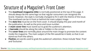
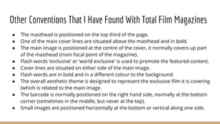
2. What are Film Magazines?
Magazines are a type of platform in media which are used to promote, review
and talk about different topics relevant to the magazine’s themes. Film
magazines are based on the world of cinema, and are normally used mostly to
promote previews and rumours of upcoming films.
There are three main brands in the film magazine industry, they are:
4. Empire
● A British film magazine that is published by Bauer Consumer Media
(Bauer Media Group).
● They publish monthly by Emap, with their first issue being published in
July 1989. (Bauer paurchased Emap Consumer media in 2008).
● The magazine is published in the UK, USA, Portugal, Turkey, Russia and
Australia.
● It is the biggest selling film magazine in the UK.
● The magazine covers both mainstream films and art films.
● Each issue has different content for the reader, these include: news,
previews, reviews, Classic Scene (a transcript from a noticeable film scene)
regular Top Tens and more.
Source: https://en.wikipedia.org/wiki/Empire_(film_magazine)
Empire website: http://www.empireonline.com/
5. Total Film
● A UK based film magazine by Future Publishing.
● Launched in 1997, the magazine is now available in both print and
interactive iPad editions.
● The magazine is published 13 times a year (monthly publish plus a special
summer issue between the july and august issues).
● Magazine’s content includes news, DVD and Blu-ray news/reviews,
reviews and special features (sneak peeks etc.).
● In 2014, Total Film’s website was merged with GamesRadar’s website, with
all of it’s content on the GamesRadar website.
● There are many licensed local editions of Total Film as well, which are
released in many different countries. These include Russia, Indonesia,
Turkey, Croatia and Serbia.
Total Film’s website: http://www.gamesradar.com/totalfilm/
Source:https://en.wikipedia.org/wiki/Total_Film
6. Premiere
● Was an American (New York City) based film magazine published by
Hachette Filipacchi Media U.S. between 1987-2007.
● It was established in France in 1976 and is still being published there.
● The U.S. print version was shut down in 2007 with the last issue being in
April of that year. It carried on as an online-only publication, but that didn’
t last long due to the huge amount of unhappy subscribers.
● The magazine is published 10 times a year (with December/January
sharing an issue, as well as July/August).
● Each issue of Premiere includes regular features, such as: first look,
previews, DVD reviews, home cinema equipment, behind the scenes and
interviews. Special features included a list of the most powerful people in
Hollywood and extensive Academy Awards Coverage.
Source: https://en.wikipedia.org/wiki/Premiere_(magazine)
Premiere’s website: http://www.premiere.fr/
7. Which Film Magazine Will I Use
After reviewing three of the most popular consumer choices, I have decided to
go for Total Film. This is because from a marketing perspective, the magazine
is available in both print and as an iPad app. Which is great considering that
the availability of the two platforms means that there is a larger potential
audience. Also the merge with GamesRadar is great as it allows the magazine
to have tie-ins with the gaming industry, thus having a wider potential
audience of both filmmakers and gamers. Lastly, having the magazine based
in the UK makes the brand more relevant, as my film is also made in the UK.
My second choice would be Empire as it is the best selling magazine in the UK.
But it doesn’t have any relationships with other industries like Total Film does
(which limits its potential target audience). I would strongly avoid Premiere as
it is now only available in France. Which make it very limiting in terms of
marketing.
8. Structure of a Magazine's Front Cover
● The masthead (magazine title) is normally positioned at the top of the page. It
should always be the same logo so that regular consumers can recognise the
brand. However, the style is normally changed to fit in with the theme of the issue.
The masthead can be in front or behind the main subject image.
● The date line must be on the front cover. It should display the year and month of
the publication. As well as the price and issue number.
● A main cover line must stand out to grab the audience's attention.
● A barcode should be along the side or hidden in the corner.
● The cover lines are normally place around the main image to promote the content
inside the magazine. The main subject of the film would be in bold, so that it can
stand out from the others.
● Flashes are words used to grab the audience's attention. these include ‘New’, ‘Free’
and ‘Exclusive’.
Source: http://www.designyourway.net/blog/inspiration/tips-and-inspiration-on-how-to-design-a-magazine-cover/
9. Total Film Cover Analysis 1
Barcode on the bottom
right corner (hidden
away from the viewer’s
attention of the main
image).
Title of the magazine (masthead) in the upper third of
the cover. It has not been changed due to the fact
that it follows the simple blue and white colour
scheme, as well as standing out from the blue misty
background. The word ‘Total’ transparent.
The date line of the issue in capital letters and under the
magazine's logo (in the smallest font). Includes the price of the
issue.
Promoting the magazine’s (now old) website.
Main Image covers part of the magazine’s masthead. This is
probably add a dynamic approach to the main image.
Top half of the cover line is treated as a
flash to grab the audience's attention and to
help promote the content within this issue of
the magazine.
Images next to a cover line to give the
reader a visual preview of what is included.
Different cover lines that preview the different content of
this issue. Flash words are in blue to visually show
importance over other text on the cover. The typography
matches the quote at the centre of the cover.
The main cover image is at the centre of magazine to
become the main focal point for the reader. The image of
the famous actor Robert Downey Jr. is purposefully used
because he is a world renowned actor. Fans of his could
recognise his face and buy the magazine to see what he
is up too. He overlays the title of the magazine visually
express his importance.
The white flash text is behind a blue box to help it stand
out more, this emphasises on it’s importance.
The new upcoming film is promoted through the
magazine by having its title in the largest font. This is
also done to catch the reader's attention.
The background is a misty blue and white setting. This
along with Robert’s outfit, strongly suggest that the cover
is representing the Industrial/Victorian-ish theme that the
movie is known for
The main cover line is below the film’s title. It has it’s
own font type to help differentiate it from the coverlines.
10. Total Film Cover Analysis 2
The colour scheme of black, grey, white
and gold gives the magazine a sense of
class and style towards the reader. This
aesthetic style is synonymous with the
James Bond franchise.
The barcode is nowhere to be seen, this may be
because the bottom of the magazine cover is cut off
(and that is where the barcode is positioned).
The masthead is in the upper third of the
cover. It has not been changed due to the fact
that the dark background helps it stand out
more. It also helps balance out the amount of
different colours on all the pieces of text. The
word ‘Total’ is transparent, this is probably to
done to make the masthead look more
aesthetically pleasing.
The main cover line is positioned above the the
masthead in gold. the flash word ‘cool’ relates to the
masculine theme of the issue (which relates to the
James Bond franchise)
The date line is hidden in the middle of the M, this is so
it is hidden away from the reader’s initial attention.
The name of the new featured film is in the biggest font, this
is part of the promotion as it catches the reader's attention.
The flash word ‘exclusive’ is white on a red background to
help it catch the reader’s eye.
This cover line boasts about the review content of
the magazine. It’s styled a bit like a stamp to
make the statement feel more official to the
reader.
The main image is the character James Bond, who is played by
Daniel Craig. He is an established actor and is widely
recognised among the public. Because of his fame, he is
positioned at the centre of the cover (over the masthead) to
catch the reader’s attention first. Fans of his might spot this in
the shop and buy the magazine because he is in it.
Cover lines that briefly explain the contents of this
issue. The flash words are in a bold red font to catch
the reader’s attention first before they read the (more
descriptive) white font.
Images of other films help break up the
text visually. Making the cover of the
magazine more interesting to the
reader. They are also there to visually
tease the reader of new films coming
soon.
A special feature in the magazine is
promoted with the biggest cover
line. The large bold font is used to
catch the reader's attention, whilst
the gold colour helps emphasis on
the words ‘coolest movies’ (which
also relates to the James Bond
theme of the magazine).
11. Total Film Cover Analysis 3 The main cover line in a large yellow font
to help promote the main feature of the
issue.
The date line is positioned below the M.
This is so it doesn’t attract the reader’s
main attention.
This small cover line boasts about the review
content that the magazine contains. It is styled a bit
like a stamp which makes the statement feel more
official to the reader.
The barcode is positioned horizontally halfway up. It is
slightly more noticeable compared to the first magazine
which had the barcode at the bottom right-hand corner.
I believe the barcode was positioned here because the
bottom of the cover is taken up by promoted features.
The masthead is again positioned in the
top third of the poster. Again because this
cover has a dark background, the white
logo stands out and so it hasn’t been
altered. Just like the previous two, the
word ‘Total’ is transparent to make it look
more aesthetically pleasing.
Smaller cover lines that promotes less interesting
features and topics in the issue. The most recognisable
flash words are in bold to catch the reader's attention.
The gritty dark background reflects the themes of the
promoted film (The Girl With The Dragon Tattoo).
Different colours used here to make the text and
content stand out. The flash word ‘must-see’ has it’s
own colour (yellow) to make it stand out more from
the rest of the bold text.
Images of this issue’s content gives a visual preview
to the reader. It also helps to break up the large
amount of text on the cover, making it more visually
pleasing.
Large image is positioned at the centre of the magazine
cover (just like the previous two). Daniel Craig is in front
of the female actor because famous and recognisable.
The image relates to the issue’s exclusive content (thus
having the biggest promotion).
The flash word ‘exclusive’ is in a red square to help
the white, bold text stand out more. The text is tilted
unlike the other two, this might be to make it more
aesthetically pleasing (since a lot of the text is
horizontal).
Flash words in a different colour (yellow)
and bold as helps it to catch the reader’s
eye.
12. Other Conventions That I Have Found With Total Film Magazines
● The masthead is positioned on the top third of the page.
● One of the main cover lines are situated above the masthead and in bold.
● The main image is positioned at the centre of the cover, it normally covers up part
of the masthead (main focal point of the magazine).
● Flash words ‘exclusive’ or ‘world exclusive’ is used to promote the featured content.
● Cover lines are situated on either side of the main image.
● Flash words are in bold and in a different colour to the background.
● The overall aesthetic theme is designed to represent the exclusive film it is covering
(which is related to the main image.
● The barcode is normally positioned on the right hand side, normally at the bottom
corner (sometimes in the middle, but never at the top).
● Small images are positioned horizontally at the bottom or vertical along one side.