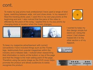
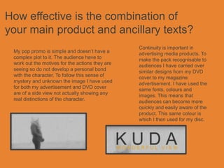
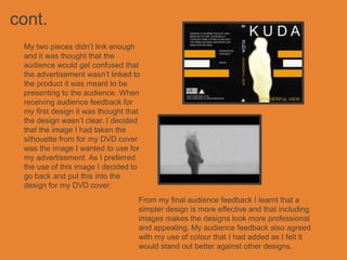
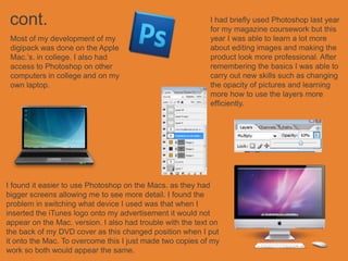
KUDA
WONDERFUL VIEW


             Evaluation
In what ways does your media product
use, develop or challenge forms and
conventions of real media products?
To keep my DVD cover with existing conventions it includes a
BBFC certificate rating, a barcode and the DVD logo. From
my research I used the idea of making the whole cover one
image. I think this works well as it keeps the design simple.
Also the image I have used is a still from the pop promo.


                                                        When researching DVD covers
                                                        they were all simple and carried
                                                        through one colour. To apply this to
                                                        my DVD cover I used only one bold
                                                        colour and kept everything else the
                                                        same. To make sure it kept well
                                                        with the picture and didn’t look too
                                                        harsh against it I grabbed a colour
                                                        from the main image to use for my
                                                        text.
cont.
 To make my pop promo look professional I have used a range of shot
 types, switching between wide, mid and close shots. In my research I
 liked the tracking shots used. I used this in my own pop promo at the
 beginning and end. I also noticed that the pace of the video is
 affected by the pace of the song. I applied this to my pop promo by
 changing shots or location when the music changes.
                                                                     I wanted to keep my
                                                                     disc design simple but
                                                                     stand out. Using the
                                                                     colour I had chosen
                                                                     helped link it to the
                                                                     other section s of my
                                                                     digipack.
To keep my magazine advertisement with current
conventions I have included things such as the iTunes
logo, testimonials from popular magazines within the
industry and a release date. I noticed when researching
that information is mainly at the bottom or top of the page
and that the image is the main selling point of the page.
Therefore using the same image as the DVD cover helps
promote the product and allows audiences to easily
recognise the product.
How effective is the combination of
your main product and ancillary texts?
                                                 Continuity is important in
 My pop promo is simple and doesn’t have a       advertising media products. To
 complex plot to it. The audience have to        make the pack recognisable to
 work out the motives for the actions they are   audiences I have carried over
 seeing so do not develop a personal bond        similar designs from my DVD
 with the character. To follow this sense of     cover to my magazine
 mystery and unknown the image I have used       advertisement. I have used the
 for both my advertisement and DVD cover         same fonts, colours and
 are of a side view not actually showing any     images. This means that
 real distinctions of the character.             audiences can become more
                                                 quickly and easily aware of the
                                                 product. This same colour is
                                                 which I then used for my disc.
What have you learnt from your
audience feedback?
 In the process of designing my digipack I changed my
 whole idea and design for both my DVD cover and
 magazine advertisement.
cont.
 My two pieces didn’t link enough
 and it was thought that the
 audience would get confused that
 the advertisement wasn’t linked to
 the product it was meant to be
 presenting to the audience. When
 receiving audience feedback for
 my first design it was thought that
 the design wasn’t clear. I decided
 that the image I had taken the
 silhouette from for my DVD cover
 was the image I wanted to use for
 my advertisement. As I preferred
 the use of this image I decided to
 go back and put this into the
 design for my DVD cover.
                                   From my final audience feedback I learnt that a
                                   simpler design is more effective and that including
                                   images makes the designs look more professional
                                   and appealing. My audience feedback also agreed
                                   with my use of colour that I had added as I felt it
                                   would stand out better against other designs.
How did you use media technologies in
the construction and research, planning
and evaluation stages?
                                                 My blog was an easy way to
 This was my first introduction to               record my progress. I had
 Final Cut Pro or even filming any               trouble with uploading some
 footage. I learnt from my theory                pictures and videos but
 that I needed to be able to shoot               overcame these problems.
 wide, mid and close shots so I
 can easily switch between them
 when sequencing my pop promo.
 I feel I have done this in my pop   In creating my pop promo I
 promo to make it look               used the software Final Cut
 professional.                       Pro. I filmed my footage on a
                                     HD digital camera and this
                                     was then uploaded to an
                                     Apple Mac. Ready to be
                                     edited in Final Cut Pro
cont.                                                      I had briefly used Photoshop last year
                                                            for my magazine coursework but this
 Most of my development of my                               year I was able to learn a lot more
 digipack was done on the Apple                             about editing images and making the
 Mac.’s. in college. I also had                             product look more professional. After
 access to Photoshop on other                               remembering the basics I was able to
 computers in college and on my                             carry out new skills such as changing
 own laptop.                                                the opacity of pictures and learning
                                                            more how to use the layers more
                                                            efficiently.


I found it easier to use Photoshop on the Macs. as they had
bigger screens allowing me to see more detail. I found the
problem in switching what device I used was that when I
inserted the iTunes logo onto my advertisement it would not
appear on the Mac. version. I also had trouble with the text on
the back of my DVD cover as this changed position when I put
it onto the Mac. To overcome this I just made two copies of my
work so both would appear the same.

Evaluation

  • 1.
  • 2.
    In what waysdoes your media product use, develop or challenge forms and conventions of real media products? To keep my DVD cover with existing conventions it includes a BBFC certificate rating, a barcode and the DVD logo. From my research I used the idea of making the whole cover one image. I think this works well as it keeps the design simple. Also the image I have used is a still from the pop promo. When researching DVD covers they were all simple and carried through one colour. To apply this to my DVD cover I used only one bold colour and kept everything else the same. To make sure it kept well with the picture and didn’t look too harsh against it I grabbed a colour from the main image to use for my text.
  • 3.
    cont. To makemy pop promo look professional I have used a range of shot types, switching between wide, mid and close shots. In my research I liked the tracking shots used. I used this in my own pop promo at the beginning and end. I also noticed that the pace of the video is affected by the pace of the song. I applied this to my pop promo by changing shots or location when the music changes. I wanted to keep my disc design simple but stand out. Using the colour I had chosen helped link it to the other section s of my digipack. To keep my magazine advertisement with current conventions I have included things such as the iTunes logo, testimonials from popular magazines within the industry and a release date. I noticed when researching that information is mainly at the bottom or top of the page and that the image is the main selling point of the page. Therefore using the same image as the DVD cover helps promote the product and allows audiences to easily recognise the product.
  • 4.
    How effective isthe combination of your main product and ancillary texts? Continuity is important in My pop promo is simple and doesn’t have a advertising media products. To complex plot to it. The audience have to make the pack recognisable to work out the motives for the actions they are audiences I have carried over seeing so do not develop a personal bond similar designs from my DVD with the character. To follow this sense of cover to my magazine mystery and unknown the image I have used advertisement. I have used the for both my advertisement and DVD cover same fonts, colours and are of a side view not actually showing any images. This means that real distinctions of the character. audiences can become more quickly and easily aware of the product. This same colour is which I then used for my disc.
  • 5.
    What have youlearnt from your audience feedback? In the process of designing my digipack I changed my whole idea and design for both my DVD cover and magazine advertisement.
  • 6.
    cont. My twopieces didn’t link enough and it was thought that the audience would get confused that the advertisement wasn’t linked to the product it was meant to be presenting to the audience. When receiving audience feedback for my first design it was thought that the design wasn’t clear. I decided that the image I had taken the silhouette from for my DVD cover was the image I wanted to use for my advertisement. As I preferred the use of this image I decided to go back and put this into the design for my DVD cover. From my final audience feedback I learnt that a simpler design is more effective and that including images makes the designs look more professional and appealing. My audience feedback also agreed with my use of colour that I had added as I felt it would stand out better against other designs.
  • 7.
    How did youuse media technologies in the construction and research, planning and evaluation stages? My blog was an easy way to This was my first introduction to record my progress. I had Final Cut Pro or even filming any trouble with uploading some footage. I learnt from my theory pictures and videos but that I needed to be able to shoot overcame these problems. wide, mid and close shots so I can easily switch between them when sequencing my pop promo. I feel I have done this in my pop In creating my pop promo I promo to make it look used the software Final Cut professional. Pro. I filmed my footage on a HD digital camera and this was then uploaded to an Apple Mac. Ready to be edited in Final Cut Pro
  • 8.
    cont. I had briefly used Photoshop last year for my magazine coursework but this Most of my development of my year I was able to learn a lot more digipack was done on the Apple about editing images and making the Mac.’s. in college. I also had product look more professional. After access to Photoshop on other remembering the basics I was able to computers in college and on my carry out new skills such as changing own laptop. the opacity of pictures and learning more how to use the layers more efficiently. I found it easier to use Photoshop on the Macs. as they had bigger screens allowing me to see more detail. I found the problem in switching what device I used was that when I inserted the iTunes logo onto my advertisement it would not appear on the Mac. version. I also had trouble with the text on the back of my DVD cover as this changed position when I put it onto the Mac. To overcome this I just made two copies of my work so both would appear the same.