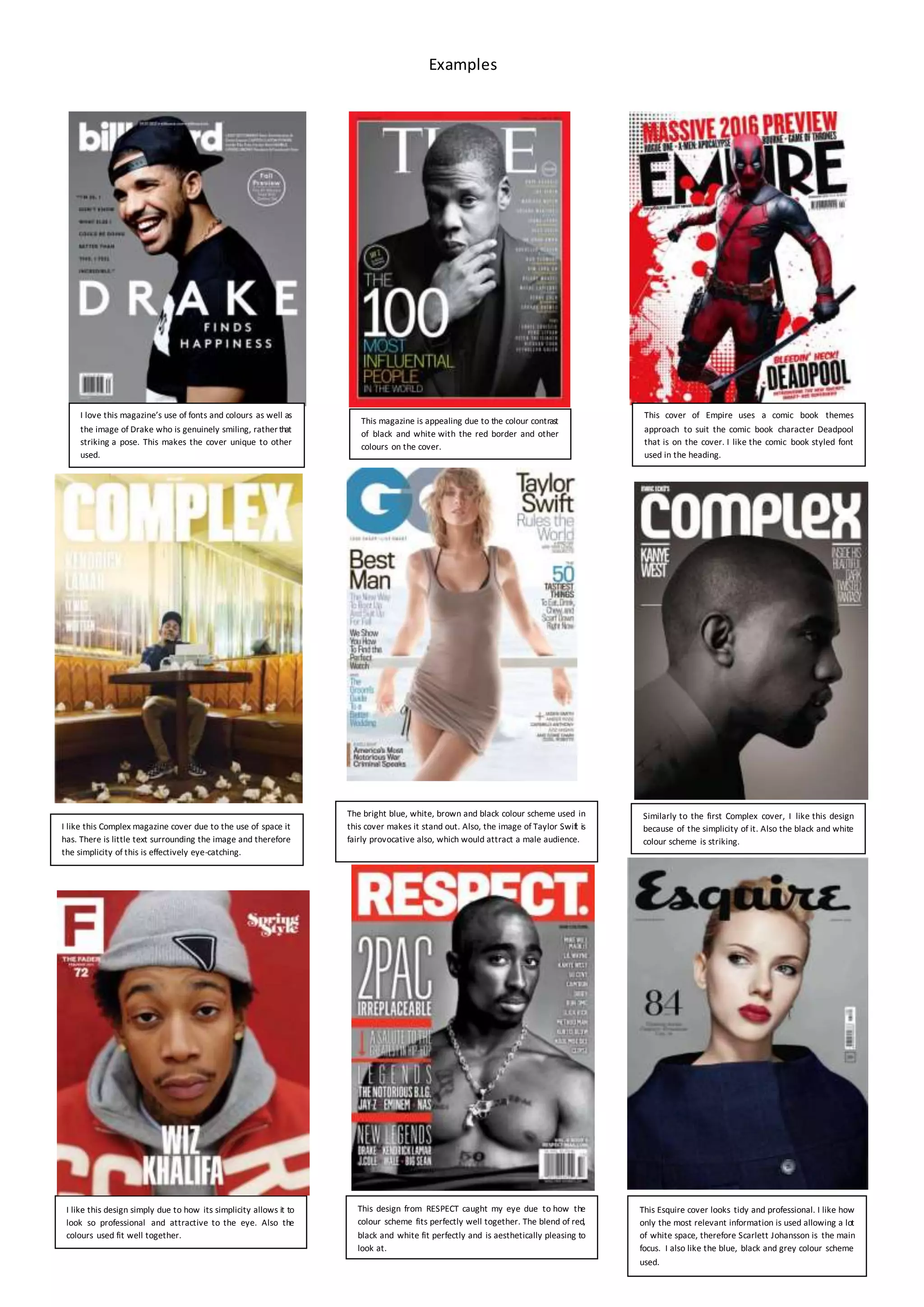
Examples
I like this design simply due to how its simplicity allows it to
look so professional and attractive to the eye. Also the
colours used fit well together.
This design from RESPECT caught my eye due to how the
colour scheme fits perfectly well together. The blend of red,
black and white fit perfectly and is aesthetically pleasing to
look at.
This Esquire cover looks tidy and professional. I like how
only the most relevant information is used allowing a lot
of white space, therefore Scarlett Johansson is the main
focus. I also like the blue, black and grey colour scheme
used.
Similarly to the first Complex cover, I like this design
because of the simplicity of it. Also the black and white
colour scheme is striking.
This cover of Empire uses a comic book themes
approach to suit the comic book character Deadpool
that is on the cover. I like the comic book styled font
used in the heading.
I like this Complex magazine cover due to the use of space it
has. There is little text surrounding the image and therefore
the simplicity of this is effectively eye-catching.
The bright blue, white, brown and black colour scheme used in
this cover makes it stand out. Also, the image of Taylor Swift is
fairly provocative also, which would attract a male audience.
This magazine is appealing due to the colour contrast
of black and white with the red border and other
colours on the cover.
I love this magazine’s use of fonts and colours as well as
the image of Drake who is genuinely smiling, rather that
striking a pose. This makes the cover unique to other
used.

Magazine examples

  • 1.
    Examples I like thisdesign simply due to how its simplicity allows it to look so professional and attractive to the eye. Also the colours used fit well together. This design from RESPECT caught my eye due to how the colour scheme fits perfectly well together. The blend of red, black and white fit perfectly and is aesthetically pleasing to look at. This Esquire cover looks tidy and professional. I like how only the most relevant information is used allowing a lot of white space, therefore Scarlett Johansson is the main focus. I also like the blue, black and grey colour scheme used. Similarly to the first Complex cover, I like this design because of the simplicity of it. Also the black and white colour scheme is striking. This cover of Empire uses a comic book themes approach to suit the comic book character Deadpool that is on the cover. I like the comic book styled font used in the heading. I like this Complex magazine cover due to the use of space it has. There is little text surrounding the image and therefore the simplicity of this is effectively eye-catching. The bright blue, white, brown and black colour scheme used in this cover makes it stand out. Also, the image of Taylor Swift is fairly provocative also, which would attract a male audience. This magazine is appealing due to the colour contrast of black and white with the red border and other colours on the cover. I love this magazine’s use of fonts and colours as well as the image of Drake who is genuinely smiling, rather that striking a pose. This makes the cover unique to other used.