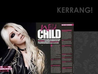
This document analyzes the design elements of two magazine double page spreads (DPS). For the first DPS profile of Taylor Momsen: the font, colors and layout are used to convey a sense of innocence, attitude, strength and feminism fitting her persona. For the second DPS on Blink-182: the large font, yellow highlighting and long tagline suggest a celebration of their return, while the continuous prose interview style appeals to a more mature audience. Overall design elements are analyzed for the connotations and how they fit the profiled musicians and target audiences.

![Film poster all genres[1]](https://cdn.slidesharecdn.com/ss_thumbnails/filmposterallgenres1-140203041225-phpapp02-thumbnail.jpg?width=640&height=640&fit=bounds)