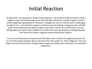
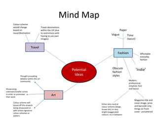
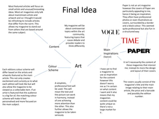
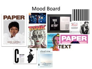
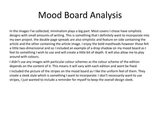
Initial Plans
Jamie Holland
Initial Reaction
To begin with, I was focused on doing a travel magazine. I did media at GCSE and had to create a
magazine cover and double page spread. My final idea at GCSE was a travel magazine, which I
ended up getting a good grade on. However, I changed my mind as I felt this wasn’t challenging
enough for me. I also wanted to explore something new and redoing a magazine cover and DPS
gave me the opportunity to explore a genre that I didn’t choose for my GCSE work. Art and
photography was a genre that I drafted in my GCSE’s but never developed so I decided that this
time around I’d create a magazine based around these subjects.
I’m very much attracted to simplicity and minimalism when it comes to magazines because, for
me, the front image should be able to say more than what words can. Paper Magazine, Time and
Vogue all came to mind when I thought about simple but striking covers and were my immediate
inspirations.
Mind Map
Potential
Ideas
Travel
Fashion
Art
Vogue
Paper
Time
(layout)
Obscure
fashion
styles
Modern,
professional,
simplistic font
and layout
Either very neutral
colour scheme (beige,
brown etc) or very
bright exaggerated
colours- no in between
Magazine title and
cover image, price
and barcode only
things on front
cover- uncluttered
Affordable
everyday
fashion
Travel destinations
within the UK (due
to restrictions with
having to use own
images)
Colour scheme
would change
based on
issue/destination
’Indie’
Thought provoking
debates within the art
community.
Showcasing
unknown/smaller artists
in order to promotee
their work
Colour scheme will
based off the atrwork
being showcased or
with artists signature
colour schemes or
patters.
Final Idea
Art
Main
Inspirations
(layout)
Paper is not an art magazine
however the covers of Paper are
particularly appealing to me,
hence it being an inspiration.
They often have professional
photos or even illustrations as
covers, surrounded by a border
and a block colour. This seemed
quite professional but also fun in
a structured way
It isn’t necessarily the content of
these magazines that interest
me; instead its more the design
and layout of their covers
The covers usually consist of the
magazine’s title and the main
image relating to their main
article, the price and a barcode
and possibly the edition
number.
I have yet to find
a magazine to
use as inspiration
for the content
however this
doesn’t worry
me as I’m certain
on what content
I want and it also
means that my
magazines
content could be
quite unique as
there’s not a
large market for
it .
Content
My magazine will be
about controversial
topics within the art
community,
featuring topics that
cause debate and
provoke readers to
think differently
Most featured articles will focus on
small artists and unusual/innovating
ideas. Most art magazines only talk
about mainstream artists and
artwork and so I thought it would
be refreshing to include articles
that differ from the norm. This
allows my magazine to stand out
from others that are based around
the same subject.
Each editions colour scheme will
differ based on the artists and
artworks featured as the main
article. This not only creates
excitement and curiosity as to what
each edition will look like but will
also allow the magazine to be
viewed as a collectable item. If an
artist is featured that the audience
is a big fan of, the matching colour
scheme will make it feel
personalised and more focused on
the main subject.
Colour
Scheme
A simplistic,
professional font will
be used. This will
mean the text and
the picture can work
in harmony, instead
of one achieving
more attention than
the other. This also
further allows the
magazine to be taken
seriously
Mood Board
Mood Board Analysis
In the images I’ve collected, minimalism plays a big part. Most covers I chose have simplistic
designs with small amounts of writing. This is something that I definitely want to incorporate into
my own project. the double page spreads are also simplistic and feature on side containing the
article and the other containing the article image. I enjoy the bold mastheads however those felt
a little two-dimensional and so I included an example of a drop shadow on my mood board as I
feel its something I wish to use and will create a little bit of depth. It will also allow me to play
around with colours.
I didn’t use any images with particular colour schemes as the colour scheme of the edition
depends on the content of it. This means it will vary with each edition and wont be fixed.
I included the picture of the stripes on the mood board as I like the uniform feel of them. They
create a sleek style which is something I want to incorporate: I don’t necessarily want to use
stripes, I just wanted to include a reminder for myself to keep the overall design sleek.
Schedule
WEEK OVERALL PLAN SPECIFIC TASKS
1 Research, Initial Response,
Audience Research
▪ Collect design ideas
▪ Collect several magazine topics and
brainstorm content ideas
▪ Finalise idea and research demographic
2 Production Experiments,
Proposal, Planning
▪ Create design and content based on target
audience
▪ Find cover image and base colour scheme
on it
3 Production ▪ Design and create the final cover
▪ Include drafts
4 Production •
5 Evaluation •

Magazine Idea Generation

  • 1.
  • 2.
    Initial Reaction To beginwith, I was focused on doing a travel magazine. I did media at GCSE and had to create a magazine cover and double page spread. My final idea at GCSE was a travel magazine, which I ended up getting a good grade on. However, I changed my mind as I felt this wasn’t challenging enough for me. I also wanted to explore something new and redoing a magazine cover and DPS gave me the opportunity to explore a genre that I didn’t choose for my GCSE work. Art and photography was a genre that I drafted in my GCSE’s but never developed so I decided that this time around I’d create a magazine based around these subjects. I’m very much attracted to simplicity and minimalism when it comes to magazines because, for me, the front image should be able to say more than what words can. Paper Magazine, Time and Vogue all came to mind when I thought about simple but striking covers and were my immediate inspirations.
  • 3.
    Mind Map Potential Ideas Travel Fashion Art Vogue Paper Time (layout) Obscure fashion styles Modern, professional, simplistic font andlayout Either very neutral colour scheme (beige, brown etc) or very bright exaggerated colours- no in between Magazine title and cover image, price and barcode only things on front cover- uncluttered Affordable everyday fashion Travel destinations within the UK (due to restrictions with having to use own images) Colour scheme would change based on issue/destination ’Indie’ Thought provoking debates within the art community. Showcasing unknown/smaller artists in order to promotee their work Colour scheme will based off the atrwork being showcased or with artists signature colour schemes or patters.
  • 4.
    Final Idea Art Main Inspirations (layout) Paper isnot an art magazine however the covers of Paper are particularly appealing to me, hence it being an inspiration. They often have professional photos or even illustrations as covers, surrounded by a border and a block colour. This seemed quite professional but also fun in a structured way It isn’t necessarily the content of these magazines that interest me; instead its more the design and layout of their covers The covers usually consist of the magazine’s title and the main image relating to their main article, the price and a barcode and possibly the edition number. I have yet to find a magazine to use as inspiration for the content however this doesn’t worry me as I’m certain on what content I want and it also means that my magazines content could be quite unique as there’s not a large market for it . Content My magazine will be about controversial topics within the art community, featuring topics that cause debate and provoke readers to think differently Most featured articles will focus on small artists and unusual/innovating ideas. Most art magazines only talk about mainstream artists and artwork and so I thought it would be refreshing to include articles that differ from the norm. This allows my magazine to stand out from others that are based around the same subject. Each editions colour scheme will differ based on the artists and artworks featured as the main article. This not only creates excitement and curiosity as to what each edition will look like but will also allow the magazine to be viewed as a collectable item. If an artist is featured that the audience is a big fan of, the matching colour scheme will make it feel personalised and more focused on the main subject. Colour Scheme A simplistic, professional font will be used. This will mean the text and the picture can work in harmony, instead of one achieving more attention than the other. This also further allows the magazine to be taken seriously
  • 5.
  • 6.
    Mood Board Analysis Inthe images I’ve collected, minimalism plays a big part. Most covers I chose have simplistic designs with small amounts of writing. This is something that I definitely want to incorporate into my own project. the double page spreads are also simplistic and feature on side containing the article and the other containing the article image. I enjoy the bold mastheads however those felt a little two-dimensional and so I included an example of a drop shadow on my mood board as I feel its something I wish to use and will create a little bit of depth. It will also allow me to play around with colours. I didn’t use any images with particular colour schemes as the colour scheme of the edition depends on the content of it. This means it will vary with each edition and wont be fixed. I included the picture of the stripes on the mood board as I like the uniform feel of them. They create a sleek style which is something I want to incorporate: I don’t necessarily want to use stripes, I just wanted to include a reminder for myself to keep the overall design sleek.
  • 7.
    Schedule WEEK OVERALL PLANSPECIFIC TASKS 1 Research, Initial Response, Audience Research ▪ Collect design ideas ▪ Collect several magazine topics and brainstorm content ideas ▪ Finalise idea and research demographic 2 Production Experiments, Proposal, Planning ▪ Create design and content based on target audience ▪ Find cover image and base colour scheme on it 3 Production ▪ Design and create the final cover ▪ Include drafts 4 Production • 5 Evaluation •