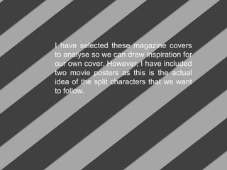
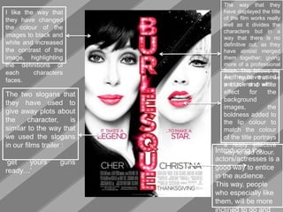
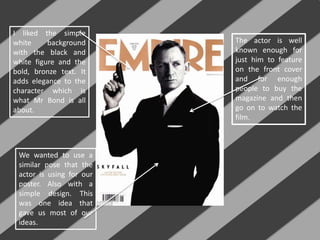
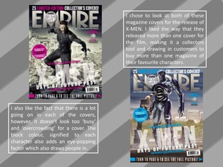
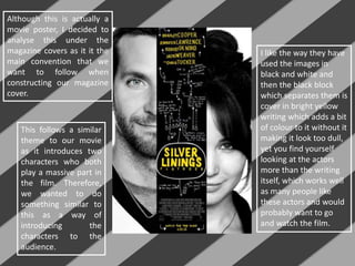
The document discusses magazine covers and movie posters that were analyzed for inspiration in creating a magazine cover featuring split characters. Key aspects that were liked included using black and white images with high contrast to define faces, merging character images together with the title, using slogans to hint at plots, adding bold lip color to match the title color, and introducing actors to attract audiences. Simplicity with a white background and black/white figure with bold text was also admired, as was a similar pose to the actor's that provided cover ideas. Introducing two main characters as the focus was deemed a good convention to follow.